Color Study 8: Tetradic or Dual Complementary
So what comes after triadic / three (3)? Why four (4), of course….or tetradic color schemes. Another way of saying that, but a lot more simply, is dual complementaries (2+2)…either way it adds up to four. For the colorblock side of this quiltlet, I selected blue, purple, orange and yellow. If you take a quick look at the color wheel again, you’ll see that yellow is the complement—on the opposite side of the color wheel—of purple (a mix of red and blue). Similarly, orange ( a mix of red and yellow) is the complement of blue.
One way to remember the meaning of complement (thanks Terry Grant for reminding me of this great etymology) is that complement comes from the same root word as “complete.” To quote Terry: “A pair of complementary colors “completes” the primary triad.”
For my “symbol” for tetradic I chose the square, but a rectangle works just as well. Basically, take any two pairs of complementary colors, and you have a tetradic or dual complementary scheme:

I returned to a semi-abstract composition for the quiltlet side, using a symmetrical composition. If you slice the quilt on either diagonal, it is a mirror image (more or less…the snippets in the centers of the petal or pod shapes vary). Look at how the snippets in the centers pop–that’s your complementary color scheme at work!
Also, I set “Value” to work here, too. You may remember that value is the relative lightness or darkness of a color. I used a light or pale blue for the blue, and a deep dark purple for the purple. Yellow by its nature is hard to make dark, but I picked a yellow that ranges from almost white to bright, but a reasonably intense (i.e. darker) orange.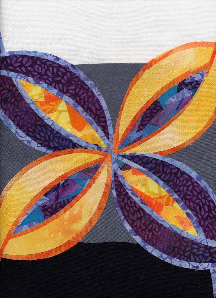
Now it’s time to introduce a new concept:
Warm colors advance / move forward.
Dark colors recede / move backwards.
Look at the petals/pods again. Notice how the yellow and orange petals seem to pop forward? The blue-purple ones seem to be in the background. As well, the blue-purple centers of the yellow pods seem to really be retreating into the distance, while the yellow-orange centers on the purple pods are almost bursting out of the center.
If you want something to “pop” or look as if it is in the foreground, using a warm color will help create that effect. If you want to tone down, or move something into a subordinate position, see what happens if you use a cool color instead of a warm one.
Tomorrow, I’ll bring in the perpetual favorite–the “rainbow” or full-color-wheel, and the next posting will be a thread sampler I made to illustrate the effects of different colors of thread on the same range of colors (that’ll make a lot more sense when you see the picture!). Then I’ll talk a bit about how I choose colors, and how I use the color wheel in real life.
Thanks everyone who is reading and following this discussion!
Cheers, Sarah