Syncronicity and a new exhibit
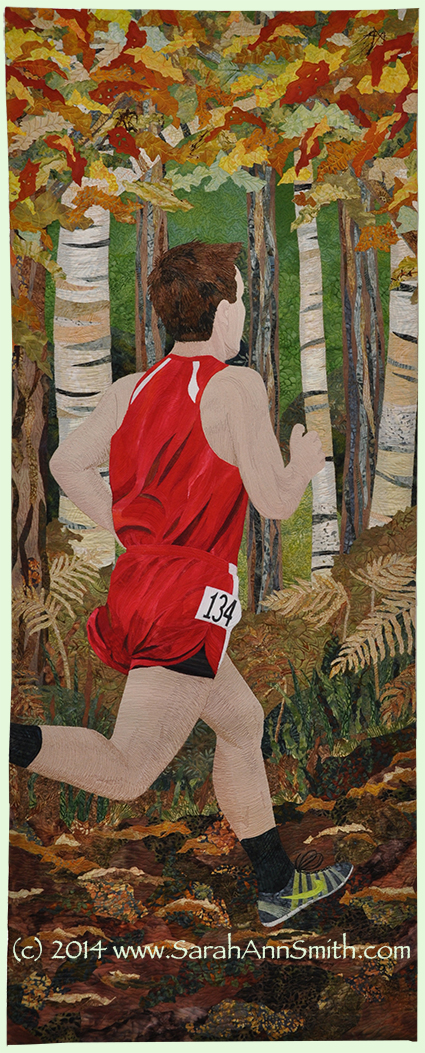
Today it is my turn on the Dinner@8 blog which is profiling the artists in this year’s juried invitational exhibit, Reflections. Please do click on the link to read their interview with me! Fittingly, it is also Eli’s first Cross Country practice (to his dismay at 7:30 am!) of the season. Why? Because my quilt this year is of Eli’s 2013 Cross Country season:
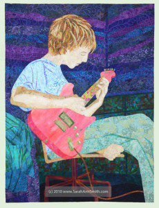
Four years ago, I created a portrait of Joshua for the Beneath the Surface exhibit also created by Jamie Fingal and Leslie Tucker Jenison, the artists behind Dinner@8.
This year it was Eli’s turn to have a portrait done at the same age. The theme this year was Reflections, and for once I didn’t want to do something literal. I’ve always loved looking at children and seeing features from their parents in them, as well as getting to know them and seeing bits of personality that come from their families. With Eli, he has brains (from both of us but I’ll take credit), athletic prowess (totally from his dad!), determination (stubbornness? we’re both guilty on that one), the broad shoulders of my dad and brothers. So Eli is running headlong into his future, a Reflection of his past and a hint of his future.
At long last, I’m happy to share with you some in progress photos, too. First I had to take reference photos (since I can’t remember all the angles!). There were decisions to make: head on? from behind (since he’s usually at the front of the pack)? sideways? On the Camden Hills course or not? Scale and composition….
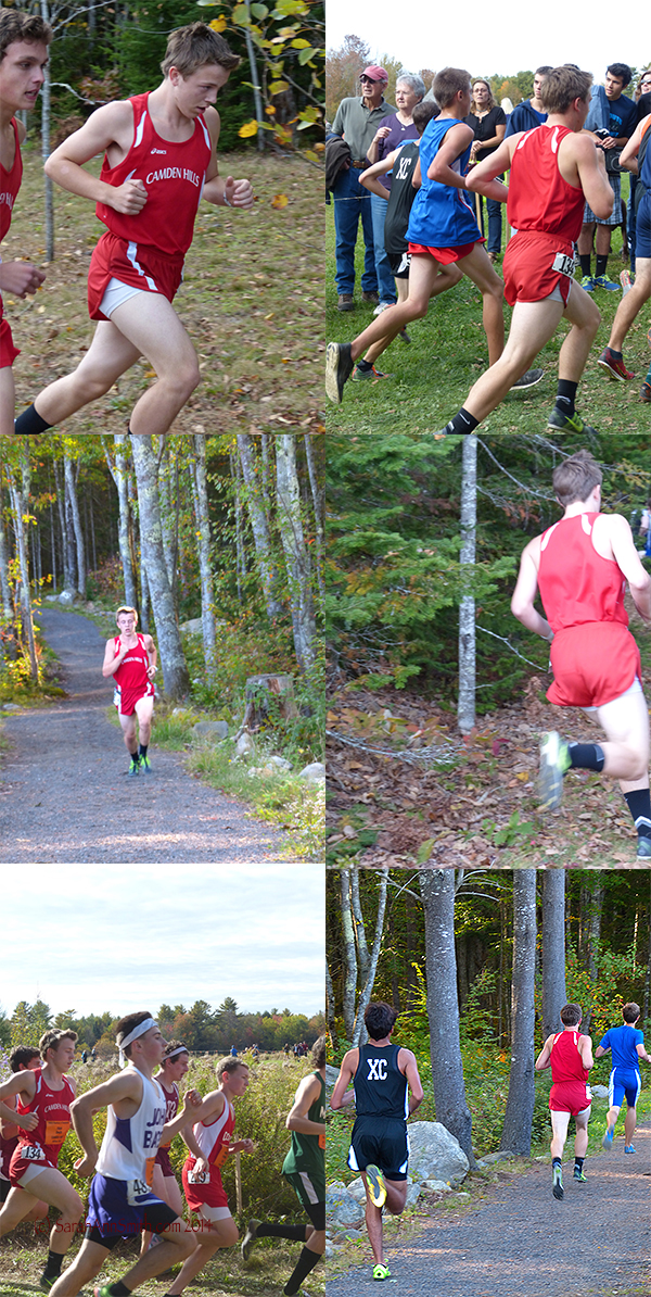
Many decisions: Close up of Eli (top left)? Heading out of the frame (top right)? Burning it up hill (middle left)? Powering around the corner (middle right)? at Festival of Champions, in a fast-moving pack (bottom left)? Running away in a small crowd (bottom right)? Right click to view larger.
I knew I wanted to have him running on the home course, which is why I took these photos:
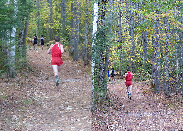
The avenue into the woods, behind the softball field, at Camden Hills. I knew I wanted this overall composition, but when I realized how small Eli’s figure would be on the 24 x 60 h. required size, I knew I would have to adjust. It just wouldn’t have the right impact if his figure was maybe 12 inches tall out of 60! Right click to view larger.
I decided to use a photo of Eli running from Festival of Champions, coming around a corner at about the same angle they run into the forest in the photos above. So I first worked on creating Eli, then I designed a background similar to the photos above. The path and trees were easy, but getting a middle-ground in the right scale for the ferns and whatnot at the edge of the path proved tricky without an actual photograph (by this time it was mid-winter and covered with snow, so couldn’t go take another look).
Then it was time to dye the fabric to match the photo of him in his Camden Hills uniform. Thank heavens I’ve taken those Carol Soderlund classes–I got the right color the first time:
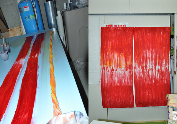
Dyeing the fabric and the results. These fabrics I knew I would use for both my Eli quilt and the Amaryllis entry for Living Colour Textiles.
The remainder of the fabric got used in this quilt:
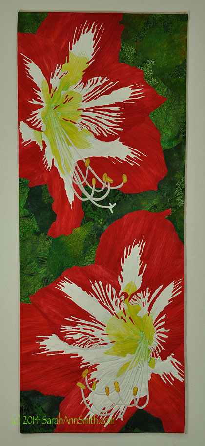
Amaryllis by Sarah Ann Smith (C) 2014. See the Living Colour Exhibit at http://livingcolourtextiles.com/
So now it is time to go dye fabric for another quilt! Do surf over to the Dinner@8 blog to read their interview with me and the other artists in this year’s Reflections exhibit.

July 25th, 2014 at 10:43 am
I was not aware of the fabric dyeing also! Really neat technique..
July 25th, 2014 at 11:35 am
Being a fellow shutterbug, I love how you can take one item from this pix, and something else from another, and additional portions from other photos and put them all together into one quilt. I will have to go check out the dyeing class. I have everything but the right dyes to do some dyeing myself.
Still love the amaryllis.
July 25th, 2014 at 4:25 pm
Love to hear about your new quilt with Eli–and hearing about the process, etc. The first time I ever communicated with you was about 4 years ago when I wrote a comment about how much I loved Joshua’s quilt–the piece itself, so masterful! Eli’s quilt is equally as wonderful–what a tribute to your dear sons!