Color Mixing for Dyers, week 2, continued… yet again!
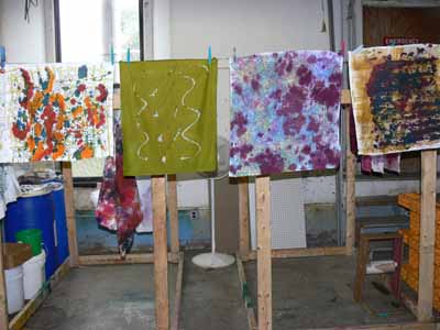
Here is some flotsam and jetsam from the workshop. First, a photo of the loading dock which oh-so-conveniently backs onto the classroom area and has some clothesline trying areas:
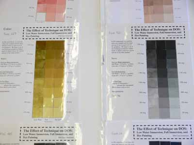
One of the most valuable exercises for me during the entire five days was doing gradation tests on the same 5 percent dye concentrate when used in full immersion dye bath (well, as close as you can get with a 3×8 inch sample in a 16 ounce plastic cup), low-water immersion (ditto), and print paste mix. Here’s a photo of some of Carol’s samples:
And this photo is of the gradation sets Nancy and I did–the pale gray to nearly black runs on the left:
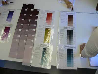
The bottom line is that print paste tends to come out about one step lighter than comparable pieces dyed in full and low-water immersion processes. What this means is that if one wants to dye-paint (like I want to do, and like Hollis Chatelain does with incredible skill and artistry), you can actually get predictable and repeatable results. Since fabric appears darker when wet, and since all dark dyes look black when wet, it is as if you were (literally) painting in a cave with no lights. By understanding and being able to predict your when-dry color, you can actually paint with the dye and get good results. Now, to finish writing my book so I can go TRY this for real!