Color Mixing for Dyers, week 2
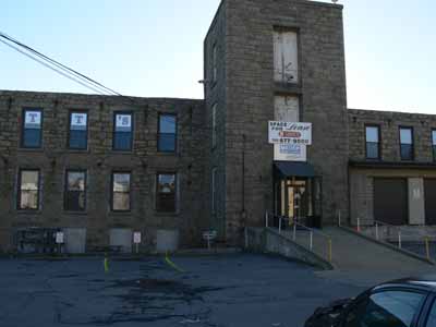
Looking at this old mill building, you’d not realize that a glory of color happens inside! This is the home to dye-provisioner Pro Chemical and Dye….known to quilters and dyers as “ProChem.” 
Earlier this month I was fortunate to take a second workshop with Carol Soderlund, Color Mixing for Dyers II. This workshop builds on what we learned in part 1, which I took last year. It was fun as several women returned from last year, so it was great to see familiar faces, meet new folks, AND meet Wil Opio Oguta, from the Netherlands, whom I had “met” online through the Fabled Fibers challenge. If you click on Wil’s name, you’ll go to her blog and can see some of her pieces form the workshop, too.
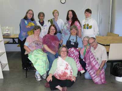
Here’s our “class picture,” with many of us holding something we had made during the five days. We had folks not only from across the US, but also from Denmark, the Netherlands and France! Carol is in the plum tie-dye shirt in the center, I’m just to the right of her.
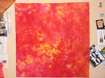
I make MANY different pieces, but will share this one with you today; it is a mix of several yellows (ranging from a cool lemon color to a warm, nearly tangerine, plus two reds, a cool fuchsia and a warmer basic mixing red). 
Over the next week or so I’ll add several posts with different things I worked on during the workshop. The first two days were focussed on using thickened dyes (print paste mix), doing many techniques that were familiar to me, having used them with paints of various sorts. It was interesting, however, to do them with dye instead (I MUCH prefer the soft hand of fabric after it is dyed compared to even the most supple of paints).
We dyed a fourth “color family” using three new primaries over the course of the whole workshop, then the last three days we worked on layering and overdyeing for specific effects and our own personal projects. As with paint, some blues are warm (think turquoise), some are cool (think glacier blue), some yellows are cool (lemonade), some are warm (sunshine and buttercups). By using primaries with different properties, you can get dramatically different shades of color: a warm yellow, warm red, and shaded/toned blue produce a completely different palette thank a cool yellow, cool red and warm blue. I’ll share a few photos later on of my color swatchbook just to tempt you, but first I have to cut and paste up my swatches from this session!

