Thermofax screens and printing….
Last week I made my journal quilt, and tried a new-to-me technique: screening with Thermofax screens. My attempts to get the screens “burned” at the local tattoo place didn’t work (he had a Vista machine, not one of the 3M, so it didn’t work with my screen materials). SO, I mail ordered from Flying Images (check at the bottom of the page here, on Jane Dunnewold’s site–click on suppliers then scroll down). Talk about FAST service… I e-mailed and called on a Monday morning to see if she could do a quick job (I had been told she has one-day turnaround), e-mailed her jpegs that morning, and by suppertime the screens were made and in the mail…WOWIE!
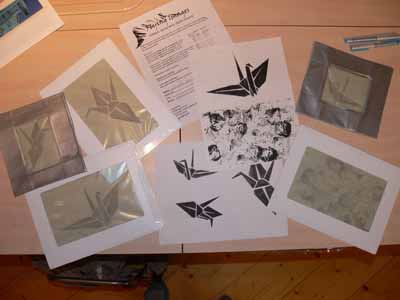
 In the photo you’ll see her printouts of my images of origami-cranes and, on the bottom half of the second screen, a design I did up printing with half of a sliced white onion. Because I was sub-dividing the screens into smaller pieces, I framed them up myself…some with purchased white plastic frames, the others with cereal box and duct tape.
I used textile paints to screen onto fabric for the journal quilt. This year, instead of doing one journal 8 1/2 x 11 inches each month, we are to do one quilt 17×22 inches (the equivalent of four pieces of paper) using at least three techniques from the Creative Quilting Book (which I really am going to review, soon I hope). We can’t share the journals with you, but I can share these faxes and some playing around that I did before beginning my 2007 Journal (which went in the mail on Tuesday… two full weeks early!).
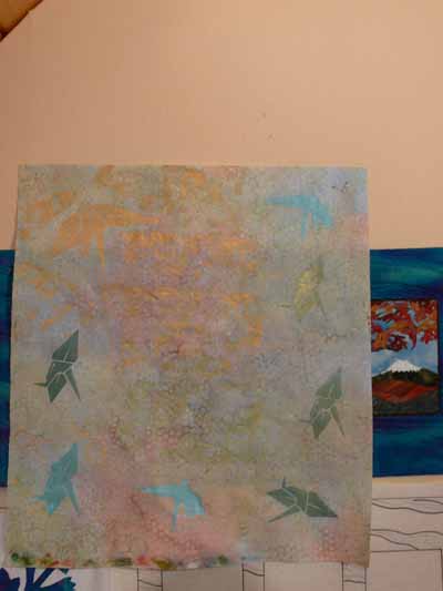
This first piece is a pastel batik. Along one edge, you can see where I daubed paints testing for the right color. Around the edges I tried out the cranes in various colors. When I blobbed the blue paint on the screen, I had rinsed my brush and it was a bit wet, leading to too-thin paint that bled under the screen; lesson learned! In the center, using low-contrast metallic green (Lumiere paint) and gold (also Lumiere) I screened the onions… oh OW am I gonna love using this one for subtle background texture:
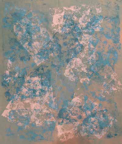
This second piece is one I gave to Kathy, since it is her (and my) favorite turqoises and teals. I began with a piece of my hand-dyed fabric…one that admittedly was a bit lacking in oomph. As in blah. So I used Jacquard Textile paint (the white), then mixed some Setacolor (a dark-ish teal) with some metallic (I think it was Pebeo / Setacolor also) along with a bit of white to get the middle-value screened onions, then more of the same but less white for the darker value. I was thinking of adding a bit of gold, but Kathy is really good at painting on fabric, so told her to take this piece and feel free to add to it and play with it:
