Anyone up for giving some honest feedback?
About my Tree spirits piece, that is. I’m curious….
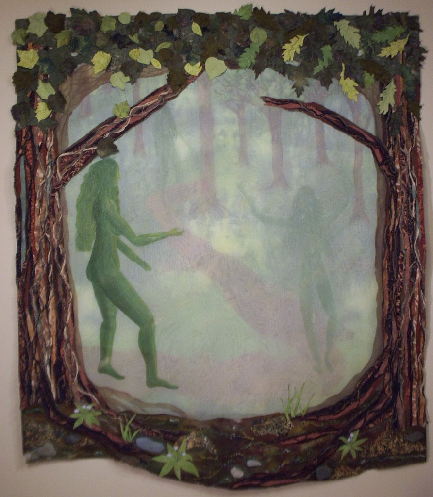
I got my judges feedback from PIQF (the Mancuso show in California that is reputed to be art-quilt friendly). The judges this year were Barbara Barber (of the UK…the perfectly painless points lady…she has an applique quilt or two at the museum in Paducah that are stunning and perfect) and Tracey Brookshier, about whom I know nothing except that I recognize her name. OK…googled her www.traceybrookshier.com and it’s pretty traditional. They liked the edges…the depth and texture of the trees and meadow a lot. But criticized the quilt center —here’s the exact wording:
Outer border wonderful, textural, interesting use of materials–love the rocks and leaves.
Inner composition is very low contrast and somewhat overwhelmed by wonderful outer border.
Interesting technique.
End comments.
So on one hand, I was definitely successful….they saw that I deliberately had lots of detail on the edges, and that the center was “soft”…the through-the-mist-and-late-sun thing, with the spirits being somewhat ephemeral. On the other hand, they saw that as a negative.
At first, I figured–they didn’t get it…that was what I intended. But in the spirit of really critiquing the piece and learning from the comments…..maybe they are right. The contrast of great detail and richness in texture and elements with the subtlety of the cente–maybe it doesn’t work together…..
Thoughts anyone? Does the richness of detail in the edges detract from (not enhance) the center? Or does it work, and since they’re really not from the art side of things, they didn’t “get” the point…that the richness was to deliberately contrast and emphasize the “vagueness” of the painted center? And I’ve donned my rhino hide because I wonder if maybe I missed part of the boat, and really do want some good feeback so I can learn and get better.
THANKS! and Cheers, Sarah