Marking quilts, part 3–fussy marking
Sometimes you need to get really, really persnickity when marking a quilt…it needs to be absolutely precise. The lettering on my nativity quilt is a case in point. I wanted the lettering to be the same font and the letterhead / logo for my school:
I asked someone in the the school’s alumni and development office, who told me the exact font (there were actually three, two of which I had on my computer–yeah!). I played with those until I had the look and size I wanted (font size was 208!), then printed them out on paper. First, I trimmed the paper to 7/8″ under the bottom line of the printing so I could line it up with the inner border.
Then I realized I needed to have done that on the top for the writing on the bottom border (the part that says 1906 Christmas Tableaux 2006), which was already trimmed shorter than that. Oops. So I just measured 7/8 inch above the smaller letters and eyeballed it to have the same “breathing room” between the lettering and the green plaid inner border.
Next step: Saral Transfer paper. Place a section of the transfer paper under the printed lettering (or design…whatever you are using). Using a stylus (a pen like thing with a small round metal ball on the end–a dead ballpoint pen, knitting needle or dull pencil work equally well) or a somewhat dull pencil, trace the design. In this case, I outlined the letters and numbers. 
When you remove the printing / pattern template and transfer paper, it looks like this…dusty! However, the transfer medium stays in place better than chalk, but less well than quilter’s pencils. You can eliminate some stray dust by placing the transfer paper so that the extra bits are out the top instead of under your arm / wrist / writing hand. Then you don’t get transfer from your hand and arm moving across the paper. I like the Saral Transfer paper because I don’t have to fuss with making a zillion templates (or cutting stencils) to trace around which I would have to do to use the quilt marking pencils (to dangle whatever part of grammar that is), I can look at it right side up, trace on top and move on to the stitching.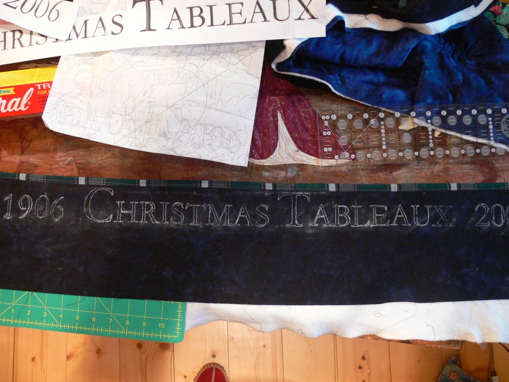
Then, to the sewing machine! At arms’ length, or less, like when sitting at the machine, I was getting pretty critical of my stitching, thinking I’d need to pick out at least some of the letters (the “o”s and “0” — letter “O” and zero — especially). But once I got the stitching done, the thread tails pulled to the back, it looked pretty good, so think I’ll just leave it be. I’m also really relieved that the gold metallic thread and writing didn’t overpower the center of the quilt; instead, the outline works just right I think. It says what I want, but without being too in-your-face or detracting from the quilt. I hope.
I also managed to do the “logo” “d”… I wasn’t sure I could manage that really fiddly bit in the center. I think I held my breath until the whole thing was done… the center part is maybe 1×1 inch or less…really small! If you right click on the photo, a larger view should open in another window. 
June 14th, 2006 at 6:40 pm
Woman, you’re good. Your stitching look wonderful. The “d” too! Can’t wait to see it in Houston.
June 15th, 2006 at 10:42 am
Thank you for sharing your work and your marking methods. I recently used the chalk pens, but used yellow and I did find it difficult to remove.
Please post a photo of the quilt when it is finished, it looks awesome!
June 15th, 2006 at 8:31 pm
It’s so pretty. And I say that in the most thoughtful, wonderful, artistic way. I just love it!