Website Makeover! Please VISIT : )
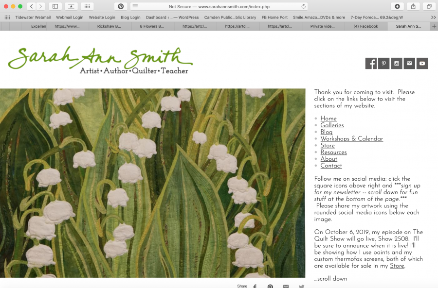
Those of you who have surfed into my blog over the past two weeks or so will have noticed a completely new look to my site. Thanks to Derry Thompson of GloDerWorks and inspiration from several top art quilters with great sites, I think Derry and I have come up with a gorgeous new site–my first complete makeover since creating the site in 2004. I am responsible for (guilty!) the visuals, and Derry has done all the brilliant work behind the scenes to bring my vision for my site to life.
I still have a LOT of work on my end: thanks to the vast changes in the internet since 2004, I pretty much need to re-do ALL of my photos for larger size and crisper photos. Thankfully, I have a better camera, a tripod, lighting, and better skills at both photos and Photoshop so the image looks most like the real quilt. But I didn’t want to wait for months before sharing the “New Look” with all of you. Stay tuned as I update one gallery at a time.
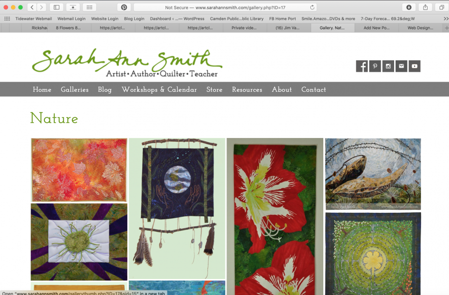
Some of my favorite new things:
- The clean look
- The colors (I gave Derry a specific palette of colors)
- The font (Josefin Slab and Josefin Sans)–now updating all handouts etc, too!
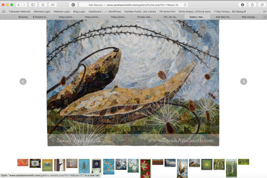
- The multiple ways to navigate the images: gallery, filmstrip, arrows on the sides
- The FOLLOW social media buttons (square) at top right
- The SHARE social media buttons (rounded)
- The BIG IMAGES!
My inspiration came from many sites:
- Jane Dunnewold‘s clean look to her site is a breath of fresh air. I love the font, but decided to go my own route. My green is similar to hers…one that I use in much of my art
- Hollis Chatelain’s Gallery layout is wonderful, not to mention that she has been an inspiration to me for nigh on to two decades now.
- Sue Benner’s crisp, clean site with crisp, clean color makes my heart go thumpety thump. I love the photos of her on her About page, down on the floor with the iron (been there, do that). I thought about an entire page for my Instagram feed, as on her Connect page, but opted for just the most recent IG image at the footer of everything but the blog.
- Deidre Adams way of watermarking consistently on her images–more PhotoShop work for me but worth it!
- And many thanks to Holly Knott for creating the SVG file for my signature, which is used in the header as well as on labeling (my paint kits for example). Someday I will learn Illustrator and InDesign, but Holly’s prices are so reasonable and she was so fast (same afternoon!) it would’ve been crazy not to use her skills. Holly has a brilliant page about photographing your quilts, Shoot That Quilt, and also designs websites.
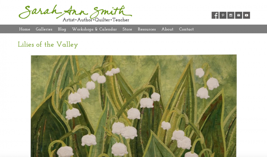
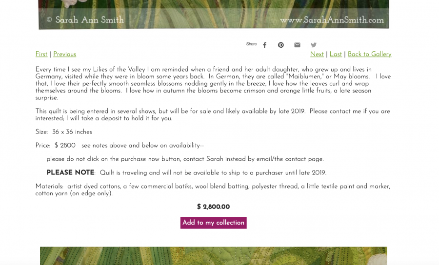
Endless thanks to the long hard work Derry put in creating this site so that it is JUST PERFECT, beautiful, and works well. I am pretty much an “I do it all myself” business….except I made a smart decision in 2003: to go with Gloria Hansen and Derry Thompson to design and host my site. I have learned so much since 2003, a lot from these two. I never have to worry if a glitch happens, Derry fixes it. I actually scold him for answering late at night and on weekends: dude, you need to take some time off! Hoisting a pint to you!
Thanks for looking and reading this far….I hope you enjoy the new site!
September 3rd, 2019 at 5:53 pm
Looks great. I have been wanting to go for a cleaner, crisper look.
September 4th, 2019 at 7:44 am
Beautiful… love the changes… crisp and clean! I know how much work is involved too. Love the slider gallery of your work on the front page!!!
September 4th, 2019 at 9:31 am
Thanks so much…that was one of the most important changes I wanted….BIG photo with better resolution (I need to re-do a LOT of photography since I now have a better camera and set-up)!
September 4th, 2019 at 9:33 am
Thanks Gerrie! Gloria’s design was exactly what I wanted 15 years ago, but times change, technology changes, and I have changed as has my art (thankfully I think it is better…hope so!). And I also am clearly now selling art, not my patterns or something else….my goals in what I do changed. I’m delighted. Still a few tweaks….