Color Study 10: Thread!!!
Ooooh….if there is anything I love as much as color, and fabric, it is thread! There are bazillion different threads available to quilters now, and you can use them to great effect. You don’t have to stick to cotton, cotton, cotton. Nor do you have to stick to same-color, same-color as in blue thread on a blue quilt.
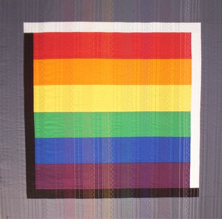
Now, I almost NEVER use solid colors in my quilts, but for the colorblock side of the studies I decided it would be a simpler, more clear lesson if I used solid. I decided to take things one step further and make a simple piece to illustrate the effect of mixing different colors of thread on a quilt. Please note, the effect is more obvious when machine quilting because you have a continuous line of color; if you are hand quilting, every other stitch is on the under side of the quilt, which mutes the effect of the color of the thread.
I quilted straight lines at varying distances from each other, then a serpentine stitch to simulate free-motion but keep things consistent.
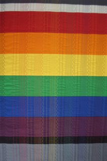
I used gray thread on the left and right borders. Then in order from left to right used black thread (on the black and the first inch of the colored stripes. I left an inch unstitched for so you can compare the actual color of the fabric with the apparent color once stitched. Then, left to right, the thread colors are red, orange, yellow, green, blue, purple, gray, and white.
This close up may show better.  Or, either click on the photos or right click to try to open in a new window and see a larger image (and hopefully the thread will show up better!).
The easiest thing to notice is that same color thread on same color fabric (blue on blue, red on red) “disappears.” The greater the value (light versus dark) contrast, the more the thread shows. For example, yellow thread shows up a lot on purple, not as much on green or orange.
Next, look at one horizontal band of color and see how your perception of the color changes depending on which color of thread is used. In my Split Complementary (see Color Study 7–scroll down or click on the February 2006 archive button on the right) quilt, I think the dark red-violet tulips are too dark, so when I quilt it I plan to use a lighter magenta or plum thread to decrease the contrast / lighten the perception of the color.
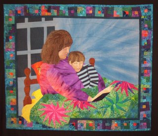
Here’s an example from “Bedtime”, a quilt that is currently travelling to Spring Quilt Festival in Chicago and then (yeah!) on to Quilt Expo in Lyon, France, with the I Remember Mama exhibit. Here’s the full quilt:
Below this photo is a cropped section of the bedpost. I used only one fabric…all the shading is done with thread (and I hope the quality of the photo isn’t awful). Since I don’t have the quilt here, I can’t go take a better picture …drat! Here, try this link to see this quilt on the Quilts website; the color is off–very garish, but it is a sharper photo than mine and you can see the detail better.
Hollis Chatelain is a MASTER of using thread to color her work. In recent years she has been working in monochromatic color schemes with dye: all blue, all yellow, all green. Any additional color that you see is ONLY from the use of thread to color the work. Go browse her site….you’ll be amazed. She is one of my all-time favorite artists.
And a copywright caveat!
Oh…sorry about this. An inquiry today made me think that I ought to note that all the writings and images on this blog are copyrighted (by me). I’m thrilled for you to read them, take notes, even print a copy for your personal use. But please respect my work and copyright and do not use these to teach, hand-out, etc. You know the drill. Thanks!
