Color Study 6b: Warm and Cool colors
Martha mentioned in a comment that she had never understood what was meant by warm and cool colors. The easiest way to think of it is this:
Warm, the colors of
–fire
–embers
–the sun
–morning
–summer
–autumn leaves
Cool, the colors of
–night
–ice
–cold places / winter
–many shadows (though the Impressionists had a lot to say on that one!)
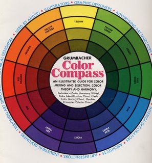
Another way is to look at the color wheel. Here are scans of my favorite color wheel (I have at last three!), but alas I can’t find it anywhere on the web for sale….It is the Grumbacher Color Compass, item B425, has a 1972 copyright date on it, and Third Edition 1977:
If the color wheel were a clock, yellow would be at high noon. The colors before noon, the “morning” colors are “warm”—starting with red-violet at 7 am, through red at 8, into orange at 10 and yellow at noon. The afternoon colors are “cool.” The early afternoon is starting to cool, but you still get a “warm green” in the yellow-green at 1 pm. Then you move through progressively “cooler”, more blue shades of green to green and at 6pm, dusk falls and you reach violet. Isn’t color wonderful?!!!! It is SO much fun.
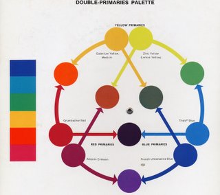
That brings me to dual primaries. Michael Wilcox’s book Blue and Yellow Don’t Make Green first introduced me to this concept: there is no such thing as pure red. A red pigment is either a blue-red or an orange red. After all, who’s to say what is “true” red? How do any of us know that what I see and call red is the same color you see? 
This color wheel in the Grumbacher Color Compass is a guide for artists who use Grumbacher paints. If you click on the photo, you can have a window open with a larger image; then you might be able to read that there are, for example, two reds: Grumbacher Red has an arrow that points to orange, indicating that it is on the orange side of things. Alizarin Crimson points to violet, indicating that it is a blue-red.
Try pulling a wad of one color fabric off your shelf, then really look at it: if you’ve picked red, is it kinda blue-y? Or could it be more towards tangerine (a red-orange)? If you have pinks, does the color veer toward fuschia or even a violet (cool), or is it more peach (warm)?
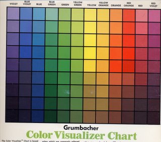
And since I had the color compass on the scanner, here’s the Color Visualizer Chart…which shows what happens when you mix white or black with a given color. There are nine lines of colors on the chart below. The one smack dab in the middle is “pure” hue / color. The ones above it are the color mixed with white, the ones below mixed with black. At the end of the series of color studies, I’ll talk a little about tints (mixes with white), shades (mixes with black) and tones (mixes with gray added), and about tertiaries. 
BUT, I’m going to force you to wait a couple months for color samples….I have three small deadlines in the next two weeks to finish entries for various things, then I have a HUGE quilt I want to make and finish by May, and I really need to get cracking. Well, huge by art quilt standards, small by bed quilt standards…about 40-54, but with lots of detail and embellishments. I’d like to finish it in time to enter in Houston (so done by June 1 at the latest so I can photograph, etc.)
And now, I’m going to go add a little more quilting to my February Journal quilt (which alas I can’t share, even here on my blog…sigh) so I can get it e-mail off to IQA by the due-date!
Hope this helps! Tomorrow, ummm…what comes next…….tetradic I think…….nope–not yet, we’ve done one-color quilts (monochromatic), two-color (complementary), three color (analogous and triadic) and next: another “3”, split complementary. Stay tuned!
