Color Study 5: Triadic / Primary Colors
So why am I going through all these combinations you might ask. Gee…maybe I should have started these lessons with this thought….the joy of writing before you edit your brain!
A lot of folks are scared of color; they don’t understand it, and they don’t understand how to make the colors work (or play) well together. Do not be afraid—of color that is! By understanding how the colors relate to one another, you can make quilts, art or outfits that look good. Or, if you want to create a jarring image, you can use colors that fight one another to help create that effect. Once you understand how colors work, you can get them to work for you!
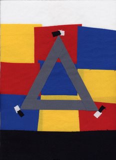
Today’s quiltlet is about the triadic color combination. Here’s the color block side of the quiltlet:
As you might guess, it means there are three colors evenly spaced around the color wheel. That means you can have a threesome of red-yellow-blue, or orange-green-purple, or the “tertiary” colors…remember them? the ones that are–for example– a combination of yellow and orange make yellow-orange.
If you look at the color wheel in yesterday’s post, the primary colors are in the center, and look like colors we associate in the US with children—colors that little kids just love. The center of the color wheel is an equilateral triangle, one where all three sides of the triangle are the same length. So, drum roll along with a flash of the obvious, I chose a triangle as my symbol for triadic combinations.
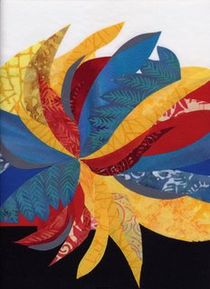
For the “front”, I chose a radiating design, again using the white top and black bottom borders, with my medium gray salted into the swirls. You can see on both sides that the gray seems dark compared to the yellow, yet lighter than the medium blue. This is the value of “value”–the comparative lightness or darkness of a color.
Tomorrow, the secondaries in a triadic / triangle combination!
