Color Study 3: Analogous
An analogy in writing is where you compare something–you relate them to each other: giving birth is like trying to shove a piano through a keyhole, is one example (which is a lot more fun than the SAT test “tree is to cone as ball is to circle”). In color, analogous colors are colors that relate to the ones on either side of them. Here’s a scan of page 31 in The Elements of Color by Johannes Itten, one of the classics of color analysis:
Primary colors are the ones we often associate with kindergarten and young kids, at least in the US: Red, Yellow and Blue. They are called “primary” because you need a fairly “pure” pigment to get those colors. Here, they are at noon, 4 pm and 8 pm on the wheel and in the very center.
Secondary colors are orange, purple and green; you can get those colors my mixing red and yellow, red and blue, or blue and yellow, respectively. By combining equal amounts of two primaries, you get a second, mixed color–they come second, after the “first” or primary colors.
Tertiaries are, then, the third colors. Take one of the secondary colors made of equal amounts of two primaries, than add more of one of the primaries. Using orange as an example, add red or yellow to make yellow-orange or red-orange.
Looking at your handy dandy color wheel, and sticking to with orange, you can get an anologous color run by looking at the colors on either side of orange: yellow-orange-red. Or, you can limit the color-run to the tertiaries, as in the example just given. For yellow, a similar color run would be yellow-green, yellow, and yellow orange. You can “bridge” the warm and cool colors by going through the greens: yellow, yellow-green, green, blue-green, blue. Or have a similar run on the blue side of the wheel: green-blue-violet.
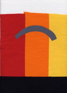
For my “quiltlet” example, I used a primary / secondary color run: red-orange-yellow. Here’s the color-block side of things; I selected an arc to represent analogous colors, since they are side-by-side in an arc on the color-wheel:
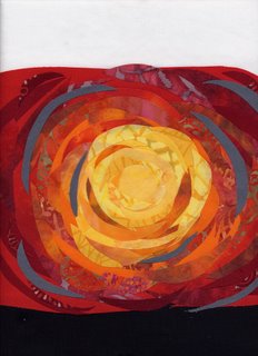
And here is the “quilty” side of things (inspired by a wonderful ephemeral artwork by Andy Goldsworthy–I don’t remember which of his books it was in, but he whorled fallen autumn leaves around a hole dug into the earth….vibrant reds surrounded a seemingly black hole, then orange, then ochres and yellows, until you reached the brown bare Earth…here’s a link on the web to that picture , and on-line art site with pictures of his works, and a link to some of his books at Amazon. Here’s the quiltlet:
Obviously, the dominant composistional element is the circle. As before, I bordered the top with white, the bottom with black, and salted some medium-gray into the center. Try holding your hand or a piece of paper over the white border and see how that affects your perfection of the color. Now try blocking out the black border on the bottom. White mutes the color; black intensifies or makes the color more vibrant. Depending on what you want to do with the color—you can change the colors next to it to punch it up or tone it down.
If you’re interested in an academic approach to color, but one that isn’t too dense or daunting, head to the library (or Amazon) and look at The Elements of Color by Johannes Itten (still in print after all these years, and for a reason…). ISBN 0-442-24038-4. In the quilting world, an older book by Mary Coyne Penders, Color and Cloth, is very good at dealing with how to use the color in commercial prints, the way most of us work. Joen Wolfrom’s books, ColorPlay and The Magical Effects of Color, are outstanding, but may be a bit art / academic oriented for some readers, but I loved them. To jump up on the soapbox a bit….go ahead and learn the art world’s terminology….it’s just words. Learn the definitions, and you’ll be way ahead of the game, and you’ll understand better what you are looking at when you walk into the fabric store. If I can learn color, ANYone can!
