Digital Surface Design With Diane Rusin Doran, Giveaway!
Thursday, January 16th, 2014The drawing is now closed. Drum roll please for Daphne Greig!
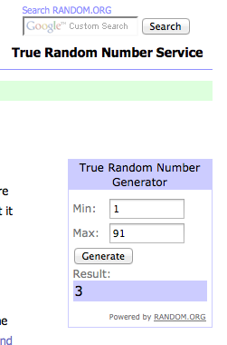
And the winner of the DVD is Daphne Greig, comment number 3!
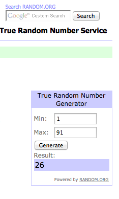
And I’ve selected one more person to be eligible to win some of Diane’s fabric. Each member of the bloghop is selecting a second comment, sending that name to Diane, and at the end of the week she will select a winner for the fabric. That was comment 26:
The second drawing to be eligible to win some of Diane’s fabric.
NOTE: The DRAWING is OVER and comments on this post are closed. You can comment on other posts though!
Oh what FUN! There is a reason why Diane Rusin Doran’s blog is called Ooh! Pretty Colors! In her new Quilting Arts Video Workshop, Digital Surface Design, Diane shows you how to make your own cloth digitally: just think of it: all the beauty of hand-dyed fabrics, of hand-printed fabrics, in just the colors and designs you want, endlessly re-printable, and as she said in the conclusion, if you can click a mouse and move a slider on your computer, you can follow her clear instructions and create your own digital art cloth. The download is available now at the Interweave Store, here, and the DVD will be available for order in a matter of days. I’m thrilled she asked me to be part of her bloghop and giveaway. Keep reading to find out how to win a free DVD!
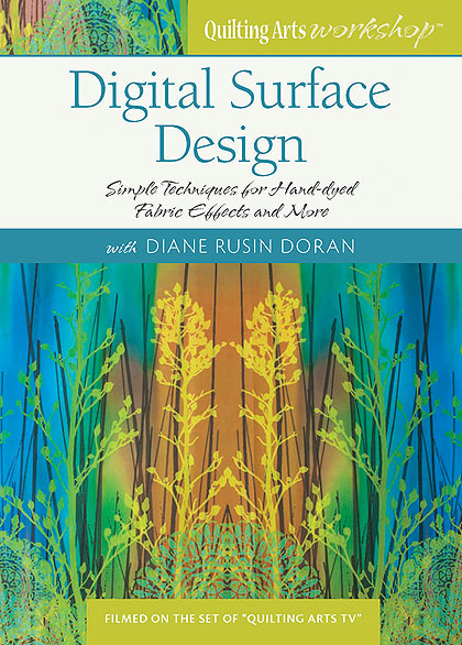
Diane Rusin Doran’s new Quilting Arts Workshop: Digital Surface Designs
This workshop is all about creating your own digital art cloth. Diane teaches you how to emulate traditional surface design, which she defines as the application or removal of color and pattern on cloth, with your computer. You’ll need Photoshop Elements (software available for under $100), and can print your designs at home or by sending your files away to a fabric printing service. I will be downloading my copy onto my iPad (I have a download, not the DVD) so that I can watch on my iPad, pausing when necessary, and work alongside Diane on my laptop at the same time; you could do the same by watching the DVD on a TV and working on your computer.
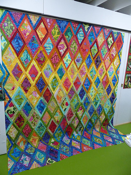
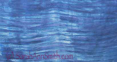
I can’t recall when I first met Diane in person, but we’ve “known” each other online for years. Several years ago I saw her Return of the Grackle quilt in person and was absolutely riveted: it is quite large, 40×51 inches–I just wish you could see how stunning it is in person:
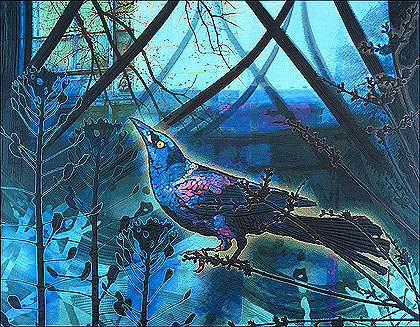
Return of the Grackle by Diane Rusin Doran
The video has five sections:
1. Introduction (7 minutes)
Diane talks about what she will teach us, what supplies you need, and why you might want to do digital rather than traditional surface design. Diane’s lessons build on each previous segment so that by the end you can create a layered composition, breaking what at first seems daunting into an easy step-by-step process.
2. Digital Backgrounds for Hand-dyed Effects (20 minutes)
Diane teaches us how to make a softly mottled cloth using a photo of clouds in the sky, and how to simulate drip-dyed fabric by carefully showing step by step how (and where to find the correct thing to click) to navigate Photoshop Elements. Diane used a PC with a newer version of Elements than I have, but it was easy to follow. I plan to re-play the entire video and copy down the sequences step by step for various lessons in this video so I have them for handy reference when I go to play. Familiarity with Photoshop Elements is helpful, but by no means necessary.
3. Digital Patterning using Brushes (19 minutes)
I’ve played around with Elements a lot and learned quite a bit, but this DVD is way better than just stumbling across something: it is guided play. I’d already discovered many of the things Diane teaches in the previous section, but this chapter was uncharted territory for me. My brain started into high gear as soon as she mentioned re-sizing motifs at will and creating your own brushes to supplement the default ones in the software. For example, I can carve a block traditionally, but then scan in a print and use Diane’s methods to re-size and print at various scales without laboriously re-carving the block (only to decide that wasn’t quite the right size). So I can still get the hands-on that I crave, but with infinitely more possibilities.
4. Designing with Layers (15 minutes)
In the last major section, Diane then shows you how to combine what you did in simulating hand dyeing and stamping stenciling to create layers of imagery and color on cloth.
5. Gallery and Conclusion (7 minutes)
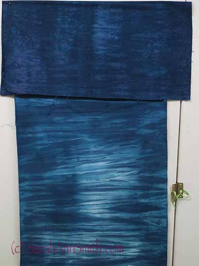
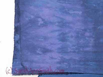
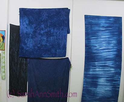
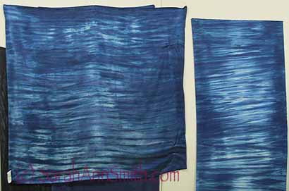
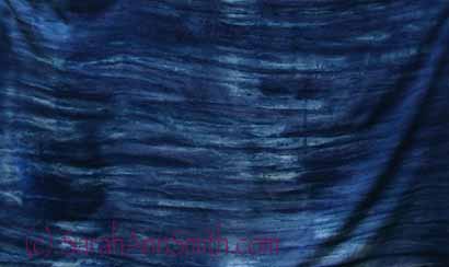
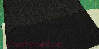
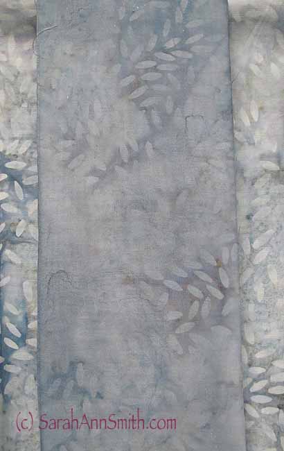
Finally, Diane shows us fabrics, and variations on the themes, printed from what she has taught us in the 3 teaching segments of the video. Here are some of her printed fabrics (and part of her portion of the giveaway):
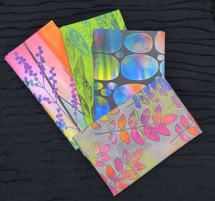
Win these fabrics made by Diane by commenting on blogs in this bloghop–see the link below.
Her favorite fabric is the one used on the cover of the DVD, which I first saw in a shirt she was wearing in November at International Quilt Festival: yes, she printed it on a knit fabric and made a shirt out of it, and I love it!
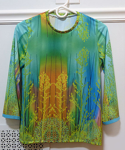
Diane had her design printed onto fabric, then made this beautiful top!
Diane’s first QA Workshop, Digital Collage for Quilt Design, is now on its way to me. I can’t wait to combine the two and work on a quilt…I have this photo of a rose……
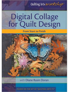
I’ve already ordered Diane’s first video workshop…this new one has whet my desire to play!
So I invite you to join me in thinking how to combine traditional manual arts with the computer!
Here’s the schedule for the bloghop and giveaway. Like Candy, on January 28th I will be drawing one name from those who comment on this post on my blog to win the DVD. That means for the next nearly two weeks, you can visit ALL of these blogs and get FIVE chances to win a copy of this DVD. I’ll also pick a SECOND lucky person to be eligible to win a packet of Diane’s custom digitally designed cloth (see her blog to read about it); that drawing will take place on Diane’s blog!
- January 14 – Candy Glendening – visit Candy’s blog or the Interweave link to see a preview from the workshop. http://www.candiedfabrics.com/journal/
- January 16 – Sarah Ann Smith – https://www.sarahannsmith.com/weblog/ (you’re here now!)
- January 21 – Deborah Boschert – http://deborahsjournal.blogspot.com/
- January 24 – Susan Brubaker Knapp – http://wwwbluemoonriver.blogspot.com/
- January 28 – Diane Rusin Doran – http://oohprettycolors.blogspot.com/
And I’ll close with another fabulous quilt by Diane, California Dreaming:
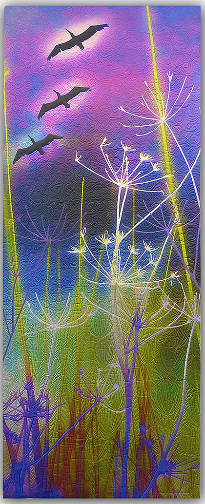
Diane Rusin Doran, California Dreaming. Printed on silk and just LOOK at that quilting!