email Youtube

Home
Galleries
Blog
Workshops & Calendar
Store
Resources
About
Contact

Archive for the ‘Applique’ Category

Teaching at Quilt Festival in Houston, 2012!

Wednesday, September 12th, 2012

Just wanted to dash off a quick note to tell you how happy I am to be teaching again at International Quilt Festival in Houston this coming fall!  I hope to see some of you there…perhaps in my classes!  To learn more about the classes, click here to go to the Quilts, Inc. website.  From there you can download the PDF class catalog, register (online–easy peasy) for classes and/or events.

I’ll be very busy; my schedule begins on the Monday of Quilt Market (a to-the-trade only wholesale show) and continues through the week of Festival!

October 29-November 2, 2012 – International Quilt Festival, Houston, Texas (click on images to view larger):
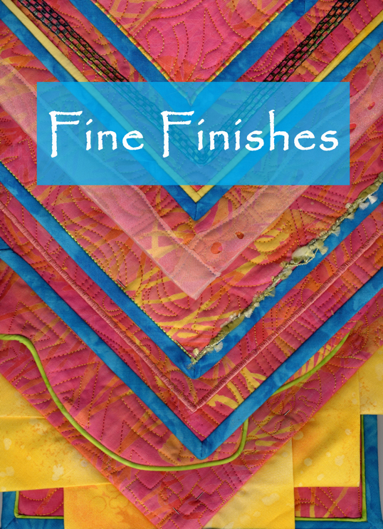
  • Monday: Fine Finishes(edge finishes including perfect mitered corners!)
    • Learn to make a perfect mitered binding straight grain bindings, double-fold bias bindings, piping, and couched yarns.  Time permitting Sarah will share how-to’s for  fabric accents, curved bindings, fused bindings, wacky raw-edge squares, and couched-yarn finishes! By the end of this class you’ll have a “swatchbook” of samples and notes including a wide assortment of styles and techniques to finish your quilts and quilted garments.  See a previous blogpost about this class here.
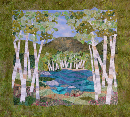
     

  • TuesdayBirch Pond Seasons(fusible applique)
    • Learn fusible applique, several techniques for “piecing” with fused fabrics, and how to make your own Birch Pond art quilt.  I’ll also cover facings as an edge finish and a range of fun ideas that will let you branch out on your own after class.  Kit fee ($20) covers the cost of the pattern and one package of white MistyFuse (except when taught in stores; then, please purchase these items from the store). See a previous blogpost about this class here.
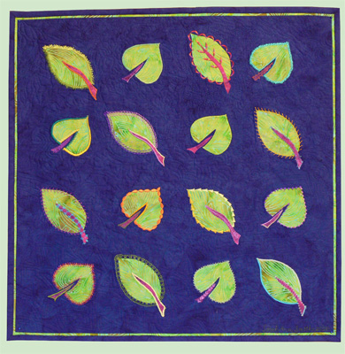
     

  • WednesdayDecorative Stitch Applique(use those fancy stitches on your machine!)
    • Make a small wallhanging or a selection of small blocks which take full advantage of all those decorative stitches on your sewing machine. Using fusible appliqué and an assortment of as many threads as you care to bring and use, you’ll see how versatile a single leaf pattern can be! The embroidery / decorative stitches you use in this class can be adapted to your choice of other appliqué methods; we will use fusibles in class so that you can make a wide selection of appliquéd leaves during the class. The project samples can be used for a quilt, a garment or home dec items. See a previous blogpost about this class here.
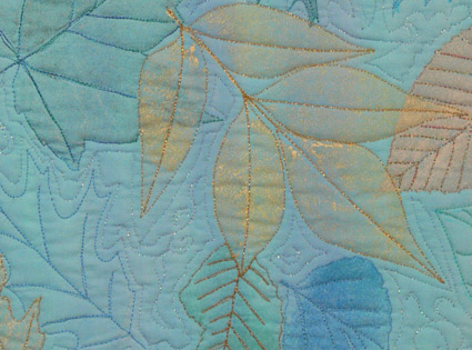
     

  • Thursday Morning Machine Quilting ForumFun with Fancy Threads
    • I’ll share some tips about using fussy, fiddly threads and how to master them with the right needle, the right bobbin thread, and a fun little project/demonstration.  This Forum starts with an overview and introduction to six machine quilting experts.  Each of us will give a 9 minutes (not one second longer!) presentation. Then we break out into 6 stations…think of it as speed-dating for machine quilters!  We’ll do a 20 minute presentation, then the bell rings and off you go to the next station/teacher.  A great way to see if you want to learn more or book a teacher for your group.
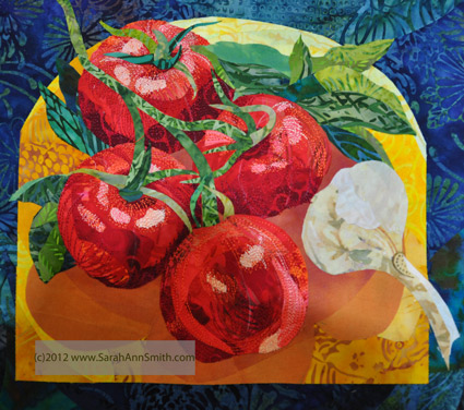
     

  • Thursday AfternoonMeet the Teacher,a free 30 minute demo on the show floor:  Collaged and Fused Art Quilts
    • I’ll show you my process for creating fuse-collaged quilts, with step-by-step examples of this small tomato-garlic-and-basil quiltlet.
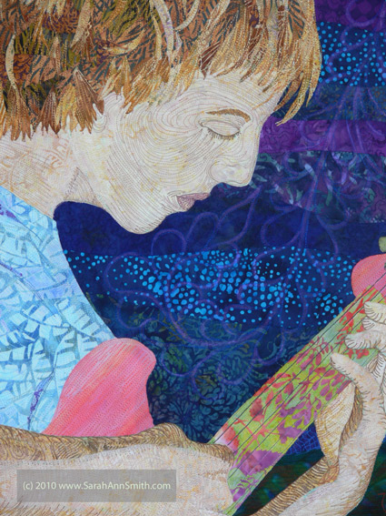
 

  • Friday Morning: Friday Sampler–QuiltColoring with Thread
    • Think of your sewing machine and thread as a big box of crayons… more colors than you’ve ever had in a box of crayons!  Then learn to use your machine and thread to color your art quilts and bring them to life.  This Sampler is a ginormous room with 20 or more teachers giving quick demos.  Participants can move from station to station as they choose.  It’s a great way to see if you’d like to take a class with a teacher or even book them for your guild.
  • Saturday:  Sarah gets to relax and play today… I’m going on the bus tour to the Texas Quilt Museum in LaGrange.  Anyone want to go on the same bus?
  • Sunday:  I’ll be visiting the booths and quilts today…including one of mine that has been juried into the show (more on that later, after the judging is done and it’s safe to post pictures to the internet).

I’m so looking forward to Houston this year…hope you get to come play, too!

The Coastal Quilters 2012 Chapter Challenge

Friday, September 7th, 2012

For the past two years (and the coming year) I’ve been the coordinator for our local quilt group’s challenge.  Last year, long time readers may recall, the quilts were to be 20 1/2 by 20 1/2 square and use an item from the grocery store as inspiration (see posts here and here).  THIS year we did the same size, but had to use a vintage block in the quilt.  This challenge was inspired by Mary Kerr’s Vintage Revisited exhibits which were shown at Maine Quilts.

The Coastal Quilters (Maine) 2012 Chapter Challenge

Mary graciously said of course we could do something similar!  So I went to troll eBay for Vintage blocks; no one set seemed to have enough for the usual 12-16 participants in our challenges, so I ended up buying two sets of blocks:  the red-green Ohio Star and the burgundy-cream Ocean Waves.

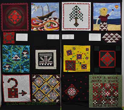
The results, once again, were STUPENDOUS!  We had the twelve completed quilts (several others wanted to make some, but life seriously got in the way…please send them comfort and healing).  From left to right across the two panels, the quilts are:

Top Row:

  • Eleanor Greenwood — Vintage Ohio Star Medallion
  • Jim Vander Noot –Three Sheets to the Wind and a Sail
  • Sarah Ann Smith — Cardinal in the Pines
  • Rebecca Hokkanen — Ocean Wave

Second Row:

  • the Ohio Star block, description of the challenge, participants/quilt names, description of challenge Ocean Waves Block

Third Row:

  • Prudy Netzorg — Waves of Fish
  • Karen Martin (alas her black border disappeared on the black drape!) — Flight to the Past
  • Mathea Daunheimer (sent all the way from New Zealand! where she now lives) — Progression:  Growth
  • Gail Galloway-Nicholson (made with wool!) — Simply a Star

Fourth Row:

  • Patty Courtney —  Leaving Ohio
  • Maggie Schwamb — Railroad Colors
  • Robinsunne — Expansion
  • Barb Melchiskey — Block Swap (the blocks have velcro and you can move them like on a design wall!)

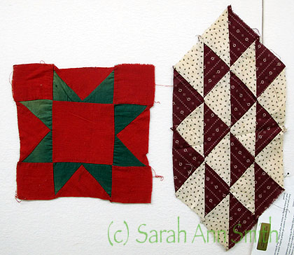
Here’s a close-up of the two blocks:

Our challenge blocks. The red-green blocks had some fading on the green but were meticulously hand-pieced. The Burgundy-cream were made from old-fashioned shirt ticking prints.

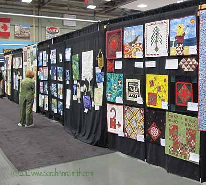
And on display at  Maine Quilts 2012 in the Chapter Challenge aisle:

The small Chapter Challenge aisle at Maine Quilts 2012 (www.MaineQuilts.org), put on by the Pine Tree Quilt Guild, Maine’s statewide guild

If your group would like to have a similar challenge, we had very brief requirements this time.  I wanted a consistent size as the quilts look better, more cohesive on display.  For our statewide show, Maine Quilts, the small challenges must be pinned to a backdrop.  A couple years ago I bought some plain black in an estate sale and use that for my drapes.  The consistent size also makes it much easier to arrange the quilts and estimate size of the final display (required on the Maine Quilts entry form). The rules were to use at least 40 percent of the original block on the front of the quilt  and that the fabrics must be recognizable.  As luck would have it, we ended up with almost an equal number of quilts from each block.  Barb was so inspired that the muse carried her away to a slightly larger sized piece (on the bottom right).

In my next post, I’ll share my quilt, Cardinal in the Pines.

Quilt Nebraska 2011, part 3

Saturday, September 24th, 2011

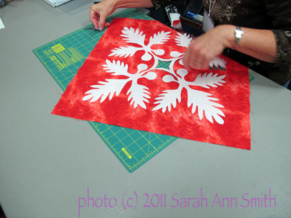
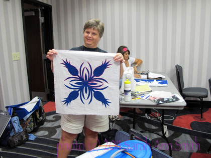
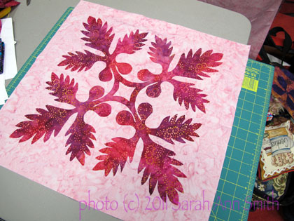
The white is the freezer paper pattern piece (the Ulu or breadfruit block), the red will be stunning!

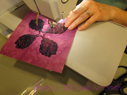
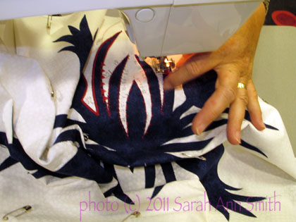
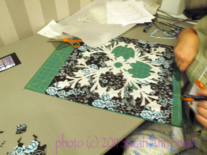
Teaching Hawaiian style applique is always so much fun, waiting to see how the designs look in the different fabrics.  I offer students a choice:  dive in the deep end of the pool and begin with a block that finishes at 18-19 inches, like the one above, or give the technique a test-drive on a small 6 inch block before moving to a larger piece.   Many students like the somewhat fiddly smaller pieces because they can practice on it in class, then work on their “special” full-size block at home where they are comfortable and have all their fabric stash and thread.   As you can see… we had happy students…this is good!

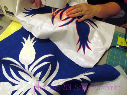
The pink thread (top half is stitched) really adds a nice dimension to the blue and white pineapple block...well done!

then

Here is the same block being stitched, plus the "negative" or "opposite" block, white pineapples with a deep blue field

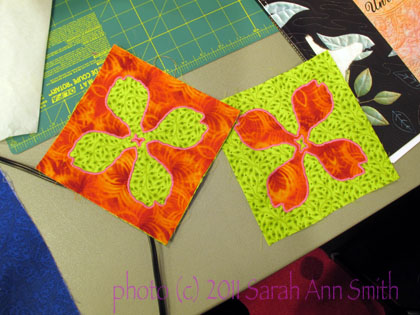
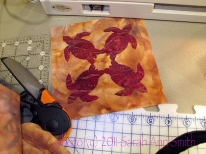
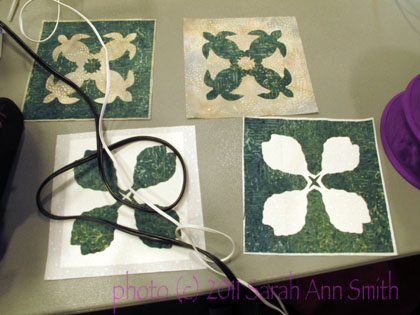
For the small blocks, students have a choice of the Taro leaf or a turtle.

Really vibrant taro leaves

And some turtles--really love the pattern on the batik of the turtles, looks like water currents

More Taro leaves being stitched

And turtles AND taro leaves!

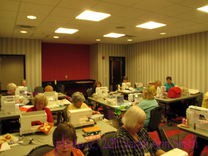
Here’s a picture of the classroom:

Sewing, sewing, sewing! As you'll notice, we requisitioned another table from the hallway to go down the center... the narrow tables were not roomy enough for three students each! Thanks to all the ladies for being so gracious about the cozy quarters.

And a few more of the larger squares… I just love the variety in the fabric selections!

This photo doesn't do justice to the beautiful fabrics!

One student used her "positive" cut-out to test various decorative stitches, then wanted to work on the negative (white pineapple, dark background) at home. Great way to test...she did what I always suggest, writing notes right on the white fabric to remember which stitch, what settings. Really like that spike-y stitch!

Lovely range of pinks in the Ulu block

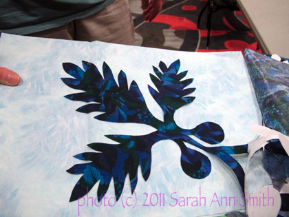
The cut-outs from the plumeria pattern started to look a bit bat-like on this print

(Oh…. tacky moment:  these patterns are all from my Nourish the Body, Nourish the Soul pattern available here.)

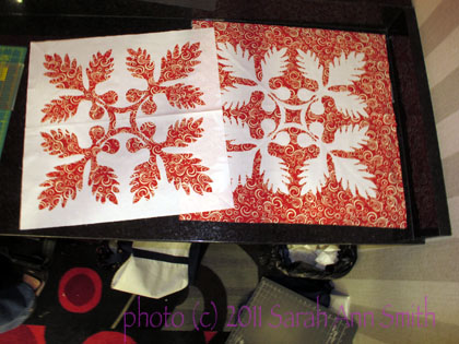
And finally, two rousing red blocks.  This student looked at various threads to satin stitch, from black to white to red, and settled on an orange that will set off the edges but not scream:

You cut one square of red (carefully) and fuse it onto two white backgrounds--two blocks for the price of one!

I had a total blast teaching in Nebraska.  The students were great, the many volunteers who put this event together were great!  Thanks so much for inviting me, ladies, and hope you my readers have enjoyed visiting with me!

Clothed in Color: how I did it….

Thursday, March 24th, 2011

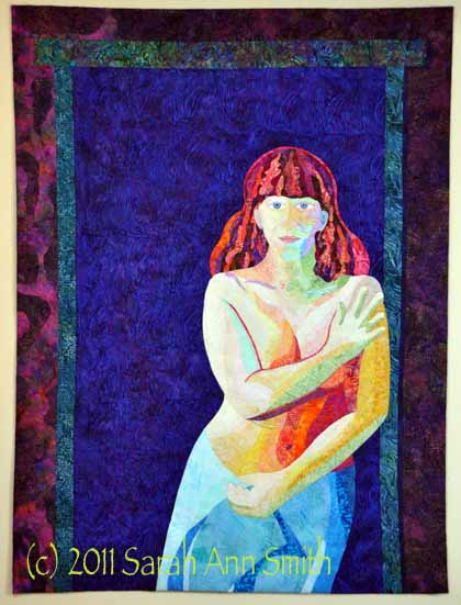
I’m always fascinated by the creative process, especially seeing how someone else did something.  So I figure I’m not the only one with these voyeuristic traits and thought I’d share a bit of “how I did that.”  That, in this case, is my quilt Clothed in Color, which is an entry for “The Space Between” juried exhibit.  I wrote about it here.

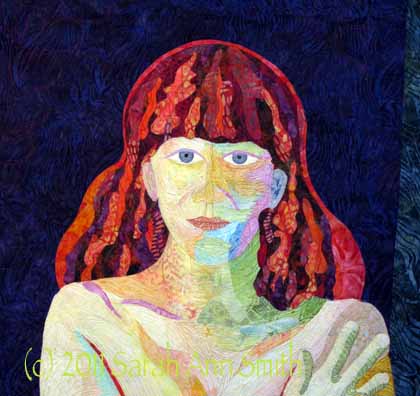
Clothed in Color; 36x48 inches (not quite one metre wide). Made with batiks, hand-dyes and thread.

Over the past few years I’ve been teaching myself about and playing with color, both in the dyepots and commercial cloth.  When I decided to do a portrait of our older son, I wanted to work with value only, the relative lightness or darkness of color, ignoring the actual hue (color).  As I mentioned before, though, I wasn’t too sure he would appreciate his skin being green, blue, pink, whatever.  As a test-run, I tried the process in the portrait of our pug, and it worked, so I set to work on the Joshua quilt (put Joshua quilt in the search box and it will take you to posts from mid 2010 with the process on that one) except that I used realistic skin tones.  Not so for this quilt!

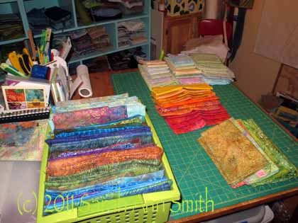
For this quilt, I began by selecting pale batiks and dark batiks in anything other than a tan-brown-skin tone.  OK, an honesty moment.  I began by depositing a large sum of money (with glee, abandon and NO regrets) at Batiks Etcetera last summer.  As I drove to my teaching job at the AQS Knoxville show, I made certain to stop at Batiks, Etc. in Wytheville, Virginia. The shop is even more wonderful than their booths at shows and the service just as wonderful.  It is hard to find the light-light and dark-dark fabrics, so I went hog wild.  True confession:  I have never, EVER spent this much for fabric in one place at one time in my life.  It pretty much used up my fabric budget for the last 7 months of the year.  And it was worth every penny!  (PS…I blogged about it earlier, too, here.)   And I’m planning on doing it again this coming June when I drive past that shop on the way to teaching this year (WHEEEE!  Get ready Carol, make the bag a big one!).  Now here’s the photo of lights and darks:

Sorting fabrics by value...light to medium on the table, darker ones and some extra lights in the green bin.

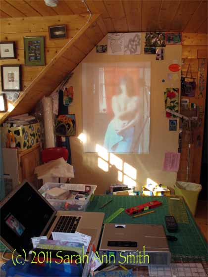
To get the correct pose, I set up my camera on the tripod and used the timer to trip the shutter (and cover myself strategically before anything too revealing got on digital memory card!).  I took a lot of photos until I had the right tilt of the head, expression, curve to my side, placement of arms and hands.  Then I set up the digital projector (which I bought to use in lectures and classes, and now have this use for it, too!) to project the photo onto paper folded/cut to 36×48.

Me, in blurry living color, on the design wall in the old house; you can see the laptop and projector on the work table. PS--notice in the photo I am in our bathroom with a cloth covering the window behind me, not in a doorway at all. That's the camera and tripod on the right reflected in the mirror (which I was using to see how things looked).

Somehow, a photo is much more “revealing” than the same thing in batiks, so while I’m not too uncomfortable with a semi-nude quilt of myself, I decided I had best blur the photo.  Ahem.  And I’m glad I lost that 25 pounds a couple summers ago!   Having carted the weight around since my last pregnancy (the kid is now 13) it was time for it to go!

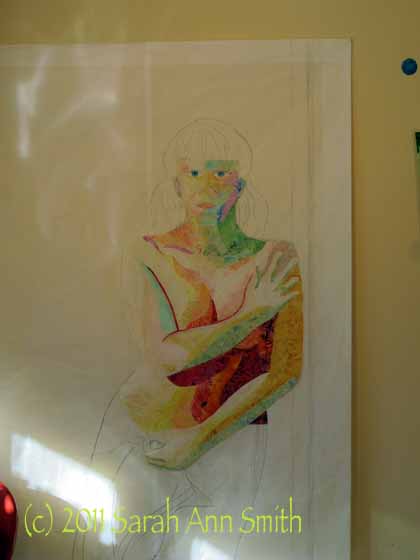
Anyway, back to quilting.  Or drawing.  Rather than use photoshop to define shapes, contours, etc. I prefer to take a drawing pencil and outline the edges and make my own decisions about where I want shapes and colors to merge and blend and overlap.  I will draw these “interior” lines, too, and often add notes like “medium-dark” on the drawing.

I decided to tackle the hardest part first:  my face.  In the end, the eyes ended up about 1/4″ too close together, and I may be able to adjust that, and they are a smidge too large.  Other than that, things turned out OK.  Once the face was done, I could move to the torso (using larger chunks of fabric), the towel, and the hair.

I began with the most difficult parts (face and torso). I ended up removing much of the dark fabric for the strong shadow under my arm..tho the photo was that dark, it just looked weird in cloth, so I reduced the fabric and later added lots of dark thread to create the shadow.

Thelma Smith made some awesome quilts of the Sonoran Desert, and in them used a technique she learned from a painter and then shared with me.  The painter used Cadmium Red Light paint to outline / highlight some figures.  It really makes them pop out from the background, especially when values are similar.  It doesn’t shriek at  you like black would, and despite being a color totally not there in real life, the technique works.  I’ve wanted to try it for quite some time, so I did for the hair, and used a deeper red for the shadows to the right and top of my right arm.  I decided since I selected a deep-dark fabric for the background, there was plenty of “pop” on the body, and didn’t continue the “red halo”, but think I’ll have to do another portrait of someone and give it a try on the entire figure.

Anyway, here is the hair in progress:

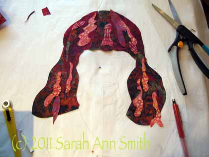
Hair, in progress (early stages)

In this photo, I decided to work on the table, not the wall.  I placed my sketch UNDER some parchment paper; I can still see the lines, and can cut and MistyFuse directly onto the parchment.  As with Joshua’s hair, I cut large, darker chunks to create the overall shape of the hair.  Then I cut highlights (magenta, orange, rust, green!) in wobbles and waves and wiggles, adding until it was “just right.”  Here’s a closer view of the hair when done:

Detail showing finished hair

When I first envisioned the quilt, I thought I would fuse assorted bits of dark fabrics to make the background, as I really liked how the stark, dark contrast worked in the quilt of Joshua.  To get an idea of how it would look, I took one large chunk of blue batik and put it up on the wall, then pinned the fused “me” to it.  I liked it…a lot!  And decided that if I made the background into “boards” like our walls in that house, it would actually detract from the quilt.   So I made my life easier and used one single dark blue batik for the “wall behind the doorway,”  a doorway that doesn’t actually exist.  Then I used other bits to create the door frame and wall around it, preserving the angle of the light / shadows—the light was strongly coming in from windows on the left (and lamps set up to cast strong shadows to make getting the planes and shapes of my body easier in the drawing phase).

I’ll add that the entire quilt is done ONLY with thread, cloth and MistyFuse (my totally favorite fusible web).  There is no paint.  No pens or pencils.  Just cloth and thread.

So that’s how I did it!  Hope you’ve enjoyed the view,

Cheers, Sarah


Clothed in Color

Friday, March 18th, 2011

WOW… I actually made an art quilt, and I can share it!   I had thought that the quilt must be kept secret until those juried in were announced, but apparently I was seriously wrong.  So I can SHARE!   Once again this year Jamie Fingal and Leslie Tucker Jenison are jurying and curating a show that will debut at the IQA show in Long  Beach, then hopefully head on to Houston and beyond.  The theme this year is “The Space Between.”

This is a detail of my face:

I knew what I wanted to do in a quilt, but wasn’t sure how it could fit the theme.  In chatting with Leslie by e-mail, she recognized that *I* was in the space between, the sandwiched generation handling the needs of both children and aging parent, not to mention spouse, work, family and all that.  I am indeed the one caught.

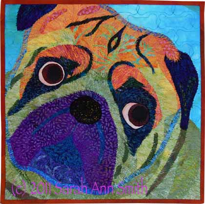
Presto!  I would finally get to make a quilt that has been in my head for four years:  a (discreet) nearly-nude self-portrait using no skin tones–I am clothes quite literally with color.  Like artists in the days of old, I find that I am my own least expensive and readily available model, so I ended up as the subject because I wanted to do another portrait, following the ones I had done of our pug:

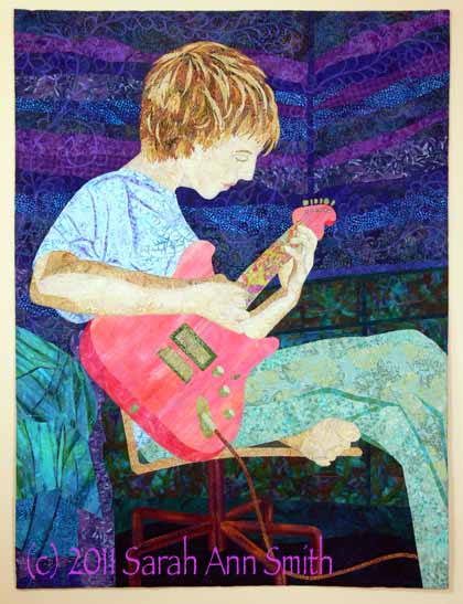
and our older son:

I’ve been learning and experimenting with value (light-medium-dark), and used the pug (a 12×12 inch quiltlet) as a practice for the quilt of Joshua.  However, I wasn’t sure Joshua would like having pink, pale yellow, peach, mint green, baby blue or lilac skin.  SO….I opted for realisting skin tones and played with value in the color of his clothing, guitar and room furnishings.

When it came to me, I could do whatever I wanted, so I did.  Skin is pink, orange, plum, green, blue.  Hair is plum, peach, rust, dark green……in another post I’ll share the in progress photos.

Keep your fingers crossed…I hope it gets juried in to the exhibit again this year.