email Youtube

Home
Galleries
Blog
Workshops & Calendar
Store
Resources
About
Contact

Archive for the ‘Art’ Category

A sneak preview…Start your Art – Lyric Kinard

Thursday, November 1st, 2018

Art and quilt teacher and friend Lyric Kinard (website and Facebook and Instagram) delighted me recently when she asked if I’d like to be part of a bloghop to launch her new prompts deck of cards “Start Your Art”…of course!  The official bloghop is in about two weeks after International Quilt Festival, but I’ve had a chance to download the pdf and play a bit.

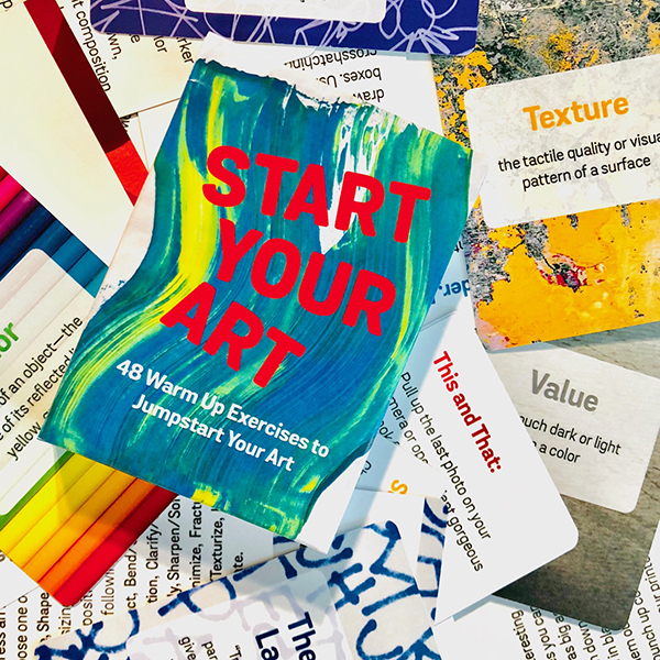
Hot off the press, Lyric Kinard’s Start Your Art deck of cards / prompts is available as an actual deck or a digital download. You can get the deck here at Lyric’s shop.

Then, not long ago, Laurie Russman, of neonkittyquilts on instagram and website, told me about the MegaPhoto app she uses to make “tweaked” photos.

Sitting waiting for my annual physical check-up, I decided to play–a prompt from Lyric’s deck plus MegaPhoto!  Lyric has some suggestions–like set a timer and keep it short–to get you started along with 48 exercises.  I hopped around the set randomly and selected one (and of course I forgot to write which prompt) that I could do on my phone while waiting.

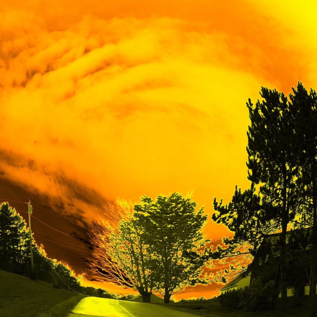
I began with a frequently photographed location on my afternoon dog walks and used one of the MegaPhoto filters to get this image…all sorts of new ideas for quilts are funning (what a hoot, that was meant to be running, but I like the typo!) through my head.

To those of us who have been teaching ourselves art for a while, some of the prompts may be familiar, some are new, but I have to say I totally love having these on my phone where I can take advantage of those moments where you are somewhere without a book–a productive alternative to Facebook!  Even familiar prompts become new and are worth doing again. Then I tried another filter on the same photo–what a difference in mood!

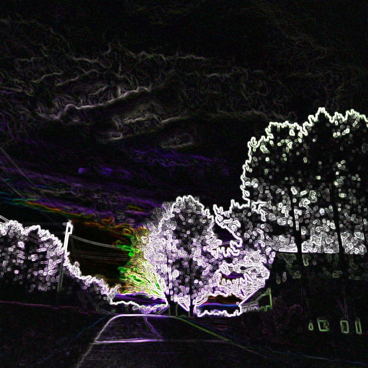
Another filter in MegaPhoto –just look it up in your App Store. I believe there is a free version, but you can get rid of the ads and add a few extras for about $2.99.  

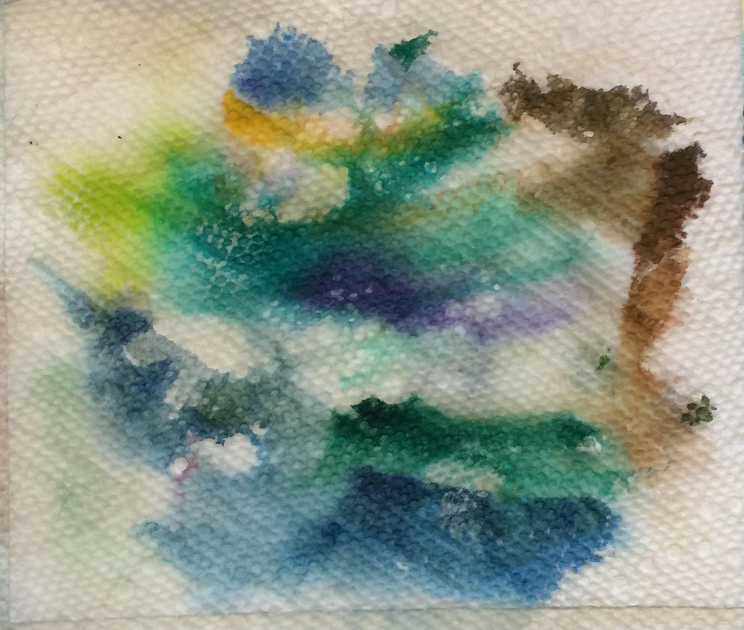
I tend to be pretty literal in my artwork, so many of Lyric’s prompts that require one to work in abstracts will be a good push for me.  This may be my favorite of my Mega Photo filters I used on this photo:

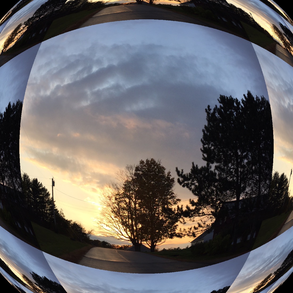
Love the prismatic, fish-eye look to this photo. I can see playing around with this type of composition and fracturing in an art quilt….maybe over winter? Or even…hmmm…printed onto cloth, then paint on the cloth, then quilt….hmmm….

See, that’s what happens with prompts:  they get the creative juices going.  They let you get out of your own way and try something that isn’t in your “usual wheel-house aka creative safe spot.”  I’ll do a proper review of the deck in mid-November when it’s my turn, but just wanted to let you know what I’m doing now that the boxes of stuff are shipped to Houston, it’s not yet time to pack clothes, and I’m noodling around with play time!

So I can heartily recommend Lyric’s Start Your Art.  I’ll play around with it more and check back with another review for the bloghop in mid-November.  Here’s the link again to this deck of cards:

Why I love vultures!

Monday, October 22nd, 2018

The Vulture is Landing!

When we lived in Camden, I learned to love vultures.  At some point in March, they would arrive, heralding spring.   Eventually I learned that they ride the thermals, which carry the scent of supper up to them.  If it isn’t warm enough, not enough scent.   So that means when they arrive, winter is indeed ENDING.   Also, they are FUNNY–they may be a bit on the ugly side, but gosh they are just comical.  They are gregarious, live in tight family groups (the ones that roosted at the end of our driveway numbered around 30!), are large, squabble like most families, and when you hear them flap in the pitch dark when you are walking the dog late at night they sound REALLY REALLY BIG!  But they are just under-appreciated (anyone else ever felt that way?).

So for this weeks Journey Through the Natural Year lesson–well ok, the lesson from two weeks ago, I’m behind–I decided to NOT do the pileated woodpecker teacher Val Webb selected and see if I could do a passable job on something else dark with a red head, my much-adored funny vultures.  I’m rather pleased–I can now see a couple small areas where I didn’t get it quite right:  beak a tad too long, curve on the upper wing needs a couple of bends in it, but I am really pleased.  Well, I was until the blotch.

I used this photo, which is part of the WikiCommons meaning I can use it as long as I give credit–Thanks Peter K. Burian! https://commons.wikimedia.org/wiki/File:Eastern_Turkey_Vulture_in_flight,_Canada.jpg#/media/File:Eastern_Turkey_Vulture_in_flight,_Canada.jpg
turkey vulture By Peter K Burian – Own work, CC BY-SA 4.0, https://commons.wikimedia.org/w/index.php?curid=63275338

Here is the sequence…and the remedy to the blotch:

Step one: pencil things in. I am sketching in a Daler-Rowney dry media sketchbook that has paper that I really dislike. It is good for pencil and not a whole lot more!

Getting the face and eye in helps so much. I used a crow quill dip pen and deAtramentis Archive Black Ink.

Progress. You kinda get lost in the feathers, but I’m pretty pleased with the shadowing through the long wing tips and the value changes.

Then karma smacked me upside the face: BLOT. After 4+ hours of work, a BLOT. And with this miserable paper NO chance of scraping etc. I was so proud of what I’d managed to do. But I kept going. And asked sketching friends and teacher Val Webb for possible solutions.

SOB!   I got lots of good suggestions, and (gee imagine that) had pretty much all of the suggested art supplies.  The only thing I didn’t try was Val’s suggestion to use gel medium to glue down a piece of paper over the blotch, because this paper is so awful I knew it would have been futile.

Finished, with blot.

Being an impatient sort and loving my Signo Uniball white pen, I added some of that and it helped…a LOT.  That and other suggestions I received were

  • Gouache (tried both Talens white and Schminke Titanium White, the Schminke worked better)
  • Prismacolor white pencil (too weak)
  • Signo pen (worked perhaps best, but is tricky to manage as it is a rollerball and sometimes leaves a track or blank space in the center of a line)
  • Watercolor ground
  • Acrylic ink in white–had both Liquitex and Daler Rowney; applied with both dip pen and brush

My test-drive page. The colors are from watercolor–this paper precluded using it–and colored pencil. I ended up using a combination of the Carmine and Crimson and a colorless blender.

The left side, close up. I made a blot of ink, then some squiggles to approximate where I blotched on the vulture.

The right side. Definitely like the way the Signo pen worked, and also the Daler Rowney FW acrylic ink…look at the right side where I dotted it on with a dip pen. The one on the far right is my untouched for comparison.

Observations:

–Both the white gouaches and the Daniel Smith watercolor ground looked yellower than the bright white paper when wet, but when dry that tint disappeared.  In fact, the Schminke titanium, which seemed to work the best of the two, is even brighter white than the paper–a tiny drop of something to match the color of the paper would make it work.

–The Signo pen worked best, but you kinda need to add it in dots because the pen itself can “railroad” meaning you get edges of white and not much in the center due to the rollerball tip.  However, a couple coats worked well.

–The Daler Rowney FW acrylic ink worked better than the Liquitex Ink! .  It took a couple coats, but it could be a viable option.

I’d like to try a controlled test of my favorites, the Signo pen, Schminke Titanium White gouache, and the Daler Rowney FW white acrylic ink, on a few watercolor papers to see how it looks AND what happens if you then ink or watercolor OVER the “fix.”

Here’s the offending splotch after touch up with both Signo and the Acrylic Ink in white:

The splotch is visible on close inspection, but really I’m delighted with the result.

And once again, here’s the final result–not bad at all!   I’ve always said that the difference between a beginner and the advanced/pro is knowing how to fix your mistakes.  I’m moving out of beginner range!

The Vulture is Landing!


Dinner@8 interview

Saturday, October 13th, 2018

Hi all!  Popping in for a quick post:  An interview with yours truly about my work and my submission for this year, Pink Oyster Mushrooms, is now live on the Dinner@8 blog, here.

Here’s what I wrote on my entry: Beneath the Surface of the Edges of the pink oyster mushrooms, the Space Between the gills forms rhythmic Patterns of shadow and light. My Affinity for fungi and lichen extends to the inspiration I find in the world around me in Maine, even at at the Belfast Farmer’s Market. Dyeing and painting white cloth is part of my artistic voice, my Personal Iconography.

International Quilt Festival Houston is approaching, which means for the 10th year there will be a Dinner@8 exhibit, a juried invitational, which has showcased some of the best art quilts being made in the past decade.  I have been fortunate to be invited to participate for 9 of those years and was accepted in all but one (and I totally agree with the curators…I would have picked other quilts than mine, too!).  I am THRILLED to be in what is the final exhibit because, sadly, all good things come to an end. From the quilts I have seen, this may be the best exhibit yet.

Conceived and curated by Jamie Fingal and Leslie Tucker Jenison (click on their names for link to their personal websites), each year they selected a theme and a size for the exhibit.   The size was in place for three years, then the next three years a different size, etc.  This last year, the size was 30×50, and we were asked to choose one of the themes from the past nine years.  Honestly, my quilt could fit under many of the themes.

The way it works is in November (or thereabouts), Jamie and Leslie sent out a theme to a group of invited artists.  You them made a quilt, only one, to fit the theme and size and submitted it by the due date.  Then you waited to see if you made it in to the exhibit.  I am beyond honored to have had my works next to so many spectacular works—truly, go browse the exhibits for each year and even go buy the catalogs (links on the Dinner@8 site).

THANK YOU Jamie and Leslie:  you have created through these exhibits a body of the best of the best, and I am beyond gobsmacked that I have been able to be a part of these exhibits.

To see all the interviews this year and those from past years, click on the Dinner@8 Blog link.

Watercolor–a nifty little palette

Friday, September 28th, 2018

You know you’re tetched in the head (old phrase from my mother and aunts, meaning a few bricks short of a full load a.k.a. crazy) when you like your paper towel swipes LOL!   I’ve signed up and am actually doing the lessons in a couple of online classes:  Journey Through the Natural Year with Val Webb and SketchbookSkool’s Watercolor Rules (are made to be broken).  So I’ve been playing.

Wiping my brush off may be one of my best watercolors to date LOL!

I’ll share some of my exercises as the classes go on, but I wanted to share this tiny palette I found at least a year ago but haven’t used.  I bought it solely for the tin–the Schminke ones cost a fortune.  This one may not be quite as sturdy, but it is mighty nice!

This little black palette has a ring on the bottom to help hold it if you are sketching in the field. The center portion lifts out (it’s between the box and the tin in this photo) for more mixing area. I am pretty sure these are standard half-pans so could swap them out for higher end watercolors (or just empty these and re-use).  The item is still available on Amazon for about $19, here.  There are other colorways but I liked this one and it was cheapest.  Closed it is just under 3 x 5 inches! 

Here’s a paintout of the colors. The quality of the colors is better than I expected. Definitely not Daniel Smith or M. Graham, but adequate for a quick color in a sketchbook. But as I said, I bought this for the tin, not the paints.

SAQA Auction 3: Tell me a story

Thursday, August 30th, 2018

If a picture paints a thousand words, sometimes a title can write a story.  Here is another mini Dream Collection of six artworks from the upcoming  SAQA / Studio Art Quilt Associates annual fundraising auction:  bidding begins September 15th.  To learn more about the auction, go here.