email Youtube

Home
Galleries
Blog
Workshops & Calendar
Store
Resources
About
Contact

Archive for the ‘Art’ Category

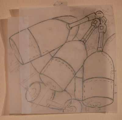
More of what I’ve been doing…
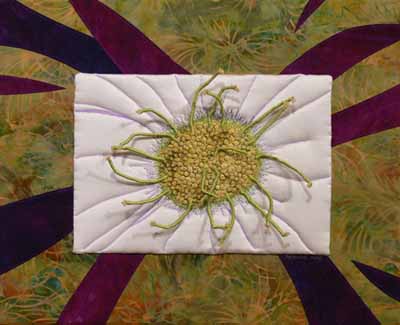
Thursday, May 29th, 2008

One of the members on one of my e-lists is going through a rough year, recently diagnosed with not one but TWO serious illnesses at the same time. So, another group member is going to put together a snuggly quilt for her, and I made this block. The stitching around it reads: fabric, friends, health, hugs, thread, these things I wish for you, fabric, friends, health, hugs:

Heart in hand

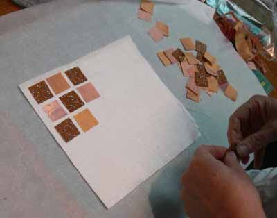
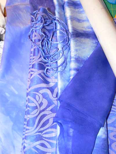
Then I FINALLY, after five months, got the squares cut from my BlauViolett dyed cottons and silks so I can do some tests for lightfastness (as in, will it fade a lot or not?) for this dye, procion MX-RX-7 known as BlauViolett. You may (dimly, in your distant memory) recall reading this blogpost about my December dyeing adventures. Well, I didn’t want glue to be a factor in any lightfastness testing, so I cut sorta-square pieces about 3 1/2 inches on a side and stitched them to some stabilizer (a sewing product used to prevent fabric from behaving badly when doing dense stitchery). Here is what the fabrics looked like in December up on my work table:

Blauviolett.. all of them folded

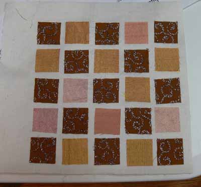
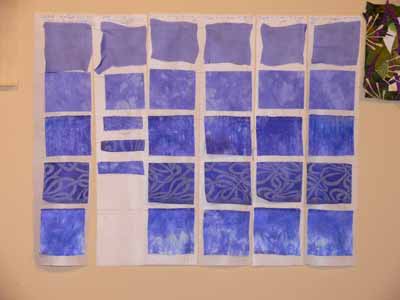
Here are the stitched up groups. There is a VERY wiggly sheer silk at the top, followed by the cotton (the dye is reputed to be very unstable on cotton exposed to light), silk dupioni, a silk jacquard (with a mystery fiber that is clearly neither silk nor cellulose fiber as it stayed white), and the delectable, want to roll naked in it wear it next to my body sandwashed silk . One source has told me that on silk, the dye is stable and retains its GLORIOUS color, but that on cotton it fades horribly. The two vertical strips on the left are going into the dark. The far left one is inside a manila envelope inside a cupboard, the short strip is on top of the envelope in the cupboard (which is opened fairly regularly but not subject to intense light exposure).

On the design wall

The other four strips are dated with the date they went up on the window. I will, I hope

In the window

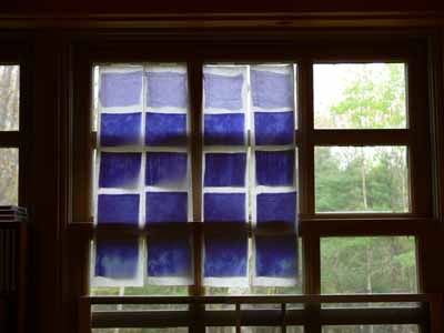
remember to take them down at one-month intervals. This window faces east-southeast, and gets some of the best sunlight / exposure in our house. We don’t have any windows without the sashings, so this is the best testing spot I can find (the only other option would be pinned to the screen on the back porch, subject to the elements…nah!). At the end of summer we’ll compare the six strips side by side!

Studio time… it’s a miracle!

Tuesday, May 27th, 2008

Buoys traced

I actually had a little time to play in the studio and tidy up. I had not planned to participate in the Coastal Quilters challenge, which I blogged about a few days ago here. But……about a week before the 10 by 10 inch quiltlets were due I thought, hey…. I could actually pull this off, I have a week. I knew what I wanted to do with the photo… of ropes and buoys… how I wanted to zoom in. And I knew I wanted to do a color study changing the colors from yellow-red buoys and multicolored ropes to something else, but couldn’t decide if I wanted to do all blues, or go wild and use pink and coral and purple. So I decided to do both! I didn’t have the facings finished in time, but since I volunteered to do the paperwork and prep stuff for hanging them in Maine Quilts in late July, I was OK.

Here’s how I did it. First, I took the photo (by CQ member Jan’s husband Dwight… you can see their website here) and fiddled around with various cropped versions until I had a composition I liked. Then I enlarged it on the computer and taped tracing paper to the screen, and traced lightly with pencil. I needed to reposition the paper and photo a couple of times since my screen isn’t 10 inches tall to get the drawing / tracing in the photo at the start of this post.

Then I picked fabrics. I kept the values the same–the background is the darkest area, the center of the tops of the buoys is the lightest (except for the white thing at the top… can you tell I’m a transplant to Maine… I don’t know what the parts are called…blushing, blushing, hanging head in embarrassment!). I was thinking teal, but the true blues picked themselves. Then I wanted to go way crazy and use a printed batik for the tops, which led to the purple-pink version! I used Saral or Transdoodle transfer paper between the traced design and the fabric to transfer the markings (like using dressmakers paper to mark darts) and cut out the pieces of pre-fused fabrics.

Finally, after fusing up the compositions, I selected at least six threads per piece and quilted the living daylights out of them! FUN! Last step, a facing since I wanted a clean “no edge” look for these pieces. When they return from being part of the group challenge, I’ll mount them on stretcher bars covered with cotton like I did the crane or white flower: White Flower

Art quilting disguised as fusible applique

Friday, May 2nd, 2008

Turquoise coneflowers

My first day in Paducah, I taught an evening 3-hour class called “Chunk and Jigsaw Fusible Applique.” This class is actually a portion of my Fabric Postcards all-day class which teaches various art quilting and embellishing techniques. I teach how to make up a small stash of fused fabrics ready for a quick project using leftovers from other projects (placed on the fusible web like a jigsaw) or small chunks of fabric…say 5×7 to 10×10 inches or so…. Then, we make a few postcards. For most students in these classes, it is their first time trying to design something, so I provide eight patterns. What is interesting, once I started providing a selection of patterns, the students didn’t use them! HOORAY! It meant the variety of ideas was enough to get them going on their own… mo’ bettah! Here are some of the results–the one above is one I would have loved to fly home with me… imagine, turquoise coneflowers…. glorious!

Note: if you were in my class and made one of these, PLEASE let me know and I’d love to include your name in this post! The class was so short that I wasn’t able to get names attached to each postcard for sharing here, but I did ask in the class if it was OK to share them. Michele E in Alabama… I’ll not share your wonderful birdie because I know you wanted to finish him/her before “going public!” but I adore him/her!

This student was game, despite never having designed something like a scenic card… I love how she placed the shapes, added the cut-out leaves, and used color. See how she cut out motifs from a batik to create the waterplants?

Beach and bird

I love Love LOVE the swoopy roofline on this house! She had found some cool “postcard foundations”, in the YLI booth I think. They were dyed/painted, creating the cool colors and textures in the background… I’ll have to look for them! Also love how she used the circles in a Kaffe Fassett print (do ALL of us have this fabric in our stash?) for the window and doorknob.

House

Notice the cool not-quilting-cotton fabrics in the houses here?

Different fabrics

Another student worked on a slightly larger background that the 4×6 peltex cards I included in the kit, using her awesome selection of sheers (which I wouldn’t have minded if they flew home with me, either). Her first piece was squares, in progress:

Sheers checkerboard, beginning

and fused up:

Sheers checkerboard

Then she made this totally wonderful sun scene:

sheers scene

One student with a completely different sense of color and composition than I have used the prints in her fabrics SO effectively:

Baroque swirls

The combination of soft batiks creates a soothing landscape:

Mountain scene

And here’s another landscape under construction:

Another landscape, in progress

Despite the hour of the class– 5:30 to 8:30 pm — the students seemed to have fun, and I know I did. And the peanut M&Ms and Milky Way bars I brought to share helped!

Creative Quilting With Beads–it’s on the way!

Saturday, April 26th, 2008

Great news…. the Lark book with 8 projects by the Frayed Edges is now available!!!!

Creative Quilting With Beads

I’ve ordered copies, and as soon as they arrive you’ll be able to order up an autographed copy (or unmarked if you prefer… either way is great!) here. I have also obtained a supply of the drop beads I used, so if folks want, let me know and I can add a baggie of enough beads to make one journal cover to the store site if there is any demand for them.

I am so proud of ALL of the Frayed Edges! Four of the five of us submitted proposals, we were all accepted and we are either

  • on the cover (my pomegranate notebook cover, which you can see here)
  • on the table of contents (Deborah)
  • on the Introduction pages (Deborah and Kate)
  • or the FIRST project in the book (Kathy!)

WOW! Here are some pictures and a bit of a review of the book:

After the elation of learning a while ago that my project was on the cover, it only got better as soon as I opened the book. Here is the table of contents, with part of Deborah‘s Cobblestones piece on the lower right:

Table of Contents

Then I turned the page to the Introduction, which repeats Cobblestones and has BOTH of Kate Cutko’s pieces (Broken Dishes and Petroglyph):

Intro

Then I turned to the projects, and it begins with Kathy Daniels‘ sea piece:

Kath’s project

Kate’s Petroglyph panel (one day at one of our regular Frayed Edges meetings, we decided the beads were too bright and shiny, so we sandpapered them and stained them with leftover coffee!):

Kate’s

Deborah’s landscape triptych with her signature writing on her fabrics (one of her THREE projects!):

Deborah

The layout of the book is good–nice and clean, clear instructions, concise (I tend to go into LOTS of detail!). The projects look as though they could all be fairly easily and quickly accomplished (once you get the “stuff” you need for them anyway!). A basics and tips/ideas section starts the book, then it progresses to the projects, which are nicely illustrated and beautifully photographed! I hope the photography in my book turns out as well as this! Apart from the Frayed Edges projects, there were a couple I loved, and I could see doing a riff on this bag in an art quilt:

Seaweed bag

The projects shown could easily be adapted to use in your own art work or done as is… way cool.

At the end of the book is a gallery of inspiring pieces. These are much more in-depth, complicated works of art from some of the top art quilters today. It would probably be impossible to pattern these works of art (if the artists would even be willing), but they show what you can do with the techniques learned in the book. Just let yourself loose and PLAY! Which is what I hope to do when I get back from teaching in Paducah.

I should be home on April 27th, and the books for sale should be here that week. I’ll start shipping as soon as I’m unpacked!

What I’ve been doing…

Tuesday, April 22nd, 2008

Well, it has been busy! This post will “publish” on Tuesday while I am winging my way south to teach in Paducah! As usual, life has been insanely hectic. I began getting ready for Paducah. Here is the first round of “stuff” in the crate:

Crate 1

Then, there is another round of “stuff” to pack and take. These things are mostly my teaching binders, a few handouts (most were shipped ahead of time), and my teachers’ samples:

Crate 2

On top of prepping all this stuff, I had to MAKE some new samples (which I’ll show you in a couple of days) to go with the shorter 3-hour format classes Paducah prefers. Then, an opportunity fell into my lap: write a proposal for an art quilt project at the Camden-Rockport Middle School. So in addition to continuing to get mom settled, the regular daily stuff, dog-walking and litter-box-cleaning (not to mention laundry, food and sleep), I wrote up this:

Proposal

The project would be seven panels. Six panels are 3 feet wide by about 4.5 feet long, with a seventh panel 40 inches wide by 18 inches deep to go over the door in the middle of the 24+ foot wall! The principal LOVES the idea of depicting inspirational people / things from around the world and across time (folks like MLKing, Mandela, Mother Theresa, Gandhi, engineers (a bridge maybe), shipbuilders and explorers, teachers, doctors), and is going to submit the proposal to a local grant-giving group. If a small miracle happens and I get it, it would be a MAJOR commission that would keep me busy the rest of the year!

Thanks to a nice tax refund, I was able to finally get my eyes checked, and will be buying new frames for the first time in 3 years. This is the most likely pair (so far):

glasses

Please ignore the dippy expression, fat on my neck, lack of makeup etc….They are a matte black, and I’m leery of black. I had wanted a deep ruby red, turquoise, or plum…. so far no luck, but some new frames coming in soon….. what do you think of these? Are they too stark on my face or OK? I do like the shape…..

I’ll be back online in a few days (well, a new post will come up) with one of the new class samples I made for Paducah AND a book review….