email Youtube

Home
Galleries
Blog
Workshops & Calendar
Store
Resources
About
Contact

Archive for the ‘Art’ Category

Eli’s art flag: a quilt project to be?

Monday, April 27th, 2009

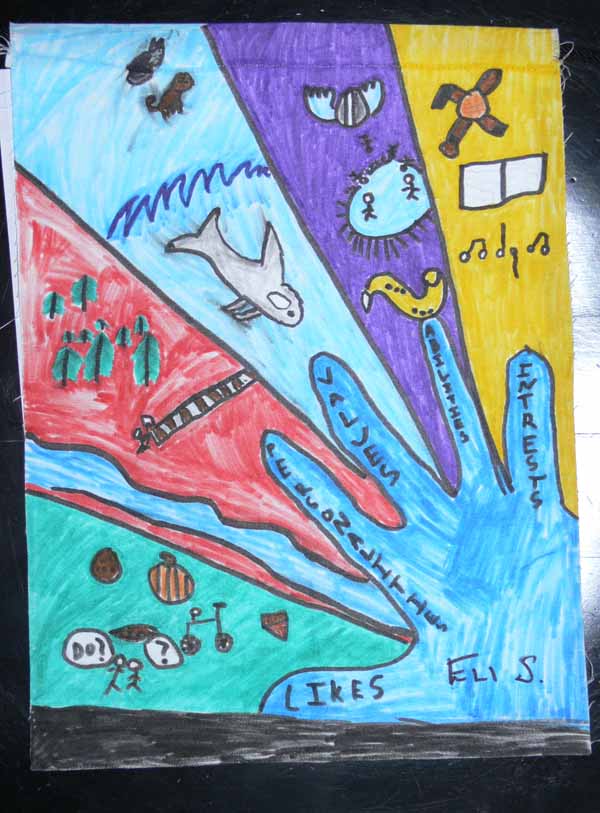
Eli, our younger son, came home with a TON of graded papers and whatnot just before the April vacation.  Amidst the social studies, writing and math, was an art project from (I think) FCS (Family Commercial Sciences or something similar, what used to be called Home Ec).  Mrs. Burwell (FCS) and Mrs. Andersen (art) are great friends, and get together some AWESOME projects for the Camden-Rockport Middles School students.  Personally, I’d like to TAKE the art classes!

200904blogboysetc005

Anyway, the project was to create “Your Personal Portrait Flag.”  The handout notes “One way we communicate is through symbols.  Symbols can be ancient or modern.  A flag is a type of symbol that consists of several parts that represent different meanings.”  The sudents were to sketch their personal flag, reflecting on “four different aspects of you and who you are.”  The students were to answer these questions (taken from the handout):

  1. 1. Interests-what things do you love to do?
  2. 2. Abilities or skills-what things can you do well?
  3. 3. Values-what is really importnat to you?
  4. 4. Personality-attitude toward life, ways you behave, etc.

The students then answered the question, learned a bit about design and composition, were to find/create symbols, transfer the designs to fabric, paint the designs, then iron, sew and hang their flags. On the back of the handout, the child listed 1-4 items for each question, then came up with a symbol for each reply.  For pets, Eli drew a cat and a pug, a saxaphone for his music, a soccer ball and goalie gloves for sports and soccer skills, trees for his love of being outside.

How COOL IS THAT???? I want to do it!   At this point, I have to get some work stuff done, like a pattern ready to go to the printer, the first panel of a possible commission done, and other “must do now” stuff, but I think this would make an AWESOME journal quilt type of project….or even something larger…. great creativity stuff!  Hooray for Mrs. Burwell and CRMS (again!).

Naiads, revisited

Saturday, April 18th, 2009

naiadsrev450

Late last year, Lisa Chipetine from the Studio Art Quilt Associates, invited me to participate in an online Quilt Critique session with Sandra Sider.  Never having been through a real critique session, I was nervous, but was so pleased to have been asked that I rustled up some courage and said yes, thank you!  Boy am I glad I did!   Since I didn’t have much in the way of new work (my time the past 24 months has been taken up with writing my manuscript and family crises, all now resolved).  So I offered up Koi and Naiads.  Since there is more going on in Naiads, Lisa suggested I use that one for the critique.  I will state up front that I was quite happy with this quilt as it was, and it had already won a Judges’ Choice (Lisa Erlandson) award at Maine Quilts last year and an Honorable Mention at the Lowell Quilt Festival show last summer, also.   Guess what:  it COULD be made better!

Here is the before,
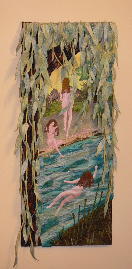
Naiads, Original "complete" version

Naiads, Original "complete" version, notice the ripple over the swimming figure

Here are the before and after, side by side:
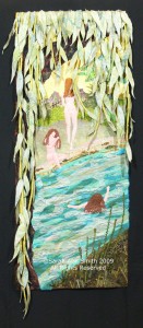
Naiads, Revised full version
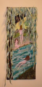
Naiads, Revised full version

Naiads, Original "complete" version

Naiads, Original "complete" version

Sandra spotted three things that could stand improvement, one of which I had already noticed.  What she mentioned first, however, is something that totally escaped me:  the seated figure on the left–her leg, the one in the water, was disproportionately long!  Even though I thought I had drawn carefully, Sandra was absolutely right.  So the water was rendered opaque, covering up the extra length since re-doing the figure would have been a horrid amount of work:
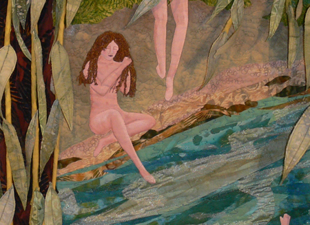
Naiads, original version, too-long leg

Naiads, original version, too-long leg

And after:
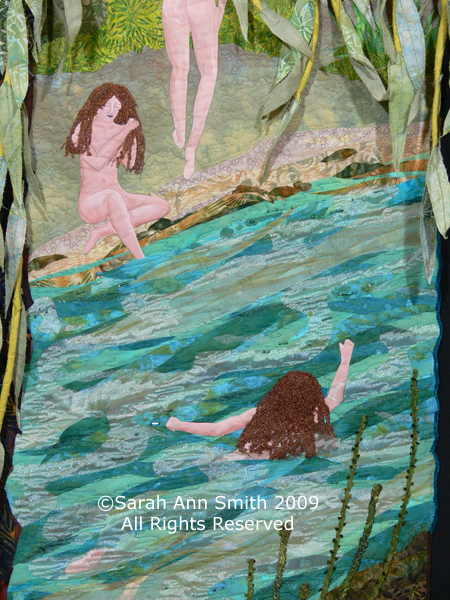
Naiads, Revised, leg "shortened" and center figure improved

Naiads, Revised, leg "shortened" and center figure improved

Sandra also noted that I had done a very good job (thank you!) of making the water LOOK like water, which she said is hard to do in cloth.   Because of that she suggested that I shorten the willow branches on the right so that the feeling of rushing river water would be enhanced.  I didn’t want to cut them as short as she suggested (above the river bank), but I did shorten them so that only the longest branches reach the top of the river.  I agree… it looks better and more “flow-y”.

Finally, the naiad swimming in the middle.  I had not quilted over her center, because quilting on painted cloth (the figure) looks weird sometimes, and the other figures weren’t quilted, plus I wanted to preserve the illusion of transparent water washing over her body.  Alas, that meant a somewhat unsightly bubble.  Sandra (using a blur/cloning tool I think) showed in her doctored jpeg during the critique (more on the how of the online session in a minute) how the focal point of the three figures is enhance by covering the lower half to 2/3 of the swimming Naiad’s body.

I wanted to retain the illusion of water, where you can see the body through the water, but agreed this section dearly needed help, so I split the difference.  I covered her hip and middle with more of the same fabrics used for the river, but left her feet and a bit more of her torso revealed.   I think the overall effect is VASTLY improved! as shown in the “Revised” detail photo.

OK…so how does an online critique work?  Lisa’s description of the “webinar”, here, is the best, plus there is a YouTube type “video” here, but in a nutshell you need a phone (toll call), an internet connection, and to show up at the designated time.  The four or five participants in the one-hour session send jpegs to Sandra about 2 weeks ahead of time, giving her thinking and “Photoshopping” time.  The critiques occur in sequence, and “silent participants” can call in and listen but not engage in the conversation (it costs less to listen than be an active participant, a mere $5 per one-hour session for the silent one, and a modest $20 for active participant).

Sandra will show the before, ask the artist (unnamed) their goals, concerns, etc., then offer suggestions.  At this point, other critique participants may also chime in.  I can tell you that I learned as much from looking and listening and commenting on the other art quilts as from the review of my own.  I have a major project/commission coming up, and once I get detailed cartoons/sketches done and maybe some initial work on the first of six panels, will go back for a good critical eye before I get too far into construction.

The bottom line?  A very worthwhile and educational experience!

SAQA at 20 – Bird of Paradise

Wednesday, February 18th, 2009

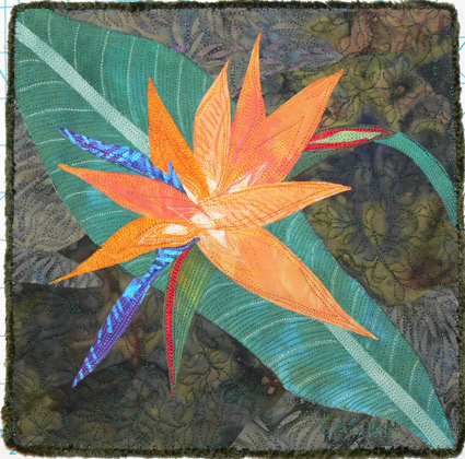
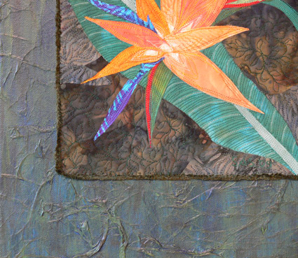
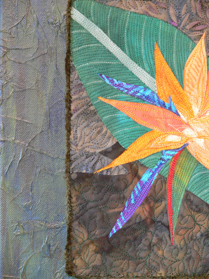
This year marks the 20th anniversary of SAQA, the Studio Art Quilt Associates.  They put out a call for entries from members a while back for small pieces for a traveling show.  They will all be matted with an 8×8 opening, so finished size had to be 9×9 or a bit larger (with the excess hidden under the mat, and used for mounting).  Since I make TONS of thread changes in a piece, even one that small, I decided to make two almost the same, send one to SAQA and prepare the other for sale.  I did take a photo of the SAQA one, but managed to delete it accidentally, but here is a photo of the 9×9 piece I kept (which is nearly identical).

Bird of Paradise block

Bird of Paradise block

It is made from my hand-dyes, commercial batiks, thread, yarn (edge-finish), and prismacolor pencil (there wasn’t enough contrast between the “spear” of the flower and the background, so light green pencil to the rescue…I hope).

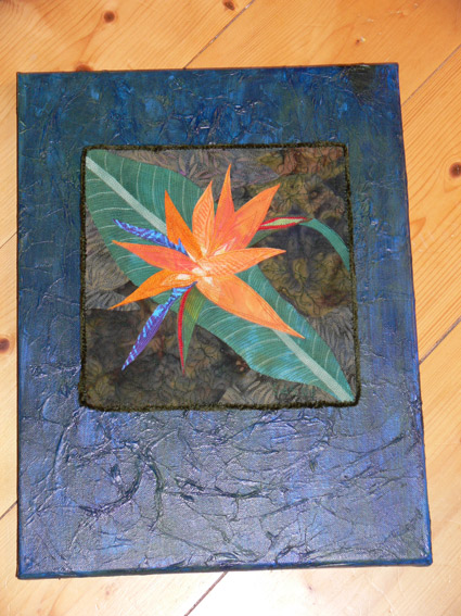
I wanted to try something for this that I had done on smaller pieces…mount it on a painted/mixed media canvas.  I had some teal cloth out on the work table, tossed the piece on it, and it looked great.  So I  used mat medium to adhere acid-free tissue paper to the canvas, then painted the canvas the same teal color.  Bleah. It definitely didn’t work the same way. I added some green.

Bird on Blue canvas

Bird on Blue canvas

Still needed more, so more paint to the rescue.  After checking with Frayed Edge Kathy D., we agreed it needed way more green.   In the end, it needed green and raw umber.  I painted the colors on, then swiped with a paper towel.

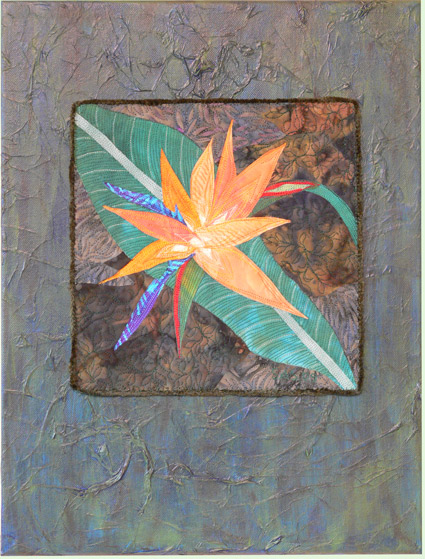
Here is the finished piece.  It will be for sale directly from  my website for a few weeks, then I’ll take it over to the Ducktrap Gallery that has my work here in Camden, Maine:

Bird of Paradise full shot

Bird of Paradise full shot

And here are two detail photos that show the texture of the canvas, which I rather like:

birdofparmixeddetail1x425and:

Bird, detail 2

Bird, detail 2

Amazing…. after two years working on the book and assorted family crises, I get to make art!  I’m looking forward to MORE!

Book Review: How to Photograph Your Life

Sunday, December 28th, 2008

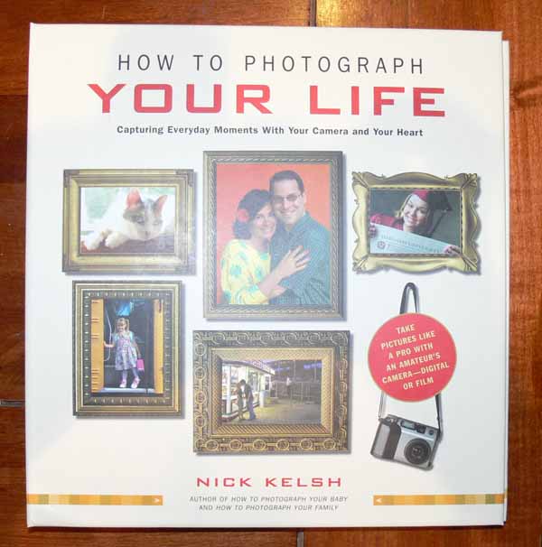
Bk cover

Quilting teacher extraordinaire Jan Krentz recommended this book to me back in April; I bought it not too long after that, and re-sized the photos for blogging back in September… give you an idea how swamped I’ve been? Anyway, Nick Kelsh has written numerous books; after getting how to Photograph your Family from interlibrary loan (this book wasn’t available), I decided to order this one from Amazon since the price was modest (and it’s a business expense!  self-education for teaching composition and design!; alas, I just checked and something crazy has happened to the price…like over $50 each!  Look for it in a library or used book store, or give it a wait and see if they re-print it and it is once again about $16.

Well, the book applies to quilting as well as photography, and in a nutshell his recommendations are:

–don’t use the flash if you can possibly avoid it, and

–crop!

The latter, of course, is the part that best applies to quilting, but the book in itself is about composition and design, albeit in an oblique way.  Kelsh is a professional photographer, but he set himself a challenge:  to use his wife’s pocket digital camera to shoot ALL the photos in this book, thereby proving that even with a decent but not exorbitantly expensive camera one can, with a trained eye (including self-taught) and practice, take great pictures.

Note:  all photos are clickable for a larger view!

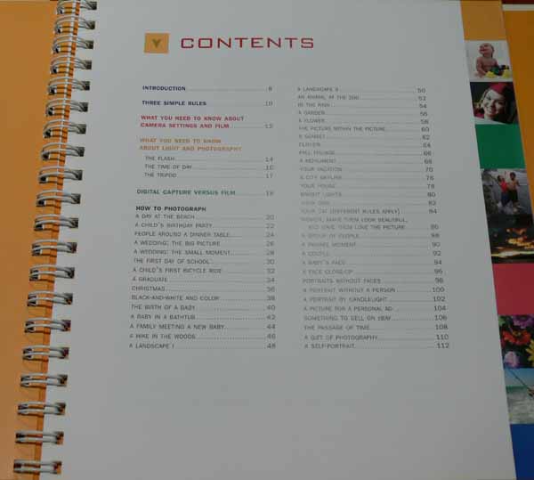
Table of contents page, Kelsh

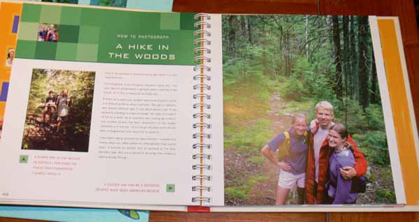
Kelsh shows a wide range of typical sorts of photos, using what the average Jane might snap, and then how to improve the photo (remember the mantra:  CROP!):

example 1, kelsh

In this picture, on the left you have the typical shot taken from just up the path, with the subjects hard to see due to the dappled light from the shadows.  In the photo at right, Kelsh moved the subjects to where they are all in the same light (not dappled) and radically changed his position (up a rock or a tree I think) so he is shooting down on them.  Better!

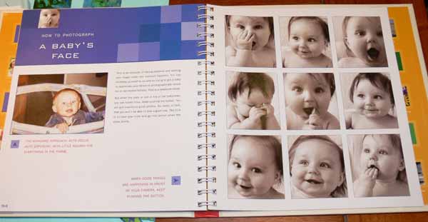
example 2, kelsh baby

This page shows another lesson I learned at least 25 years ago:  take LOTS of pictures, and you’ll end up with a gem or two (or nine).  In this example, the photo on the left has a small bit of sweet baby’s face, and lots of playpen and wall.  In the many photos on the right, you have almost ALL face… and a wide range of a sweet baby being a sweet baby in all their goofiness.  With digitals, we are blessed… it used to be financial agony deciding whether or not to snap the shutter, using up expensive film and more expensive developing.  Now if the shot is lousy, just delete!  So get yourself a large capacity card, and snap at will!

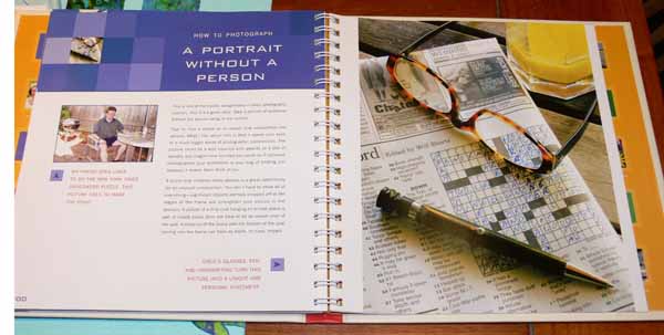
example 3, kelsh portain minus the person

In this example, he shows us how to take someone’s portrait…without them in it.  If you changed the glasses on this one, and the pen, it could have been my dad!

The book is easy to read, and it doesn’t delve into serious discussions of design, composition and whatnot, but it still manages to convey the essentials of composition and design.   If you can get a hold of a copy for a reasonable price, it is worth it, or check your library or interlibrary loan options.

Painted Buoys at Marriner’s

Friday, December 26th, 2008

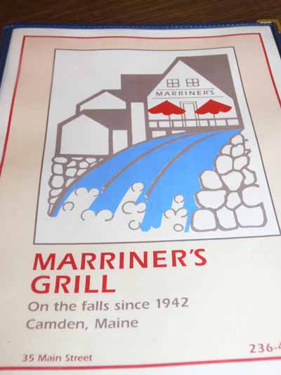
I was mulling over what to do as a giftie for my Frayed Edges friends, when Mom and I ended up at my favorite diner for lunch:  Marriner’s.  It has been a fixture on Main Street in downtown Camden (all two blocks of downtown) since 1942 (isn’t that cool!).  Here’s the menu:

Marriners menu

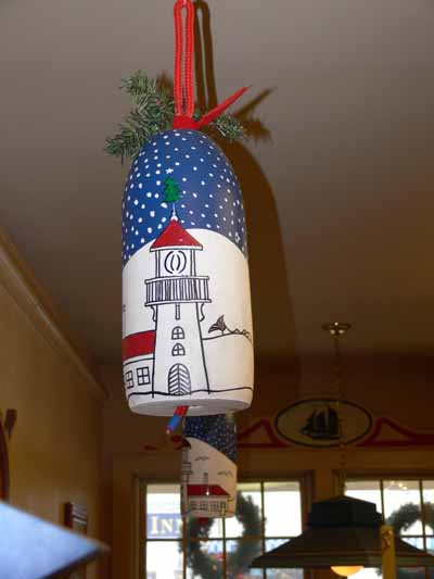
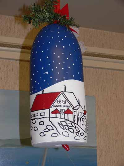
If the waitress and I guessed the spelling correctly, the artist who did the artwork inside and outside the restaurant and responsible for some of the cool design elements is Jens Johansen (alas I have no further info).  That includes the graphics on the menu (which also appear on the staff’s shirts).  Well, he did the coolest thing… painted buoys (as in the things that are attached to the rope that is attached to the lobster trap)!  Here is one from the front part of the restaurant:

Buoy–up front

And here are some photos of other cool things… from old photos, to paintings by Jens based on old photos, starting with the Galley (kitchen) sign:

The galley

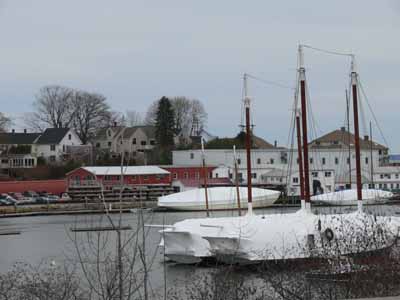
Here’s a shot of the harbor from the back of the restaurant; before the fire in the kitchen a few years back, the kitchen was across the back of the building.  When they renovated after the fire (the restaurant was closed for the first time in 40 years!  for several months as they rebuilt), they moved the kitchen and opened up booths toward the back and added a deck (heavenly in summer) with a view of the harbor:

Harbor view

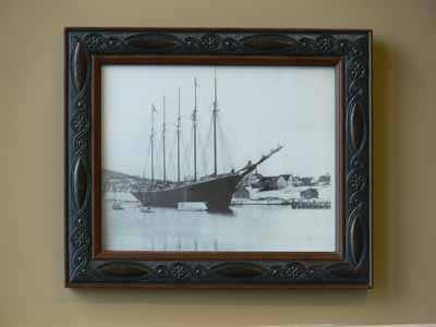
Here’s a photo from the days of yore when the schooners actually carried merchandise, not just tourists in summer:

Old schooner in the harbor

Here’s another view of the harbor, back towards where the library now stands (well, I think that’s what it is):

Another old photo

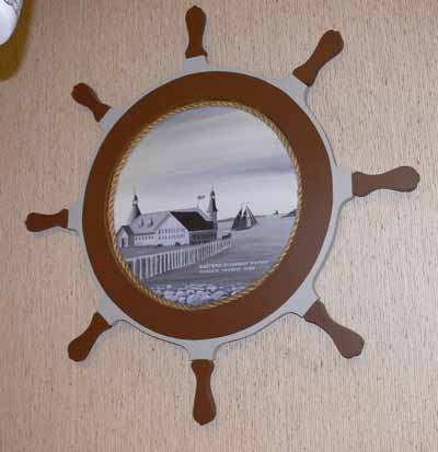
And a painting by Jens based on an old photo.  Loved how he made the plywood ship’s wheel “frame” for it!

Jens’ painting

Here is another of Jens’ buoys:

Buoy over back benches

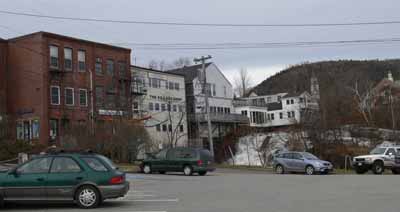
And this view of the back side of the Main St. Buildings and the falls will give you an idea of what he was painting–the one in the center with the peaked roof is Marriner’s, the one with the outside narrow deck:

Back view of Main St. bldgs, falls

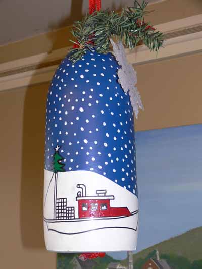
And more of the buoys over the booths at the rear of the restaurant (can you tell I LOVED them?!)–this one with lobster boat:

Buoy with lobster boat

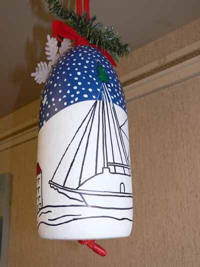
And yet another, with a rigged sailing ship:

Buoy with sailboat

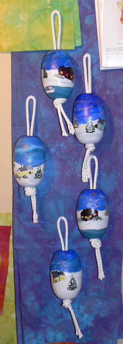
SO…… my painting skills aren’t equal to his.  And I was plumb out of fresh ideas, so I swiped from a triptych I painted on canvas-covered boards last year or the year before and went for snowy valley and snug houses…..here’s the five I showed you before (in the post about the Frayed Edges, Dec. 2008)–since I was short on time, I used floats instead of buoys, and didn’t have time to buy fake greens to decorate….

Sarah’s buoys

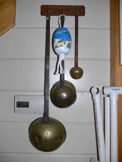
And here’s mine, which is hanging  on the antique brass ladels my dad bought in Spain in the late 50s (when I was a toddler!):

My float with ladels

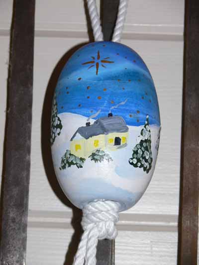
And a close-up (yes…my painting is…ummm….rudimentary?):

Sarah’s float

I’d like to buy some mistletoe next year to tuck in the knot at the bottom and use it as a kissing ball!  And,  I need to add a ribbon or something at the top… if you’re not careful the rope can come out the bottom and it’s a bear to get the folded end through the middle…. I also bought two buoys proper, and Eli and I will paint them for next year…..

Happy mistletoe everyone!