Saturday, January 26th, 2013
I blogged earlier about a wonderful lettering class I’m taking with Val Webb online; it was SO outstanding that I’ve also enrolled in an Herbs Drawing and Painting class. I thought I’d share a few of my lessons, some good, some not so much. All I need is a 37-hour day, with the extra hours for art!
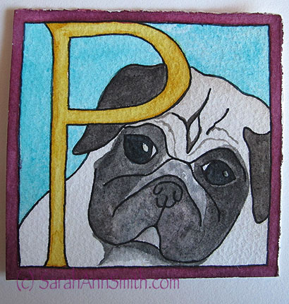
P is for Pigwidgeon the Pug
One lesson was to create whimsical letters. Val offered a pdf of a cat alphabet, but of course I had to attempt my dear (well, Eli’s dear dog) Pigwidgeon. I didn’t spend a ton of time on the sketch so it isn’t quite spot on, but I love his little peeping face anyway! This one is 3×3 inches. And while not expert by a long shot, my control of the paint is improving!
Another lesson was Art Deco style. Didn’t know what word, didn’t want something too long, and finally decided on Zelda, as in wife of F. Scott Fitzgerald (had to add that bit… Eli asked why Zelda, as the only one he knew was from the videogame Prisoners of Zelda!). I was elated at how well this turned out. The width of each section of letter is about 1/2 inch, they are about 3 1/2 or 4 inches tall:

Art Deco style lettering to simulate chrome–inked outline, watercolor, used a teeny tiny size 1 brush for the shadows on the outer edges that are maybe 1/32″ wide!
Another WOOT was the “Decorated Versal” lesson. Val had us try white ink with a crow quill dip pen. Since I’m comfortable with nibs and dip pens, this wasn’t terrifying to me, unlike getting large smooth washes of watercolor (without blotches, which are HARD). Here are some practice bits using the white ink over a wash of blue watercolor:
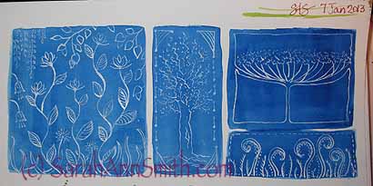
White ink from a dip-pen on blue.
A Versal is a fancy initial capital letter at the beginning of a verse (had to learn that one ). I wanted to do something William Morris-ish, so I created the vines behind the letters. I wasn’t sure what I would do to decorate the letter until I was actually muddling around, and decided to have the green vines turn to white on the letter to break up the space:
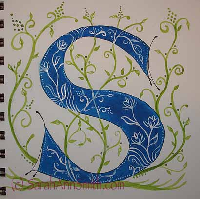
A decorated versal “S”. I like this, but thinks it needs something more to “weight” the S on the bottom. Awaiting feedback from Val!
Another lesson was to do letters that recede into the background. You begin with a wash of a lighter color over a large space, wait for it to dry, then go back in with a darker color to create the negative space. Instead of working within the box or rectangle in the class sample, I wondered what it would look like to offset the text and have illustrations on the edges. Not so great is the answer! You kinda loose the idea of perspective–of the darks going back to a vanishing point. But it was fun anyway:
A less than brilliant effort.
But it is all about learning, and I am learning SO MUCH! Now… I need those extra dozen hours a day to do more classwork, work on that quilt, exercise, sleep….. EEEK! So with that I’m getting OFF the laptop and down to the studio! Be back soon!
Posted in Art, Classes I've taken | 2 Comments »
Thursday, December 27th, 2012
Having a lovely post-Christmas lull, painting and enjoying being holed up in the house!
Winter blew in on a Nor-easter today. Currently it is 27 degrees, we have inches of snow, it is still coming down and, as it has most of the day, the snow is blowing past the snow sideways.
This house is so cozy and snug… perfect for staying inside and catching up on art. I recently shared two in progress pieces for my watercolor lettering class with Val Webb. Here they are, colored in:
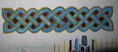
The interlaced knotwork, watercolored. I need more practice, but I’ve learned so much including how to make it look like the center bit is rounded!
And here is the “S”:
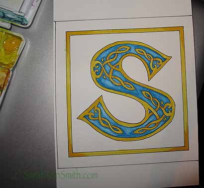
Part-way there. I’d love to have a plum colored background, but my skills aren’t quite up to that yet. I want to practice more then see if I can put deep plum around the “S” and outside the yellow border.
I’m pleased with the shading on the yellow knotwork (my own design!), but the turquoise is a bit overworked.
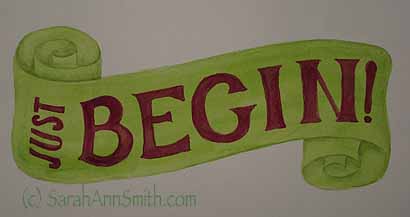
Today I did this scroll. Getting better, bit by bit!
And just because I couldn’t resist….
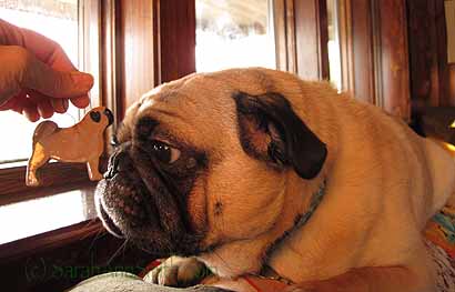
Showing Pigwidgeon the pug ornament he, Eli and Paul gave me for Christmas. Can you say CUTE? PUG-LOVE!
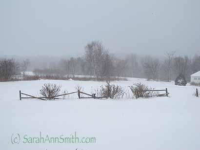
And we’ll end where we began…with the snow blowing sideways!
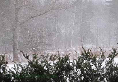
Off the side of the living room porch.
Posted in Art, Family, Home, Hope | 3 Comments »
Sunday, December 9th, 2012
Sheesh…. crazy busy here! I had surgery on my left foot on Friday, the same as what I had in August on my right foot, for arthritis removal. Things are going quite well and pain-free, but I have been insanely busy getting stuff done in anticipation of bobbing around on one foot for a week! Last Saturday was the start of Eli’s high school wrestling career, with a pre-season meet that included Class A, B and C schools (Camden Hills is Class B). Eli had three matches: his first was against a senior and the defending Class C State Champion (!!!!). Astonishingly, Eli managed to get a couple of escape points and NOT get pinned, which under the circumstances was amazing (since boys’ strength increases exponentially each year…kinda like dog years!). Then he won his next two matches convincingly.

Illuminated script lettering from Val Webb’s Watercolor Lettering class.
I’ve also been taking the most WONDERFUL online “Watercolor Lettering” class with Val Webb. The class is hosted privately, not via an online store or school. She creates a private group on Facebook where we can share, you download instructions from a password-protected blog (that is open for about 4 months which you have to work on the 10-week class), and there are video tutorials (some 30 minutes long!) there. I have learned SO MUCH! The example above is one I completed today, and it is probably the best thing I’ve ever done in watercolors. Val’s critiques are offered privately or, if you ask, on the group. Since I learn so much from reading the critiques, I have gladly offered mine up for sharing on the group, as have others. Val is generous yet points out in the nicest way what you can work on…helping you see where there are inconsistencies that might be done differently the next time. Just wonderful!

Me at home last night, showing a friend what the knee scooter looks like.
On Friday, after slamming all week to get stuff done in my studio, mow about 8 acres (literally) of meadow before winter and get the riding mower tucked away for winter, and do chores more easily done from two feet, I had my second surgery. Basically, the doc puts you under with something similar to the anasthesia they use for a colonoscopy (you have blissful amnesia after the fact), then takes a drill to remove the arthritic growth from one’s big toe. The only hard part for me, last time, was that I had to use a walker (crutches would ahve been as bad); because of the arthritis in my thumbs, putting weight on my hands to get to places (like the bathroom) was SO painful–far worse than the foot! So the ER recovery nurse suggested we rent a “knee scooter.” A what? She pulled it up on a laptop, showed me, we called the Medical supply place in Portland (on our way home) to reserve one, and I am SO HAPPY! I can get around the house easily!

Eli’s first match yesterday, in the official season-opener meet, was against the MDI (Mount Desert Island) kid who placed third in Eastern Regionals last year. As you can see, the boy (in green) is seriously ripped–that’s Eli in red grabbing his leg.
So easily, in fact, that since this surgery is on my left foot, I was told I could drive whenever I felt up to it. Well, yesterday was Eli’s first “official” high school wrestling meet and I had been SO bummed I wouldn’t be able to go due to the walker. Not any more! I felt up to it, and I MADE IT to the meet! It helps that the meet was in a town only 30 minutes drive, too. So I got myself and scooter into my car and went! And Eli had a fabulous start (of course he did, he rocks!). As a matter of fact, the team had a fabulous start. They lost 7 out of 13 Varsity team members to graduation last year, including 3 state champions. Yet, the team WON the 6-team Class B meet! Ellsworth obliterated four of the other teams, and Camden Hills obliterated Ellsworth. Can we all say “WAY COOL!”

Well…here’s just before the end of the third period, where Eli is getting the MDI boy on his back, again. Eli won, 10-3! That’s against the boy who was 3rd at Eastern Regionals last year. Papa Smith was VERY pleased!

And another move, where Eli is cranking on the boy in green, trying to get his shoulders to the mat and pin him, thereby ending the match immediately. He almost managed a couple of times, but this was definitely his toughest match of the day. The boy in green, by the way, is swiveling his hips to face down to prevent Eli from getting the pin, and the referee is down on the mat so he can peer underneath when it is close to see if it is a pin or not-quite.

Eli’s second match was against another seriously-strong young man from Ellsworth, here. Although this photo is blurry, I love how it shows the motion and intensity of the matches. That’s Eli on the left driving in to his opponent.

Honestly, I’m not sure why the wrestlers (boys and girls) love this so much. Personally, I would not love having someone’s knee in my back and my face held into the mat! Eli is (duh) in good control position here.

And a win “by fall” (which means Eli pinned his opponent, the kind of win that gets the team the most points). Eli also won his third match, which was against the JV member of the Belfast team. The varsity 152-pounder wasn’t there, but is apparently exceedingly good, was 3rd at States last year.
So, Eli’s official start to his high school wrestling (supplemented by two win-by-forfeits, where the opposing team didn’t have a kid to compete in his weight class) is a 5-0 record. WELL DONE! The rest of the team did extremely well… so proud of all of them including the coaches, kids, JV, and manager. This year the coaches are: PK, the high school science teacher, former coach and former Camden Hills wrestler and State Champion is coach, True Bragg is Asst Coach (had been Middle School coach, and he too went to Camden and was State Champion), Coach Goodspeed (been around since 1982 as head coach, part of the room and asst coach) and Paul as Asst Coach also. Thanks to the men, ranging in age from mid 20s to 70 ish, for helping. WOOT!
So that’s what I’ve been doing. Since I am allowed to put NO WEIGHT on my left foot all week, I hope to get caught up on some computer work: accounting for my teaching trips this year, learning InDesign (or at least starting), learning my new iPhone (I LOVE IT!), caught up on watercolor lessons, make some small Christmas gifties, write the Christmas newsletter, order the Christmas cards, do some fun reading, watch a couple DVDs I ordered like a year ago… hmmm…sounds like I need several weeks! I promise to try to be better about blogging! Meanwhile, enjoy the holiday season. Happy Hannukah to those who celebrate–personally, I believe in joining in all celebrations of light and goodness and joy!


