email Youtube

Home
Galleries
Blog
Workshops & Calendar
Store
Resources
About
Contact

Archive for the ‘Art’ Category

tea and ink, creativity and watercolor

Thursday, July 24th, 2014

Of late I have been busy with many things, one of which is Sketchbook Skool, an online cast of a gazillion students and, each term, six different teachers.   This past week’s lesson was with Brenda Swenson, and the use of single colors of watercolor on paper, letting them mix and play has been a revelation.  Since my last post, about the new Series 1400 of Quilting Arts TV, featuring little ol’ me in three episodes talking about making a quick bag as a gift, machine quilting, and correct needles/thread, was the last post, I thought I’d continue with the Series 1400 theme, creativity and inspiration.  (To see the information on the series and the ongoing bloghop, please click here to read about the series and visit all the creative, inspiring bloggers who just happen to be guests on this season!).

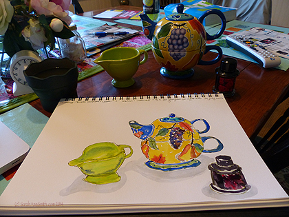
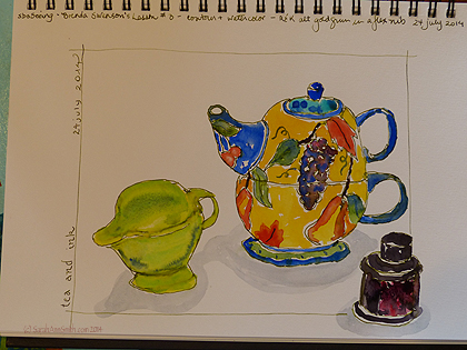
The completed sketch by me--contour drawing with fountain pen with non-waterproof ink and watercolor.

The completed sketch by me–contour drawing with fountain pen with non-waterproof ink and watercolor.

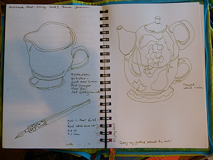
To begin at the beginning, we were to do a contour drawing, 3 minutes, of an item.  Then 6 minutes for two items, and 10 minutes for three.   Here’s what I did in my “everyday” sketchbook, which happens to be a Stillman & Birn Epsilon, 7 x 10 inch size.  This sketchbook has a hot press finish, about 100-lb paper; they are available at Binders Art Supply in Atlanta (google up the website) and Dick Blick (ditto), among other places.  I didn’t know where I put my Tombow marker (water soluble), so decided to use my Flex Nib (Noodler’s Creaper pen) fountain pen with R&K Alt Goldgrun ink (LOVE); both pen and ink came from the wonderful Goulet Pens.  (Note:  I’m not advertising, just anticipating questions!)

Timed contour sketches of fiestaware pitcher, tea-for-one teapot/but from my friend Marie many years ago, and a bottle of deAtramentis Roses scentted ink (heavenly color AND scent, also from Goulet Pens).  I used R&K Alt Goldgrun in my fountain pen.

Timed contour sketches of fiestaware pitcher, tea-for-one teapot/but from my friend Marie many years ago, and a bottle of deAtramentis Roses scentted ink (heavenly color AND scent, also from Goulet Pens). I used R&K Alt Goldgrun in my fountain pen.

Today, I rushed a bit and the pitcher is seriously tipsy, but I’m pleased, especially with the way the reds and black merged on the label on the bottle.   And the more I practice / make art, the more I am embracing  the idea that I do not need to be absolutely freakin’ perfect, that the wobbles and imperfections are what give something individuality, just as our handwriting varies from those cursive letters above  the blackboard back in second grade.

Here's the in progress, with the items behind the sketchbook on a dining table that I should have tidied before the photo but of course did not.  Truth in blogging.....

Here’s the in progress, with the items behind the sketchbook on a dining table that I should have tidied before the photo but of course did not. Truth in blogging…..

Notice the difference between this page and the one at the top–what a difference a little “framing” makes!  And I LOVE that green ink!

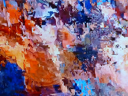
And for more inspiration, I just had to add this.  Last night thunderstorms rolled in, so of course we lost satellite signal and everything started to pixillate.  Immediately I tried taking a photo with my iPad (on which I was trolling FB or playing solitaire), but the camera just c ouldn’t capture the incredible colors.  So I dashed madly for the camera in the next room and got this photo at the last second before the picture returned to normal.  THIS is inspiration…aren’t these colors glorious?  I’m not much of one to enjoy abstract art, but this is enough to make you want to grab tubes of paint, several palette knives  and go to town.

Our pixillated TV screen.  Isn't this incredible?  The COLOR!

Our pixillated TV screen. Isn’t this incredible? The COLOR!

So that’s my life the past 48 hours (plus helping to hang the quilts for Maine Quilts, the annual quilt show here).  Art and inspiration!  And check out my previous post (link above) if you’d like to scope out the bloghop for the new Series 1400 of Quilting Arts TV, featuring yours truly in three episodes!

As for sketching and watercolors and contour drawings, I have a lot to learn, but it is so much fun, and it inspires me to make more art, including of the textile kind!


Food! — a SAQA exhibit and quotes about food

Monday, June 30th, 2014

This autumn I will embark on something new:  curating a SAQA (Studio Art Quilt Associates) exhibit titled “Food!”  That actually sounds a lot more glamorous than it is:  essentially, I will be the behind-the-scenes person coordinating entries, notifications, getting the quilts, communicating with venues and such like.  The juror, the person who will select the quilts for the exhibit, is the irrepressible Alex Veronelli of Aurifil Threads.

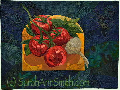
Tomatoes, Basil and Garlic, No. 1, the start of what I will call my Quilting the Good Life series!

Tomatoes, Basil and Garlic, No. 1, the start of what I will call my Quilting the Good Life series!

This blogpost is to whet your appetite (pun totally intended) and get you to thinking about food and its portrayal in cloth.

I’ve used my small Tomatoes quilt (the one in my Video Workshop on how I create and quilt my collaged pieces) to illustrate this just so we’d have a tasty visual, but this post is all about ideas from words.   To find a full prospectus, you need to be a SAQA member; go to the Members login page to (duh) log in.  Then click on Calls for Entry (here), and then for even more information, click on “go to complete prospectus and entry instructions” or click here (remember you must be a SAQA member and logged in for that link to work).  In a nutshell, though, the exhibit will be about all aspects of food from production to consumption.  Finished quilts must be between 24 to 46 inches on each side; the variation in size will make it challenging for me to organize and hang the selected quilts, but will give artists substantial flexibility in size and orientation of their quilts.

While we were discussing the title and working on the Call for Entry, I googled around to find quotes about food.  Here are a whole bunch–do any of these inspire YOU to make a quilt about food?

  • First we eat, then we do everything else. — MFK Fisher
  • Nothing would be more tiresome than eating and drinking if God had not made them a pleasure as well as a necessity.  – Voltaire
  • We are indeed much more than what we eat, but what we eat can nevertheless help us to be much more than what we are.
    – Adelle Davis
  • One of the very nicest things about life is the way we must regularly stop whatever it is we are doing and devote our attention to eating.  – Luciano Pavarotti
  • Always serve too much hot fudge sauce on the hot fudge sundaes. It makes people overjoyed,and puts them in your debt. ― Judith Olney
  • There ain’t no point in making soup unless others eat it. Soup needs another mouth to taste it, another heart to be warmed by it. ― Kate DiCamillo, The Tale of Despereaux
  • Sitting on the porch alone, listening to them fixing supper, he felt again the indignation he had felt before, the sense of loss and the aloneness, the utter defenselessness that was each man’s lot, sealed up in his bee cell from all the others in the world. But the smelling of boiling vegetables and pork reached him from the inside, the aloneness left him for a while. The warm moist smell promised other people lived and were preparing supper.                                                                                                                                                                                                                       He listened to the pouring and the thunder rumblings that sounded hollow like they were in a rainbarrel, shared the excitement and the coziness of the buzzing insects that had sought refuge on the porch, and now and then he slapped detachedly at the mosquitoes, making a sharp crack in the pouring buzzing silence. The porch sheltered him from all but the splashes of the drops that hit the floor and their spray touched him with a pleasant chill. And he was secure, because someewhere out beyond the wall of water humanity still existed, and was preparing supper. ― James Jones, From Here to Eternity
  • … food is not simply organic fuel to keep body and soul together, it is a perishable art that must be savoured at the peak of perfection.  –E.A. Bucchianeri
  • Jam on a winter took away the blue devils. It was like tasting summer. –Sandra Dallas
  • We eat the year away. We eat the spring and the summer and the fall. We wait for something to grow and then we eat it.― Shirley Jackson, We Have Always Lived in the Castle
  • This magical, marvelous food on our plate, this sustenance we absorb, has a story to tell. It has a journey. It leaves a footprint. It leaves a legacy. To eat with reckless abandon, without conscience, without knowledge; folks, this ain’t normal. ― Joel Salatin, Folks, This Ain’t Normal: A Farmer’s Advice for Happier Hens, Healthier People, and a Better World
  • The first supermarket supposedly appeared on the American landscape in 1946. That is not very long ago. Until then, where was all the food? Dear folks, the food was in homes, gardens, local fields, and forests. It was near kitchens, near tables, near bedsides. It was in the pantry, the cellar, the backyard. ― Joel Salatin, Folks, This Ain’t Normal: A Farmer’s Advice for Happier Hens, Healthier People, and a Better World
  • You know, the act of feeding someone is the ultimate act of care and affection…sharing yourself with someone else through food.” He held another mouthful of cake under her nose. “Think about it. We are fed in the Eucharist, by our mothers when we are infants, by our parents as children, by friends at dinner parties, by a lover when we feast on one another’s bodies…and on occasion, on another’s souls. ― Sylvain Reynard, Gabriel’s Inferno
  • Southerners are known for their hospitality and the foremost way of exhibiting it is through food. ― Cicely Tyson
  • There is communion of more than our bodies when bread is broken and wine drunk. ― M.F.K. Fisher
  • Good bread is the most fundamentally satisfying of all foods; and good bread with fresh butter, the greatest of feasts. ― James Beard
  • I’m pretty sure that eating chocolate keeps wrinkles away because I have never seen a 10 year old with a Hershey bar and crows feet. ― Amy Neftzger
  • First we eat, then we do everything else. ― M.F.K. Fisher
  • Red onions are especially divine. I hold a slice up to the sunlight pouring in through the kitchen window, and it glows like a fine piece of antique glass. Cool watery-white with layers delicately edged with imperial purple…strong, humble, peaceful…with that fiery nub of spring green in the center… ― Mary Hayes-Grieco, The Kitchen Mystic: Spiritual Lessons Hidden in Everyday Life
  • The shared meal elevates eating from a mechanical process of fueling the body to a ritual of family and community, from the mere animal biology to an act of culture. ― Michael Pollan, In Defense of Food: An Eater’s Manifesto
  • To eat well in England you should have breakfast three times a day. ― W. Somerset Maugham
  • Bacon is the candy of meat. — Kevin Taggart
  • It seems to me that our three basic needs, for food and security and love, are so mixed and mingled and entwined that we cannot straightly think of one without the others. So it happens that when I write of hunger, I am really writing about love and the hunger for it, and warmth and the love of it and the hunger for it… and then the warmth and richness and fine reality of hunger satisfied… and it is all one. ― M.F.K. Fisher, The Art of Eating: 50th Anniversary Edition
  • Mayonnaise: One of the sauces which serve the French in place of a state religion. ― Ambrose Bierce
  • your body is not a temple, it’s an amusement park. Enjoy the ride. ― Anthony Bourdain, Kitchen Confidential: Adventures in the Culinary Underbelly
  • I don’t know what it is about food your mother makes for you, especially when it’s something that anyone can make – pancakes, meat loaf, tuna salad – but it carries a certain taste of memory. ― Mitch Albom
  • Tomatoes and oregano make it Italian; wine and tarragon make it French. Sour cream makes it Russian; lemon and cinnamon make it Greek. Soy sauce makes it Chinese; garlic makes it good.”― Alice May Brock
  • If more of us valued food and cheer and song above hoarded gold, it would be a merrier world. ― J.R.R. Tolkien
  • Ask not what you can do for your country. Ask what’s for lunch. ― Orson Welles
  • After a good dinner one can forgive anybody, even one’s own relations. ― Oscar Wilde, A Woman of No Importance
  • I cook with wine, sometimes I even add it to the food.”― W.C. Fields


Sketching and playing

Wednesday, June 25th, 2014
Playing with the Stillman and Birn paper samples

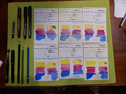
Playing with the Stillman and Birn paper samples.  Pens and pencils I used in my test are to the left.

First up:  my apologies–this post got REALLY LONG.  But I have a feeling I may be referring people to it so wanted ALL the info in one blogpost.  So here goes:   many moons ago, the generous folks at Stillman and Birn sent me a sample pack of their six papers because I didn’t know what to order in a sketchbook, and the sketchbooks aren’t exactly inexpensive so I didn’t want to buy six.   I decided to do a controlled test on the samples using various pens, pencils, inks and watercolors.  The paper comes in two weights:  100 lb and 180 lb, two colors: white and ivory, and three finishes:  vellum, cold press, and smooth.  Vellum is a velvety finish (not like drafting vellum which is like a heavy duty tracing paper); smooth is comparable to hot press.  Here’s the S&B information:
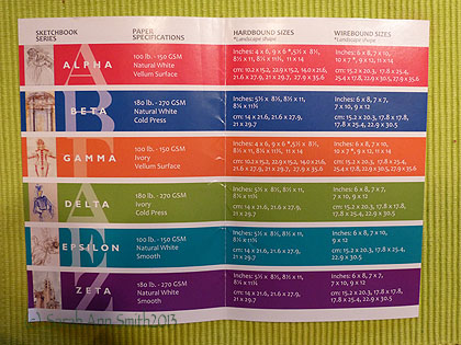
Stillman and Birn chart with the differences in the papers (alpha through Zeta).

Stillman and Birn chart with the differences in the papers (alpha through Zeta). Paper specs are on the S&B site here.

And some useful links:

  • Stillman & Birn website
  • Dick Blick offers S&B sketchbooks here and here.
  • Binders Art Supply in Atlanta carries the sketchbooks AND the paper!!!!  Awesome customer service (see below)
  • Goulet Pens has great fountain pens, a massive selection of inks, a billion instructional / informational videos and (DRUM ROLL of epic proportions please) they sell SAMPLES of the inks.  You can get about two cartridges worth out of each sample…so I have ordered and used about TWENTY samples.  But that is a separate blogpost for later.
  • Online classes with Val Webb, probably the best art teacher I’ve ever had; she helps all of her students achieve more than we could ever dream!
  • Online classes at Sketchbook Skool with Danny Gregory, Koosje Koene and various guest teachers

Here’s a photo of the six pieces of paper in my Stillman & Birn sample pack:
The six papers from Stillman and Birn

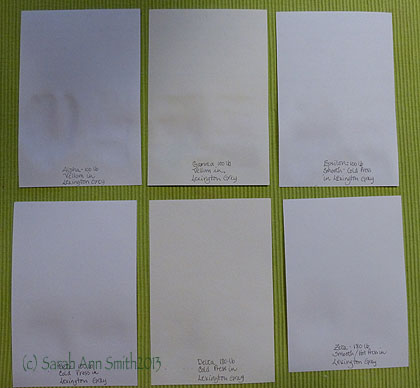
The six papers from Stillman and Birn.  I’ve put on the back the name of the paper, weight, finish, and the ink used (Noodler’s Lexington Grey).  Top row is 100-lb, bottom row is heavier 180-lb.
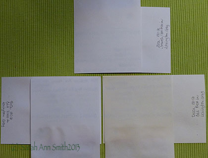
Here I've got the paper criss crossed with the 100 weight on top so you can see the effect of very wet watercolor on it and the show-through (or lack thereof)

Here I’ve got the paper criss crossed with the 100 weight on top so you can see the effect of very wet watercolor on it and the show-through (or lack thereof).  For lighter weight paper, the lack of ghosting and bleed through is good.
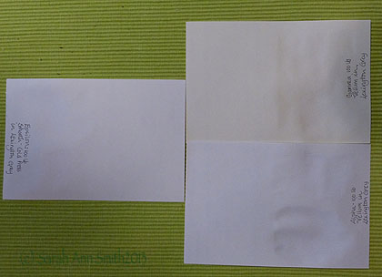
Another

Another view of just the 100-lb papers while still damp (the ones on the right) from watercolor

Here are close-ups of each of the six papers showing how my favorite pens and pencils behave on each offering:
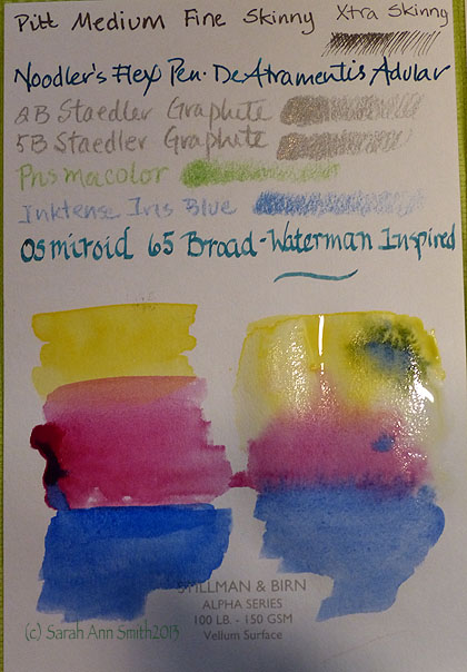
Still wet!

Still wet! Alpha series 100-lb. Vellum surface.  You can see that I did the “evil” test with LOTS of soupy watercolor to see how far you can push this paper.  The answer:  a long way!  I did find that for me the Vellum surface papers were a bit “skittery” with the extra fine Pitt Artists pens, which I didn’t enjoy.  Personally I preferred the Epsilon (below), but that is totally a matter of what each person likes.
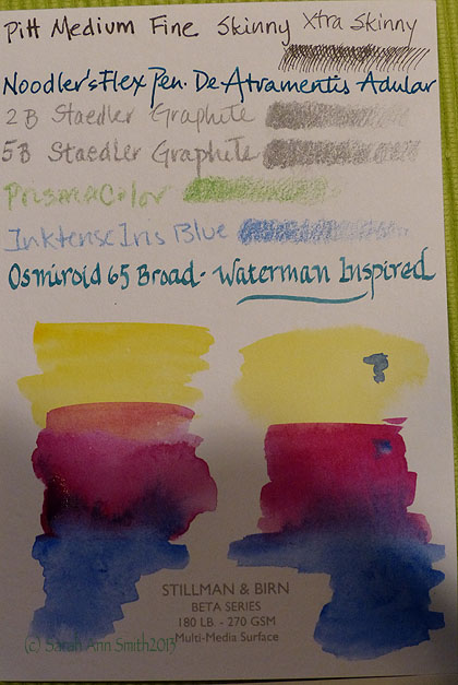
Alpah

Close-ups of the various papers.  This is the white Beta series, a cold-press finish sized for multi-media
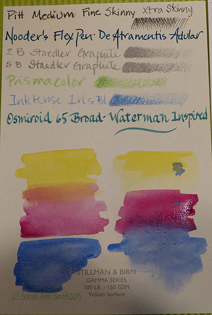
Gamma Paper, 100-lb Ivory, Vellum finish
Gamma Paper, 100-lb Ivory, Vellum finish

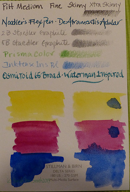
Delta?

Delta Series, Ivory, heavier weight 180-lb paper.  Suitable for very wet media.
Delta?

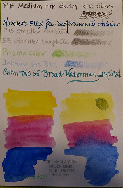
Epsilon:  this ended up being my favorite because of both the surface and the fact that you get more pages per sketchbook.  If I were endlessly wealthy, I might (or might not) choose the Zeta.  But since many of my pages do not use heavy water, I chose Epsilon knowing full well I could end up with some buckling.
 

Delta?

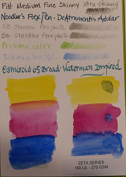
Zeta paper.  White, smooth finished.  Suitable for wet media and more.

I’m just finishing up my first S&B sketchbook, an Epsilon 7 x 10 wirebound.   I LOVE IT!  So much that I ordered some individual sheets to customize my sketchbook for my trip to England.   Before that though, here are some sample pages from my Epsilon sketchbook so you can see how it handled various media.
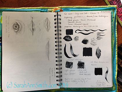
Epsilon 7 x 10 sketchbook, pencil on left page.  Charcoal and water on right page with white charcoal pencil.  Exercises from an online class with Val Webb.

Epsilon 7 x 10 sketchbook, pencil on left page. Charcoal pencil and water on right page with white charcoal pencil. Exercises from a **fantastic** online class with Val Webb.
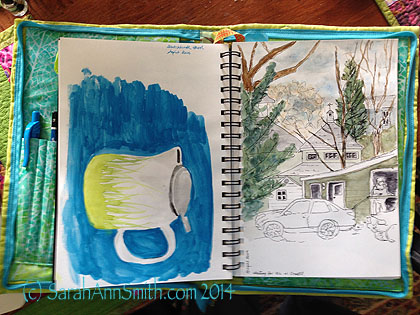
My rudimentary watercolor, form the first two lessons at Danny Gregory's Sketchbook Skool. Pen and ink with watercolor.  The heavier usage on the left ripples a bit, but I'm ok with that.  And I could, quite honestly, iron it flatter if I wanted to!

My rudimentary watercolor, from the first two lessons at Danny Gregory’s Sketchbook Skool. Pen and ink with watercolor. The heavier usage on the left ripples a bit, but I’m ok with that. And I could, quite honestly, iron it flatter if I wanted to!
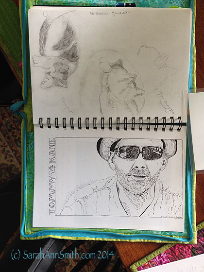
More lessons from Val Webb (cats in pencil) and a portrait of Tommy Kane from one of the videos in the Sketchbook Skool class. Done in Pitt Artists pens S and XS.  I roughed in the general shapes with pencil, inked, erased with kneaded eraser, then filled in and stippled and cross-hatched.   Excellent paper!

More lessons from Val Webb (cats in pencil) and a portrait of artist and Sketchbook Skool teacher Tommy Kane from a screen capture image from one of the videos in the Sketchbook Skool class. Done in Pitt Artists pens S and XS. I roughed in the general shapes with pencil, inked, erased with kneaded eraser, then filled in and stippled and cross-hatched. Excellent paper! 

I also got lucky:  I emailed Stillman and Birn  (they are SO responsive!) to ask if they had ever considered making a “sampler sketchbook” as the samples were small, but I didn’t want to buy six sketchbooks!   Turns out they had, but they didn’t sell well so won’t be making more of these samplers.  The guy told me that Binders in Atlanta might still have some, so I called them up a couple months ago since none of the sampler sketchbooks were listed on the website.  The nice lady at Binders (which also has OUTSTANDING customer service) went to look in the shop as the computer showed they had four left.  I bought three of them, two as gifts, one to use myself.
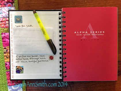
Contact info on the inside cover of my Stillman & Birn sampler sketchbook--alas these are no longer made!

Contact info on the inside cover of my Stillman & Birn sampler sketchbook–alas these are no longer made!

The sampler sketchbooks are the small size (6 x 8 ish, with 5 1/2 inches of usable width on the page) with four sheets/eight pages of each of the six papers.  Sometimes I like wide–enjoyed the format of a Moleskine accordion fold, but not that paper.  .  So I bought some of the Epsilon and Zeta paper sheets and make myself some 2-page and some  accordion fold “extensions” to tape into this journal in the sections I’ve reserved for art.  I’m not as fond of ivory paper, so I used the vellum ivory Gamma pages to write down essential information for my upcoming trip:  lodgings, emergency contact numbers for insurance, lost credit cards etc.  I’ll do some watercolor washes on the Delta cold press and may use that for both watercolor and collaging in trip ephemera.  The Alpha pages will be for my trip “calendar.” The Beta, Zeta and Epsilon pages will be for artwork.
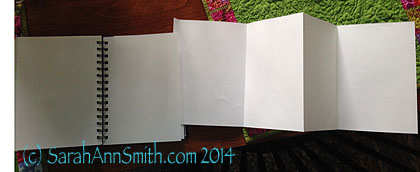
I made a few "page extensions" (the size of 2 sheets) and a few "accordion or Z-fold" extensions to add to my book should I feel the urge to do a really wide landscape or a funky train-journey thing

I made a few “page extensions” (the size of 2 sheets) and a few “accordion or Z-fold” extensions to add to my book should I feel the urge to do a really wide landscape or a funky train-journey thing.  I purchased individual sheets of both the Epsilon and Zeta paper, then cut and folded these extensions.  I’ll take some glue or tape to affix them if I decide to use them on my trip.  This is my work-around to not wanting to make a complete journal on my own and them not having the exact thing I want–just modify!

And using more of the single sheets of paper I’m going to draw a map and then illustrate it as the journey progresses.  I’ve cut it to about 11 x 14 inches so I can glue one corner to the inside cover for opening out easily.  On the last page, I’m taping in a printed-out map, also that can be folded up nicely.
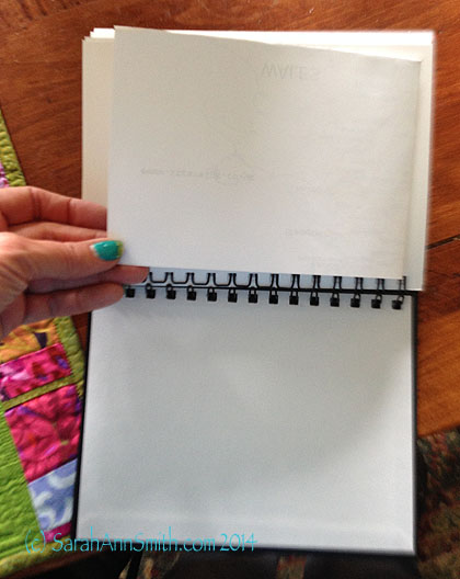
Taped in printed-out map of about half of England, folded, glued to last page in sketchbook.
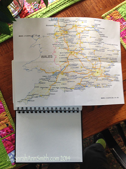
Taped in printed-out map of about half of England, folded, glued to last page in sketchbook.

Opened up printed map.

Opened up printed map.

Then my hand-drawn illustrated map will be taped/glued to the inside of the back cover.  With the wire-bound, there is enough room to add these extra pages without having the rigid covers “splay out” much if at all.

So thank you if you’ve manged to read through this massive tome!   Really loving my Stillman and Birn, as well as great classes from Val Webb and in the Sketchbook Skool, and the fabulous customer service and responsiveness from S&B, Goulet Pens and Binders.
How Batik is Made video

Thursday, June 19th, 2014

I came across this video somewhere through some list that I’m on, and thought I’d share as it is one of the most detailed explanations I’ve seen of the batik process, particularly about the discharge process which removes color after the first round of dye and wax.   Hope you enjoy!

Reflections, Eli and the whooshing sound of time disappearing

Thursday, May 15th, 2014

I am delighted to report that I will have a quilt in this year’s Dinner@8 exhibit, Reflections, which will debut at International Quilt Festival, Houston, in October 2014. I’m honored and humbled to be in such company as the other artists included, many of whom I know and am happy to call friend.

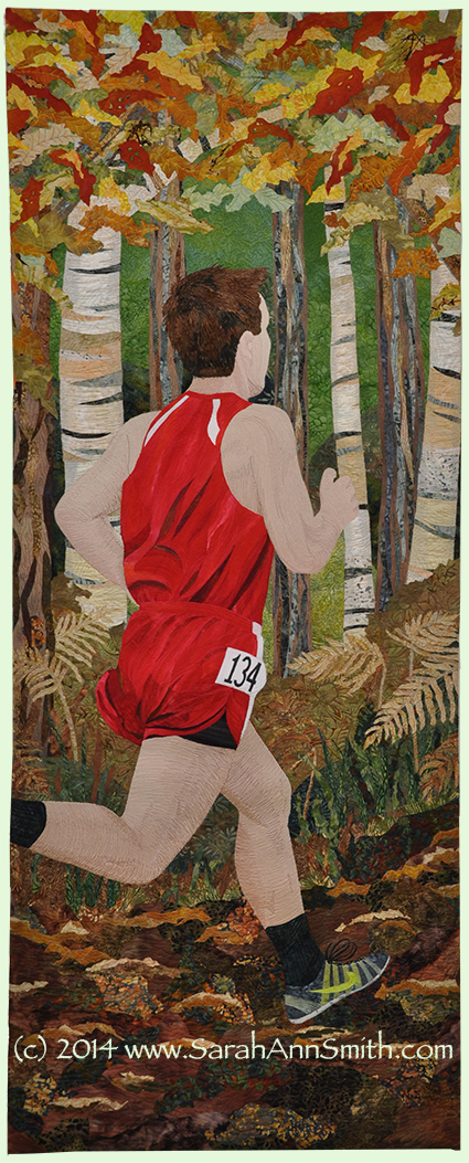
Eli, Cross Country 2014 (c) SarahAnnSmith.com

Eli, Cross Country 2014
(c) SarahAnnSmith.com

This year’s challenge was to make a 24″ wide by 60″ long art quilt to the theme of Reflections.  Curators Jamie Fingal and Leslie Tucker Jenison wrote:

A mirror image. A response to a thought or word. A memory. What glints back at us as we gaze upon the water. The throwing back by a body or surface of light, heat, or sound without absorbing it.  What will your reflection reveal about you?

For more information, visit their website, here.

For once in my life, I decided not to be literal.  Instead I thought about our sons.  Four years ago, for one of these exhibits, I made a portrait of Joshua playing his guitar.  Now, at the same age, I wanted to portray Eli, who is an honor student and star athlete.  Though his “first” sport is wrestling, it doesn’t really play well with a long and narrow format!  BUT, running does.  So I chose cross country season!

For my entry, I wrote something along these lines:  When I reflect on how fast time has passed by, I am nearly paralyzed.  Like me, Eli prefers to “Do,” not ponder.   At sixteen, he is literally and figuratively running headlong into his future.

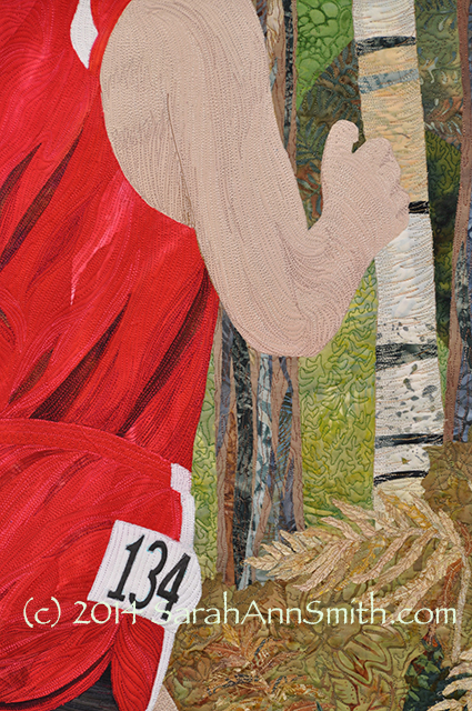
For this piece I dyed the red fabrics (same batch as those used for the amaryllis quilt–clever how I managed that one, eh?) and some of the ground and foliage fabrics.  The remainder are commercial batiks.  As usual, I have quilted it very closely.  I hope to share more details with you on that.  For now, here’s a detail photo.

Detail, Eli, Cross Country 2013. (C) 2014 SarahAnnSmith.com

Detail, Eli, Cross Country 2013.
(C) 2014 SarahAnnSmith.com