Well, it finally happened. Someone has made a couple quilts that look exactly as if the person saw my two quilts pictured here and copied them without permission. And she is calling them “original art” and protected by “her copyright.” Sigh. I asked her nicely to give credit, she refused (letter below and boy is it mean–letter removed under threat of legal action by the author), so have written to Etsy to request removal of the two “copy” quilts. Like I really wanted or needed this headache? So I decided to write this post to share what has happened to me so that both new and experienced artists might learn from what has happened. I would add that I totally *encourage* my students to use my patterns and make copies–that permission is given in the pattern. But these are my original art, not patterened, and may NOT be copied nor derivative works made. Read on!
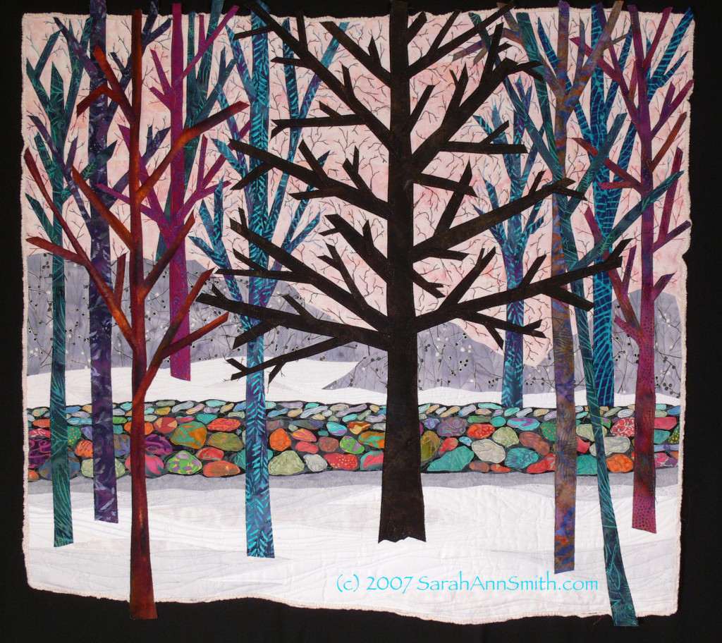
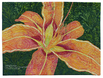
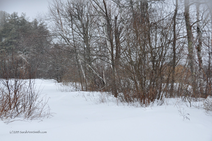
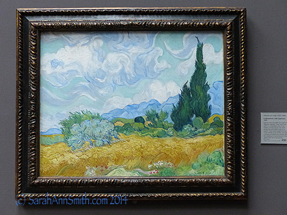
I made this quilt, A Sense of Place::The Wall, in late 2006/early 2007. It was published in 500 Art Quilts (ed. Karey Bresenhan, Lark Books), has been exhibited and is on my website and on my professional member gallery at SAQA.com
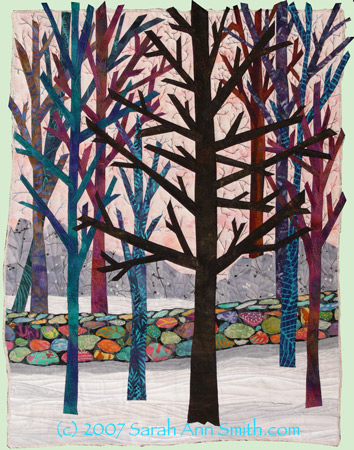
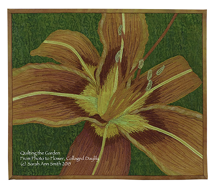
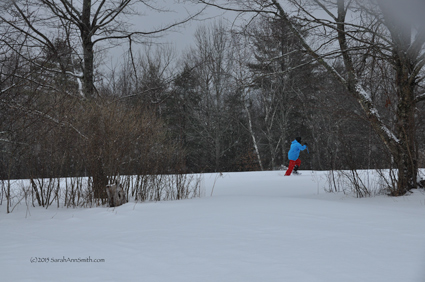
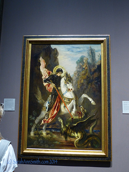
This is a companion piece, The Tree, which was in the FiberArt For a Cause cancer fundraiser (and sold on Gold Donor Day, thank you again K. McNeese!)
From the artist’s Etsy shop and website, it looks as though she is serious about starting a career in textile art (good for her), is working at it (ditto), but is still on the first part of the learning curve and hasn’t quite figured out what is “her.” That’s fine–all of us have been at that point! That’s how we learn.
QUICK UPDATE: both Etsy and Pinterest reviewed the person’s postings, my work, and have removed the two items that were problems. I have to give BIG kudos to Pinterest, which removed the pins of the two quilts in question in less than 3 hours! and to Etsy. Etsy responded so kindly — really impressed. End of Update. Moving on!
This kerfuffle started on Sunday evening when I received an email from someone I know by name and have met once, briefly, in person. She wrote to tell me she had seen a piece that she thought looked just like mine and the artist in question had them for sale on Etsy. After checking out the Etsy shop and the artist’s website, I then wrote to said artist and offered to let her continue to sell these works as long as she removed the “original art” and copyright notices since they appear to be clearly derivative of my work and credit me with the original design (and link to my website). I’ll post my letter to her in at the end of this post, then her reply to me below that, but I will NOT publish her name, Etsy shop or website here. I SO wish I could share a link to her Etsy and Website because you’d see clearly why I feel the works, while not identical, are so clearly derivative (and yes, I have screen shots of her Etsy and web pages on my computer in case she decides to get litigious). Once you read her letter, you’ll understand why–talk about vicious. Sheesh. Anyway, I feel fine publishing the content of the email because it was sent to me, and is therefore for me to do with as I see fit despite her request that I not go public with it (why? wonder if she realizes how bad it makes her look?). Unfortunately, she declined my offer that could have solved this whole mess. I don’t know how I could have been any more gracious or helpful while still defending my own rights politely but firmly.
The artist, in her reply to my inquiry to her (through her website), was very angry, spoke about synchronicity (when two people in different places do the same sort of thing at the same time) and more. I agree that synchronicity happens, but in this case the two pieces I found are so similar to mine which were made years earlier than hers: colors, composition, subject matter (trees in winter), down to a wall of colorful stones fused onto black, a wall that extends across from one side to the other, that it defies credulity that this could be synchronicity. Are winter scenes of trees with bare branches in snow common? Sure! Am I the only one who plays with a colorful palette? Of course not! But all of those things, down to the stone wall constructed in an identical manner? Nope. I’m not buying that one. It is entirely possible she saw my quilt in the 500 Art Quilts book and was not aware that it was in her mind when she made her pieces. But to say the similarity is synchronicity strains credulity beyond the breaking point.
There is a ton of stuff on the internet about copyright law in general and US copyright law specifically. And I am NOT a lawyer. But I do know that I and anyone I know who has seen her works and mine have immediately seen that her works **appear to be** a blatant copy. I’m OK with people copying provided they do so with permission (she did not ask or have that), such as my students and people who purchase my patterns, and they respect the original artist and her legal rights. In fact, I asked a few folks I know (some who know my work well, one who doesn’t) to make sure they see her Etsy listing to corroborate my version of events and tell me that they feel the works are copies–not identical but clearly copies. The artist –in her letter to me below (NOTE: letter removed due to thread of legal action by the author)– even said perhaps I copied her and noted that she made her pieces “a few years ago.” Mine were made in late 2006, years before “a few years ago,” and the copyright statement on her Etsy listing says copyright 2013-2015. Clearly I could not have copied what she made years later. Whether she copied intentionally or unwittingly is not the point; she simply refused to acknowledge that her works are derivative.
Tuesday I wrote to Etsy to ask them to remove the two items in question since clearly the person who made them has furiously rejected my offer (see below) and won’t make things right on her own. I don’t know what will come of it, but I am pleased to say that within two hours of hitting “send” on my email to the Etsy legal department I had an initial response. I’ll post later with whatever transpires.
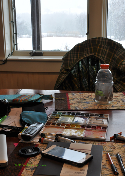
LESSON: watermark EVERYTHING.
LESSON: Go through the hassle of learning technology. Just this past few weeks, in an online Photography class with Ricky Tims, I’ve learned how to embed my copyright information in photos, so henceforward all photos I post will have the copyright in the digital metadata.
LESSON: Nothing will keep people from copying, or help those who don’t wish to listen or understand that what they have done is wrong.
LESSON: You just gotta keep making your art and move on. But you DO need to speak up, loudly, and defend your work and your rights. So that’s what I’m doing.
LESSON: For those of you new to art and art quilting, learn. Learn all that you can. Copy if you need to do so to learn, but be respectful. And learn about copyright. There are links below in my letter to the artist that take you to the source (for those of us in the US): the US Copyright Office.
LESSON: Document everything. The fact that I blogged about these quilts in 2007 helps. The fact that the metadata (digital encoding) on my photo files shows they were taken in late January 2007 helps. I keep all my working drawings, patternings and notes in a manila envelope for each quilt, dated and tucked into a file cabinet. Glad I do! These two quilts were more spontaneous, but I do have the blog and photo info.
LESSON: If something happens and one is as upset as this person clearly is in her letter below, perhaps one should stop and wonder WHY. Perhaps she deep down realizes that the similarity is more than accidental and is upset that she has been caught out and called on it? Who knows?
LESSON: There are good people out there who alerted me to this. We take care of each other.
So if you’re up for reading even more of this stuff, my letter is below, followed by her response. I leave you to draw your own conclusions. Her words speak very loudly, but they may not be saying what she hopes. They do say a lot about her. It’s a shame, because she is clearly working hard and diligently at something she loves. I hope she will learn from her mistake, and also learn that this is a small community and word gets around. Again, I will NOT share her name.
My letter to her and her reply (with identifying information removed) are quoted below in their entirety.
On Mon, Mar 2, 2015 at 8:57 AM, Sarah Ann Smith <my email removed to nix more spam> wrote:
From: Sarah Ann Smith <my email removed to nix more spam>
To ARTIST
Subject: HerWEBSITE Contact Form
Message Body:
Hi NAME! Welcome to the world of art quilting! I stumbled across your Etsy listing of a couple quilts, the XXX-NAME-XXX series, that look exactly like copies of my A Sense of Place: The Wall and A Sense of Place: The Tree works. Hmmm… not good! Especially since you are claiming copyright to these as original works when they are clearly derivative of my copyrighted original works.
I’m not about to be a big bad meanie. I understand that you are somewhat new to art quilts and perhaps don’t understand copyright, copyright law, and some of the nuances because, frankly, it is somewhat complicated. I’ll add a few hotlinks to US government sites that explain it at the end of this message.
Someone who saw your work immediately recognized the pieces as a take-off of my work, so it is clear that you were inspired by my work. THANK YOU for liking it so much you wanted to copy these pieces. We all learn by copying those who came before us. However, to be blunt, it is not right for you to state that your SERIES NAME pieces are original artworks and subject to your copyright. In fact, that is illegal (check those links at the end of this message). In asserting such a claim you are in fact infringing on my copyright on my original artwork, created in 2004.
Because you are just starting out and probably do not understand fully how copyright works (for example, changing something 10 percent is a fallacy, copyright is still copyright), I am willing to let you display these works on your website and sell the existing works if, and only if in any place where they are published (including your website and Etsy shop), you remove the statement that they are original and copyrighted by you , and add a statement that they are “based on original artwork by Sarah Ann Smith at www.SarahAnnSmith.com” and that I have “given NAME permission to sell these three works only.” Further, you may not make any further works based on my artwork. I know each piece takes a lot of time, and respect your right to earn a living. But I also need to protect my own ability to make a living from my art.
Here are three hotlinks that may help you understand copyright:
http://www.copyright.gov/
http://copyright.gov/help/faq/index.html
http://www.cendi.gov/publications/04-8copyright.html
This link http://copyright.gov/circs/circ01.pdf talks about Copyright Basics and is quite helpful. It says in part “Section 106 of the 1976 Copyright Act generally gives the owner of copyright the exclusiveright to do and to authorize others to do the following:
• reproduce the work in copies or phonorecords
• prepare derivative works based upon the works”
Your quilts fall into the “derivative works,” and are therefore not legal. As I said, I’m willing to let you sell these, as long as you remove the statement that they are original to you and add a statement that they are based on my work, with a link to my website. These statements need to appear any place on the web or in a gallery/craft show/shop, wherever, that you display or sell your NAME OF SERIES pieces.
Your work is lovely, you clearly love color and fabric as much as I do. I’d like to encourage you to keep learning and listen to your own muse. No one can make YOUR art as well as YOU do. Copying is a good way to learn, but making your own original art is even better.
I’ll check your website to make sure you have complied. Thank you for attending to this promptly! We’ve all got better stuff to do –like make art– than deal with copyright violations! Cheers, Sarah Ann Smith.
This e-mail was sent from Artist’s WEBSITE
And here is her astonishingly virulent reply to me, in its entirety, but I have removed names ( it’ll be obvious where):
LETTER REMOVED, 3:37 pm March 13, 2015 under thread of legal action by the author.
And back to me:
Enough said! I find it curious that she refused to even go look at my works, since she would have seen the similarity instantly. Maybe she didn’t want to know the truth??? At coffee with my BFF yesterday, I showed her the other person’s pieces on my phone, and (because they were little on the phone screen) my BFF at first thought they were mine! How clear is that? Anyway, let’s hope Etsy does the right thing. I am sure the artist will not remove one that is on her website, but frankly that one is simple a generic winter scene and doesn’t have the stone wall, so it doesn’t bother me. It’s the two on Etsy that are clearly deriative. Now, on to more fun things to do with my life!