email Youtube

Home
Galleries
Blog
Workshops & Calendar
Store
Resources
About
Contact

Archive for the ‘Art’ Category

Descended from the Stars, Part 3

Wednesday, July 22nd, 2015

Good news:  it looks like there will be an article on this quilt!  Bad news:  that means I won’t be sharing quite as much here out of respect for the magazine.   But here is a lot, and I’ll tell you when the article is out!


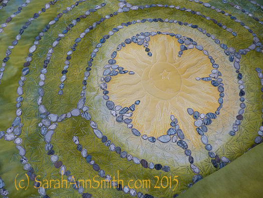
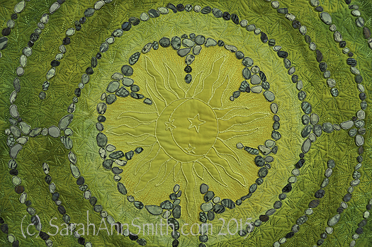
The sun in the center of Descended From the Stars

The sun in the center of Descended From the Stars

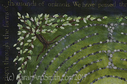
When I left on in my last post about this quilt, I had shared the dyeing process and the stones and lettering.   Next, I fused trees in the four seasons into the corners.  I distorted the shape so the tree canopy served as a frame.  I had thought initially I might need an inner border, perhaps couched yarn or stitching of some sort, but the shape of the tree worked so well I didn’t need anything extra.

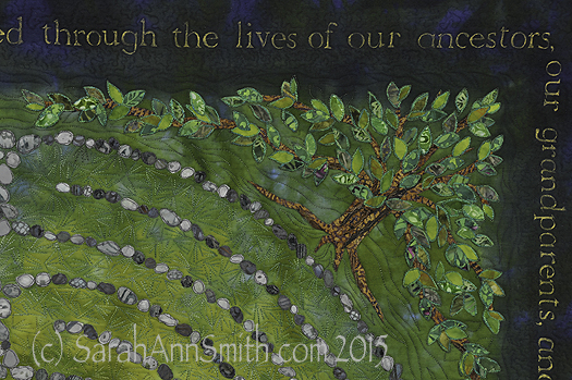
Detail, upper left corner, Spring Tree of Life.

Detail, upper left corner, Spring Tree of Life.  Each of the leaves is free-motion stitched with several rounds of thread on each leaf.  The nice part about doing this at the top stage is that I could use the scissors on my Janome 15000.  I didn’t have to bury thread tails!

Detail, top right, Summer Tree of Life.

Detail, top right, Summer Tree of Life.

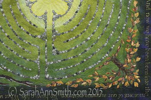
Detail of the lower right corner, showing the autumn tree of life.

Detail of the lower right corner, showing the autumn tree of life.

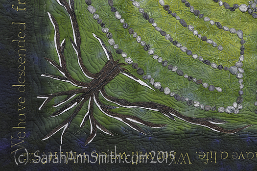
Detail of the lower left corner, with the winter tree kissed by snow.

Detail of the lower left corner, with the winter tree kissed by snow.

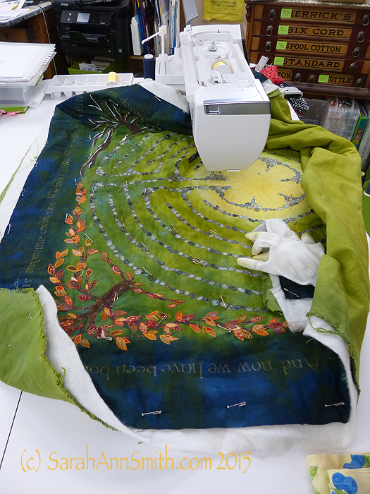
You can see my work (on a glorious Janome 15000) as I am quilting around on the stones and leaves.

Here

Here I have begun quilting.  You can see the custom-dyed cotton duck on the back.

Next,

asdfa

Superior Threads (Thank you Bob and Heather Purcell!) has come out with some tone-on-tone variegated threads.   I have been pestering Bob for YEARS to make threads like these as I prefer blendy to contrasty.  I ordered up all of the new earth-tone blendy variegateds in the Fantastico line and used them.

At last, it was nearly DONE!  Time for facings, sleeve and label.

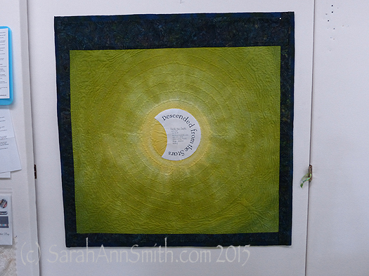
The back side of the quilt.  By dyeing the back to correspond with the front, the quilting design shows up on the back as it does on the front.

The back side of the quilt. By dyeing the back to correspond with the front, the quilting design shows up on the back as it does on the front.

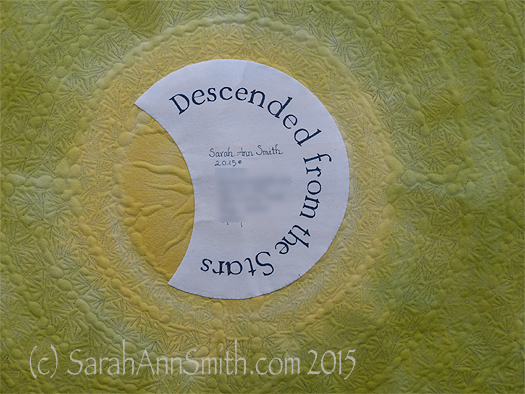
And I couldn’t resist the temptation to place a moon behind the sun as my label.  One more time with the dip pen!

The End--the label is on, the sleeve is done, the facings are stitched!

The End–the label is on, the sleeve is done, the facings are stitched!

(c)Sarah Ann Smith 2015; quote (c) Mirza Khan, used with permission

(c)Sarah Ann Smith 2015; quote (c) Mirza Khan, used with permission

This quilt will be for sale–another reason I opted to not include a lot of personal details in the quilt.   As I said before, I am happy!


Foto Friday on Monday, because I forgot LOL!

Monday, July 20th, 2015

So I forgot to post a photo on my Foto Friday (and just my second week of doing this…erk!).  Except I just checked and I skipped an extra week.  SHRIEK!  OK…so today you get TWO fotos!

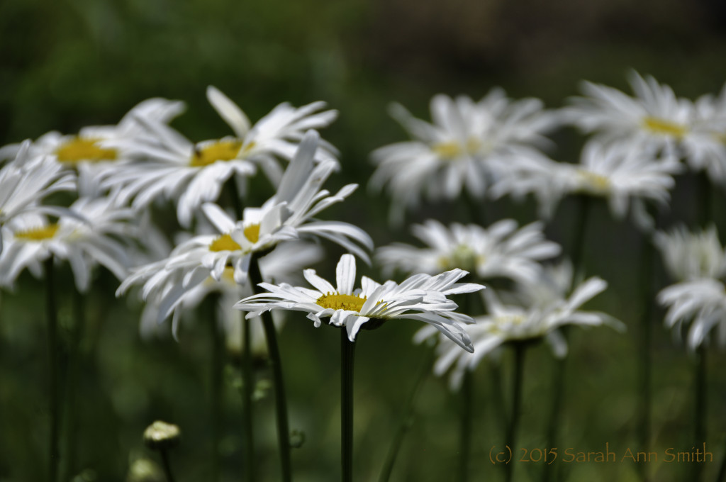
This past week's challenge was Macro/Flowers.  I don't have a Macro lens, so I just did flowers.  I deliberately focused on the one flower, blurring out the rest to create a focal point. Adjustment to levels, highlight.  That’s all folks!

This past week’s challenge was Macro/Flowers. I don’t have a Macro lens, so I just did flowers. I deliberately focused on the one flower, blurring out the rest to create a focal point. Adjustment to levels, highlight. That’s all folks!

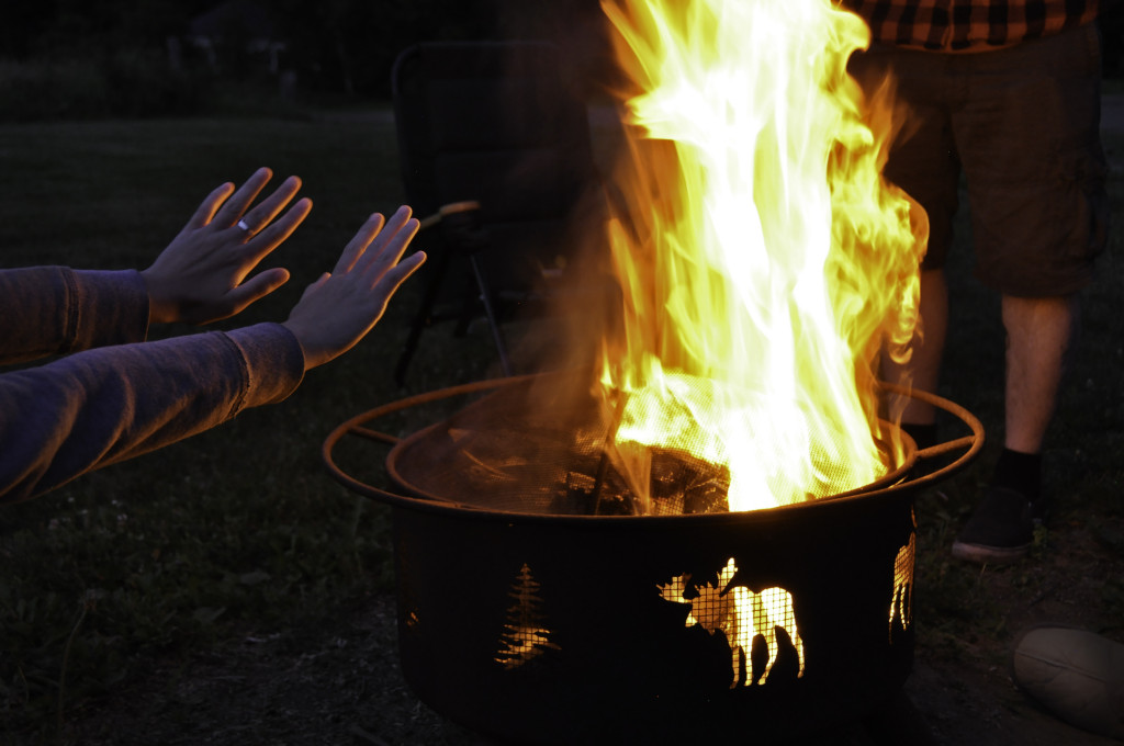
And from the previous week, the theme was Celebration.   We had a lovely quiet Fourth of July, and I was touched that Joshua and Ashley wanted to come spend time with us.  And I gotta get Joshua to teach me how he got a burger that is both well done and juicy!

As soon as the theme was announced, I knew I would celebrate family when the few of us (just five!) gathered on the Fourth.  I like the triangular composition and the fact that three of my four family members (well, of the humans) are in this shot, even if hubby’s slipper is barely in the lower right corner!  Used dodge to darken corners, lasso and content aware fill to eliminate the white tag on the chair behind the firepit, a distracting glint of light on the chair leg, and a streak from a rising ember that just looked off.   Given how dark it was and that this was hand-held, I’m glad it turned out so well.

As soon as the theme was announced, I knew I would celebrate family when the few of us (just five!) gathered on the Fourth. I like the triangular composition and the fact that three of my four family members (well, of the humans) are in this shot, even if hubby’s slipper is barely in the lower right corner!
Used dodge to darken corners, lasso and content aware fill to eliminate the white tag on the chair behind the firepit, a distracting glint of light on the chair leg, and a streak from a rising ember that just looked off. Given how dark it was and that this was hand-held, I’m glad it turned out so well.

I am just too dang busy, but I’m sure having fun and learning!  My yard and house are a mess, but so what.  As the saying goes, I’ll be buried under 6 feet of dust, I’ll deal with it then!

Out of the Blue at the Whistler House Museum of Art

Friday, July 17th, 2015

Well that was FUN!  Got home yesterday from errands, gathered up the mail from the box, and found this in the pile!

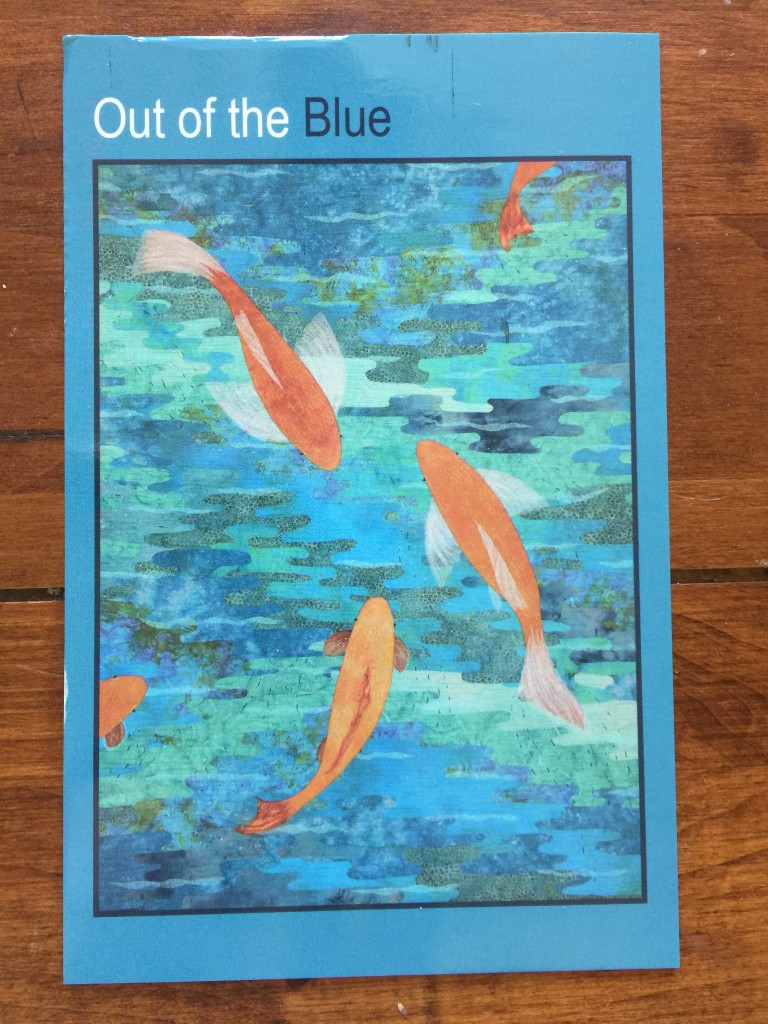
Publicity card for the Out of the Blue exhibit at the Whistler House Museum of Art in Lowell, Mass.  Yep, that's MY quilt!  SQUEEE!

Publicity card for the Out of the Blue exhibit at the Whistler House Museum of Art in Lowell, Mass. Yep, that’s MY quilt! SQUEEE!

I just checked, and apparently I forgot to announce here (as opposed to over on Facebook) that TWO of my works have been accepted into the Out of the Blue art quilt exhibit this summer at the Whistler House Museum of Art.  (If you click on that link you’ll see a thumbnail of my quilt; click on that for more information.) Yes, that Whistler, James McNeill Whistler, the one who painted Arrangement in Gray and Black, No. 1, better known as “Whistler’s Mother.”  Can you say GIDDY!   When I first moved to Maine, I learned about the Lowell Quilt Festival and the exhibits in town at the Whistler and the Brush Gallery.  So I went and thought:  I’ll know I’m making it if I can ever get in there.   Well, early this summer (I had signed up eons ago to be on the email list) I received a call for entry.  I thought:  why not!   All I can do is send the entry fee, and it will support art quilts no matter what.  Imagine my delight when I got in!

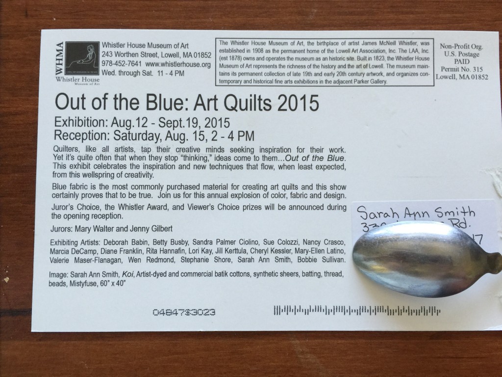
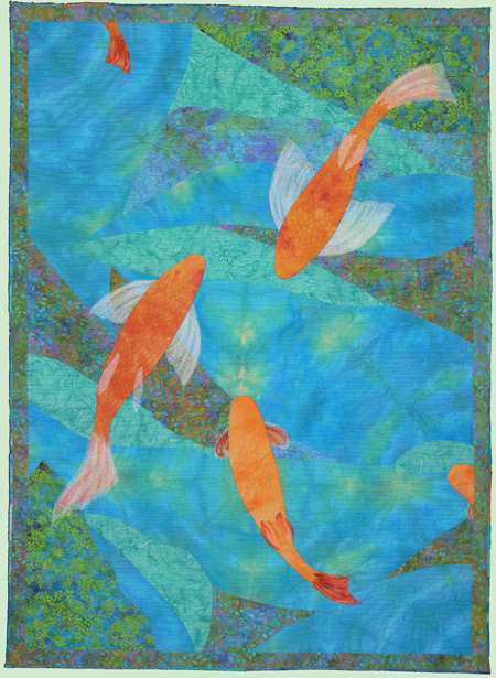
Yep, my art quilt Koi is the publicity image for a museum show!  My self-portrait “Clothed in Color” is also in the exhibit.  Here’s the back side of the card (minus my home address because this is the internet):

The exhibit will be open Aug. 12 to Sept. 19th of this year.  The Reception is Saturday, Aug. 15th from 2-4.

The exhibit will be open Aug. 12 to Sept. 19th of this year. The Reception is Saturday, Aug. 15th from 2-4. I love that they included the materials, including MistyFuse! 

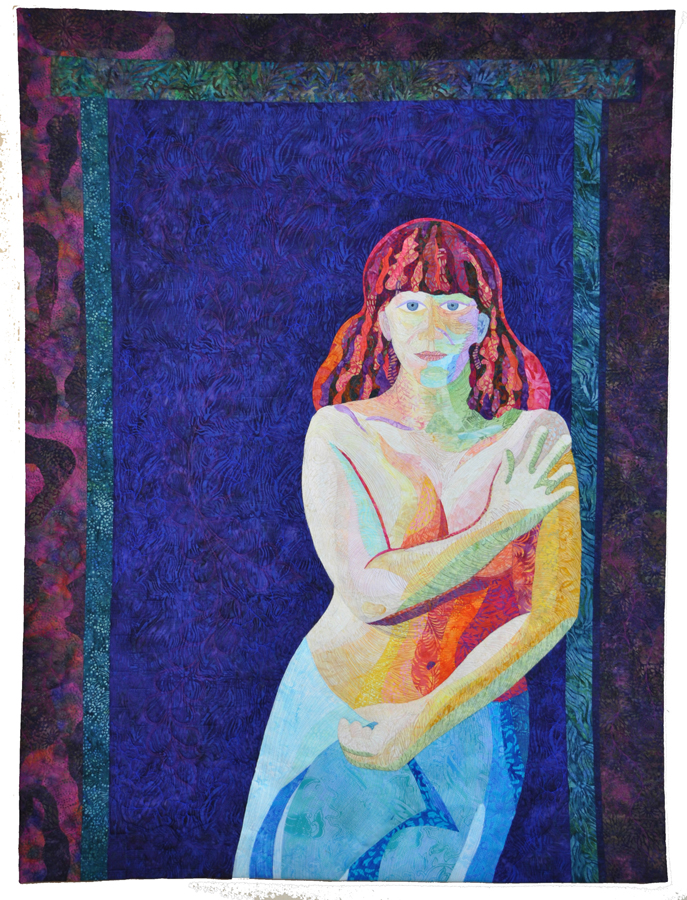
And here is Clothed in Color:

A self-portrait --hmm.... just occurs to me there is some symmetry of a sort here, as Whistler is famous for his portraits--

A self-portrait –hmm…. just occurs to me there is some symmetry of a sort here, as Whistler is famous for his portraits– anyway, a self-portrait in no natural colors (well, other than the blue of my eyes, but my eyes are a bit more blue gray than blue….)

That weekend is also the Mancuso show in Manchester, NH.  It will be a VERY LONG day, but I’m thinking I will try to drive to Manchester (several hours away), spend a couple hours at the Mancuso show, then about 1 pm get on the road to Lowell to arrive shortly after 2 for the reception, then begin the trek home (about 4 1/2 – 5 hours).

Congratulations to the other artists in the ehxibit–I hope to see  some of you there!  And thank you to the jurors for accepting my works and to all those involved in the decision to select the publicity image!

And to round things up, here is the back side of Koi!

Koi is actually a two-sided quilt.  This photo was taken before adding the hanging sleeve to the top of the back (imagine lying on the bottom of the koi pond looking up at the fish bellies and the trees above)

Koi is actually a two-sided quilt. This photo was taken before adding the hanging sleeve to the top of the back (imagine lying on the bottom of the koi pond looking up at the fish bellies and the trees above).  I made the top facing so that if anyone were to purchase it and wanted to hang it so you could see both sides, you can insert a metal slat and have it hidden.  Then I had to add the requisite 4″ hanging sleeve for standard display.


Descended From the Stars, Part 2

Saturday, July 11th, 2015
(c)Sarah Ann Smith 2015; quote (c) Mirza Khan, used with permission

(c)Sarah Ann Smith 2015; quote (c) Mirza Khan, used with permission

In my last post I shared my most recent work and the good news that Descended From the Stars has been juried in to Affinity, the 2015 Dinner@8 exhibit which will premiere in Houston.  Today I thought I’d share how it began.
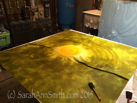
It began with an idea and Procion MX dyes.....and a pyrex pie plate (yes, dedicated to dye only use for safety) in the center

It began with an idea and Procion MX dyes…..and a pyrex pie plate (yes, dedicated to dye only use for safety) in the center.  Here is the first round of dyeing, with the pie plate to elevate the yellow center and prevent tendrils of green from sneaking in to my sun.

When my sons were little they attended Children’s House Montessori School in Friday Harbor, Washington.  The teacher asked me to dye a (GULP) hand-tatted doily of her grandmothers.  Made in natural cotton color, she wanted it yellow because it looked like a sun.  When a child had a birthday, she would place the doily on the floor, and the child would walk around the “sun” once for each year of their young lives:  four circles for four years.

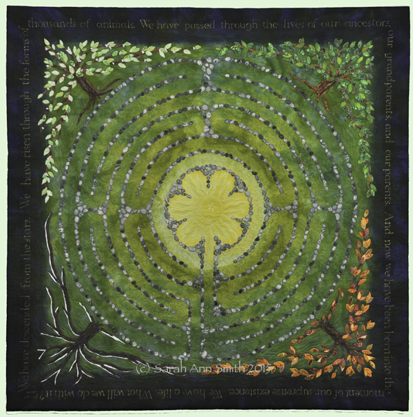
I then thought about a labyrinth.  What is life but a labyrinth?  It  twists and turns, going around the center/sun, in the same place but not really, through the changing seasons.  That led to thinking about the tree of life.  Finally, I wanted to include Mirza Khan’s quote (see previous blogpost, here) in the deep blue of the heavens.

I knew I would never find fabric like I wanted, so out came the PFD (Prepared For Dyeing) cloth and the dyes and my color “bibles” from classes with Carol Soderlund (her website has info) to figure out which pure dyes I needed to get the colors I wanted.  The photo above shows the yellow and green.  The next photo shows when I added the deep blue to darken the edges.   I ended up doing a second dyeing to get the deep, deep dark blue on the edge.
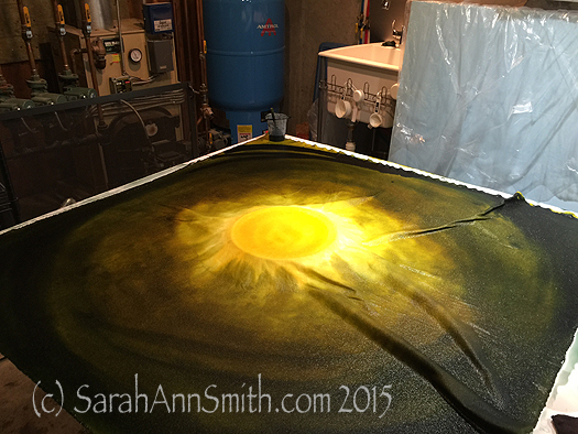
Deep navy is brushed on to the fabric to provide a gradation of color from pale in the center to deep dark on the edges.

Deep navy is brushed on to the fabric to provide a gradation of color from pale in the center to deep dark on the edges.

Once dyeing was complete, I enlarged a labyrinth design onto paper, then transferred that onto my dyed top.  Then I spent several episodes of DVR’d MasterPiece Theatre cutting out stones from batiks pre-fused with Mistyfuse.   I used an old ice cube tray, putting one type of stone (cloth) into a cup.  That way I could choose fabrics to be sure I got a fairly random patterning.
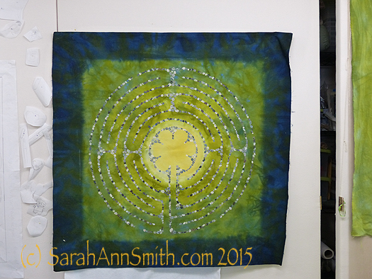
asdkfjs;

You can see a faint white chalk line on the edge of the green/blue that gave me my center square.  On the left, you can see an idea that didn’t work out.  Initially I planned to applique items onto the labyrinth that represented important phases in my life.  But once the quilt took shape, I realized that would simply be too much clutter!

Next came the lettering, which was done with a dip pen and Liquitex acrylic Ink! in gold.  I figured out how large I wanted the lettering to be (counted all the letters in the quote, divided by four to see where I would need to break at corners, etc.) and after a second try, got the size correct.
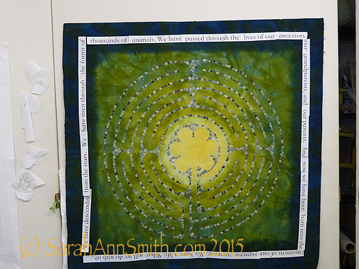
Here I have pinned the text, printed onto paper and cut apart, to see if it will fit.  It does (on the second attempt).

Here I have pinned the text, printed onto paper and cut apart, to see if it will fit. It does (on the second attempt).  I chose a font I liked since I more or less copied the font in my lettering.

I chalked in guide lines:  top, bottom, top of lower case, like on a second grader’s paper.  I find that as you go along, large writing tends to want to get small and closer to normal size writing, so I needed the guidelines.  I used the SewLine ceramic chalk mechanical pencils, then erased the lines when done.  I covered the outer edge of the cloth with the text strips (seen above) immediately above where they needed to go so I could also keep my spacing consistent and accurate.  I placed freezer paper underneath in case I had any blobs.  Sigh.  My first blob happened on my second letter!  But I was able to fix it (used a little of the blue acrylic ink after scraping up the blob and that made it look like part of the dye patterning!) and learned to be more careful.  It took a few hours for each side, so I only did one side on any given day.
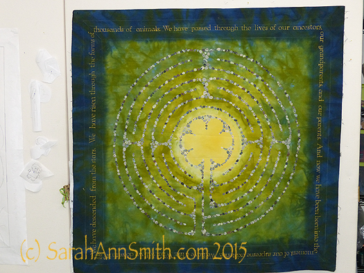
The lettering is done!  next, on to the trees.

The lettering is done! next, on to the trees.  You can see the chalk guidelines in this photo.

And yes, I did have a practice piece!
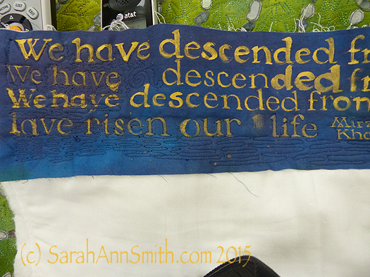
It's quilted in this photo, but I had a scrap of blue fabric and tried various ways to write, from a chisel brush to the dip pen and crow-quill (metal) nib that I ended up using because it gave the crisp look I wanted.

It’s quilted in this photo, but I had a scrap of blue fabric and tried various ways to write, from a chisel brush to the dip pen and crow-quill (metal) nib that I ended up using because it gave the crisp look I wanted.

In the next post, I’ll show the trees and quilting.
 

Descended from the Stars, Part 1

Wednesday, July 8th, 2015

I’m thrilled to be able to share my most recent major work along with the news that Descended From the Stars has been juried in to this year’s Dinner@8 exhibit, Affinity, which will debut at International Quilt Festival 2015 in Houston, Texas, this coming October.

(c)Sarah Ann Smith 2015; quote (c) Mirza Khan, used with permission

(c)Sarah Ann Smith 2015; quote (c) Mirza Khan, used with permission.  Click to open slightly larger.

You can find more about the exhibit and the other artists here.  I am blushing to find myself in such company, and humbled to be in this exhibit for my sixth consecutive year.

The theme is Affinity, and the call for entry reads:

I am the garden that I plant.
I have…a natural liking for or attraction to a person, thing, or idea.
I am all the books that I have read.
I have….. A close resemblance or connection to someone or some thing.
I am the places that I have been
I have…. An agreement with someone.
I am the people that I love to be near
I have…a relationship or ties to another individual.
I am the sum of my life experiences.
“Affinity”.
Months before hearing the new theme and call for entry, I had received an email from my high school, San Domenico, with a Lenten message.  This particular day’s message didn’t have an attribution as did the other quotations, so I wrote to Religious Studies director Mirza Khan (after googling the words) and learned he had written the text.  I asked and received permission to use them in an art quilt.  When I heard the call for entry, at a dinner with other Dinner@8 artists in Houston last year, I immediately thought of the quote and felt as if the theme were about identity. Here are Mirza’s words:

ONE LIFE

We have descended from the stars.   We have risen through the forms of thousands of animals. We have passed through the lives of our ancestors, our grandparents, and our parents.  And now we have been born into the moment of our supreme existence. We have a life. What will we do with it?

Mirza Kahn

San Domenico

Here are two detail shots of my quilt.  In my next two posts I’ll share more about my process and thinking as I made this piece.  All I can say is that I am REALLY HAPPY with it!
Detail of the lower right corner, showing the autumn tree of life.

Detail of the lower right corner, showing the autumn tree of life.

Detail of the lower left corner, with the winter tree kissed by snow.

Detail of the lower left corner, with the winter tree kissed by snow.