So the week got away from me! Eli has the first official Cross Country meet of the season, and I’ve been working on assorted projects and, well, the week got away from me! The theme for the previous week in Ricky Tims’ 52 Week Photo Challenge was the Power of One. I think mine is more the power of Red, but it’s the best I came up with. Next week’s assignment is Do Over, so I will try either silhouette or Power of One again…… (and sorry, but the reminder that all photos and imagery are (c) Sarah Ann Smith…I forgot to watermark these). Right click on photos to view larger.
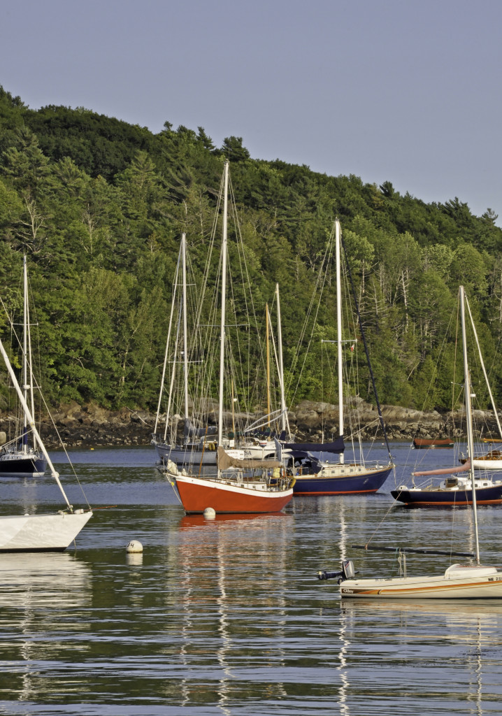
This was my class entry. Adjustments to decrease both shadows and highlight (just a little—too much on hightlights makes a bizarre halo on the treeline!), only 3 on vibrance. Smart sharpen.
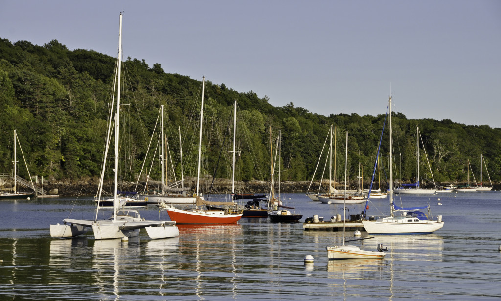
I took the same photo as a horizontal, which is more typical for shoreline shots, but I liked the emphasis on the masts and reflections in the one above better which is why I chose to submit that one.
Slight adjustment to increase constrast and lower highlights. Smart sharpen. Cropped to eliminate excess sky and water (and the tippy tops of some rocks on the bottom).
And a few more options I considered:

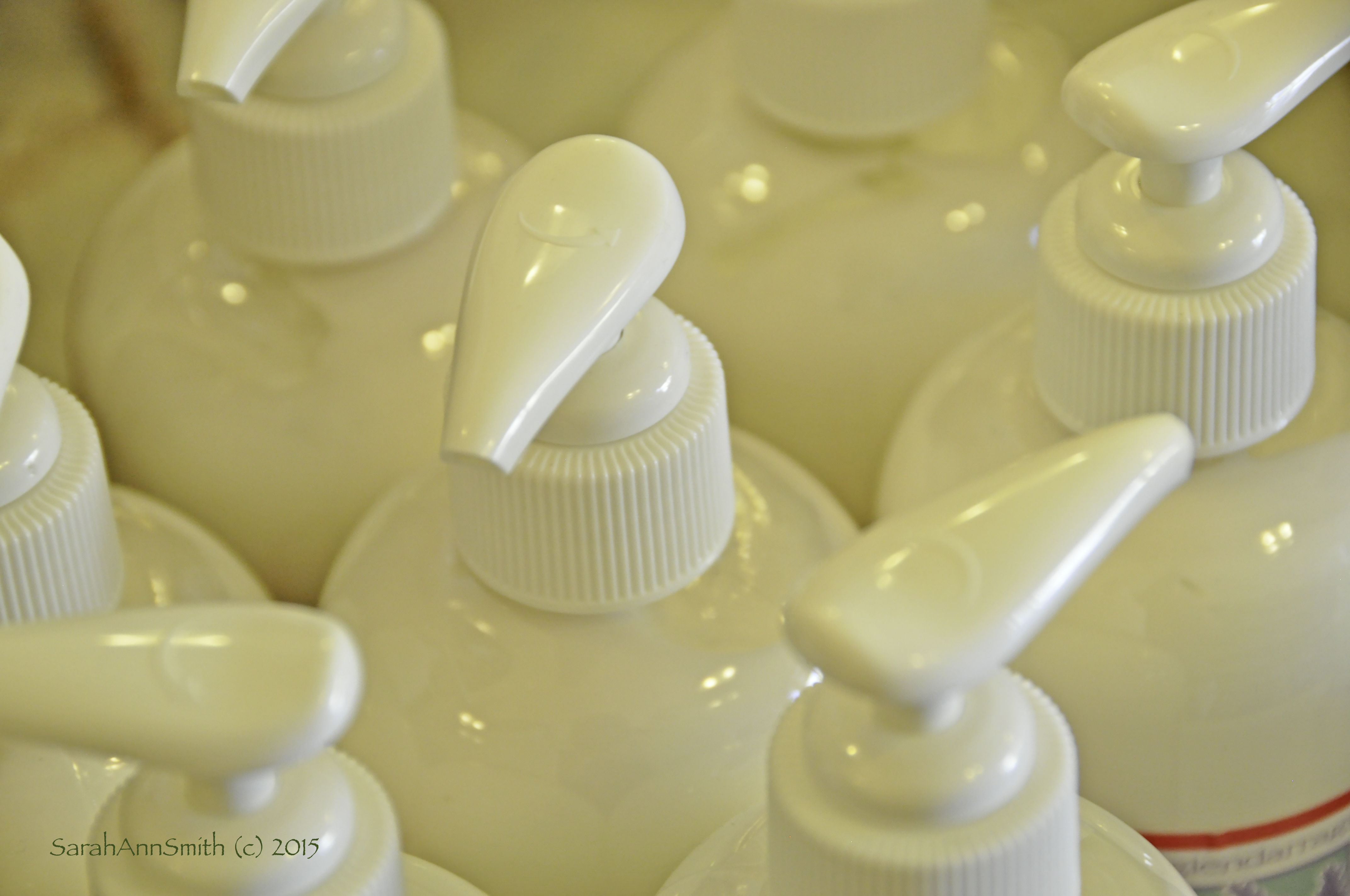
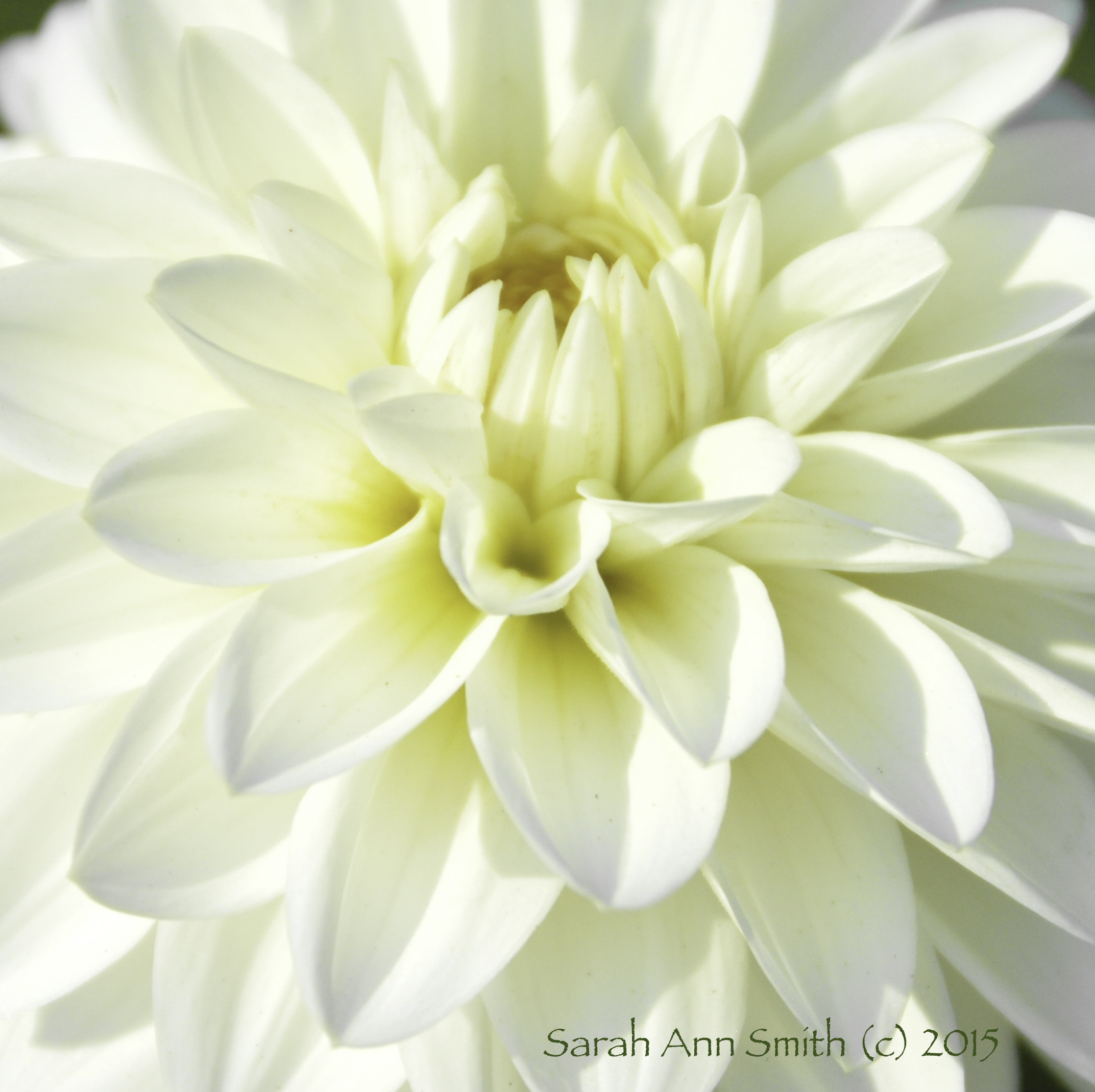
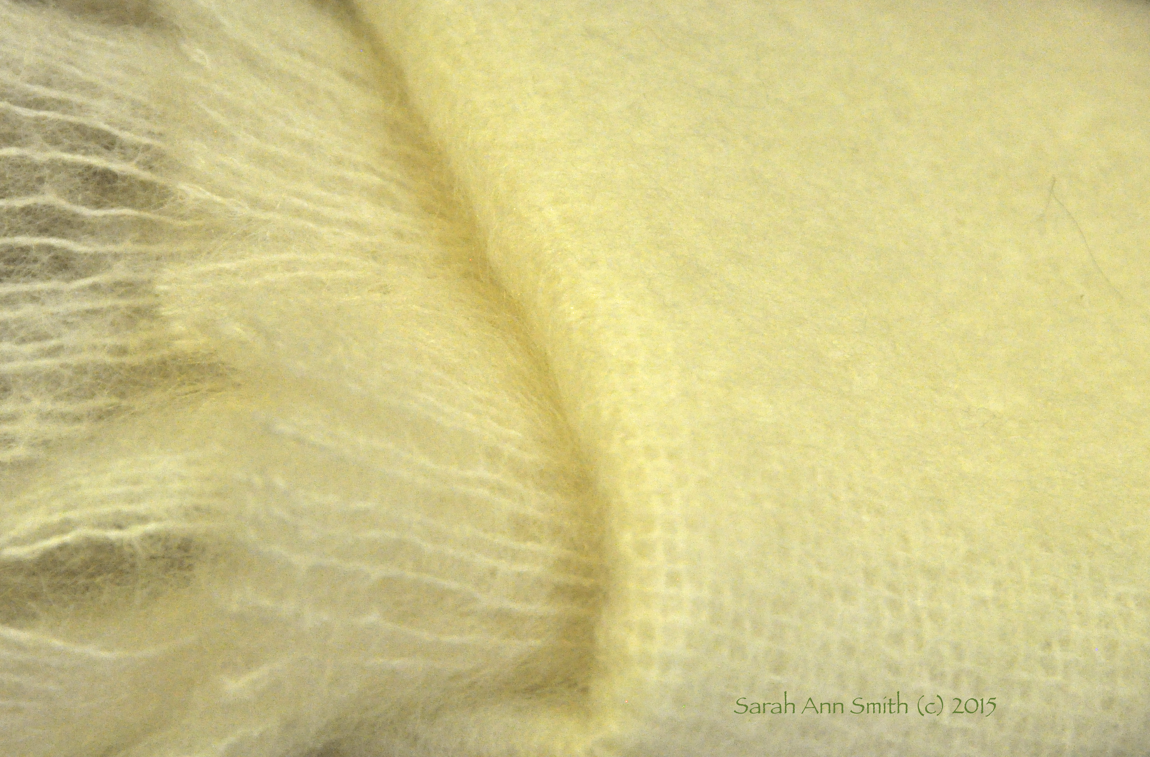
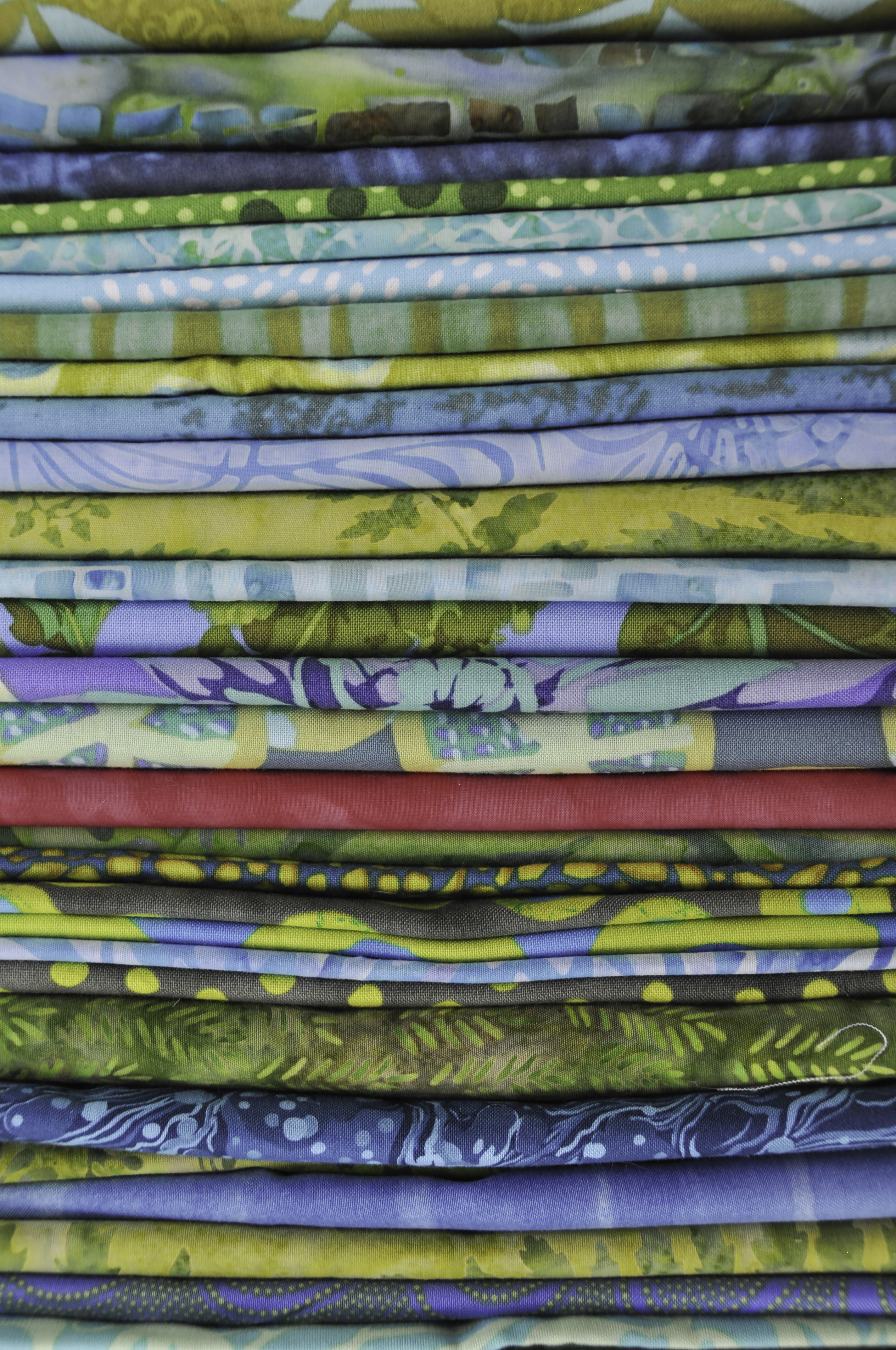
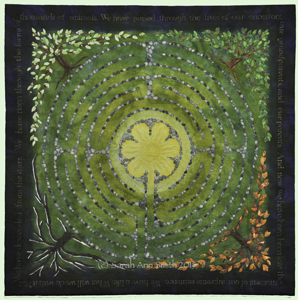
Of course I had to do one that was quilty! This is part of my stash for a thousand pyramids quilt I hope to make. The quilt on our bed is over 10 years old and is really starting to look it! Smart Sharpen, adjustment to red layer to make the “one” more accurate. Digital cameras mess with reds!
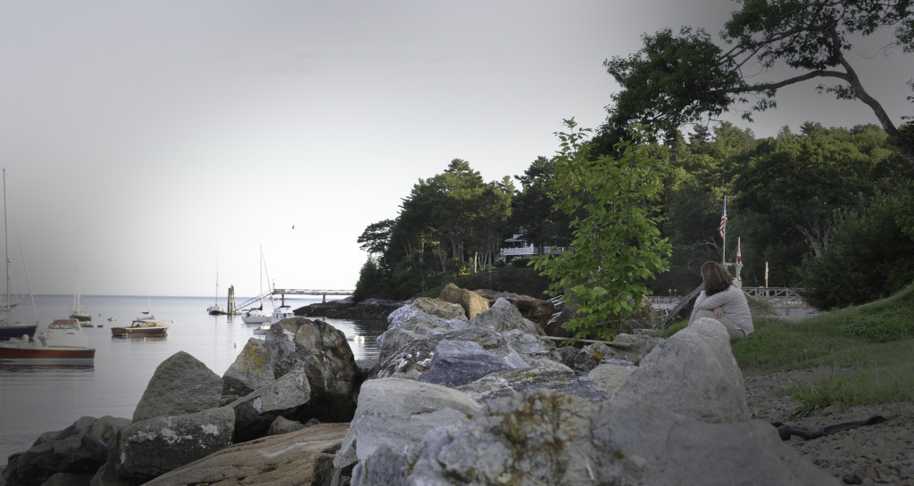
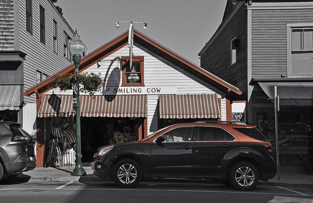
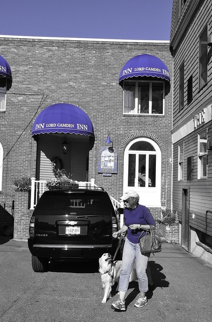
I need to review our lessons. Tried to do a vignette, but had to resort to using the dodge tool on the corners. Wasn’t able to highlight the woman without making it look forced. If I had used selective focus, with her sharp and the rest blurred, that would have created a stronger focal point, but I wanted the idea of her looking out on the harbor. Perhaps I should have moved up hill…….learning, learning!

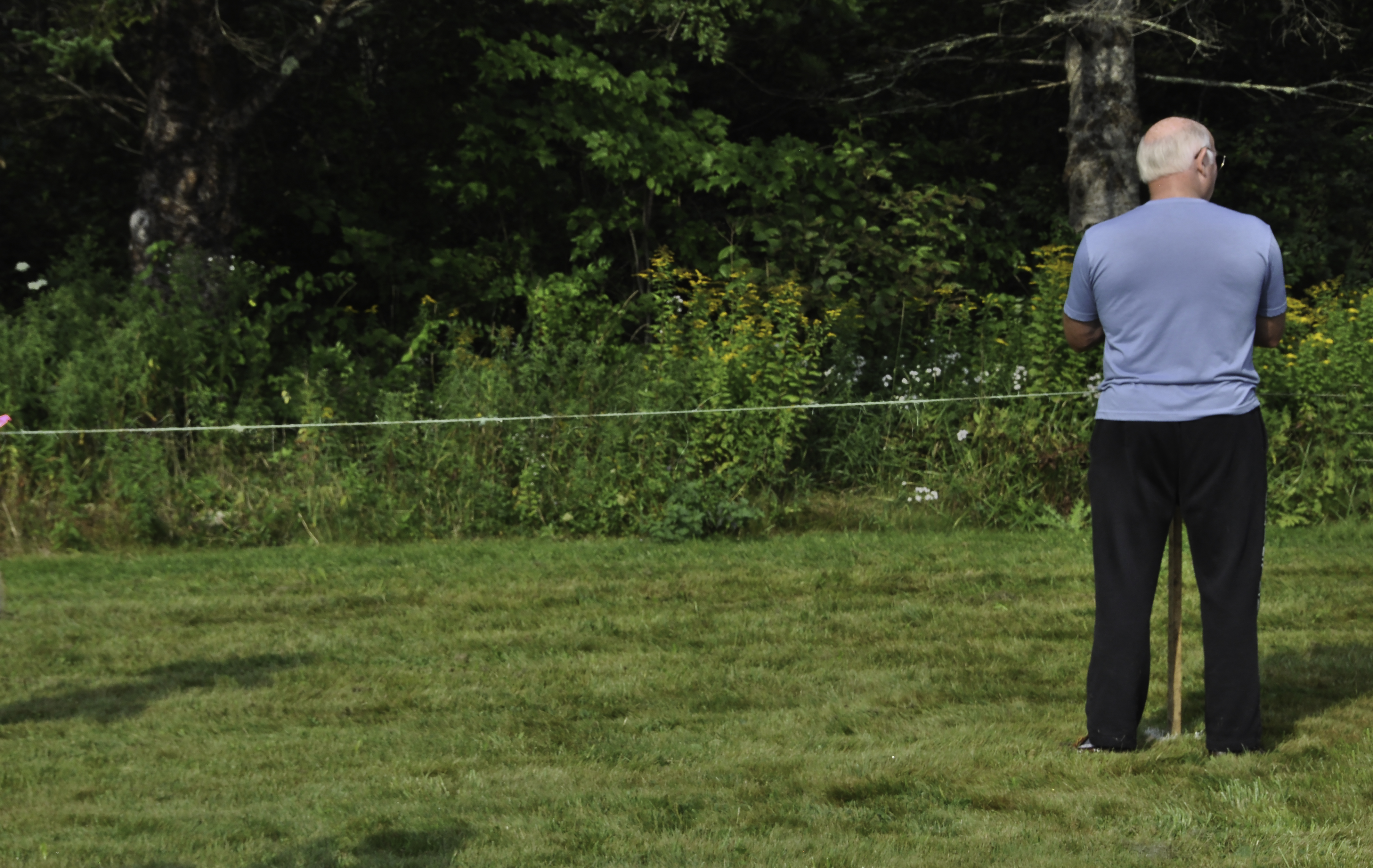
A rare shot of the hubby, who usually scowls at the camera. Waiting for the runners at a cross country meet. Increased contrast a tad, cropped off a bit on the bottom, lasso and content aware fill to remove a sliver of a person on the far right.
Have been busy dyeing fabric, making slacks, making a top, and working on a small quilted thingy. Must take photos. Must blog! Stay tuned and enjoy the last gasps of summer!