This week’s lesson is Black and White Dreamscape in my online class with Ricky Tims. Earlier in the year we learned the dreamscape technique (a process in Photoshop) which makes an image (often a landscape type of scene) look, well, “dreamy.” This time, instead of both layers being in color (which intensifies the color), one is in black and white. This leads to a somewhat old-timey, hand-tinted photograph image.
Also, in the last paragraph, I have a question if anyone knows of a good endocrinologist in Maine.
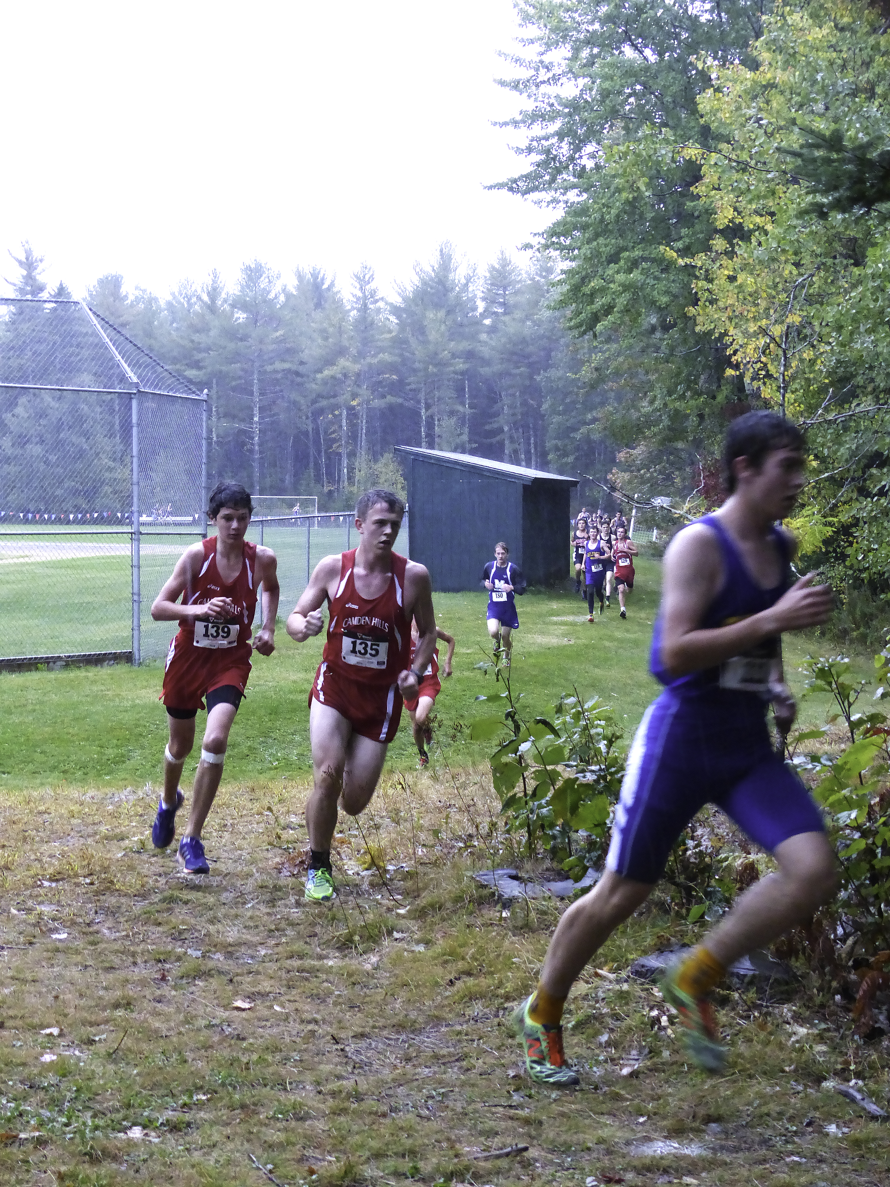
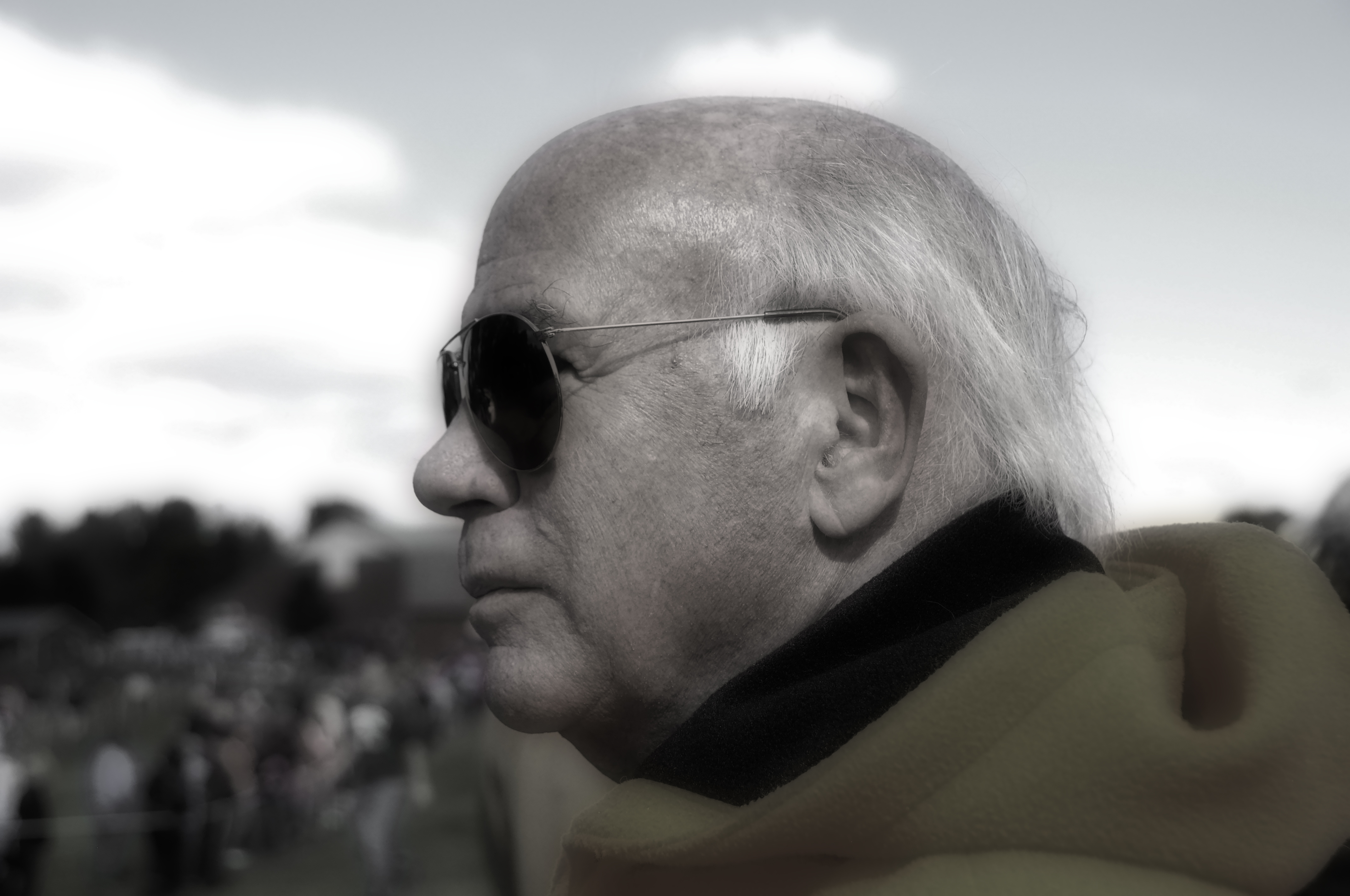
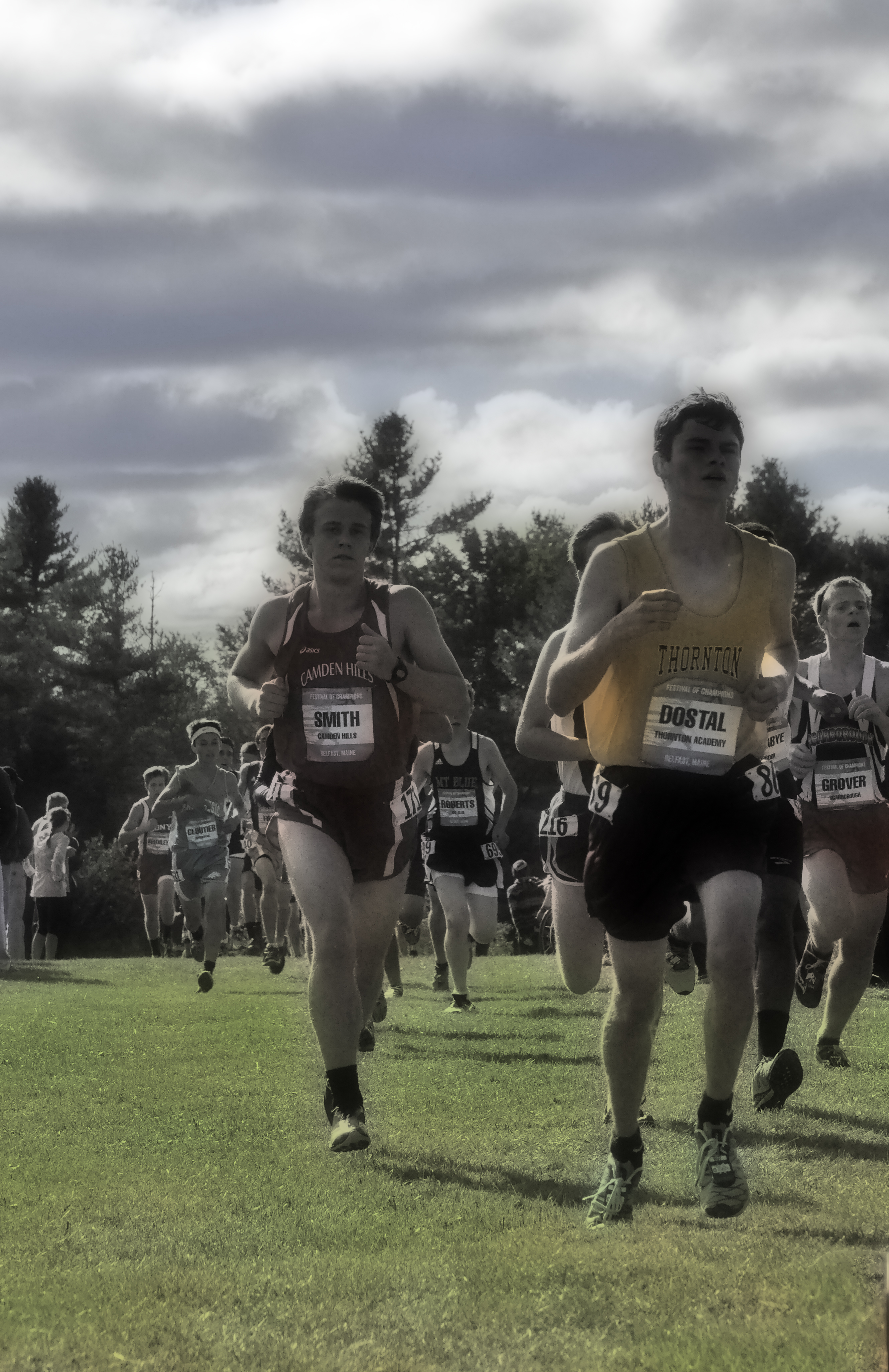
I took a TON of photos, but settled on this one of my husband. He HATES having his picture taken. To the point that he scowls and grumps at the camera so much that folks who don’t know him would think, erroneously, that he is a seriously grumpy old man. So while I was taking a bazillion photos of last week’s cross country meet, including both landscapes and runners, I snapped a few of hubby.
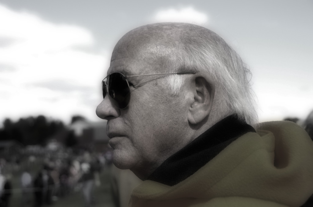
Used desaturate etc per class instructions. Still quite colorful after merging/flattening, so used Hue/Saturation menu to knock down the yellows, reds, and blues. Hubby is notoriously awful about getting his photo taken, so glad I got this one.
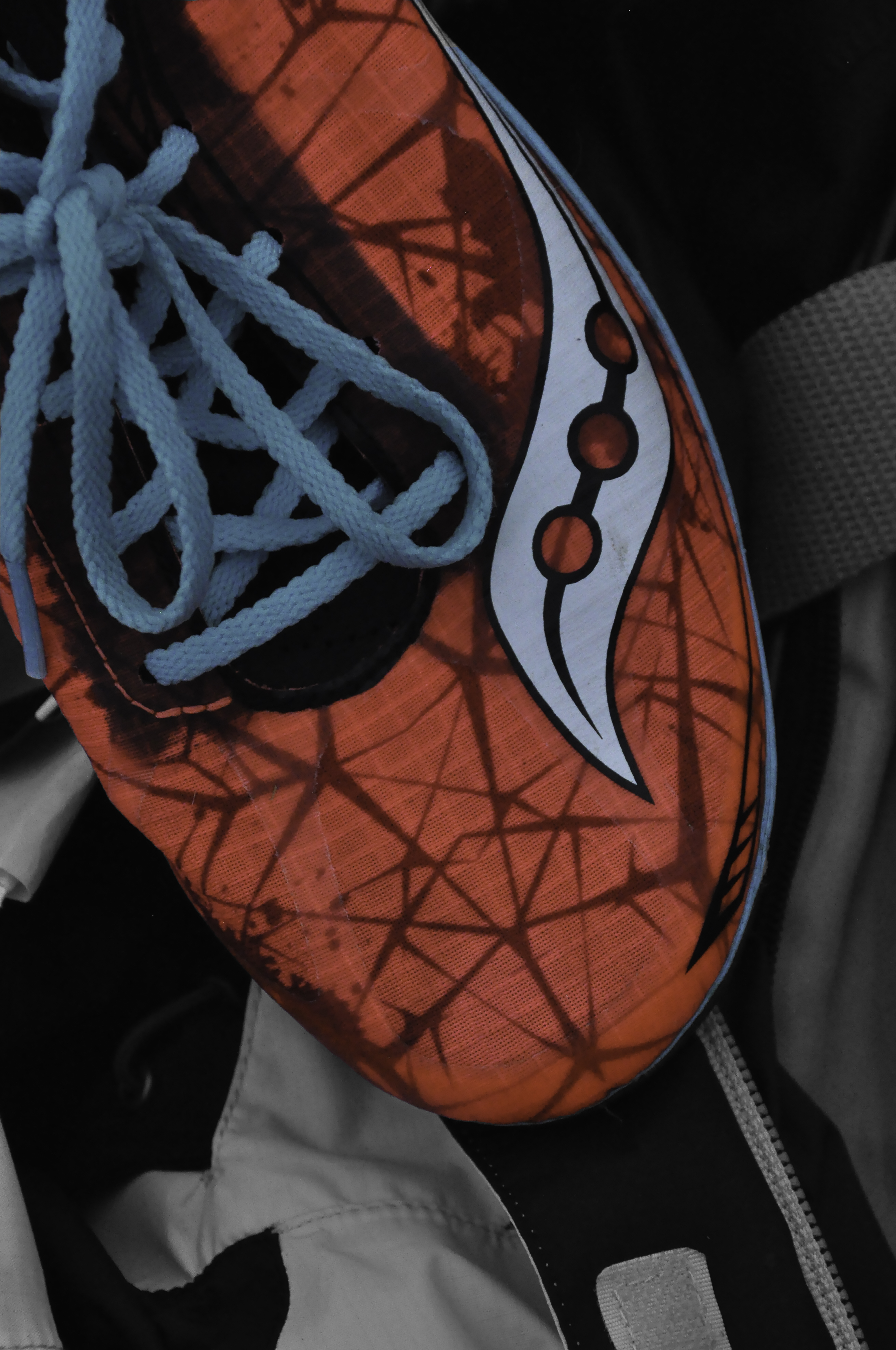
Of course I got the runners, and for once managed to get a good one of Eli. I don’t know why (because he is pretty fast????) but I can get OTHER kids sharp and in focus while moving quickly, but I always seem to mess up with Eli. This time, it worked!

B&W Dreamscape technique. Used Desaturate and Merge Visible (instead of flatten). That’s my senior on the left (in the red). As with Dreamscape, I don’t think this technique is me, but I can see where it could be interesting for a hand-tinted-photograph kind of look. Will try various shots and see if a particular sort of image (wintry village scene for example or portrait) is more suitable than the vibrant glorious autumn day for the Festival of Champions race in Belfast, Maine this weekend. So proud of my student-athlete!
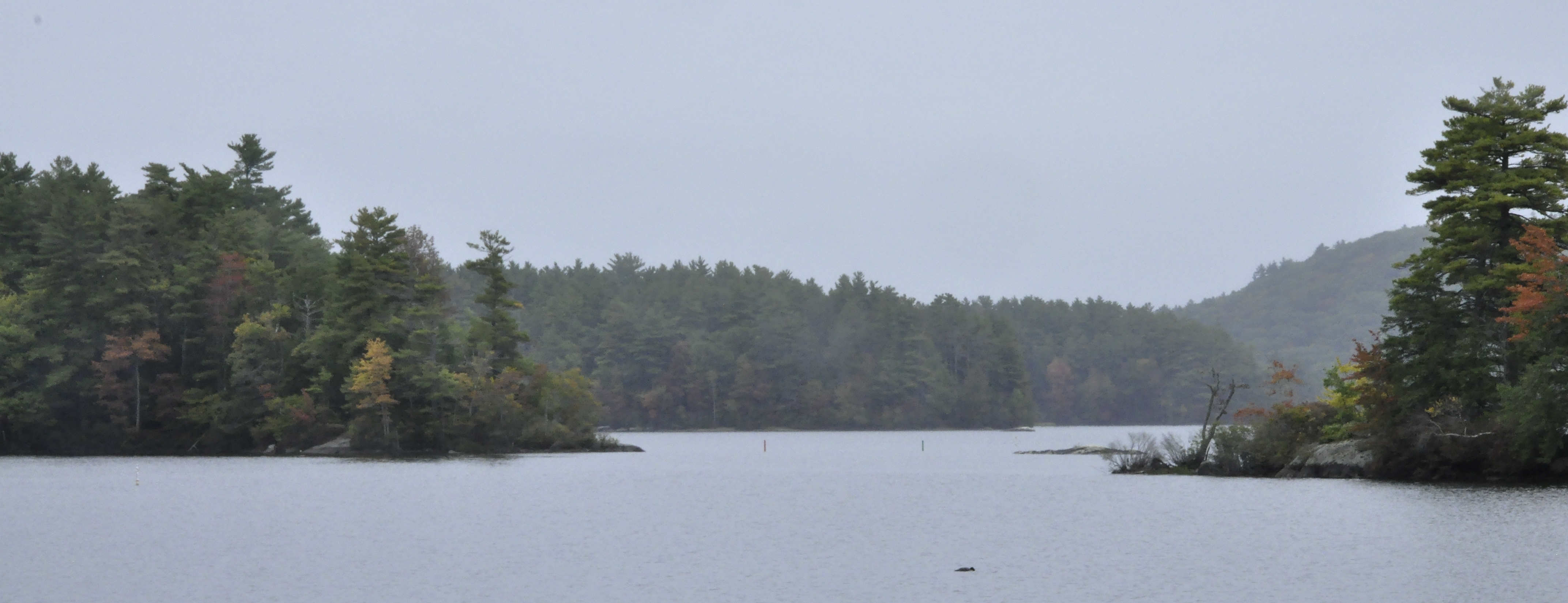
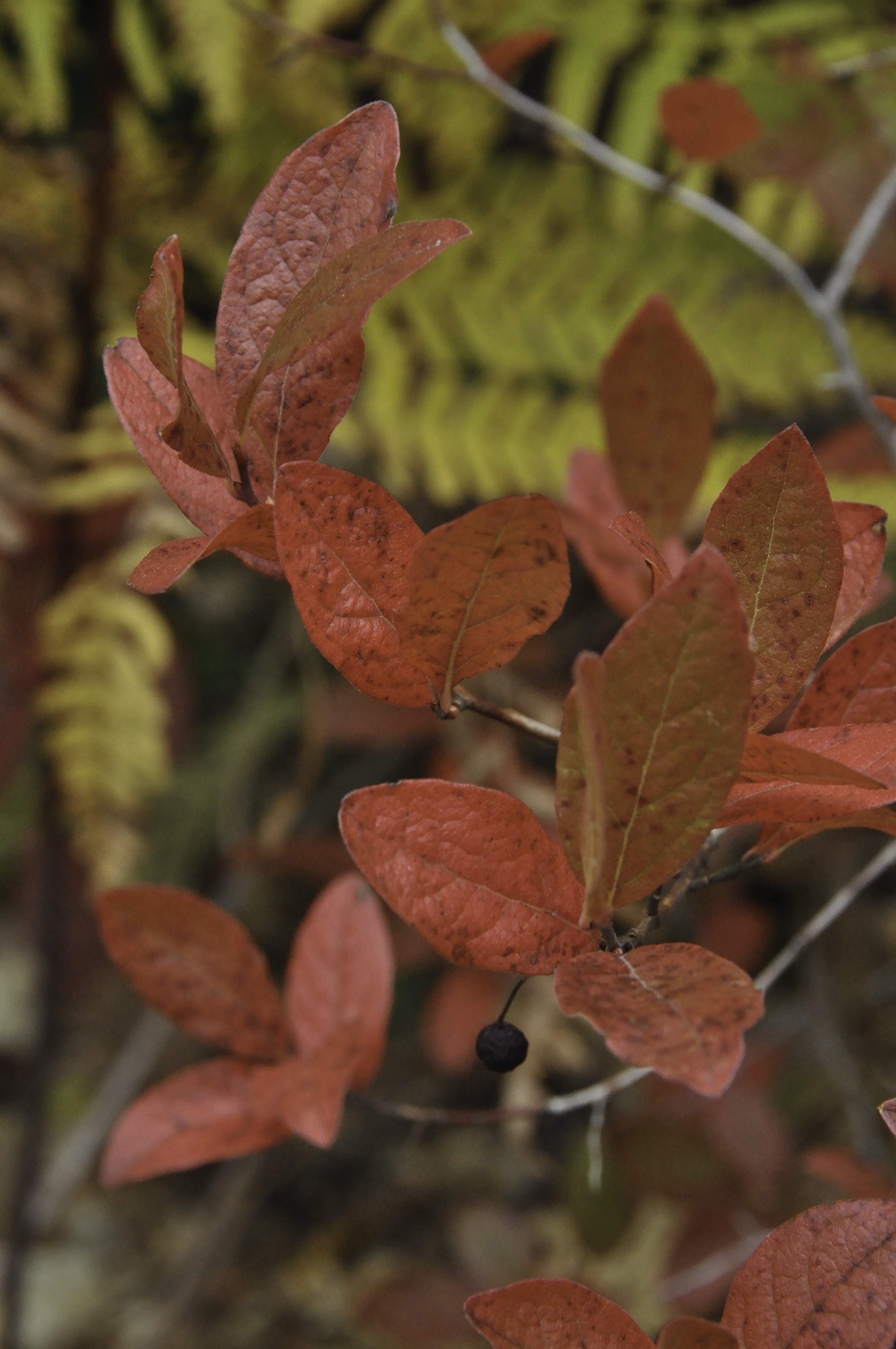
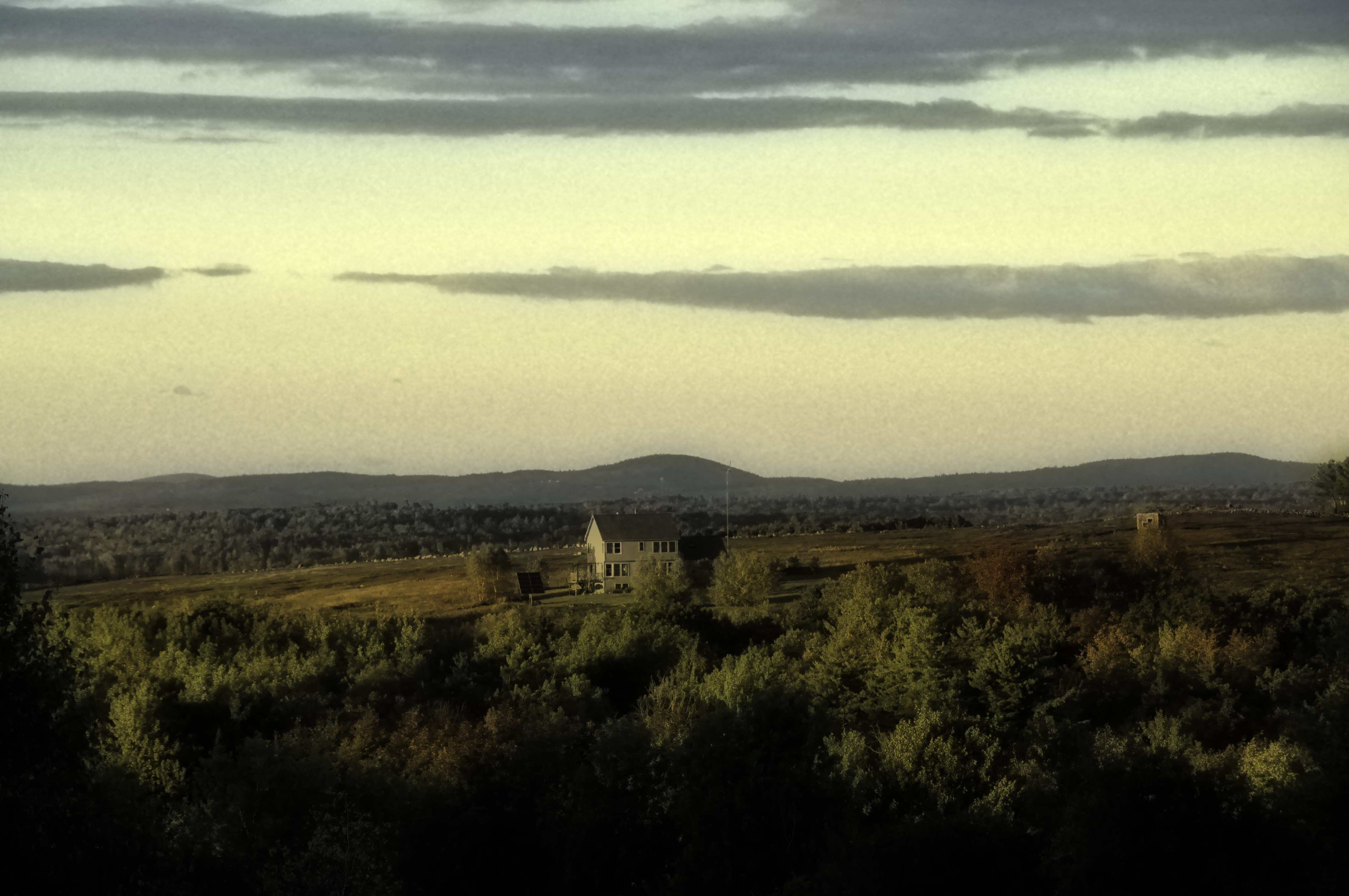
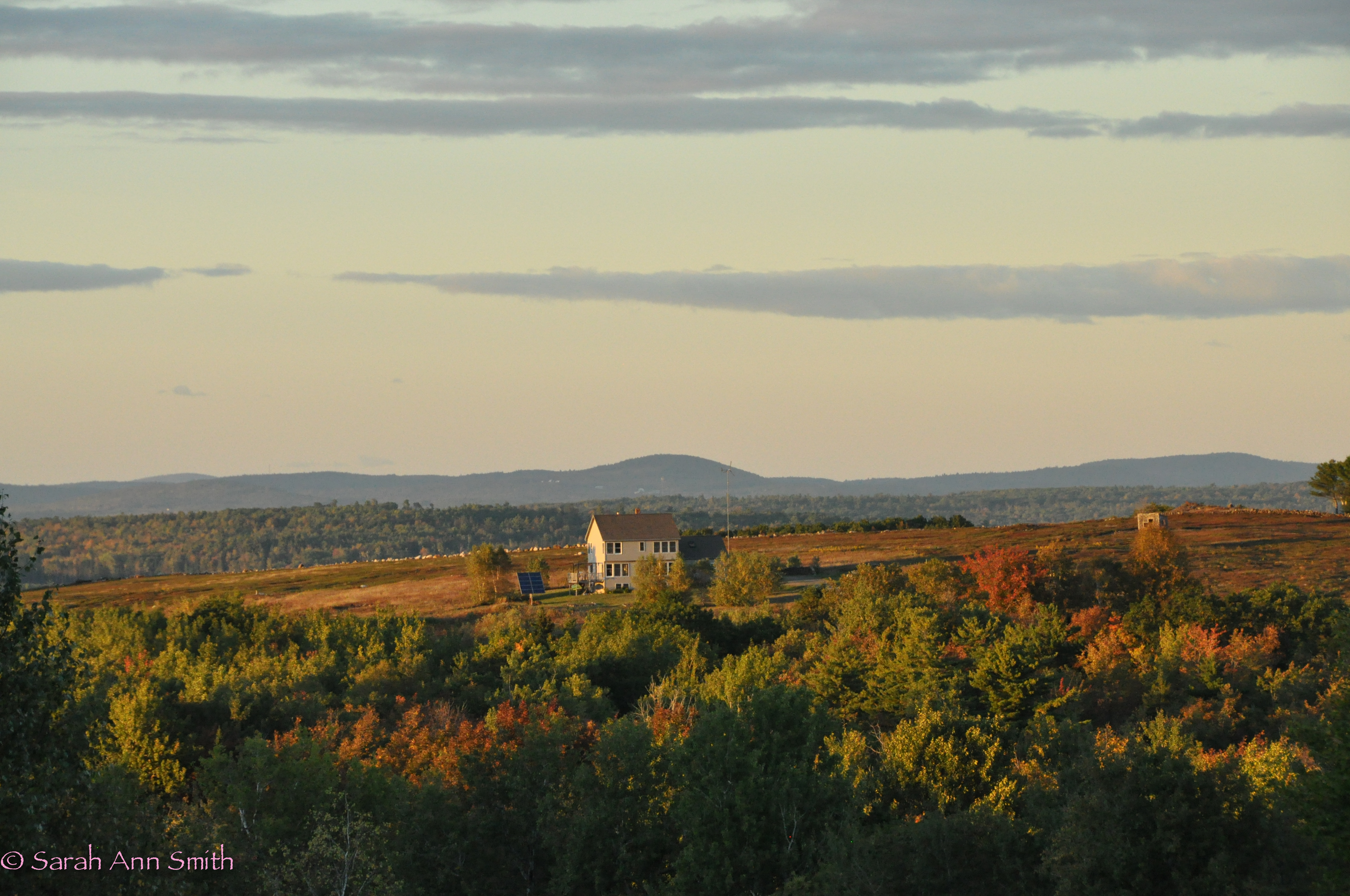
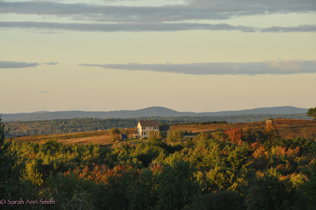
I also tried the view from our house. However, autumn is to me all about the glorious color, so while the photo is fine, I really prefer the “regular” version!
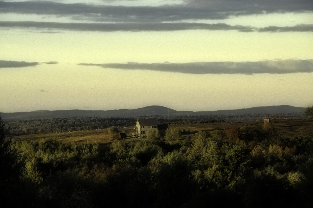
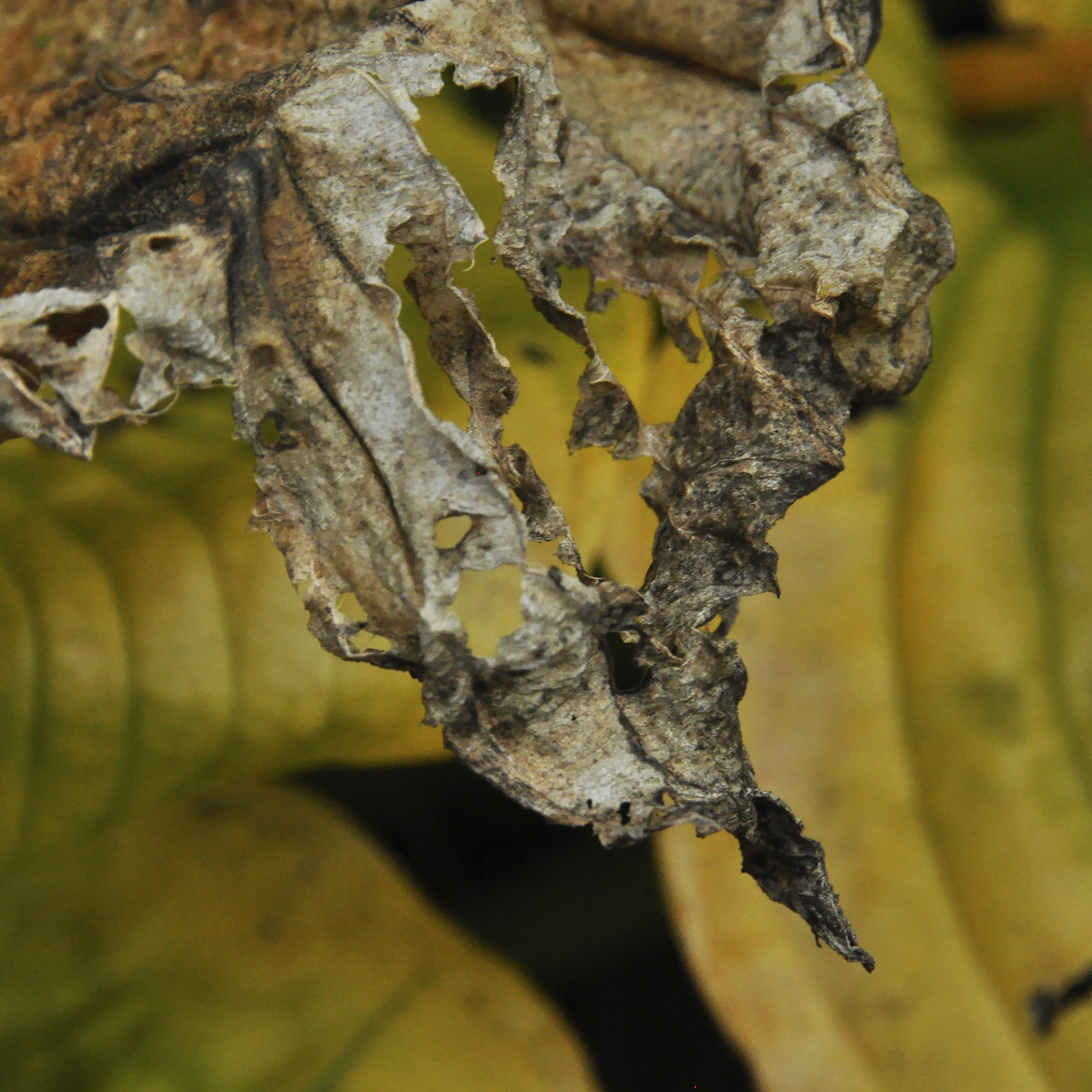
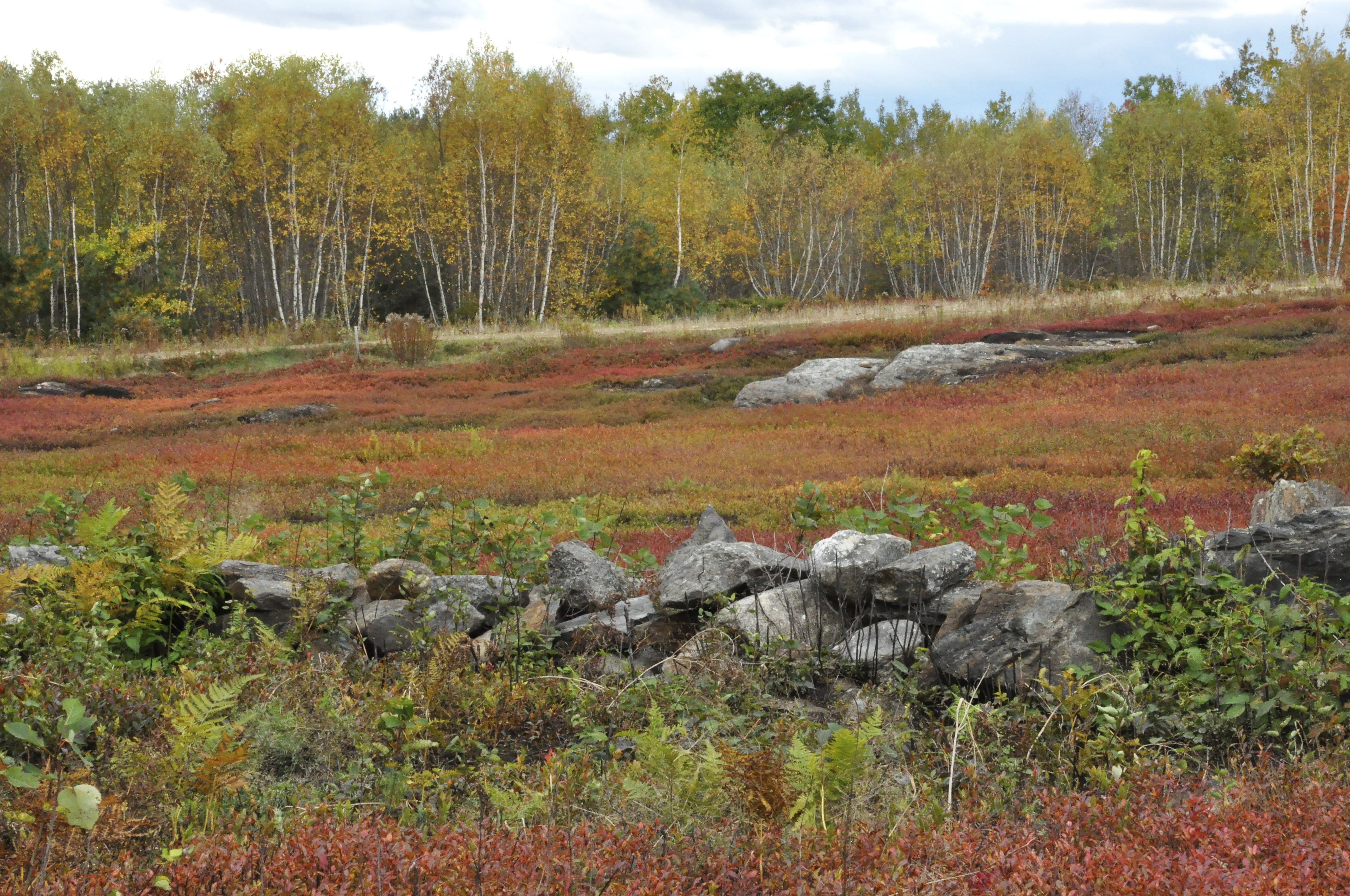
Meh. Not a fan. The whole point of autumn is vibrant color, not muted. Wrong scene for the technique. DID discover than on the Adjustments>BW layer, you can toggle to Infrared or Blue or Neutral Density and get different variations on the theme of B&W which could be useful in the right application.
Dreamscape B&W. Used the B&W (not desaturate) on this one. In adjustments / Shadows-Highlights, cranked up the color, because autumn is about the color (tho this lesson is less so). Used Dodge tool to lighten the nearly-black trees in the foreground (western light on the trees in the yard was blocked by intervening woods).
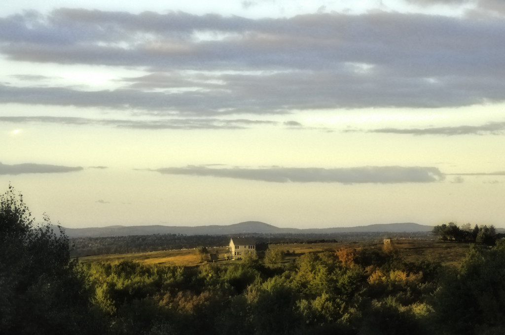
I don’t think this shot was quite the goal of the lesson, but I like this image betterwith more color. And of course love the Golden Hour light.
This is the non-dreamscape…..it’s a subtle difference, but somehow more crisp and bright.
Also, I’m getting close to fed up with my current care for thyroid disease. If anyone knows of a good endocrinologist in Maine, or even possibly in Massachusetts north of Boston, I’m almost frustrated enough to drive 8 hours round trip. We’ve been trying to get my dosage right for ELEVEN freakin’ MONTHS. I’m so sick of this! I realize it is hard to get it right, but really? Nearly a YEAR? Mine is not a “routine” case obviously but if anyone has pearls of wisdom, please comment or contact me via the (duh) contact page. THANKS!