email Youtube

Home
Galleries
Blog
Workshops & Calendar
Store
Resources
About
Contact

Archive for the ‘Paint’ Category

Painting–the inside of the house, part 2

Tuesday, March 6th, 2012

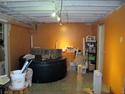
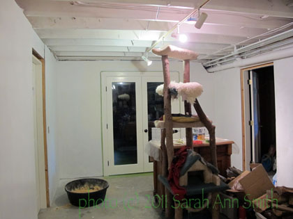
So here was the really big change and paint job:   The basement has a long rectangular area in the center, with rooms off of it:  a utility room (housing the furnace, oil tank, etc), a wood room (to hold all the wood for the winter heating by woodstove), a workroom, a space they used as a family room (with NO windows and painted an icky dark green with drab taupe on the ceiling) and we use as storage), and what has become my studio.  This area was painted a “roasted pumpkin” color…think the color of pumpkin pie, but a tad more orange-y.  Not a bad color, but not on walls of an area with no windows!  The stairs down to the basement were the same color.

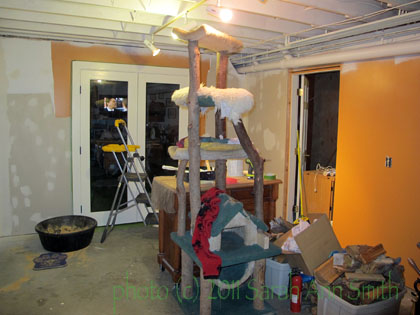
Stuff pushed to center, prior condition...unpainted drywall and some of that pumpkin color....


The other end, in pumpkin. Yes, that is a hot tub. In a windowless basement. ??? Never used. Time to sell it I think....

So last summer, I took a gallon of leftover sky blue (from the boys’ bathroom) and mixed it with a gallon of white to lighten it somewhat, and painted the walls in the center area.  First, it needed a primer though to cover up that dark pumpkin:

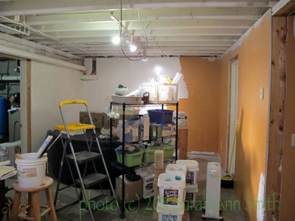
Looking better with the primer just on part of the walls

Hallelujah....lighter! brighter! What a welcome change!

Next, Blue:

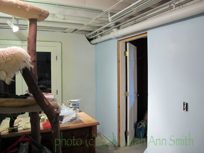
primer on the wall on the left, blue (first coat) on the right

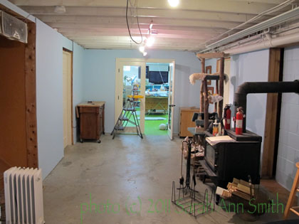
Looking toard my studio...isn't that BETTER?!!!!

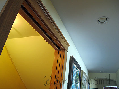
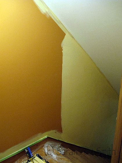
The stairs down (see on the far left in the photo just above) was just as awful.   So I tackled that about two weeks ago:

I painted the ceiling, too, in the stairs. It had been smudged when the previous owners moved out, and was this gloomy color. The light fixture alters the color somewhat, but in this photo you can see how gray the ceiling is in the rest of the house/hallway, ad the warmer "gardenia" color I put on the stairway ceiling

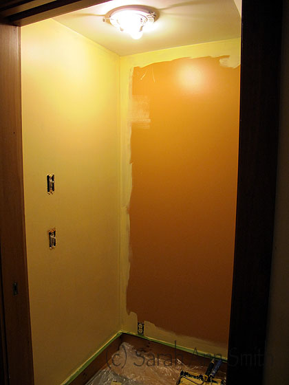
And getting rid of the last of the pumpkin just this past month:

Stair landing, halfway done

A nice Sunrise yellow color replaced the pumpkin! Mo bettah!

Painting–the inside of the house, Part 1

Thursday, March 1st, 2012

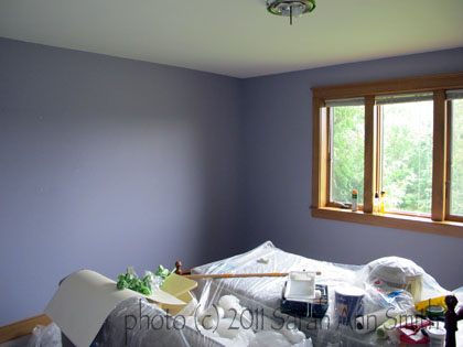
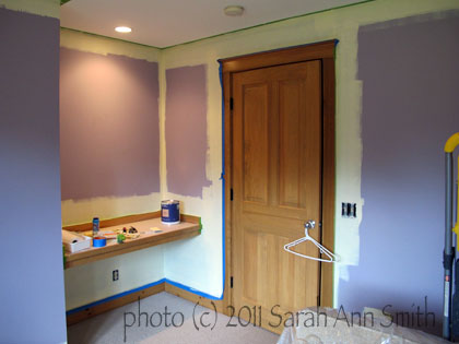
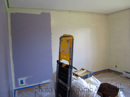
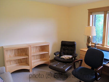
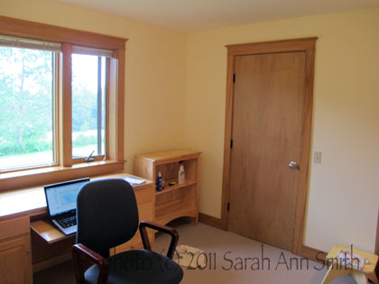
I never did blog about all the painting I did last summer/fall, and just finished more.  The house we moved into last February was in great shape but we decidedly did not share the previous owner’s taste in color.  At all.  When we moved in, we had painters do Eli’s room, the two bathrooms,  the dining room and my studio, but left the rest to do ourselves (meaning me).  Joshua wasn’t happy with the idea of moving at all, and instead of painting the lavender (Shudder) color in his room, just covered it up with posters.  When he moved out last July (and he’s doing GREAT by the way), Paul took that room as his office.  I realized the ceiling was grim…very dingy and gray ish in color.  So I painted not just the lavender walls, but the ceiling.  With the help of Leanne at the local EBS (Ellsworth Building Supply, a small Maine lumber company/hardware store), we chose Gardenia, a warm white. What a difference color makes…and not just in quilts!

Before: very lavender. VERY. and it turns out even the ceiling paint was tinged (and dingy-ed?) lavender....

Ceiling has been painted, cutting in with the pale yellow Paul chose....

Then,

The largest wall, halfway done...takes a lot of pale yellow to cover medium lavender!

Done....that long wall is no longer purple!

This is called turning gloom into happy!

And the other side of the room, again in sunny, happy yellow

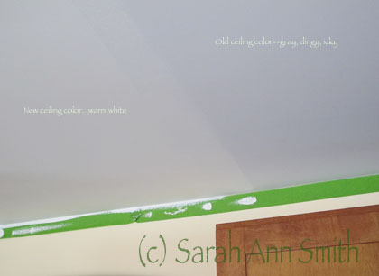
I discovered the ceilings throughout the house were this dingy grayed white.  UGH.  So I decided the entire house needs new ceiling color.  I can tell you, I DETEST painting ceilings, but I will do it.  In February, I did the kitchen and entry hall (all one big space).  Since a photo of a ceiling isn’t exactly exciting, you only get one:

The kitchen ceiling...original color on right, improved color on left, and green tape!

So after doing THAT obnoxious job, I treated myself to some quilting.  WOOT!  Back soon with quilting, Cheers, Sarah

Sketching on location: coffee cups!

Friday, November 4th, 2011

OK…so I was actually (who me?) spontaneous this summer and signed up for a www.Joggles.com class with Jane LaFazio, Sketchbooks and Watercolor on Location.  The idea is/was that you go OUT to sketch and sketch from the real thing, not a photo.  I am SO GLAD I did…I’m having a ball, so much so that (as I’ve mentioned before) I signed up for a second class.  This post is about the first class, and one of the early lessons.

So I dropped the son off to run at the high school (this was late summer), and treated myself to tea and sweet at a nearby spot.

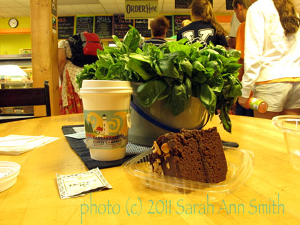
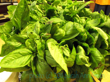
Told the child I wanted /needed about an hour.  After dithering about what treat to get, I finally sat down at this table with LUSCIOUS basil.

I briefly considered including the basil in the sketch. I then realized I'd be there 'til midnight if I tried, and decided (who me?) to go simple. OK, to go not as complicated.

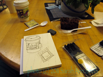
Then I finally began to sketch.

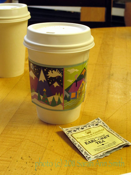
A close-up of the cup and tea bag. Don't you just LOVE the cup sleeve, from the Carrabassett Coffee company?

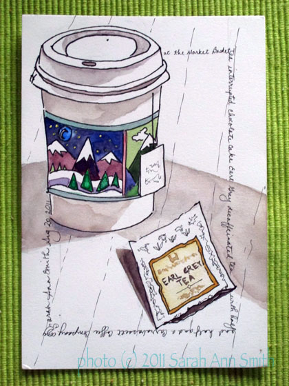
Here is the sketch, done first in pencil, then inked in with a Pitt pen.  Of course, 20 minutes after I arrived I get a call:  “Mom, it’s too hot to run!”  Me:  “remember I said I needed about an hour?”  Then, “you’ll have to wait for me for another half hour…find a shady spot to sit.”  Sigh.

Inked in....cup is too short and not tapered enough, but still OK.

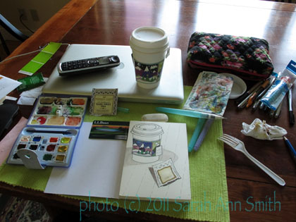
SO…. I packed up my cup and supplies and the rest of the chocolate cake (slurp), and retrieved the child and headed home.  It actually was pretty warm.  Then I set things up at home.  The shadows/light were different, but close enough….

Adding color at home, on the dining table, lacking the usual clutter around my spot.

And the final sketch:

Not too bad for a beginner....the curve of the cup isn't quite off, and the tea bag looks like it is levitating a bit, but not too bad....

Considering I’m just starting with watercolor, I’m pretty happy.  I have discovered that having REAL watercolor paper makes a world of difference, and having little water in the brush makes it much easier to stay within the shapes and not bleed and make yucky stuff! FUN!

Quilt Nebraska 2011, part 1

Friday, September 16th, 2011

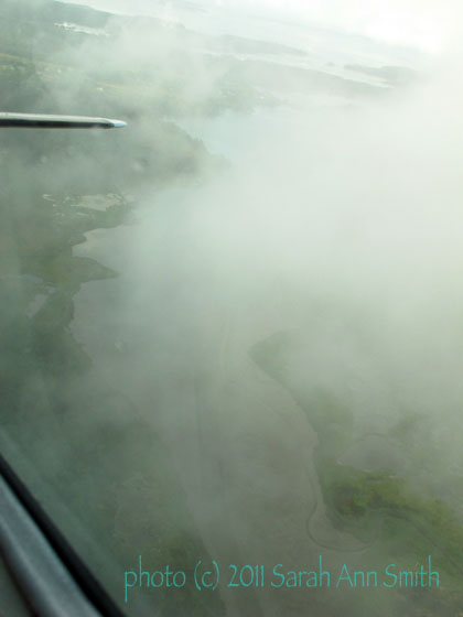
The last week of July, I headed to Nebraska (with trepidation given the weather forecasts for 100+ days everywhere in the midwest).  I left a cloudy Maine and snapped this photo on the way out of the midcoast:

Outbound...love the picture of the land through the clouds.

To get anywhere, I either drive a long way and spend the night (more expensive for the guild) to catch a plane out of Portland or Boston, OR I leave from Rockland/Owl’s Head, which is about 30 minutes from home.  Mo bettah!  Still not inexpensive, but less costly than an overnight.  The plane is small — here is a blogpost from last May — perhaps 9 passengers total, one of whom sits next to the pilot.

Once I got to Nebraska via Rockland to Boston to Detroit to Omaha to a car to 2-3 hours to Kearney (phew), I taught three classes:  Art Uncensored, Fine Finishes, and Hawaiian applique.  Since there are a ton of photos (and I’ve skipped a bunch), I’ll break it into two posts.   I must say, I seem to have taken cooler weather with me.  The 100+ temps abated and it was a quite tolerable (thanks to A/C) 90-ish during the days.

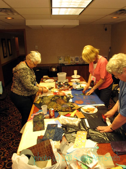
The first day I taught in a conference room in the Holiday Inn since the class was small.  This is the first time they have offered classes on Thursday, and I think many were low on students.  We still managed to fill up the room!

three students filled up the entire conference table (along with all the STUFF I schlep for them to try)

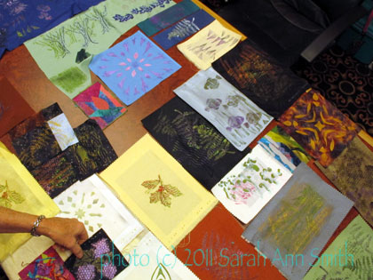
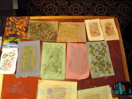
They did a great job and produced a lot of nice surface-designed fabrics, using both my carved blocks and the raw materials and ideas of their own:

An end-of-class collage of pieces made

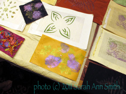
And even more end-of-class samples by the students; techniques include lino-cut rubbings, rubbings with Shiva painstiks, stamping, printing, stenciling.... lotsa fun!

I particularly liked how the student used the sequin waste and shaded colors to create the berry clusters here:

The green-on-white is a "paper snowflake cutout" stencil, the other two are the berry/grape/hydrangea (take your pick) clusters... really like them!

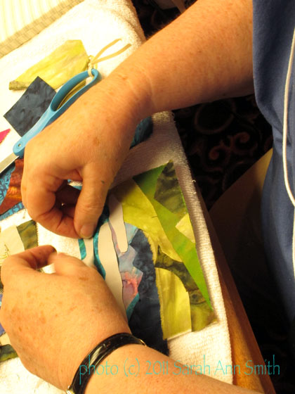
And one lady actually made a postcard…

collaging fabric to make a landscape

I’ll be back in a couple of days with the final two classes:  Hawaiian Applique and Fine Finishes.

SAQA-Maine, a September treat

Thursday, October 14th, 2010

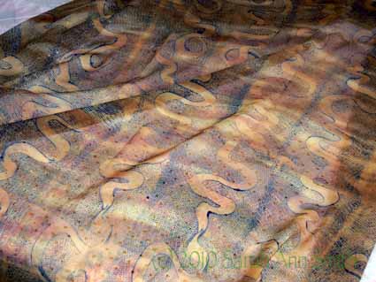
Margaret Sheehan's coppery monoprinted sheer

SAQA is the Studio Art Quilt Associates, a non-profit group to promote art quilting with members around the world.    There are regional groups, including one for New England.  Those of us in sparsely populated Maine –the state population is about 1.3 million, the same as San Antonio, Texas or San Diego, California!–live far enough from the majority of the regional group members in Massachusetts and southern New Hampshire and Vermont, that we don’t often get to the meetings.  So Sarah Carpenter, Beth Berman and Wen Redmond had an idea an made it happen:  SAQA-Maine retreat weekend in Searsport, Maine the weekend of Sept. 18th!

Beth VERY generously hosted much of the meeting in her home and new studio.  Other meetings were at the hotel just a mile or two up the road and a nearby church (the evening show and tell…alas it was part of the event I couldn’t attend). I forgot to take pictures of the first part which was meeting, at Beth’s house, or when the workshops began.  Various regional members offered to do demos or mini-workshops, and oh was it fun!  Valerie Poitier’s talk on perspective (my right brain was confuddled but I did get it eventually!), as was Wen Redmond’s demo on making thermofax screens and printing with them.  At least  I finally remembered to take the camera out during my mono-printing session with Margaret Sheehan.  I sure hope she comes back and does a two-day workshop near enough for me to take…talk about utter playtime! You can visit Margaret’s blog here and see some of the sheers featured below in the photo at the top…wow!

Here are the pics from that session:
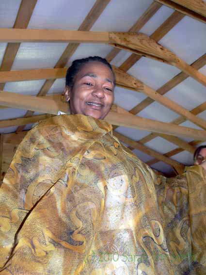
Valerie Poitier looks stunning in Margaret Sheehan's sheer artcloth (also seen in the first photo of this blogpost)
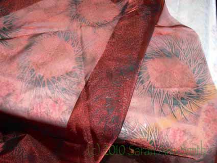
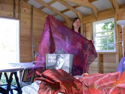
Margaret S's red sheer mono-printed cloth---I LOVE that bird's nest design
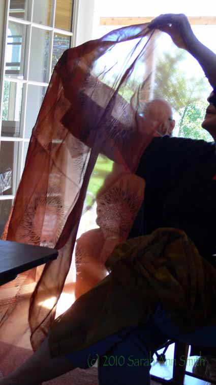
And holding the red sheer up with the light from the open doorway behind...

I think this falls into the category of “Be Still my beating heart” and “I wanna do that NOW!”
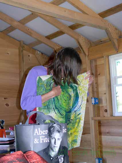
Margaret explains some of the techniques used on this cloth
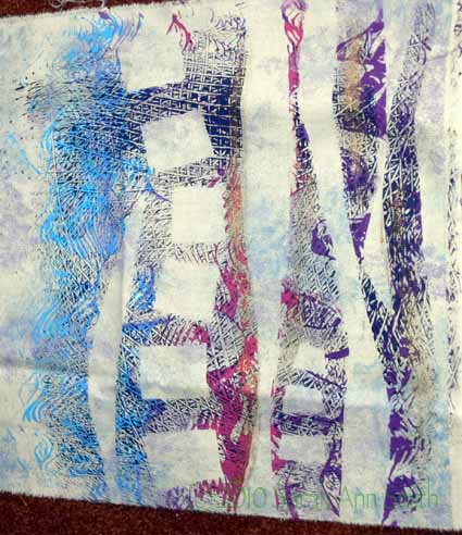
This piece of Margaret's shows how she used freezer paper resists when mono-printing
Yet another heavenly sheer--the synthetic sheers come from JoAnns mostly, the prom dress section, and obviously are vastly improved with paint
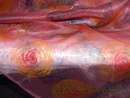
A different red sheer with sunswirls
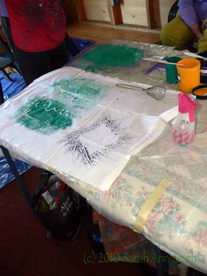
Margaret showed us how to use heavy mil plastic drop-cloth, textile paint and common tools for surface design; notice the whisk.....
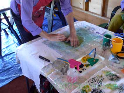
Transferring the mono-print (paint on plastic) onto the cloth is a tactile experience
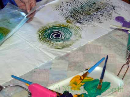
In the upper left corner, Margaret pulls away the plastic with spiral she has just printed onto the cloth
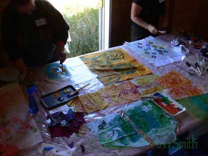
The table I worked at! My stuff is on the near side and in the center
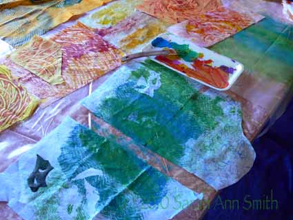
A closer look...here on my blue/green I used too much paint and lost definition. It is a learning process!
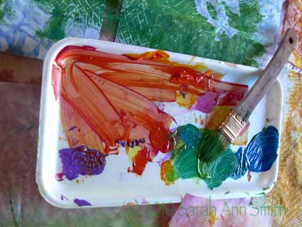
Even my paint tray was pretty!
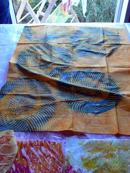
one of my classmate's circle design...ooooh! I'm pretty sure she used an Afro/Hair pick for those marks
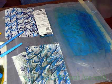
Drat I wish I could remember how she told me she made those marks....you can see this is addicting!
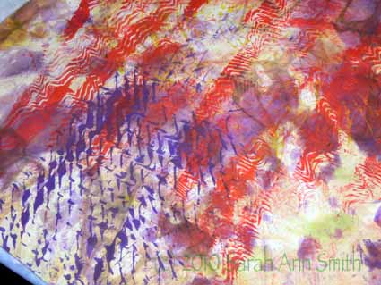
Again..I forget how shemade those purple marks, but I love them!

As you might gather, for a 2-hour session that was about an hour of demo and an hour hands-on, we the students really were inspired and went to town with our scraps.  Thanks SO MUCH to Margaret for sharing her time, technique and paints!   Next year we REALLY need to chip in to cover expenses for supplies…. Margaret, if you see this send me your snail mail address and I’ll either send you a fiver or a bit of hand-dyed as thanks!