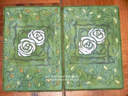
Lino Cutting with Dijanne Cevaal
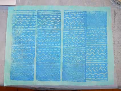
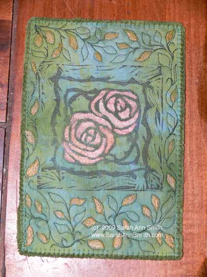
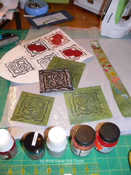
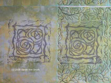
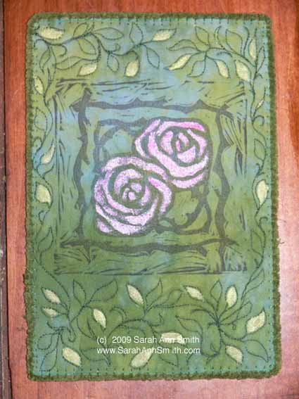
Thursday, February 4th, 2010I LOVE woodblock prints, etchings, lino-prints…. I love and am always inspired by Dijanne Cevaal’s work, which you can see on her blog, here (and then follow the links there to more eye-candy). Well, last year when I was beyond over-busy, I learned she was teaching an online lino-cutting class. I promptly wrote and asked her to let me know when the next one began. She did, and on Monday we received our first lesson. Here are my first rudimentary attempts…
I have cut easier-to-cut surfaces than linoleum, such as MasterCarve (the Rolls Royce of rubbery media) and Speedy-Cut. But I knew I could learn from Dijanne, and just reading the first lesson was a wonderful tour of antique textiles, textile printing history (did you know that Fauve artist Raoul Dufy also designed couture textiles? I hadn’t!), and lots of useful tips.
I also learned while working on the first exercise that my Speedball lino-cutting tools are VERY SHARP, and how deep is too deep to cut safely (thereby causing the blade to skitter out of control into my left index finger…OUCH!). Yes, Dijanne warned us, but I –as usual– appear to have had to learn the hard way that THAT was TOO deep!
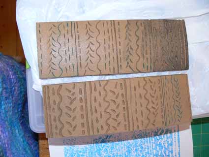
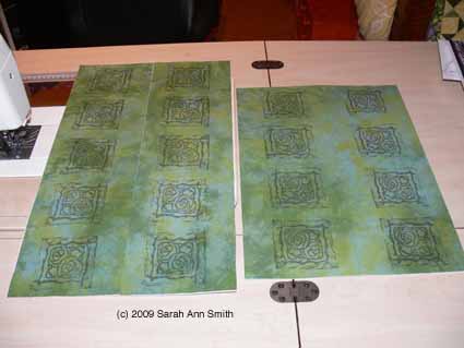
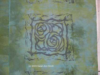
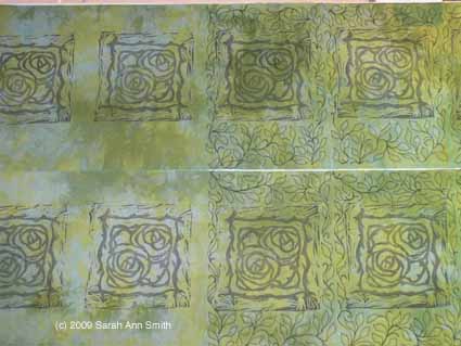
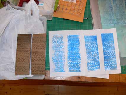
The picture at the top is four efforts at printing on cloth. I used one of three different types of linoleum (wanting to try out each one before buying a bunch) I ordered from Dick Blick, a major discount art supply house here in the US. I actually don’t much like the one I used here… it is like sawdust plasticized. I hope I like the other, but harder to carve (?) lino better… the other yellowish one certainly feels smoother, and the quite hard gray even better. Anyway, here I decided to be uncharacteristically methodical, and tried all 8 of my blades (I have two different carving tools, and luckily each one came with a slightly different assortment of blades, giving me four “V” and four “U” shapes/sizes).
I did a test-print (I used Jacquard textile paint in blue on a piece of aqua hand-dyed) on paper first. Clearly, I need to refine how much paint I get on the lino-cut and how well. My sponge roller is in need of a new sponge, since the last time I used it it accidentally dried with paint in it. Ooops.
 I’ve got two more exercises to do for this lesson, and I’m really looking forward to the next two lessons! However, I’ll wait for my sliced finger to heal and also work on a MAJOR project that is due and needs massive amounts of work NOW… back in a bit with more lino-cutting!

