email Youtube

Home
Galleries
Blog
Workshops & Calendar
Store
Resources
About
Contact

Archive for the ‘International Quilt Festival’ Category

Teaching at Int’l Quilt Festival Houston 2016

Thursday, July 28th, 2016

Can you tell it’s been busy?  Whenever I disappear, that means so much life is happening I don’t have time to blog.  I’ll try to catch up a little bit at the time.  First things first…the catalog is out for classes at International Quilt Festival in Houston!!!!! Here’s my very busy line up!

Screen Shot 2016-07-19 at 4.39.58 PM

Houston has revamped the catalog a little bit. There are now (yeah!) pictures in the catalog (not just online) and there are weblinks so you can go to my website for the FULL supply list and handouts.   To shorten the process, if any of the above look good to you, you can go to my class listings page here for info about my classes.  Each description has a hotlink to the pdf Supply list.  If I have blogged about a class, that also is in the description.  You can also find all my supply lists in one place on my Resources page.  If you click on “Resources,” Look at the jump links at the top.  Click on Class Supply Lists and it will jump you down the page (instead of having to scroll down).

I’m thrilled to be so busy and hope to meet many of you.   I will do a separate blogpost to go live in a couple days about The Nest, a new and totally fun half-day (or full day if a guild wants a full day) class, and my fairly new Easy Peasy bag class.   Can’t wait!


Descended From the Stars, Part 3

Wednesday, July 20th, 2016
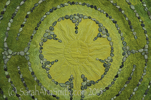
The sun in the center of Descended From the Stars

The sun in the center of Descended From the Stars

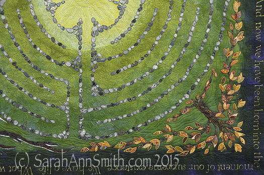
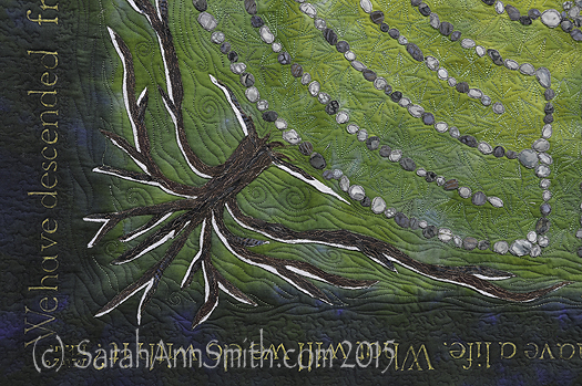
When I left on in my last post about this quilt, I had shared the dyeing process and the stones and lettering.   Next, I fused trees in the four seasons into the corners.  I distorted the shape so the tree canopy served as a frame.  I had thought initially I might need an inner border, perhaps couched yarn or stitching of some sort, but the shape of the tree worked so well I didn’t need anything extra.   As I did with the stones, I cut out leaves, LOTS of leaves, separating the colors into the ice cube tray so I could place them carefully.
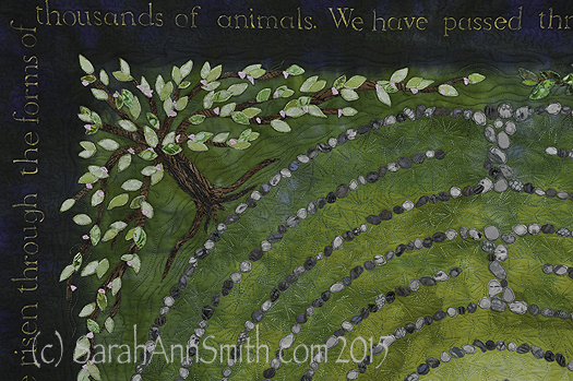
Detail, upper left corner, Spring Tree of Life.

Detail, upper left corner, Spring Tree of Life.  Each of the leaves is free-motion stitched with several rounds of thread on each leaf.  The nice part about doing this at the top stage is that I could use the scissors on my Janome 15000.  I didn’t have to bury thread tails!
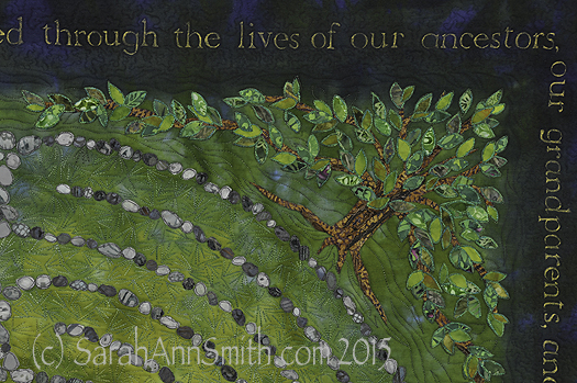
Detail, top right, Summer Tree of Life.
Detail, top right, Summer Tree of Life.

Detail of the lower right corner, showing the autumn tree of life.
Detail of the lower right corner, showing the autumn tree of life.

Detail of the lower left corner, with the winter tree kissed by snow.

Detail of the lower left corner, with the winter tree kissed by snow.

I did the stitching around the stones and on the trees, including the leaves, at the top stage with stabilizer underneath.  (See my post here to learn more about my current article for Machine Quilting Unlimited on the Fourth Layer–stabilizer– for densely thread painted quilts.)  I removed the stabilizer everywhere except for under the center because I knew I would want to quilt that area more densely than the rest of the quilt.
Here

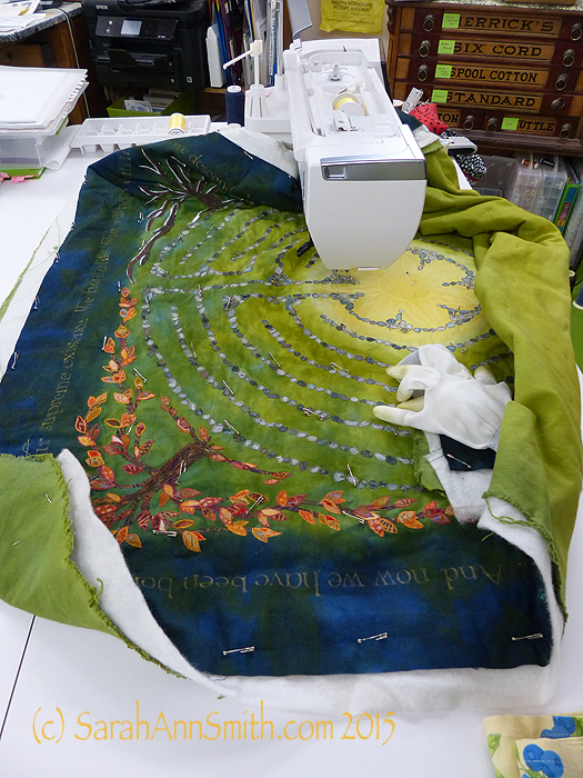
Here I have begun quilting.  You can see the custom-dyed cotton duck on the back.  The use of heavier cloth helps keep the quilt flat and stable; it also helps minimize shrinkage.  The final piece had to be 40 x 40 inches, and I wanted to have a balanced amount of blue on both sides of the lettering, so I needed to control the shrinkage that happens with dense quilting.

Next,
asdfa

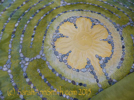
Superior Threads (Thank you Bob and Heather Purcell!) has come out with some tone-on-tone variegated threads.   I have been pestering Bob for YEARS to make threads like these as I prefer blendy to contrasty.  I ordered up all of the new earth-tone blendy variegateds in the Fantastico line and used them.  I began with a light green blend in the first row around the sun, switched to another in the next to rings, and then a third in the fourth ring that you see here.  If you look at the left, you can see how I snuck some of the current thread color into the next ring to get even more color blending.

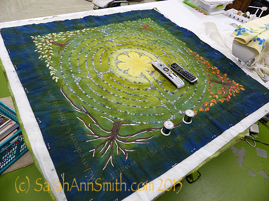
Then, I had to decide what threads to use in the dark areas.  My sewing tables (two back to back) are each 24 inches, so I have a nice, HUGE flat surface to support the quilt as I work.
asdf

Choosing thread:  dark, pine-y green and deep blue.

With all the manipulation, I realized that some of the ink had rubbed off, despite being REALLY careful to heat set it according to directions.  I wrote immediately to friends Judy Coates Perez and Susan Brubaker Knapp to seek guidance.  Judy had only used the regular colors, not the metallics.  And Susan had an article in the just-out issue of Quilting Arts about lettering, including these inks!  She too discovered that the metallics seem to “shed” a bit.
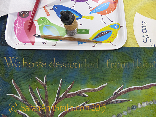
After quiting, some of the bling had rubbed off my quilt, so I had to do it AGAIN!

After quiting, some of the bling had rubbed off my quilt, so I had to do it AGAIN!  You can see where I have inked over the letters and what is left to re-do.

After re-inking and heat setting, I tested on my scrap cloth several products to seal the ink including GAC 900 (a textile medium that one adds to paint), a UV Coating, matte gel medium, and Krylon Spray Fixative which says it is acid-free, archival and safe on fabric.  Only the Krylon didn’t leave tell-tale signs that it had been used.  So I carefully masked off the rest of the quilt, leaving only the lettering area exposed and sprayed the Krylon on it (stinky!) in hopes that will help prevent the mica flakes in the gold ink from coming off.

I was nearly done, except that I didn’t really care for the multiple layers of thread I had used stitching the sun.  Picking it out did NOT appeal to me.  So I trekked down to Clementine fabrics in Rockland and bought some perle cotton in the right color.
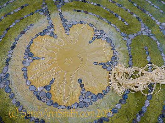
I wasn't happy with the way the stitching looked, so I couched perle cotton on top of the outline of the sun.  MUCH better!  You can see the difference in this half-way-through shot.

I wasn’t happy with the way the stitching looked, so I couched perle cotton on top of the outline of the sun. MUCH better! You can see the difference in this half-way-through shot.

At last, it was nearly DONE!  Time for facings, sleeve and label.
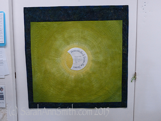
The back side of the quilt.  By dyeing the back to correspond with the front, the quilting design shows up on the back as it does on the front.

The back side of the quilt. By dyeing the back to correspond with the front, the quilting design shows up on the back as it does on the front.

And I couldn’t resist the temptation to place a moon behind the sun as my label.  One more time with the dip pen!
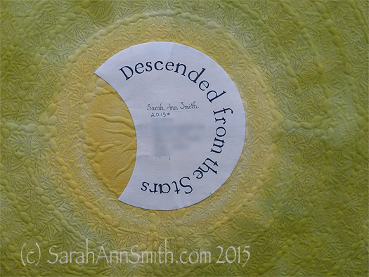
The End--the label is on, the sleeve is done, the facings are stitched!
The End–the label is on, the sleeve is done, the facings are stitched!

(c)Sarah Ann Smith 2015; quote (c) Mirza Khan, used with permission

(c)Sarah Ann Smith 2015; quote (c) Mirza Khan, used with permission

This quilt will be for sale–another reason I opted to not include a lot of personal details in the quilt.   As I said before, I am happy!

Milkweed No. 2, Part 2

Sunday, February 7th, 2016

A few days ago, I shared with you the happy news that Milkweed No. 2 is heading to Australia and New Zealand to be a part of “A Matter of Time,” and exhibit curated by Brenda Gael Smith.  Brenda is blogging sneak peeks on the blog.

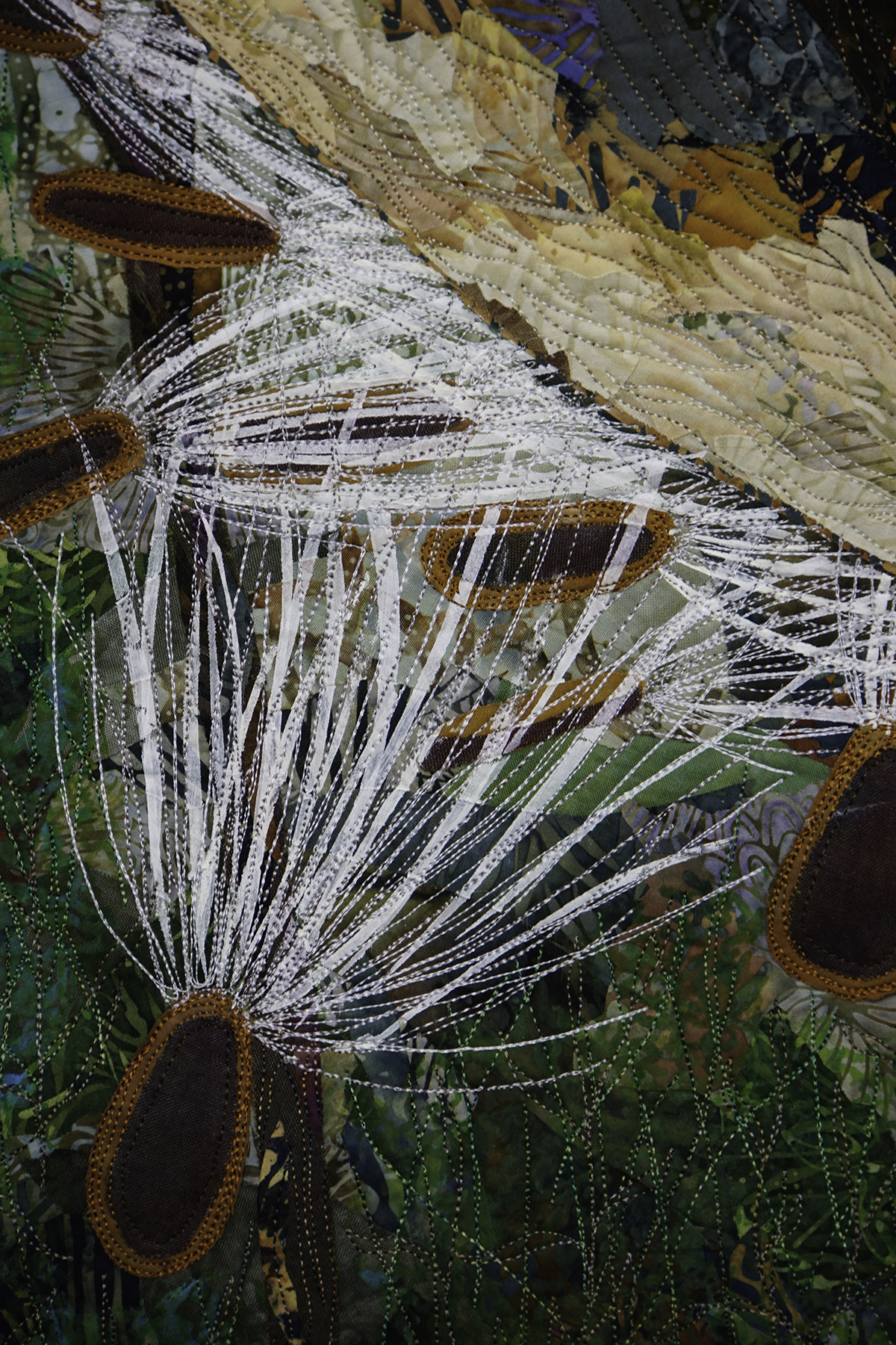
Milkweed pod, seeds and silks detail

Milkweed pod, seeds and silks detail

SASmith.MilkweedNo2.Detail2_DSC3256 I thought I’d share a few more bits of my process, especially because I will be demoing and teaching a class at Houston that incorporate these techniques.

In an effort to reduce the labor-intensive process of quilting the surface of my works at 1/8" apart over nearly the entire surface, I've started adding some surface design.

In an effort to reduce the labor-intensive process of quilting the surface of my works at 1/8″ apart over nearly the entire surface, I’ve started adding some surface design.

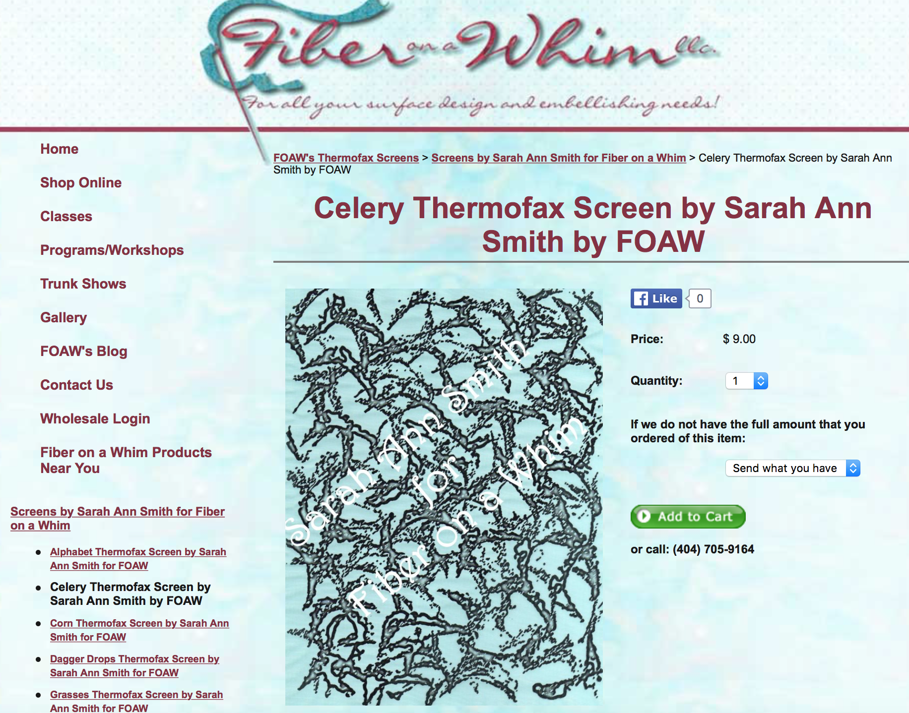
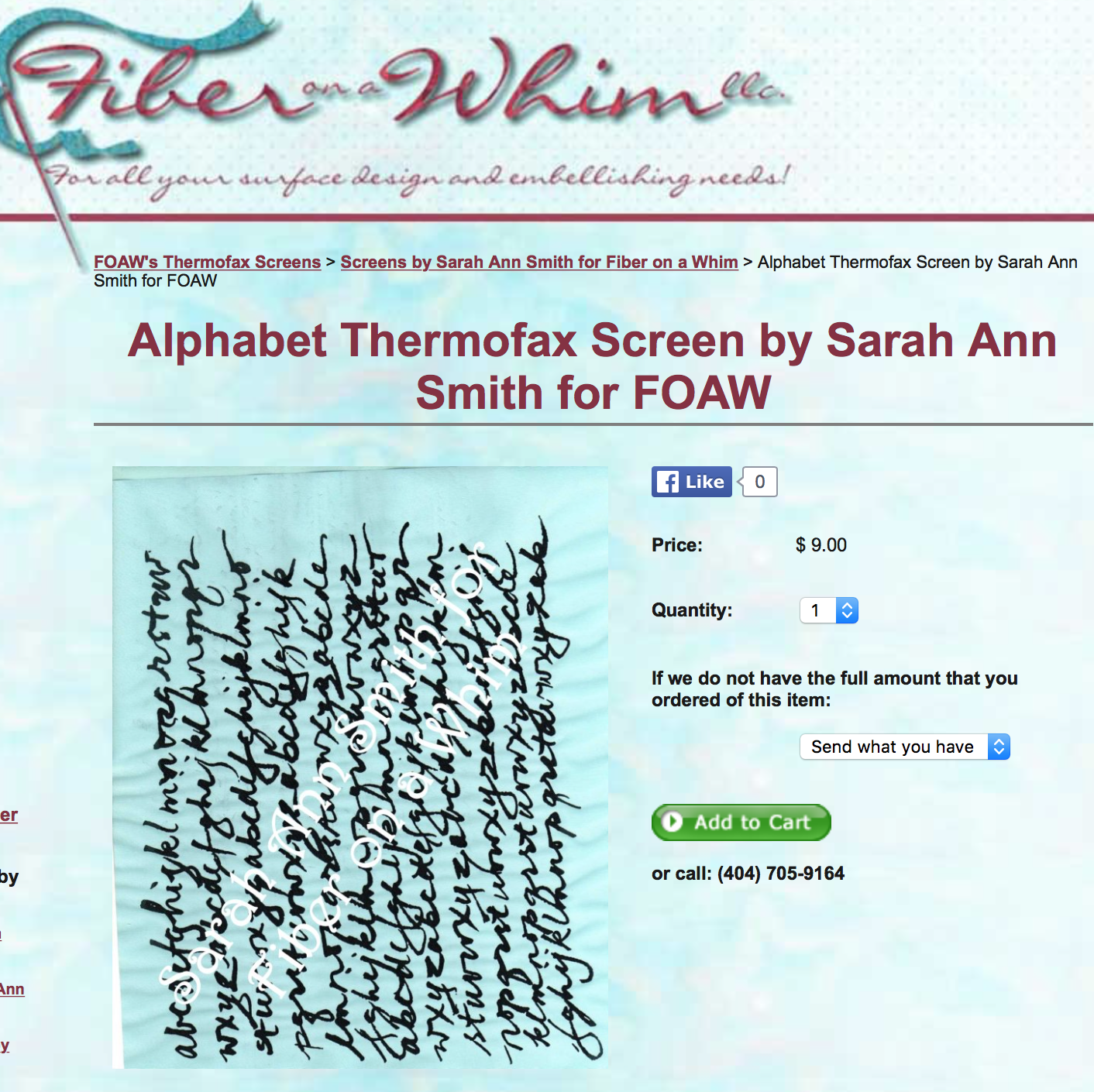
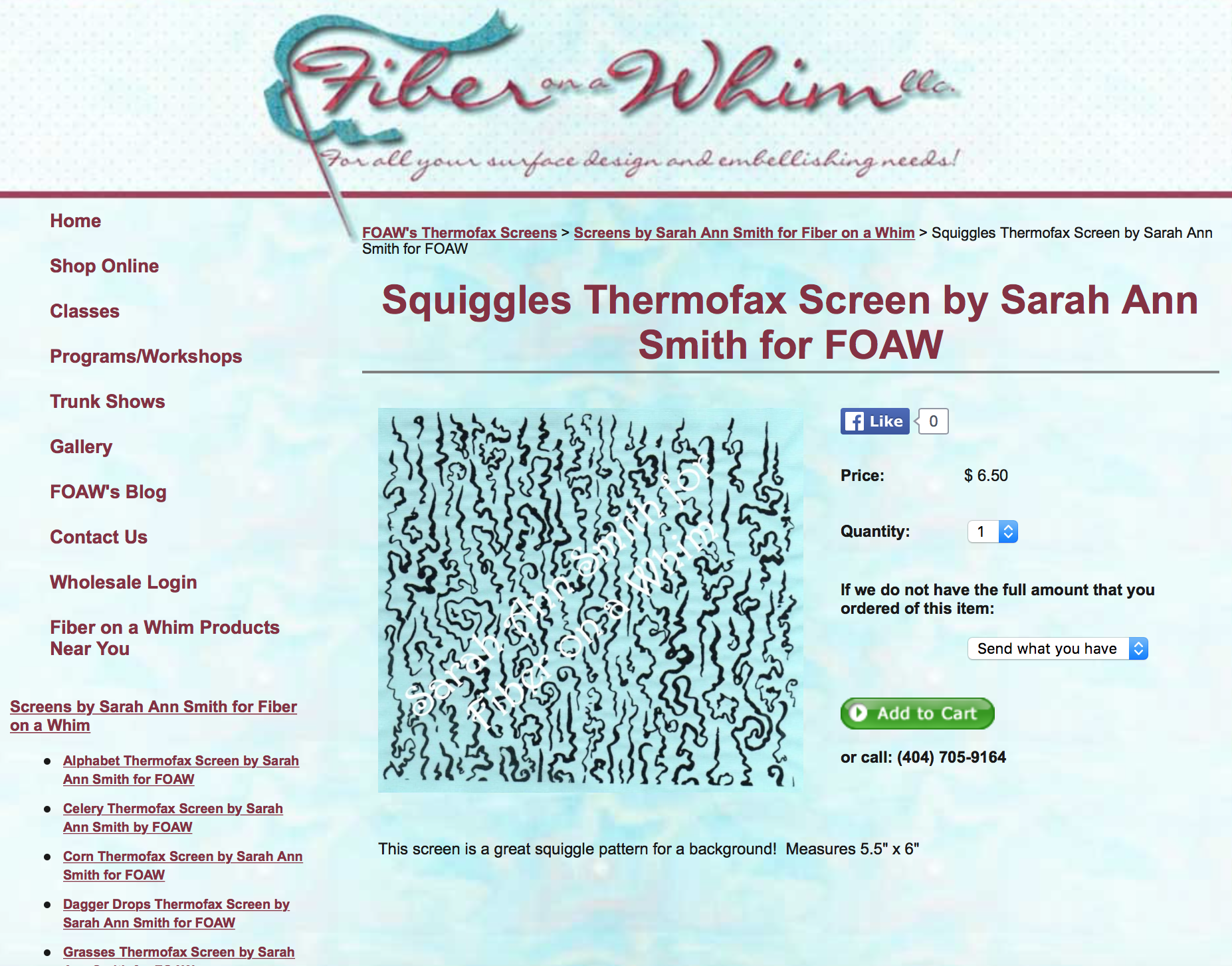
A couple years ago, I designed some Thermofax screens and had them made by Jan and Kristen at Fiber on a Whim.  They asked if I would be interested in selling the designs, and I quickly said Yes!   Here are three of my favorites:

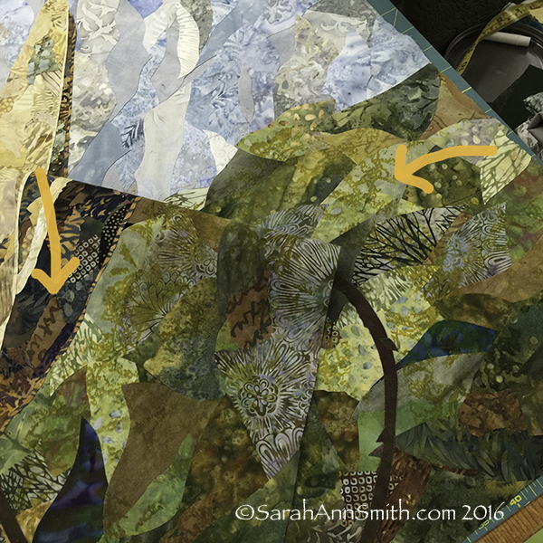
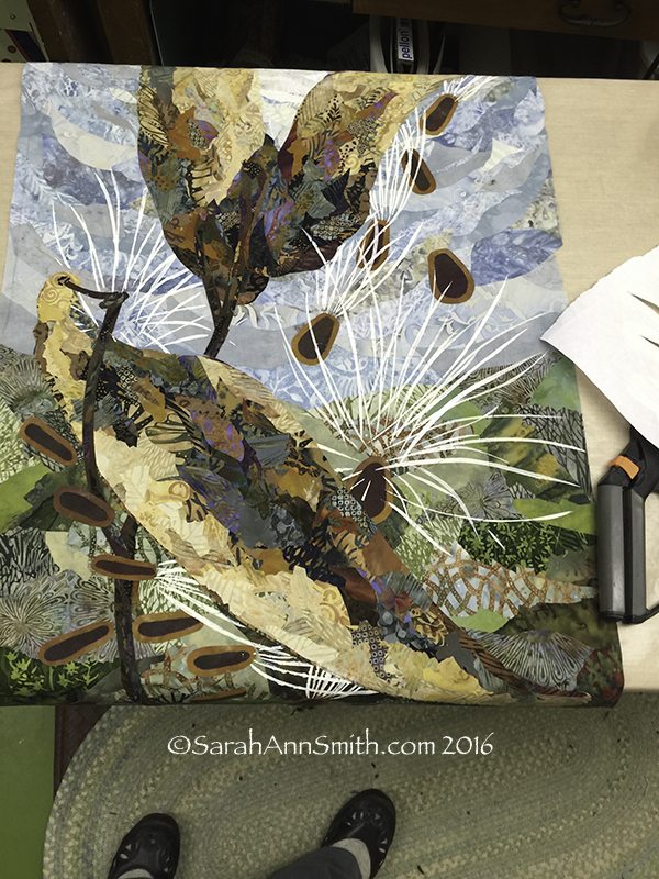
On the photo above, I have used textile paint and my "celery" screen to help blend the collaged batiks and hand-dyes

On the photo above, I have used textile paint and my “celery” screen to help blend the collaged batiks and hand-dyes.

My alphabet screen was used on some rather plain brown hand-dyed (by me) fabric then cut into bits to use in the quilt in addition to using batiks.

My alphabet screen was used on some rather plain brown hand-dyed (by me) fabric then cut into bits to use in the quilt in addition to using batiks.

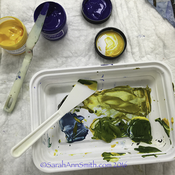
I mixed up some transparent textile paints--I use both Jacquard and ProFab--to screen print over the already collaged/fused background pieces.

I mixed up some transparent textile paints–I use Versatex, Jacquard and ProFab–to screen print over the already collaged/fused background pieces.

Next came the second round of screen printing, using my Squiggles screen, putting a darker green over the yellow-green I used for the celery.

I simply adore this screen. Add this to the top of any fabric--a plain tone on tone, hand-dye or batik and you've got great texture that can be blend or contrasty as you need.

I simply adore this screen. Add this to the top of any fabric–a plain tone on tone, hand-dye or batik and you’ve got great texture that can be blend or contrasty as you need.

I’ll be teaching some of this process in the Saturday Sampler where I will demonstrate working on your own personalized cloth as well as in my “Nest” class (you can see a bit about that here).

I also did a bit of stenciling using freezer paper and two colors of white.

I also did a bit of stenciling using freezer paper and two colors of white.

If you’d like to order those screens, visit Fiber on a Whim! Better yet, if you can come play with me in my classes at Quilt Festival in Houston this coming autumn!

JAM-SASmith


Teaching at IQF Houston 2016!

Tuesday, February 2nd, 2016

As you might guess by the deafening silence here on the blog, I’ve been rather busy but I have various bits of good news to share, and I’ll start with the most recent:  I will once again be on the Faculty for International Quilt Festival in Houston in October/November 2016!   And, drum roll, I’ll be teaching a few new things….yippeee!   Here’s my schedule, which stretches from the Monday of Quilt Market (a closed trade show for industry professionals) through Saturday of Quilt Festival.   On Sunday I get to PLAY—provided I can put one foot in front of the other and still see!   For details about each of the classes, please visit my Classes page which has descriptions of all the classes, class supply lists and, when available, hotlines to blogposts from previous versions of these classes so you can get a feel for what to bring.

Learn to make the painted fabrics in this project in my mini-Whimsy class at IQF-International Quilt Festival Fall 2014.

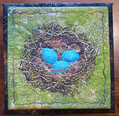
Learn to make the painted fabrics in this project in my new class The Nest–Surface Design Exploration for Beginners at IQF-International Quilt Festival Fall 2016.


  • Monday, October 31:  Decorative Stitch Appliqué, in the Janome classroom, All-Day class
  • Tuesday:  a day off–I’ll probably be IN a class!
  • Wednesday, November 2:  Fine Finishes–An Album of Techniques (bindings and more), in the Janome Classroom, All-Day class
  • Thursday, November 3, morning:  Machine Quilting Forum–Fun and Fancy Thread, 9-Noon
  • Thursday, November 3, afternoon:  The Nest–Surface Design Exploration for Beginners, 2-5, kit fee
  • Friday, November 4:  Tame Fussy, Fiddly Threads for Machine Quilting, in the Janome Classroom, All-day, kit fee for a range of threads etc
  • Saturday, November 5, morning:  Saturday Sampler–Screen-Paint the Perfect Fabric, 10-Noon
  • Saturday, November 5, afternoon:  Easy-Peasy Inside-Out Bag, 2-5, in the Janome Classroom
  • Sunday:  PLAYTIME–to see the exhibits and shop and collapse, in that order!

I’m totally good with having stayed home this past year as it was our younger son’s senior year in high school, but I so missed seeing folks.  I’m thrilled to be back in Houston and on the faculty. Thank you IQF and students!


See my work in Houston!

Thursday, October 29th, 2015

I’m thrilled to share that I have three works on display in Houston–in the juried show, the Dinner@8 Exhibit, and the National Parks exhibit.

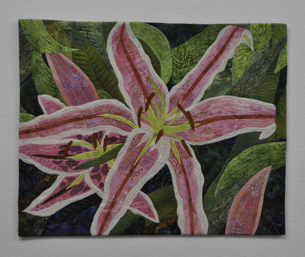
In Miniature art quilts, you’ll find my Pink Lilies (if anyone takes a photo of it…of the entire ‘neighborhood’ not just the quilt, please do share!):

SASmith.PinkLilies.Full-0842 copy

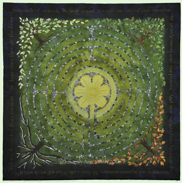
In Dinner@8’s Affinity exhibit, is Descended from the Stars, my most recent major piece:

(c)Sarah Ann Smith 2015; quote (c) Mirza Khan, used with permission

(c)Sarah Ann Smith 2015; quote (c) Mirza Khan, used with permission


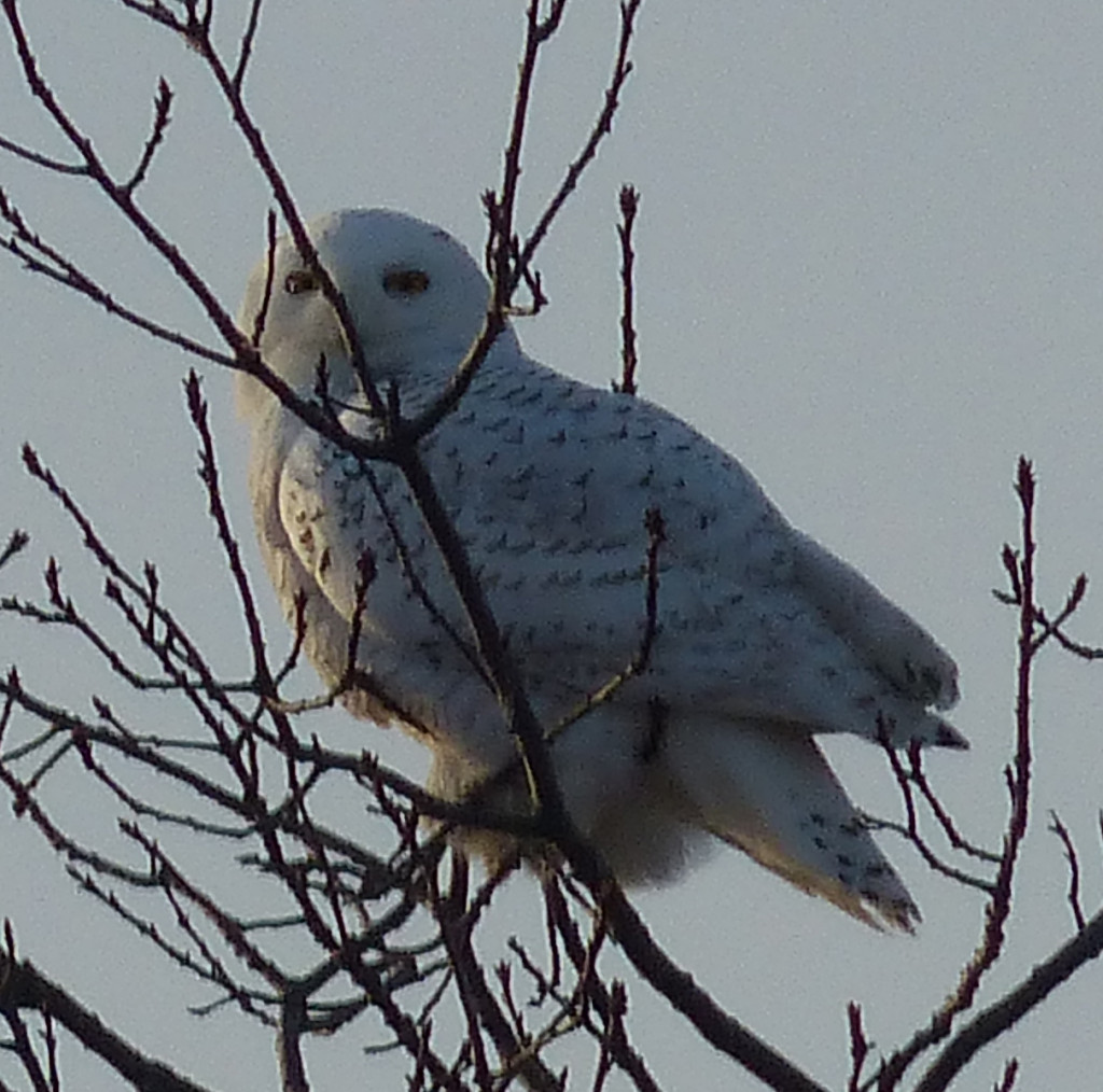
And, SOB, I STILL can’t share a photo of my Snowy Owl quilt for Acadia National Park in the National Parks exhibit.  I’m so sorry about that!   The book won’t be out until next spring and even though the exhibit is on display (with no photographs allowed signage) we’ve still been asked to NOT share pictures.  I’m so sorry–but it is 20×20 and mostly white (as befits a snowy owl in winter).   But here is the photo I took on Clarry Hill ridge in Union that was my main reference photo:

P1030533cropI so miss being in Houston…. enjoy it all of you who are there!  I’ll see you next year!