email Youtube

Home
Galleries
Blog
Workshops & Calendar
Store
Resources
About
Contact

Archive for the ‘Teaching / Classes’ Category

ABCs for Coastal Quilters

Sunday, January 13th, 2008

Class in progress

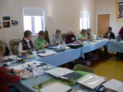
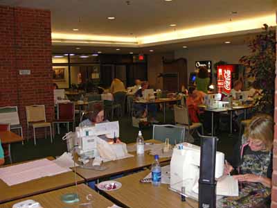
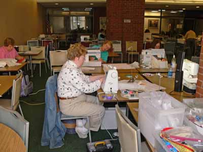
In three short months, I’ll be packing to head to my first MAJOR teaching venue: the AQS show in Paducah, Kentucky (it is amazing how quilters instantly know what you mean when you say Paducah, but mention it to the average soul on the street and you have to tell them it’s in Kentucky!). I will be teaching a whole bunch of things, including a class I had –until yesterday– never taught! EEEK! So the Coastal Quilters, my local guild chapter, came to the rescue. I offered to teach the class for free if they would be my guinea pigs…er…. ummm…. test-run for the class (picture above…but I blurred the faces because I forgot to ask each one for the OK to share pics)!

The class members were WONDERFUL, and I came away with several outstanding suggestions for improvements, learned that I needed to show how-to-steps on one project, and also decided I need to add one more exercise (meaning I have to delete something else) that pulls together everything we did in the class (and thanks to mulling it over with Roxanne by e-mail afterwards, have figured out how to do that!). All this is complicated by the fact that I function/teach better in a six hour format, and AQS prefers to offer 3 hour classes!

With “The New Drawing on the Right Side of the Brain”

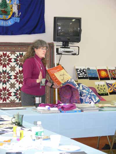
I started the class with a plug for a book that I consider nothing short of being able to work near miracles: The New Drawing on the Right Hand Side of the Brain and its companion workbook (in the picture), both by Betty Edwards–the two together cost less than US$ 24. I worked my way through the book with two friends, Linda C. and Lunnette H-H., when I lived on San Juan Island (before moving to Maine). We were all “OK” at drawing when we started (Lunnette was better than that, tho), but my gosh did I ever learn. Our before and after self-portraits showed dramatic improvement. I figure if *I* can learn on my own like that, anyone can. As a matter of fact, it was so useful I think I’ll do it again later this year. The titles above are hotlinked to the books at Amazon.com.

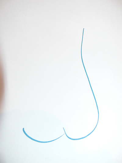
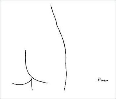
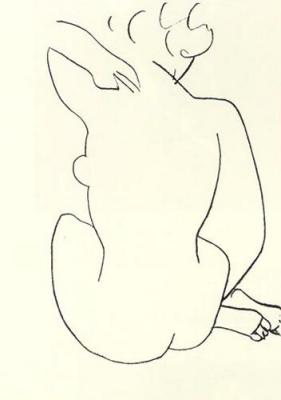
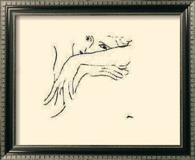
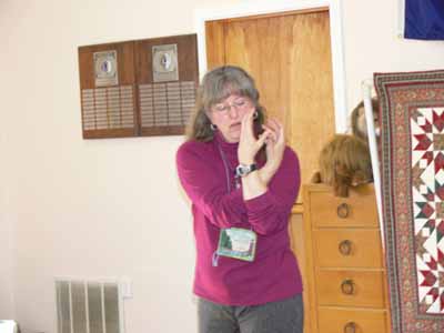
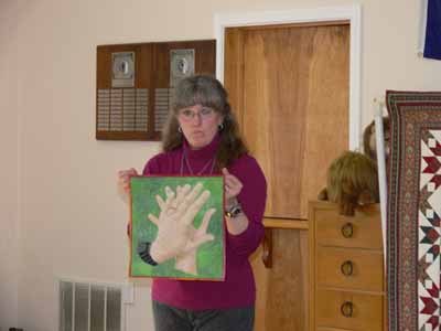
The class is called “If you can write your ABCs, You can draw”, and I started with a slide show… I need to improve the technical side of things, but as I showed more and more photos, all of a sudden I could see folks engage and start to “See.” As I told them, learning to draw is really about learning to SEE, then reproducing what you actually see (as opposed to what you think you see!). But, you don’t have to be Rembrandt…. you can use “aids.” some of these are the computer and your camera. To create “With These Hands,” I had my friend Marie take a few snaps of my hands…. I held them something like this:

Modelling how I held my hands while Marie took the picture

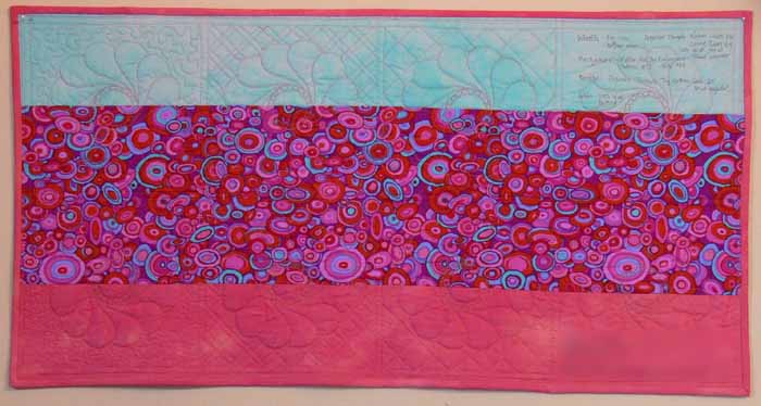
Then I enlarged the photo on my computer, taped tracing paper to the screen (moving it as necessary) and traced the outlines and major contour lines (light, medium and dark areas). THEN I could transfer those lines to my cloth and create this:

Showing With These Hands…tracing off the computer

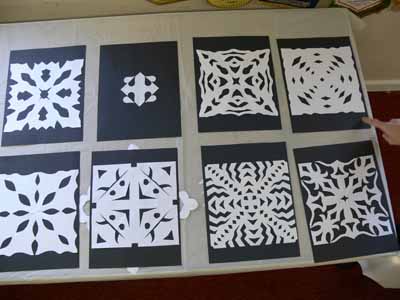
One of the most fun exercises (and alas one which will be eliminated due to time constraints, at least from the 3 hour version of this class), was making paper snowflakes to learn to “draw” with scissors, and to look at the concept of negative space:

Snowflakes

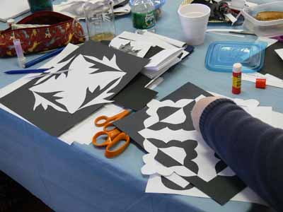
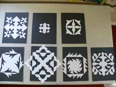
Then, a real keeper of an exercise is the “Expanded Square” from the book Notan: The Dark-Light Principle of Design by Marlys Mayfield and Dorr Bothwell (click on the title to see the book listed on Amazon–where it costs mere pennies…way worth it!). This exercise teaches you not only about negative space, but also about balance, rhythm, and possibilities of simple changes. In the book, the authors want you to use spendy black art paper to cut the shapes and glue it to white. Being thrifty (aka cheap) I had folks cut out of common white copy paper and glue it to black construction paper…it works! Here are Betty’s and Prudy’s being-glued examples:

Betty and Prudy’s in-progress Notan exercises
And here are some of the class pieces:

Notan

I learned this week that a crafts center in Ripley, West Virginia, wants to hire me (?!!!!! WOOOOHOOO) to teach a 4-day workshop, so I think I’ll combine this class, my quilting design, a bit of machine quilting, and edge-finish classes into a “The top is done…what next?” class! Zippedy do DAH! In a couple days I’ll post my upcoming schedule of classes…. stay tuned! Cheers, Sarah the swamped

A sampler of background quilting

Wednesday, January 9th, 2008

At long, LONG last, I’ve been able to make some headway on completing the last section of the manuscript for my book. Over the last few days of the boys’ vacation, I was able to complete a sampler quilt showing the effects of using different threads and different background quilting. I used the same wreath pattern on all eight “blocks”:

Full… coral Background QUilting sampler

I used a matching 40-wt. trilobal polyester thread (shiny and beautiful like rayon, but stronger and more lightfast), Superior Threads Living Colors # , for the top row. I used a darker 40-wt. polyester thread for the wreaths in the second row, Superior Threads Nature Colors # . For the background I used Mettler 60-wt. “embroidery” cotton in a matching color, and in the bobbin I used Superior Threads The Bottom Line. If you click the photo above, it will open and enlarge.

As you can see from the overall shot, from a distance the matching color-thread quilting nearly disappears. The dark color stands out a lot, though, especially with the “pearl” circle in the center. If I were quilting a real quilt, I personally would choose something in the middle of these two colors. I think the reddish color is too strong, but the matching color doesn’t stand out (so why do all that hard work if no one can see it?!).

Here’s a picture of the quilt “in progress” under the sewing machine. As you can see, I used the easy-on-the-eyes blue marking pen (the thick one). If I had had the fine-point blue pen, I would have used it. The line on the Dritz wash-out pens is so thick (nearly 1/16th of an inch) you have to choose whether to quilt on one side of it, the other side of it, or aim for the middle!

Coral Background Quilting Sampler while being stitched

The next part of the experiment was to illustrate how different background quilting blends in with or causes the main motif to pop out. From left to right (in both rows) I used:

  • no background quilting
  • cross-hatching (a grid) in a size similar to the large end of each feather in the wreath
  • cross-hatching in a smaller scale
  • stippling; on this one, I varied the size of the stippling. On the top row I used a fairly large stipple; on the bottom row I used a very small stipple to help the wreath stand out.

Between thee and me, I detest stippling most of the time. It has become SO overdone with the advent of machine quilting. There are lots more interesting ways to compress the background, but it does have its place (though infrequently!), and in this instance using a simple background quilting gets the point across better than something more creative.

Here’s a close-up of the no-background quilting blocks in the close up below…on the left. Boring and I think the background ripples some. I don’t personally care for this look, but certainly understand why some folks choose it, especially when hand quilting a big quilt!

Background sampler, left side

On the right you see the cross-hatching in a similar scale as the wreath. By using contrasting lines (curved and straight), you get some differentiation between the motif and the background. Especially when looking at the block quilting in dark thread, it works.

When you reduce the scale of the cross-hatching, you get further contrast of scale as well as line. This really helps accentuate the motifs. In antique quilts, this is how they got those beautiful wreaths and feathers to stand out and be noticeable, even though they were usually using white thread on muslin. This photo will enlarge if you right-click and open it in a new window or tab.

Coral Background Sampler, left side

In the stippling examples, boooorrrrriiiinnnngggggg, the larger stipple doesn’t do much AT ALL for me. The scale is too similar to the curves in the wreath. No significant contrast in line or scale. In the second block, the small scale of the stippling really helps “pop” the motif, as well as the small-scale cross-hatching. However, I still think there are lots more creative ways to deal with the background than boring old stippling. You can see the nearly-no-mark sampler I teach in my intro machine quilting classes here or here. That sort of background quilting is a LOT more fun (and visually interesting, at least to me!).

Finally, here’s a picture of the back. I used three fabrics on purpose to illustrate how the back looks when you have

  • a solid (ish) fabric that matches the front
  • a busy print
  • a solid fabric that contrasts with the front

Coral Background Sampler, backIf you right click on this image, you can open it up larger to see more detail (I hope!).

I prefer to use a bobbin thread that matches the needle thread so that small variations in stitch tension and balance aren’t noticeable. Some quilters REALLY don’t like it when the bobbin thread contrasts with the backing. Personally, I really like the line-drawing appearance. As you can see from these photos, the bobbin thread is visible (but not very) on the matching solid, disappears completely on the busy circle print fabric in the center, and makes a nice picture (to me anyway) on the blue:
When I finish my Hawaiian-style jumbo 9-patch quilt, Nourish the Body, Nourish the Soul, I’ll share the background quilting on that and on a couple of my pattern quilts.

Does this look at all familiar?

Friday, December 28th, 2007

I’m on a quest…. there is a line drawing I remember (which I saw about 30+ years ago) that is a seated nude woman, and consists of two lines–I had thought it was by Picasso (it was reproduced as a poster sold on college campuses….). I asked on the quilt art list and got many “close” suggestions, but none that is the one I remember. The suggestions folks gave will help me illustrate my point in my class (that it is possible to convey a whole lot of meaning in just a few simple lines), but now that I can’t find the danged thing that is battering around inside my brain, and I’m plagued with a desire to figure out WHO did it, and see an image. It looked something like this:

two-line nude

I had thought it was by Picasso, but having spent a whole lot of time at the Online Picasso Project (here) I have decided that was probably not who did it… whoever drew the one I remember probably liked women more than Picasso did.

Here are some Picasso drawings that are close, but obviously not a female nude:

Picasso HorsePicasso CamelPicasso Dove

The closest is “Femme,” but it’s not quite the same thing, and I’m SURE I remember a seated woman…..I’ve scoured the Picasso online project from 1955 to 1973 with no luck….:

Picasso Femme

Terry Grant, Pamela Allen and a few others suggested Matisse, and this is also close but not quite (and obviously fulfills the purpose for the photo in my class):

Matisse seated woman

Here are a few other Matisse that would work equally well:

Matisse Femme a l’amphore

and

Matisse Handkerchief

If anyone, however, has a clue as to who did the two-line seated nude, please do drop me a note or suggestion for searching!

Teaching in PADUCAH!

Sunday, December 2nd, 2007

It’s really true…. I knew it was because I had the signed contract, but the brochure to register for classes at Paducah arrived this week:

Paducah brochure cover

And guess what… I’m IN IT, as one of the teachers! Here is the class schedule. Each day’s classes run across the page, with the vertical columns showing which classes/teachers are in which rooms. I’m in the Roosevelt I (in the middle of the middle page) for portions of Wednesday, Thursday, Friday and Saturday, and in the Museum G1 room for one class on design on Friday afternoon. I’ve highlighted the places I’ll be, including (on the first day) the Awards Presentation to watch in awe and (I hope) the Sneak Preview (there is a teachers’ meeting after the Awards thing, so I may not be able to go).

Paducah brochure class grid

Paducah prefers to offer half-day classes, and most of my regular classes (to learn more, click on the Classes link in the menu bar above) are full-day sessions. So, I offered to split some of the full-day classes into segments. I’m so thrilled…. one lady I met recently on a yahoo group has already signed up! WOOOOHOOOO! Anyway, here is what I’m teaching (and if you have questions about the suitability of a class or whatever, please write me!):

Wednesday morning, April 23 — Looks Like Hand Applique (but Isn’t) uses washaway paper / stabilizer to make a machine applique that looks like hand-turned (almost) but that is done on the machine. Best of all, no freezer paper to remove!

Wednesday early evening (5:30-8:30), April 23 — Chunk and Jigsaw Fusible Applique–this is the easiest and most playful class, so perfect for this time (which startled me…first I saw the 8:30 pm and gasped as I’m not a night person, but 5:30 to 8:30 works perfectly for this one!)

Thursday all day, April 24 — Introduction to Machine Quilting. This is my most popular class and fills regularly. It is suitable for folks who have never machine quilted a single stitch up to early intermediate–folks who have done machine quilting but want a lot of background about the basics plus hands on help and practice using both the walking foot and free-motion.  It is jam-packed with information, so bring LOTS of notepaper and be ready to learn!  I’ve not had a soul yet who didn’t quilt their name (and someone else could read it, too!) by the end of the day!

Friday morning, April 24 — Machine Quilting: Dabbling with Decorative Threads. This is the play part of my all-day “more machine quilting” class. I will have kits ($15 each) containing seven types of threads on ten “bobbins/ micro-spools” of Superior Threads so students can try 50-wt cotton, 40-wt. single-color and variegated polyester, 35-wt variegated cotton, a metallic, a holographic (the shiny fancy stuff!), and 60-wt “Bottom Line” polyester (the Bottom Line, a fine thread designed for use in the bobbin but also a fantastic applique thread for either hand or machine work)

Friday afternoon, April 24 — If You Can Write Your ABC’s, You Can Draw Your Own Designs. This is a brand new offering, and I’m excited (and a tiny bit terrified). I’ll teach you that even if you think you can’t draw, you really can, because you “draw” your letters every time you write. It will be a fun class and I hope it will help you learn to see the world in a new way–how to identify shapes and then use that knowledge in your quilting.

Saturday morning, April 25 — Nearly No-Mark Machine Quilting. This class overlaps with the Intro to Machine Quilting class, but focuses on the doing, not the basics and foundations you need to know to get the best results. If you think you know what you need to know about needles, machine basics, ergonomics, basting and such, but really want help only with the free-motion portion of the class, this is for you. Of course, I’ll have extra handouts for this class featuring different designs and processes so if someone wants to take both classes, there will be new material and more one-on-one time (I hope!).

Saturday afternoon, April 25 — All Star Review. I’ll be one of a LARGE number of teachers doing demonstrations on special techniques. I’ll be talking about Decorative Threads on the Machine. If I recall correctly, 400 people are allowed to purchase entry to these reviews (I’m doing the one on Saturday only, not the one on Tuesday). Folks are given a booklet of one-page handouts for all the teachers, then can go from station to station watching the demos. It is a great way to get a feel for the teachers (and hopefully I’ll be able to make some contacts that will lead to future teaching gigs around the US or, dare I hope, beyond!) and be exposed to a lot in a short time. During the last half-hour of the 2 hour period we are permitted to sell patterns, items and kits. If I have any leftover thread sampler kits, they and my patterns will be available here.

To read the class descriptions, class supply lists, kit fees and whatnot, please visit the Paducah class information webpages. The hotlinks on this page will allow you to download pdfs, including one for the full brochure, and others that are sections of the brochure. My classes are in the School of Applique, School of Color and Design, and School of Quilting and Finishing, as well as the Complete Registration Guide.

To register for the classes, click here.

And on Sunday, I have a FIVE-leg journey…yes, car shuttle to the airport 2 hours away plus five flights plus short drive… to get home.   I think I’ll be a happy blithering idiot by the time I get home.  I am thrilled, honored, praying and working hard to live up to this incredible opportunity, slightly terrified, and mostly excited about being able to teach in Paduch.

Amoskeag Quilters, Manchester NH

Sunday, October 28th, 2007

micro-miniature

This past weekend I was fortunate to be able to present my trunk show / lecture “With a Dash of Color” to the Amoskeag Quilters Guild, based in/near Manchester, New Hampshire, and teach a machine quilting class on Saturday. Alas, I have very few pictures! The talk is one I have done many times before, but I always have fun and hope to turn on a few lightbulbs for folks. Basically, we all respond to color, but not all of us (me included!) have an intuitive grasp of color. There are a number of ways to put together a color scheme for a quilt, and that’s what I talk about using my quilts as examples. (read to the end for info on that bit above!)

The next day I taught a class on machine quilting and decorative threads, but snafu seemed to be the order of the day (did you all know the origin of the word snafu? I am told it dates to World War 2, or perhaps earlier, and stands for—uh, well, I’m going to clean up the language, but substitute the expletive verb that seems appropriate: Situation Normal All Fouled Up). When I arrived at the venue, the power was out to the entire building! And for a machine class. Fortunately for me and the students, the morning is mostly lecture and there was a good window, so we moved tables and sat by the only natural light and went through the basics. By the time I was nearly done, the power returned!

Thread Kit metallic colors

For the class I tried something new. I had an assortment of Superior Threads re-wound onto bobbins (a service Superior provides for teachers). As a result, I could offer a kit with ten “micro-spools” that included three bobbins of Bottom Line (60wt. poly), and one each of metallic, Glitter (a holographic thread), Brytes (30-wt cotton), King Tut (variegated 35 or 40 wt cotton, forget how heavy), MasterPiece (50wt cotton), Rainbows (variegated 40 wt poly) and a solid 40-wt poly. The kit runs $15, and is seems students were OK with that…the same as buying two spools of “fancy” thread. I offered a choice of either silver or gold–photo above (for the metallics baggie) and warm (pink/red), cool (blues) or earthtone (greens and browns)–photo below, so students could pick one color and one metallic. To my surprise, earth was the most popular! Don’t these threads look like a color feast?

Let me know what you would like in a thread sampler? I’d love to refine this kit!

Thread kit colored threads

It must have been a nerve-wracking day for program chair Cary Flanagan (who was in the class…visit her website at Something Sew Fine) and guild president Sue Ann Walker, who were trying on a Saturday morning to find an alternate location…to use immediately! Thanks to both for their efforts!

Amoskeag 1

Above are the two sections of the class….it was held in the cafeteria of an office building. The good news is that the students had PLENTY of table space, but it meant for a bit of “projecting my voice” (i.e. being even louder than I usually am) and getting some exercise getting around to all 18 students. Still, I’ve heard it went well. As always, if there is anything I can improve, I always want to know because I can’t make it better if I don’t know it needs improving! Amoskeag 2

I met one of the students, Aline, on Friday evening and she told me about this miniature she is working on, which will FINISH at 7×7 inches. She brought in a quarter of it and let me photograph it…that’s what you see at the top of this post. Yes, that is inches on the ruler, Those itty bitty triangles of pink and green are half square triangles…smaller than a 1/4″ finished size. I took one look at it and said “you are FLIPPIN’ INSANE!” and I stand by it LOL! The tiny straight line is a “piece” 1/32 inch thick. I love looking at them, but I could never, EVER be that accurate! Beautifully done, Aline!