Quilting Happened!
Saturday, January 5th, 2013What a concept, I actually got some quilting done!
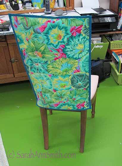
Chair, Improved with color and cloth!
I do seem to be in procrastination mode, though. I need to start a quilt for a juried invitational. I did sketch out the idea and pull some fabrics. I decided I need to dye some fabric, so I have washed the silk and hung it to dry, and plan on dyeing that cloth on Monday. But did I do anything else on that quilt? Nope. Instead I had a tidy attack in the studio, then decided that after a year-plus of fabric hanging over the back of this chair (and falling off again, and again, and again), I needed to actually QUILT the fabric and turn it into the cover I wanted.
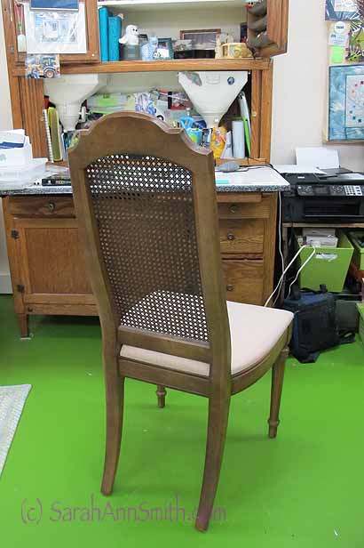
Mom’s desk chair. Well made. Seriously dated. And just blech.
The chair came from Mom, after she died. It didn’t sell in the consignment store and is a well-made chair, albeit one that looks exactly like what it is: a chair an old lady bought in 1972. Ugh. I really don’t like chairs with cane backs. The fruitwood finish is pretty dated and icky, too, but I’ll deal with that later.
And, Janome America (thank you!) upgraded me to an 8900 on their artist/teacher program, so of course I needed to take it for a test quilt-drive, right? Turns out I am in love yet again with these Janome machines. I have lots of playing to do with this one, but really like the cleaner view around the presser foot, the quiet operation, ease of use, fabulous tension… sigh! Love these machines! And so thankful that Janome-America has supported me these many years.
Perfect excuse for not working on that quilt. So I took a length of this wonderful, cheery floral and quilted it. I grabbed some teal fabric I’ve had for about 15+ years (bought to be a backing and then not used) since it would be on the inside and not seen. As it turns out, the teal looked really good and I ended up using it for the binding! I hadn’t planned on doing a binding; I was just going to turn the quilted fabric like a pillowcase and slip it over the back. But the teal blue really added to it, so I added bindings.
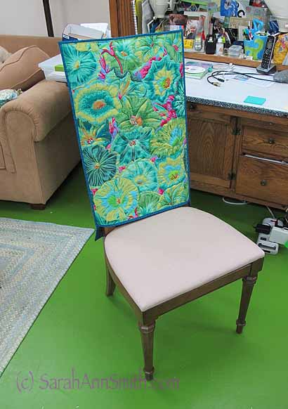
And from the front. Next: re-cover the seat with something that goes better than plain old cream.
Also, about a month or so ago, someone on a list I’m on recommended a Martelli’s quilting ring and had a discount code to use if one ordered during a short window of opportunity. The discount took the price from “are you KIDDING?” to”expensive but I want to try it and at least it is a business expense for me.” So I ordered it. About 2/3 of the way through quilting yesterday, I remembered I had the quilting ring (I bought the 11″/large version which you can see/order here) and should actually TRY IT. I like it! Some folks on the Yahoo Janome group I’m on (for 6500-8900 machines) had mentioned using two of Sharon Shamber’s red hoops, stacked, but said this was easier. I agree! Here’s the hoop just tucked under the foot (there is a cut-out that permits slipping under the presser foot).
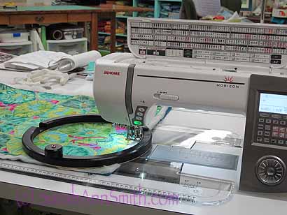
The Martelli hoop on the chair cover as I was quilting it. On the left of the hoop you can see the cut-out for slipping it under the presser foot.
And here it is moved all the way over to the harp, a large space, on the Janome 8900.
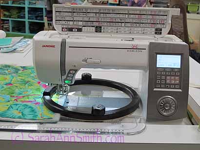
And moved as far right as it can go. This is the large, 11″ hoop on the Janome 8900. Both knobs are visible, useful and don’t get in the way. You can also gently grasp the hoop itself to maneuver it.
Even though I am VERY experienced at free-motion quilting, I can see that using this hoop will help me on some sorts of movements…longer smoother lines especially. For small detailed work, like intricate quilting on a face or small space with lots of direction changes, I think using my Machingers gloves may still be the best, but this hoop worked very well and was easy to adjust to using. In particular, the knobs and the thickness of the hoop are friendly to arthritic hands. Unlike the red hoops from Sharon Shamber and other hoop-type devices, the bulk of this one means you don’t have to use that pinching motion that hurts the thumbs. I can rest my fingers outside the hoop, hooking my thumbs around the knob and move the quilt underneath easily.
When you get to the edge, the grippy stuff on the bottom of the hoop has a propensity to grip the machine/table surface when a segment of the hoop is off the quilt. There are a couple of options: pin some fabric/hand towel to the edge to give the hoop something on which to rest. OR, as I discovered (photo below) the size of the hoop is so large that you can swing it up and let it hang over the center section of the machine until you are around the corner! You don’t have to break your thread and remove the hoop…just swing it up out of the way. Also useful if you need to change the thread and/or bobbin.
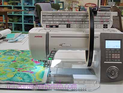
You can (at least on my machine with this large hoop) temporarily get the hoop out of the way just by swinging it up and hanging it on the center of the machine. Useful for corners where too much of the grippy on the bottom is on the table surface instead of the quilt.
Cool beans! That’s it for today. In less than two hours (I’m writing this a day ahead of it going live on the site, so it is Friday morning as I type) I head out for the next Wrestling Tournament, the second and last of the overnight trips for this season. I’ll post to FaceBook if I can!


