Manuscript samples
Sunday, July 13th, 2008You may have noticed (or not, but I sure have) a dearth of quilty posts here the past many months. I really miss my studio and making art! Between family, exhaustion and a little working on my manuscript, I haven’t been able to create much. And the two pieces I’m working on now are for the Journal Quilt Exhibit this coming year, and can’t be shared (unless they don’t get juried in, or if they do get in, not until the show opens in Houston in late October–the hotlink is to the 2007 journal quilts… you can see mine on my website and on page 9 at the hotlink). BUT, I think I can share a little bit of the book samples I’ve been slaving over for my manuscript for Unraveling Threadwork (tentative title).
(Earlier blogposts about the book, in reverse chronological order, are here and here and here.)
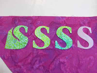
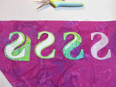
Anyway, the book is about using thread on the surface of a quilt, so that covers applique, decorative stitching, free-motion stitching (at the quilt top stage) and quilting. Here I’m making samples of various ways to applique, including illustrating the need to reverse somethings …here’s the “reversed” S shape:
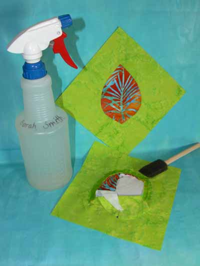
Here’s a mock up of the photo I’d like in the book on how to dampen the stitching to make removing freezer paper easier:
One thing I didn’t realize, but which makes sense, is that if you want the book to come out the way YOU want, you need to give the publishing company real guidance on the photos by doing mock ups. Of course, this is a LOT of work… you don’t just make the sample, but in my case put the camera on the tripod, set up the photography lighting, take several shots , select the worst and delete the extras, re-size the photos, then (when inserting into manuscript) relabeling all the dang things, and making sure the labels and numbers and whatnot correspond! Talk about time consuming…. so I’m only nearly a year late due to life etc.
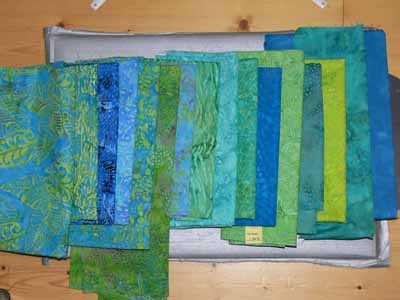
Another pretty photo is to illustrate visual texture in cloth, from plain (nearly solid) on the far right, to LOTS of visual texture (on the far left…larger designs, lots of contrast in both line and value).
And on that note, I’m gonna sign off, do some reading, and hopefully get back to work!
