email Youtube

Home
Galleries
Blog
Workshops & Calendar
Store
Resources
About
Contact

Archive for the ‘art quilting’ Category

Joshua, the quilt in progress, #2

Wednesday, April 14th, 2010

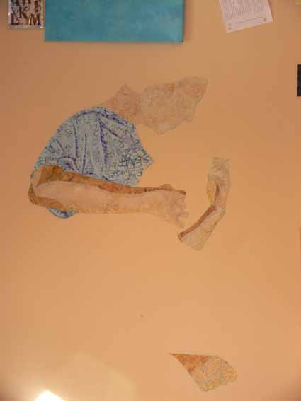
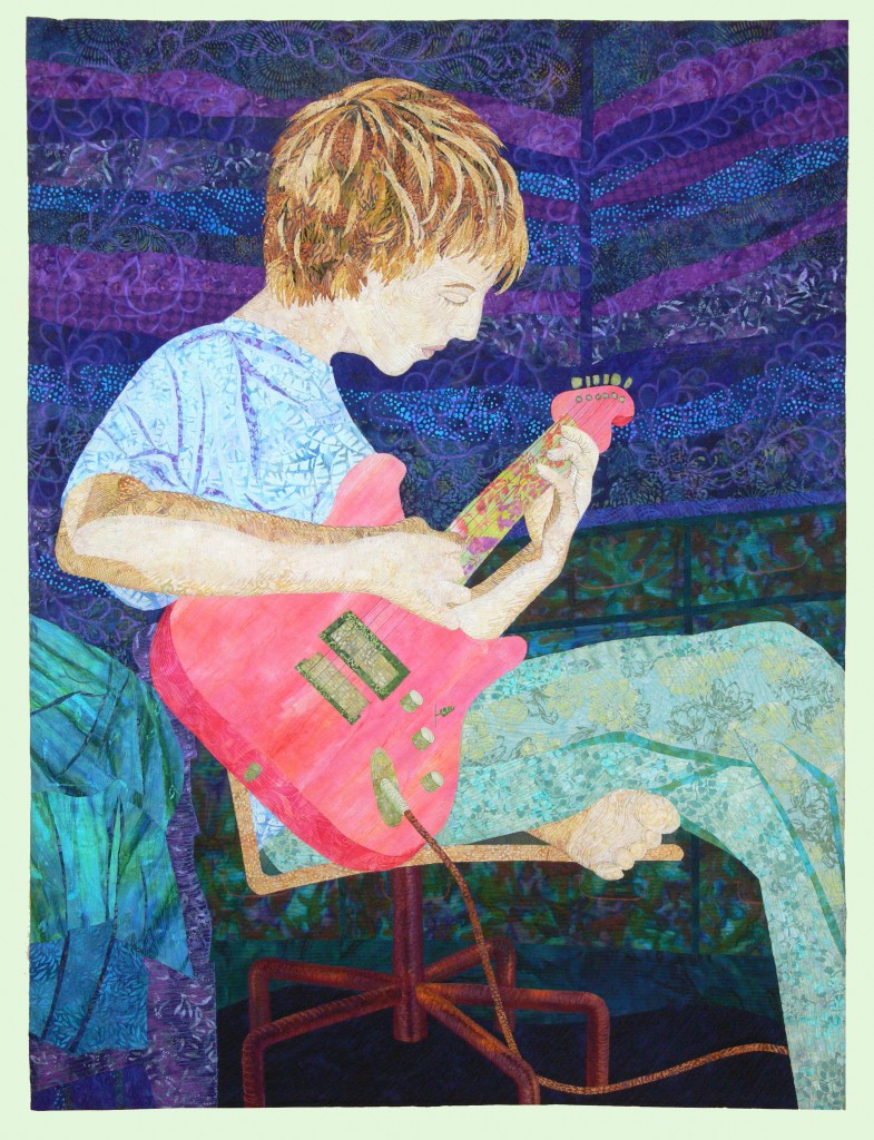
So last post on this topic, I said I’d share how I began the quilt itself:  the hardest part first.  That, of course, would be Joshua!  The face, head, hands, then body.  When I first thought about this quilt, I had thought I would do something like I did with the quilt of our pug, Pigwidgeon, and it would be in totally NOT realistic colors.  If I wanted to stick to light values for the skin tones, that meant I had the following not-realistic options:  pale pink (nope), pale yellow (nope, sallow), pale green (the Green Giant?), pale blue (nope, sickly), pale purple (BLEAH! NO!).  So I revised my plans and decided to use real skin tones and tweak all the other colors.

I found a batik that was pale beige and golden scrolls, and decided that would be my base for his face and neck, selecting a darker part of the fabric for his neck.  I underlined it (fused it to) a solid white to prevent the dark walls (which would go behind his head) from shadowing through on the “seam” allowance.  By the way… I should add that this entire quilt top is fused applique, using my favorite fusible,  MistyFuse.  Even when you have multiple build up layers, like his hair, it stays supple and fabric-like…unlike some brands the feel and sound more like cardboard once you get two layers or more!

For his arms, I used five values of cream to dark tan for the shadowy side of his arms.  The rest of the shading was done with thread.  Note the bottom of his foot, down low on the wall.  For the clothing, I used three values:  I picked the main fabric for the t-shirt, then found a lighter blue and a darker one for the highlights and shadows of the folds.

Next, the hair!

Joshua, the quilt in progress, #1

Saturday, April 10th, 2010

A short while ago, I was able to share the finished results of my most recent “big” (36 x 48 inches) quilt, a portrait of my son Joshua.  I love seeing quilts come to life, and watch the creation process when other folks make things, so I thought I’d share how this one came together.

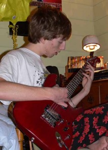
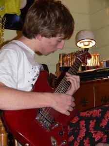
First, several months before I finally got to cut fabric, I took photos of Joshua playing guitar (after asking nicely for a few weeks, I finally pinned him down one evening).  Sitting on the floor to get a not-the-usual angle, I took about 60 or 70 snapshots, many of which I was able to rule out immediately (mostly due to closed eyes, mouth hanging open, blurry fingers).  I narrowed it down to three:  one for the position of his head (mouth closed, eyes open–on the right, below), another for the position of his hands and body (on the left), and a third for some extra details on the room.

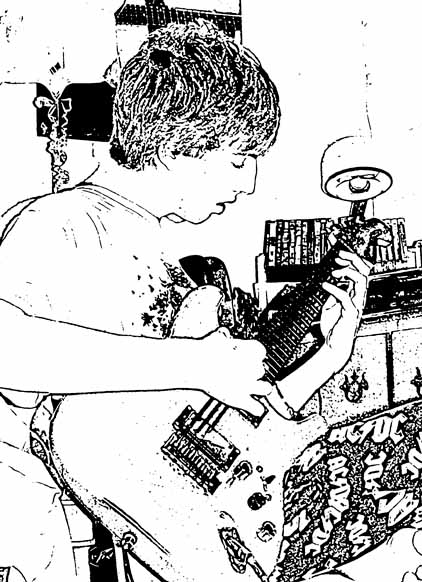
Then, I fiddled around in Photoshop to come up with a line drawing.

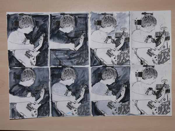
I sized this so that it would fit four times on a piece of paper and did what is called a value study.  I learned about this from an online educational resource (pay to play–thanks Deirdre for sharing this one with me!), www.artworkshops.tv , an online tv/classroom site.  I watched the video by Polly Hammett on Design with the Figure.  One of the things she showed was doing quick thumbnails (quickie outlines) of her intended composition, then using ONLY black and white, blocking out what would be light and what would be dark.  By using only black and white, you get immediate, stark visuals on the shapes and negative spaces (the shapes between), which gives you an idea how the composition will work.

This exercise was INVALUABLE!   Since I never went to art school (last class was my one and only year in art in high school), I’d never heard of this, though it is probably a basic! Here is a snapshot of the value sketches I did, except I “cheated” took a shortcut by using the Photoshop Elements outline.  The two on the far right are the “blanks.”  The one I ended up using is the bottom row, third over:  Joshua’s face and arms are light, the background is deep dark, the guitar medium in value (again, I fudged a bit on the black-white only and expanded it to include a gray).  PS–this one photo is clickable for a larger view:

This helped me decide on my colors.  I knew that I wanted Joshua to be the focal point, with his guitar as the secondary focal point.  That meant if Joshua’s skin was to be light, the wall needed to be dark, not the celery green it really is.  If you look again at the value studies, you can see how much more his face pops when it is against something super dark, not just “gray” or medium value.  I also darkened up the dresser, bedding, and eliminated details (posters, books on dresser, clutter!) to make my life easier and to make the composition more focused.

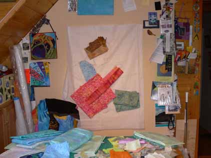
Next, I used my laptop, hooked up to my digital projector, to project the main photo onto the design wall, where I had taped up paper (medical exam table paper, long, cheap, taped together–bought a roll from my doctor for $5 and it is 3+ years old and still plenty left) and traced out the outlines.  Here’s a photo of the drawing on the design wall with preliminary fabric ideas pinned to it:

Next, I’ll show how and where I chose to begin…the hardest part first!

PS:  Norma asked what process I used in Photoshop Elements.  I’ve tried to duplicate it and I THINK this is what I did:

I think I converted it to grayscale first; Go to Image, then Mode, then click on Grayscale.

Then,  under Filters/Sketch/Stamp, click on stamp and adjust the light/dark slider to about 2… I think.

I just tried to re-do this, and that is as close as I can get.  Shoulda taken notes!

GREAT Reviews for ThreadWork Unraveled!

Wednesday, March 31st, 2010

WOWIE ZOWIE!  See these?

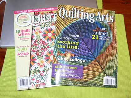
Those are probably my two favorite magazines in quilting, ever:  Quilter’s Newsletter and Quilting Arts. And they BOTH gave my book great reviews!

When I first found quilting in 1988, I found Quilters Newsletter Magazine shortly thereafter.  I promptly subscribed, and ordered every back issue I could get, and have read ever issue since cover to cover.  That is 1984 to 2010 and still going.

Back in 2001, I went into the grocery store in Friday Harbor (San Juan Island, Wash., where I used to live) and discovered the second issue of Quilting Arts magazine.  I went home, called the phone number, ended up speaking with the editor Pokey Bolton (and discovered we both went to San Domenico School, albeit about 14 years apart, when we were kids) and subscribed.  I have read every issue of that one cover to cover.

Whooda thunk it…. BOTH my favorite magazines have not only reviewed my book, ThreadWork Unraveled, but given it GREAT reviews.  THANK YOU THANK YOU THANK YOU!

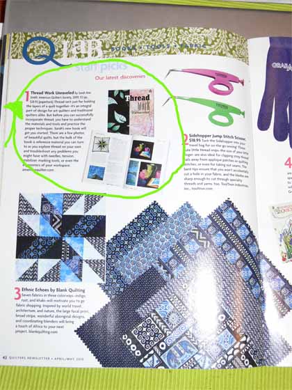
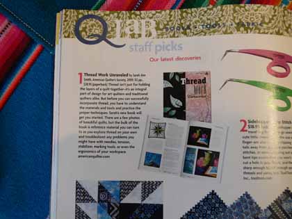
In Quilters’ Newsletter (April 2010 issue), there is a four-page article on Staff Picks…and guess what number ONE is?  MY BOOK!

Here’s a closer picture:


To say that I am dancing a major Snoopy Dance understates things in such a major way!

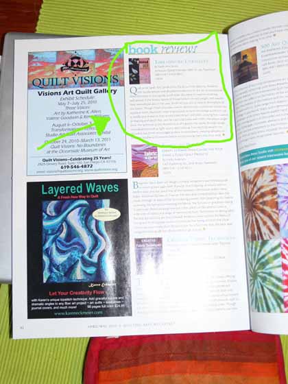
And here’s p. 82, the Book Review section in Quilting Arts magazine, April/May 2010 issue:

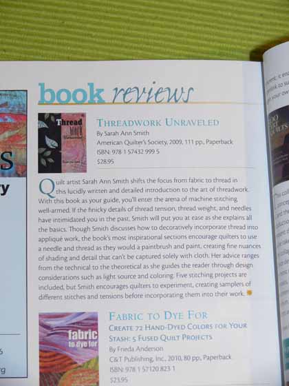
And again, a closer view:

It is so wonderful when you worked hard to do your best, and then have others think you’ve done well.  Thanks so much… and Pippa, the managing editor of Quilting Arts, said the nicest thing… that I am at my best when encouraging others:  “the book’s most inspirational sections encourage quilters to use a needle and thread as they would a paintbrush and paint, creating fine nuances of shading and detail that can’t be captured solely with cloth.  Her advice ranges from the technical to the theoretical as she guides the reader through design considerations such as light source and coloring.  Five stitching projects are included, but Smith encourages quilters to experiment,”  Wearing my teacher hat, it doesn’t get much better than that!
WOOOOHOOOOOO….that shaking in the upper Northeast is not an earthquake, that’s me Snoopy Dancing and being happy all over again!

A new art quilt: Joshua

Tuesday, March 23rd, 2010

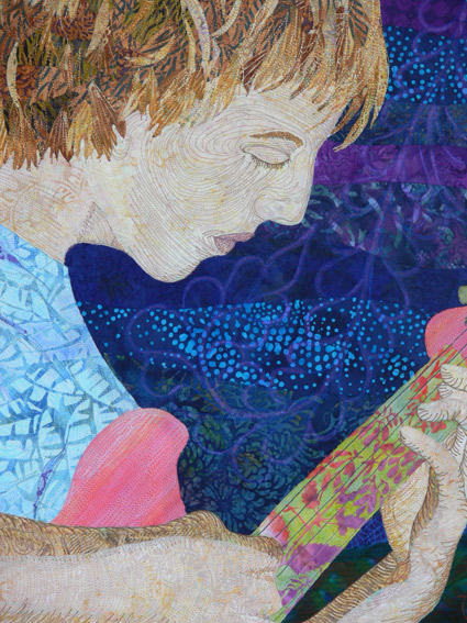
At long last!  There has been precious little time for making art quilts over the past few years.  What with family chaos, the hurly burly of every-day-life, writing a book and making all the samples, marketing the book, travel-teaching and whatnot, I’ve can scarcely recall the last large art quilt I made just for the sake of making it. Here’s a detail (you’ll have to keep reading to see the rest!  yes, I’m evil <GRIN>):

Last autumn, Jamie Fingal and Leslie Tucker Jenison of Dinner at Eight Artists invited me to submit a quilt for consideration in a juried invitational show called “Beneath the Surface.”  (Note:  a list of accepted artists is on their blogpost dated March 22…what fine company!) That means you make a quilt to theme and size (36 wide by 48 tall), and it still might not get in.  My first thought was…I have too much on my plate.  Then I realized the due-date (which always gets me in gear) was early enough in the year that I might actually have time to do it!

My first thoughts were underground waterways, roots, rocks, critters that burrow.  Then, thanks to the influence of my friend Kathy who loves the sea, I thought about under the sea.   But then I thought, no, everyone will do that…. I want to do a portrait!  Then I realized, it could fit the theme:  What is under the surface of a teenage American male?

I took about 65 photos one evening of my older son playing guitar, which is such an elemental part of who he is.  I selected two:  one for the overall body position, another for the face (angle of head, mouth closed, eyes looking down).  I ended up using a third picture because the proportions of the first two didn’t give me enough of the room for the measurements of the quilt.   Luckily, I finished on time and got in!!!

I’ll share the construction process (I’m always fascinated by how a quilt comes to life, but decided I’d show the results here, THEN show the process because, well, I’m impatient and want to share!) in future blogposts. So, here it is!

I think this may be one of the best quilts I’ve ever done; best of all, Joshua likes it too.  I was worried about the funky batik I used for the guitar neck, but when he saw it he said “If I could find a guitar like that in real life I’d BUY IT!” How cool is that?

My original statement for the quilt was (big surprise) a bit too long, so I’ll repeat all of it here:

What is beneath the surface of a 16 year-old male?  Some things are obvious:  music, food, girls, friends, food, school, guitar, food, video games, movies, girls, friends, food. Others are not so obvious.  There is the man he is becoming:  kind, compassionate, interesting, funny, breathing music in his soul, argumentative, loyal, passionate, tolerant, stubborn, smart, gregarious, curious, honest, loving and loved.   “Mom?  Can you fix me something to eat?”

Thanks to Moore’s Sewing Center (in southern California and online) and Brother International, who are sponsoring the exhibit at the IQA show in Long Beach, California; we are hoping the exhibit will continue on to the big IQA show in Houston in Fall 2010.  Thanks also from me to Iris Karp of MistyFuse for her generous support.  This entire quilt top was made with fused applique…MistyFuse ROCKS!

So far I know these artists have blogged about their quilts in the exhibit:

Those of you who can, I hope you can take pics at Long Beach!  Enjoy, and again thanks to Jamie, Leslie and our sponsors!

Lino-cut sunflower, part 2, and owl revisited

Sunday, March 21st, 2010

In my last post, I shared the carving of the 12 x 12 inch sunflower block, and a while ago the first attempt to print with the owl block (about 4×6 inches).  Well, the Speedball water-based printing ink arrived.  I only ordered one tube, copper metallic, to test it.  Shoulda ordered more!  It prints MUCH sharper, cleaner prints–I’ll put side by side of the owl in textile paint and ink below.   But first…the sunflower…..Oooooh la la!

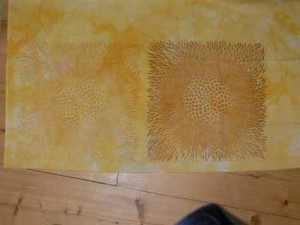
Here are the two prints I’ve made so far:

The one on the left is the first attempt.  Since the copper color of the ink is about the same color as the linoleum, it is almost impossible to tell visually by color if you have enough ink.  Clearly not.  The second print on the right is much better.  Oddly, thought the ink appears metallic in the tube, it doesn’t look metallic on the cloth.  Still, I really like it.

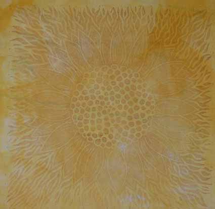
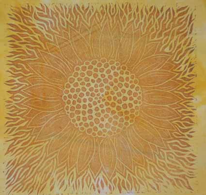
I ADORE this block. I was thinking of cutting it apart into three sections:  the center, the petals and the outside.  But what if I mess it up?  So I think I’ll keep this one as is, then carve another center and another ring of petals separately, so that I can print the block in different colors for each segment.  My mind is already racing on how I can use this to create new cloth, made a t-shirt, and basically have a ball. Here are closeups, first of the too-pale version.


This one will make a good candidate for overprinting with a different stamp in darker ink.  The darker print is much better, but I have to work on getting an unwrinkled “underneath”…I protected my padded surface with a plastic garbage bag that has fold marks in it, and they showwed up in the print:

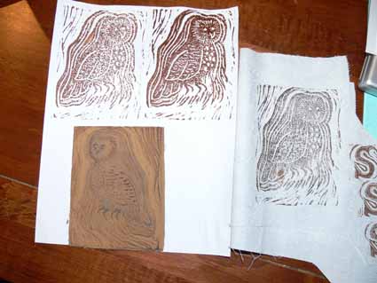
In my earlier post about the owl, I mentioned that I didn’t care for the heaviness of the lines to the owl’s left:

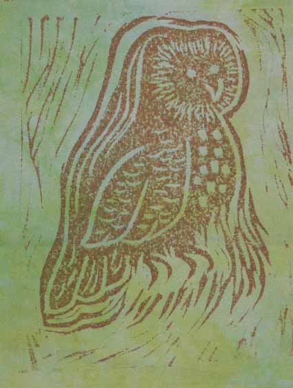
So I removed some of the lines and tried printing again.  On this one also I had the same issue with guessing how much was enough ink, the first one being too pale, the second and third better:

Here’s a closer view of one of the better prints:

There is a learning curve, but I am moving along it, and this is GOOD.  And I can see having a lot of fun with this technique.