email Youtube

Home
Galleries
Blog
Workshops & Calendar
Store
Resources
About
Contact

Archive for the ‘art quilting’ Category

Free-Motion Quilting and life…

Sunday, September 26th, 2010

Yes, it has been a while.  As usual, that means there has been more than the usual chaos around here.  We happened on to a house for sale ad in August, which started a ball rolling that we hadn’t anticipated.  We found a different house just a couple miles away (same school district, next town over), made an offer on it, and have been maniacally (sp?  that looks weird but not getting a spelling error notice) sprucing up our house.  That means little art and quilting have happened.  Until this week.

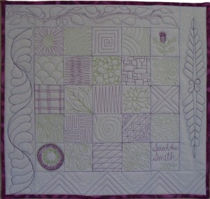
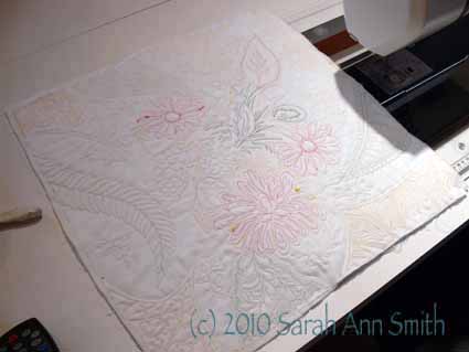
In the midst of getting the house onto MLS, I started a new sample piece for my Intro to Machine Quilting Class which I’ll be teaching again on Sunday at Maine-ly Sewing in Nobleboro.  I was prompted by two things:  this post over on Jenny Bowker’s blog and the fact that some students find free-motioning into the vastness of empty space –i.e. the 18 inch square quilt sandwich I have them bring– is intimidating.   I use this sampler as my basic teaching tool (it’s also patterned in my book–click on picture to see it larger):

Some students like to make it just as is, sewing the grid, then filling in the squares, since a small square is less intimidating that a large one!  Others feel too confined in the squares, so I tell them to just go for it on the sandwich without creating a grid framework.  I’ve also long counseled them to use a large print as a guide for learning.  You can put the print on the back of the quilt and use that as your design, or just in the borders but repeat the shapes and motifs in the center of the quilt.

If you haven’t yet visited Jenny Bowker’s blog, DO!  She is one of my all time favorite quilt artists.  Her work is always inspiring and amazing.  While you are there, be sure to click on the link to her website and view her quilts.   Jenny has combined the two methods I use into one piece…take a square of big-print fabric in the center of the sandwich.  Jenny has her students piece the top, I think, but I’ll try fusing instead…faster for a class room setting?  Then use various motifs from the print fabric plus fill patterns for the rest.  In looking at hers again, I think I need to make MORE of these little pieces; I also am thinking a bed quilt of assorted big print squares with wide, solid-fabric sashings quilted all over like this would be GORGEOUS!

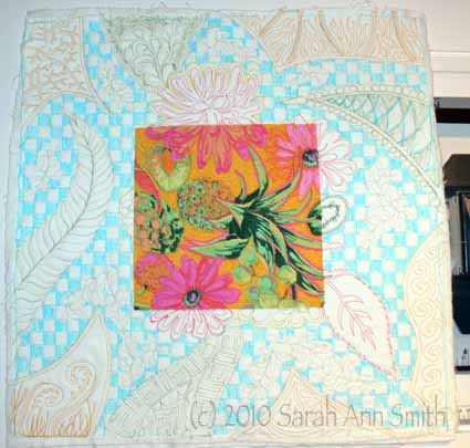
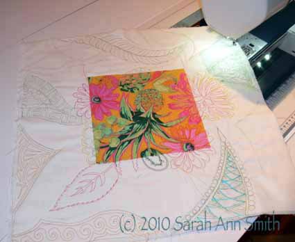
So, I decided to adapt her idea by fusing an 8 inch square into the center of an 18 inch square of white.  I also received some spools of thread from Gilbreath Threads, fairly new to the quilt thread market I think–their stuff is available here.  They found my website, asked if I’d like to try their threads (the cottons are made at the same factory in Italy as the Aurifil cotton that is so luscious Correction!!!!  Gilbreath claims the cottons are as good as Aurifil…see my clarification posting dated October 11, 2010).  I said sure, and they sent me a variety.  In the next post, I’ll share more about them, but I think I am in LOVE with the 12-wt wool and the 12-wt silk.  I am re-thinking my aversion to bobbin work…these are too wonderful NOT to use!

I began by quilting on the print square, then spilling over onto the white.  Next, I continued with the variegated green (a Rainbows thread from Superior Threads), with relatively easy quilting (requires less precision than many designs) for the four different “waves” coming in from the sides.  I then decided to repeat the yellow color of the heavy wool used to outline the flowers, but using Gilbreath’s 40-wt. Poly.  The latter handles and looks much like Superior’s 40-wt poly threads, which are my favorites.

Once the colorful stitching was done, I decided to try the two cotton threads Gilbreath send:  a 40-wt ecru and a 50-wt white 2-ply.  I used the ecru to stitch a small leaf design in the center of the remaining open areas:

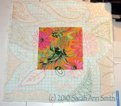
Finally, I used the fine white thread, which appears to be similar to Superior’s MasterPiece thread, for some background quilting.  I like to contrast curvy with linear in quilting, so I chose a checkerboard fill patter.  I got out my ruler (who me?) and drew a grid with wash-out blue pen (see above).  Then, because I am easily confused, I colored in the alternate squares so I wouldn’t go off-track, and stitched on top of the blue (yes, this is the picture from the top, repeated….):

Here’s the back:

You’ll notice some thread blobs…I left those on purpose since this is educational.  The point on this one is read the thread description FIRST.  I tried using the 12-wt silk and the 12-wt wool through a topstitch needle (both size 14,90 and 16/100), with limited success.  I then read that it is intended for use in the bobbin or by hand.  I simply cannot describe how heavenly that heavy silk is….. I can see doing handwork just so I can use it.  The sheen, the thickness….GLORIOUS.  I think I will take a very close up of that spool for the next post….drool!   Anyway, that’s for next time.  And you’ll see it with the blue washed out…mo bettah!

Art Cloth Frame in Quilting Arts Gifts

Tuesday, September 14th, 2010

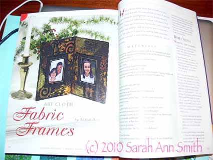
I am THRILLED to be able to share with you a snapshot of my article in the just-out Quilting Arts Gifts magazine!   Here’s “my” page / article:
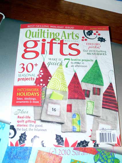
And here is the cover of this year’s project-packed issue!


Since there are copyright issues, I won’t share more pics of the issue than that, but I can say you MUST check out Susan Brubaker Knapp’s mistletoe!  I think I shall make some for this  year!

A little background:  last year I was fortunate to win a second place ribbon at the IQA World of Beauty for my quilt of our  pug; the prizes in my category, Art Quilts-Miniature, were sponsored by none other than Quilting Arts!  So as a thank you for the sponsorship of the prize, I wanted to send publisher and editor John and Pokey Bolton a little something beyond the ordinary thank you note.  So I made them a frame (color coordinated with their pets hair colors {grin!}).  Pokey wrote to say thanks, and would I consider patterning it for the magazine?  YOU BET!

I have made two other frames using this technique of assembly, so I thought I’d share pictures with you to give you ideas for different “looks” if you decide to make one of these frames!

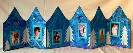
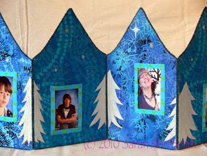
The first one I made as a holiday project, to go on the table or mantle over the fireplace/woodstove:

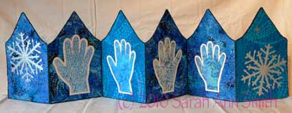
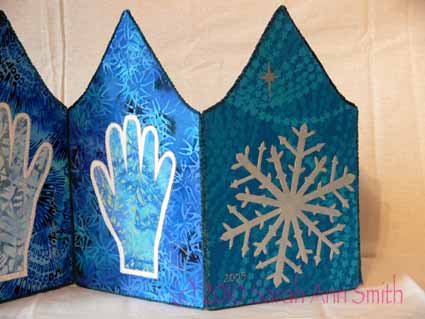
This shows the “photos” side of the accordion “book” with stencilled winter trees and stars.  The next photo is the reverse side of the “book.”  I traced each person’s hand, then reduced it to 75 percent on the copier to fit on each page, which is about 7 inches wide and 10 inches tall at the peak of the roof. I wanted to stick to the blue batiks, so I used an underlayer or “shadow” of white fabric to accentuate the shape of each hand.   I used freezer paper stencils to paint on the “paper snowflakes”:

And here are two close-ups:

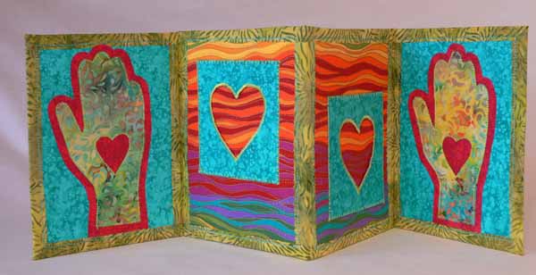
The second was a gift for my friend Kate, and I blogged about it here:

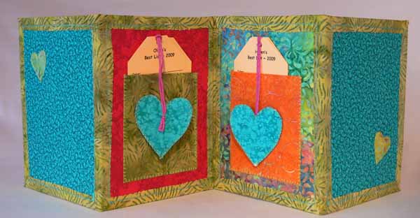
There is a heart frame to hold pics of each of her children.  On the back, there are pockets to record their favorite clothes, teams, sports, books, songs, on a card.  Here is the back side:

As you can see, you can get a LOT of different looks…just go play! To order your copy of Quilting Arts Gifts, go here, or head to your nearest big box book store which will likely have it on the stands now!

New Sewing Table and Janome Horizon 7700!

Thursday, September 2nd, 2010

Wowie zowie!  Having a little bit of income and a  wonderful sponsor is, well, WONDERFUL!   Janome has come out with an upgrade to my beloved Janome 6600, and they were kind enough to send me a Horizon 7700!  Plus I had two new sewing tables built…what a way to start the new school year!


To backtrack a bit, when we moved to Maine in 2004 and I lost my home-dec-sewing name-recognition and income base, I decided if I was going to try to make a “go” of it and earn some income from quilting, that was the time.  Shortly before that, as an utter unknown with maybe ONE publication credit to my name, but three things in Houston in 2003 (the Journal Quilts, a quilt in the juried show and another in a special exhibit), I approached Janome because I really wanted the 6500 but couldn’t afford it.  I asked if they had a teacher/artist loan program, and if so if they would consider me.

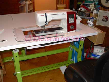
To my utter astonishment and delight, Janome America said YES!  It has been a great relationship ever since, and they have generously upgraded my machine first to the 6600 then the 7700!  So MAJOR THANKS to Janome America for their continued support…. I’d say all these great things about the machines if I had paid full-price—they are a lot of value for the quilting dollar!  So here it is:

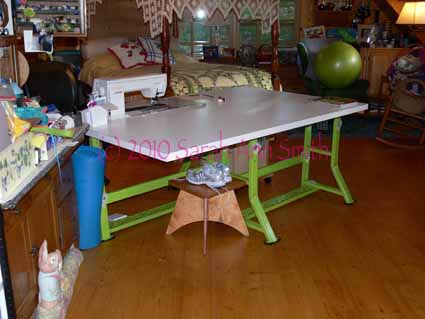
Yes, that’s a NEW table!  I had a Sylvia 1500 cabinet that I loved, but the opening was too small for the extended harp of the 7700 and couldn’t be enlarged without re-making the entire cabinet.  My friend Kate (THANK YOU!) wanted to buy my cabinet, so I decided to get new tables.  At first I thought I’d buy something from Tony at Sew Perfect Tables, but it turned out I’d lose a lot of length to the left of the needle compared to what I was used to.  So I asked Tony if I could purchase just the K-base (so-named due to the shape of the legs) used on his tables and industrial sewing machines.  He said yes, so I bought two (I’m hoping to add an HQ16 sit-down mid-arm to my arsenal next year) and had them painted lime green at New England Motorworks (I think there was a Ford Pick-up  years ago that came in this color!).  Thanks to Tony and NEM!

Then I had John Bailey of JB Builders (dad to a friend of my older son’s, builder and carpenter…and the guy who build those great shelves for my fabric, here — in the third photo down, on the left, in aqua!) make the tops to my specification.  Each tabletop is 24×60 inches, with a 12 x 27 inch opening for the machines.  The shelves for the machines are adjustable and can be raised to flush with the surface of the table (to collect more piles of stuff?).  The opening is so large because the HQ16 sit-down is a smidge over 25 inches long, so this leaves room for plugs, etc. I wanted the tables to be white, so white formica it is!  The two tables latch underneath when pushed back to back, giving me a ginormous 48 x 60 tabletop.  Eventually, there will be a machine in two of the corners, acting as a “stop” for a quilt sliding off the far corner.  Perfect!

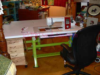
Here’s a wider angle view of the sewing side of the table (more on the drawer unit in a future post):

You can just barely see the second sewing machine shelf on the far left corner as it is raised even with the surface.  The total cost for all this custom work ended up being just about $200 more than if I had bought two smaller tables from Tony–I am THRILLED!  So thanks to Tony, John B., NE Motorworks and Janome.  I am SO looking forward to sewing and quilting with my new set-up!

LA–the Getty Museum of Art, Part 1

Tuesday, August 10th, 2010

When I told my beloved sister in law, Joyce, that I would be able to come for a long weekend, she asked what I wanted to do!  Well, most of all I wanted to be with Joyce and meet her friends, but I thought…hmmm…How about the Getty?   I’ve been inspired by photos of the Getty on my friend Deborah’s blog (see here for her pics) and some photos of the Getty in Lura Schwarz Smith’s fabulous book, Secrets of Digital Quilting, From Camera to Quilt (click here to go to Lura’s website, the title links to the book on Amazon or buy an autographed copy from Lura here).  Well…get ready folks.   I seriously shortened my list of photos…and I still have over 30 to share!  So I’m going to break this up into several posts….

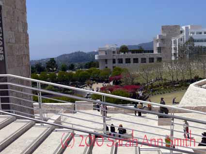
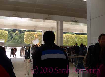
The photo above is walking up to the top of the hill to the galleries from the main entrance.   To back up a bit, admission is free, but parking isn’t.  You must park at the bottom of this tall hill that looks out to the Pacific Ocean, then take one of the frequent trams up the hillside. The sheltered-from-the-elements space is carefully designed to move MANY people efficiently.  Here, the maze of waiting lines:

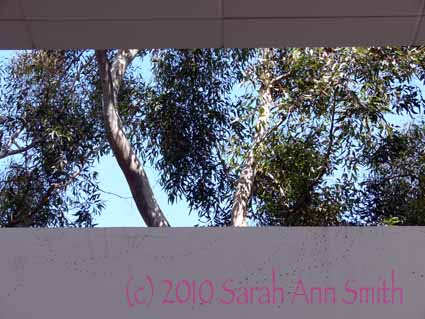
I loved this view of the blue skies through the trees…even the leftover bits from the ivy or clinging vine on the wall seems like art…

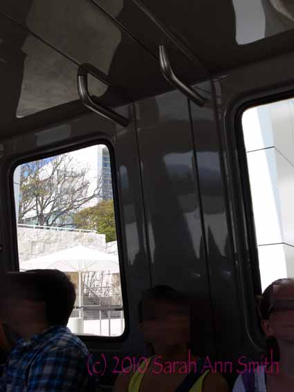
And on the tram (blurred the faces since I have NO idea who these people are and can’t ask permission to include their faces!)

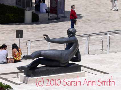
Then you see this incredible statue of a swimmer by Aristide Maillol (one of my FAVORITE European sculptors…late 19th c.):

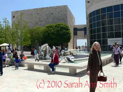
Here is Joyce at the start of our time (before we got pooped and sore feet!) on the way to see the Leonardo exhibit:

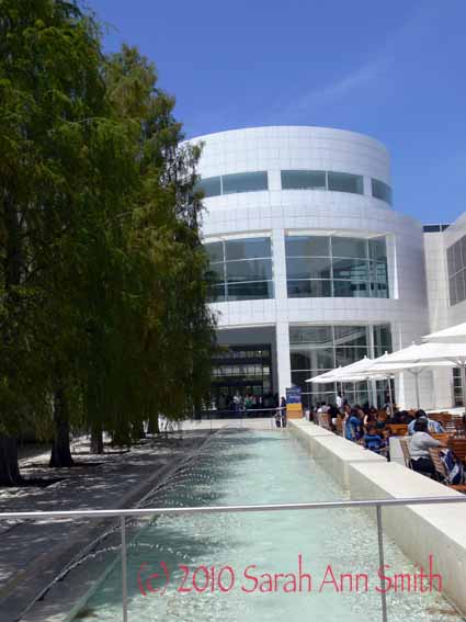
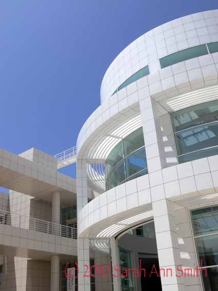
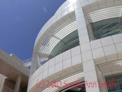
The buildings themselves, by architect Richard Meier, are a work of art, and the landscape is another work of art (more on that in a future post).  My breath is simply taken away by the stunning lines, curves, shapes, the subtle play of the smooth- and rough-faced stone, the perfect pairing of the color of the stone with the blue of the sky and the green of the trees:

And a better photo (tho gives less of a feel for the grounds):

And more:

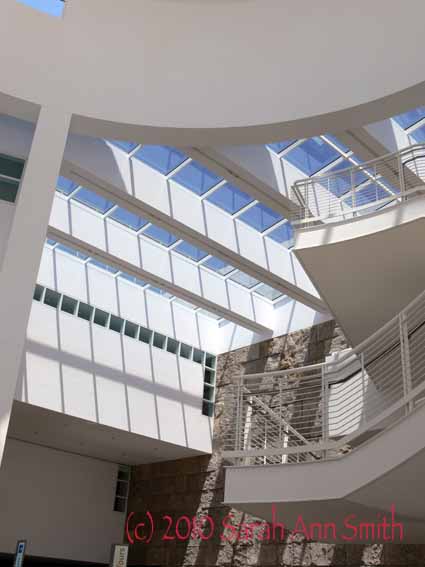
Even the white interior balconies, railings and skylights were stunning in their simplicity and line:

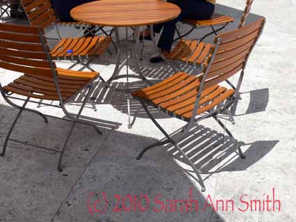
And of course the color and contrast in the tables outside–you could buy food there or bring your own and eat in the shade of the umbrellas–love the lines and circles and stripes and shadows and the one blue bottle cap on the chair seat….

WOW!  Wait till you see the next photos….

The Leonardo Exhibit, by the way, was phenomenal.  Because these works were on loan, photography was not allowed, but I saw ACTUAL journal pages, in sepia ink by the master himself and…drumroll..one was of a DRAGON!   He liked dragons, too!!!!!!   To think, those pages are over 500 years old, and the lines made were made by Leonardo himself…. utterly mind-blowing!

Sunset Crater and Sedona, Arizona

Saturday, August 7th, 2010

When noodling around the internet, the hubster found (or already knew about) Sunset Crater, which is a volcanic ash field between Flagstaff and Monument Valley on the Arizona/Utah border.   While I was in Flagstaff waiting for Paul and the boys to arrive, I noodled around on the internet and found out about the Wupatki Ruins (in a subsequent post).  As luck would have it, both Sunset Crater AND the Wupatki Ruins are on the same loop road off the main highway from Flagstaff to Monument Valley.  SO, on the way back to Flagstaff, guess where we went?

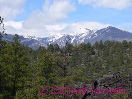
This is a different view of Arizona than what typically comes to mind (the saguaro cactus and desserts):  mountainous, cooler, still dry air, snow even in April, skiing in the San Francisco mountains behind (north of) Flagstaff.  And it is GORGEOUS!

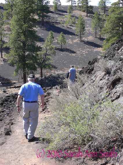
There was a nice trail (thanks to the National Park Service and the cash-strapped Arizona State Park system) to follow–look at all of the black volcanic ash as ground:

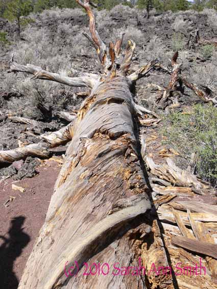
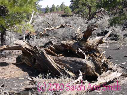
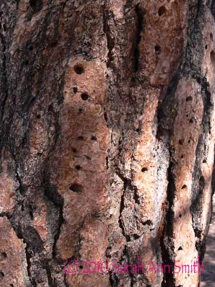
There were several downed trees, and we wondered about the spiraling grain/growth pattern.  Before too long there was a sign that explained that trees with spiraling grain sway better in the wind, and so stand a better chance of surviving the windy storms.  Fascinating! Plus the bark makes really cool patterns…again, thinking quilting designs:

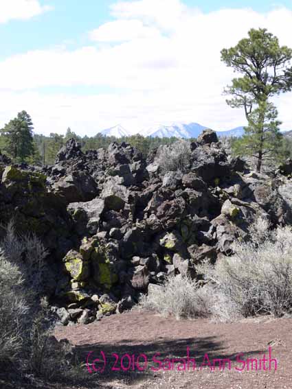
And volcanic rock:

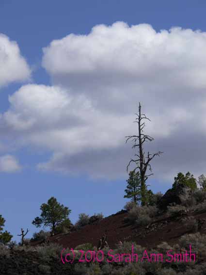
And SCREAMING BLUE skies:

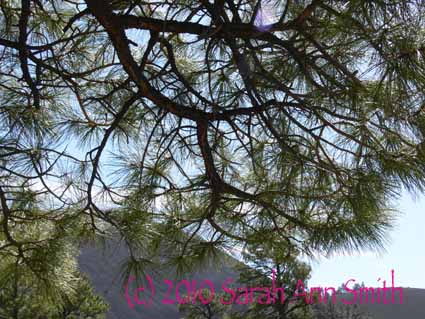
The requisite “if it is Sarah taking the pictures, there must be a photo looking through tree branches”–again, fodder for quilting designs:

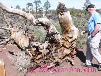
And more fodder in the gnarly roots and bug-nibbled wood:

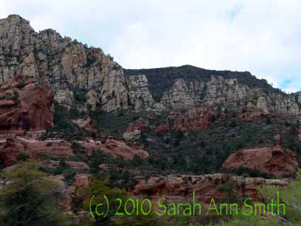
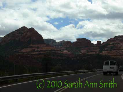
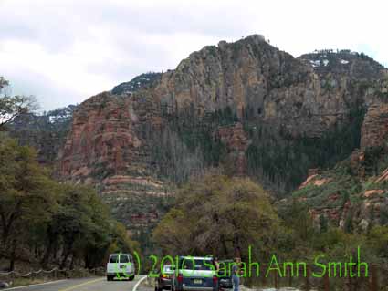
It turned out we had a bit of extra time that day.   MANY folks had told us how wonderful Sedona is, and we hadn’t realized it is a short half hour south and smidge west of Flagstaff.  So down we went.  Hmmm…   the surrounding area was gorgeous, and I’ll bet if you went out of town, it would be wonderful (Red Rocks is near there).  But the town itself?  Ick.   Serious tourist schlock and stores and junk wall-to-wall on the main streets.  All four of us took one look, said let’s eat lunch and leave!   At least the drive down was nice: