email Youtube

Home
Galleries
Blog
Workshops & Calendar
Store
Resources
About
Contact

Archive for the ‘art quilting’ Category

From the Schooner Coast, to Paducah!

Wednesday, March 7th, 2012

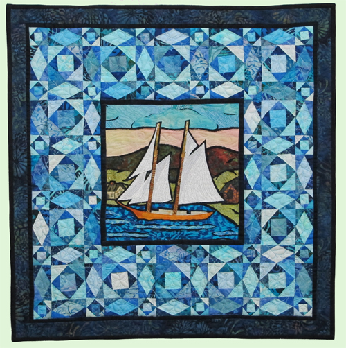
Got some great news this week, made official with the arrival yesterday of semi-finalist information from AQS (American Quilters Society):  my 20 1/2 by 20 1/2 inch quilt that I made for the Coastal Quilters Grocery Challenge, From the Schooner Coast, has been accepted in the miniatures category at Paducah! The smallest squares  finish at (shoot me!  WHY? did I do this…and believe it or not I could actualy see doing this again) 1 1/8″.  Yes, scarcely larger than an inch.  For those of you not in the U.S.  that is about 2.6 or 2.7 cm.  Small.

From the Schooner Coast (click to see a bit larger)

This quilt is a hybrid of a 9″ square art quilt depicting Camden Harbor and miniature storm at sea blocks.  I talked about the Grocery Challenge here (part 1) and here (part 2), but in a nutshell (this was something I thought up…imagine…an original challenge idea!) take a food or beverage from the grocery store as your inspiration.  You had to use at least 4 colors from the package (adding black and white was allowed), but so that folks just didn’t troll the aisles looking for a package with colors they liked, you had to add at least one motif or element inspired by the packaging.  For example, if you picked corkscrew noodles, you could quilt with a corkscrew design; or, if you picked Tabasco sauce, you could use a chili-pepper fabric.

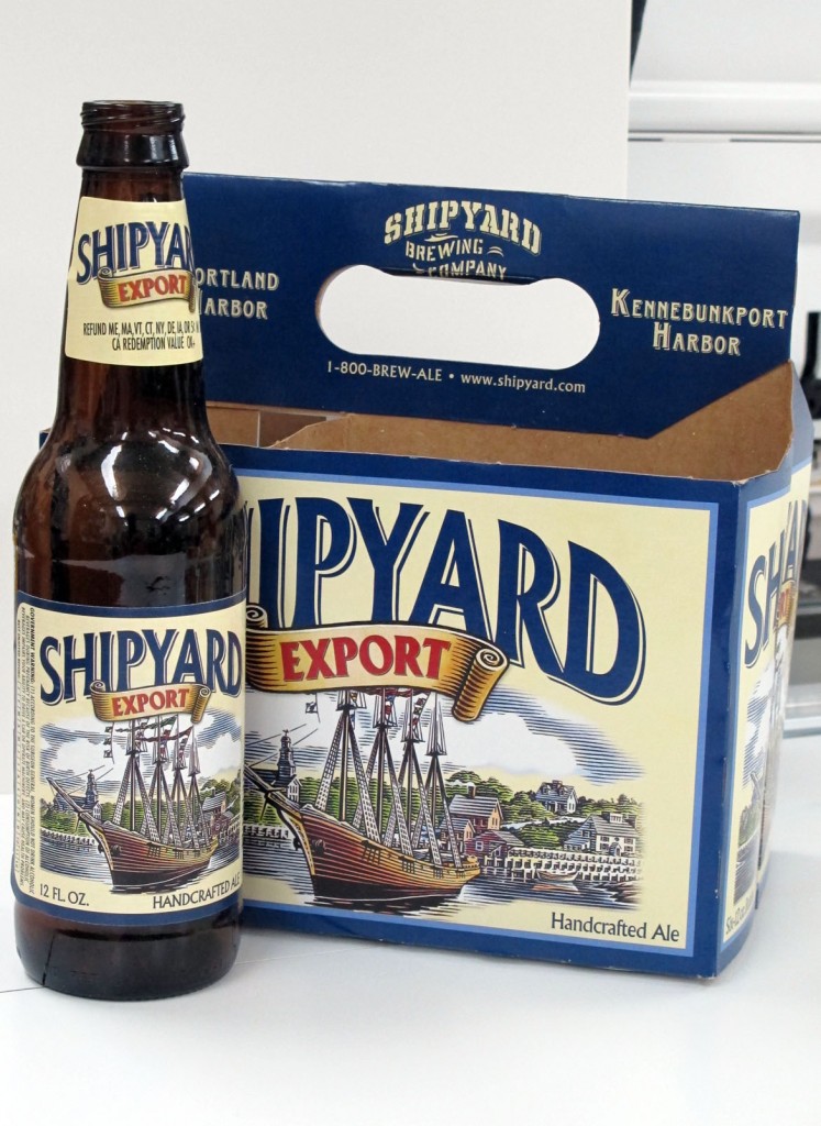
I chose Shipyard Export Ale because I love woodblock prints and I love that the image is so “Maine.”  However, I thought the picture on the label looked like Wiscasset, not Camden, so I changed it a bit to look like OUR town and feature one of the local schooners (with permission of the captain). Here’s the bottle and carrier:

Shipyard Export ale, my "grocery" inspiration for the 2011 CQ Challenge

SO…. if you are lucky enough to be headed to the big show in Paducah, hope you get to see my little quilt.  I harbor NO hopes that it will win any awards…the piecing isn’t quite perfect and this is the quilt where I learned that I should have used the hopping foot to free-motion quilt, not the one that skims the surface.  Why?  The “skimming” foot got hung up on the thick intersections for those blocks.  And when I pulled/tugged/etc. to get the quilt under the foot, the stitch length became inconsistent.  But I love this little quilt of “home” anyway!   And I learned something new that I can share with my students and all of you!


Quilting at last! or….Rituals, #1: Strength and Calm

Saturday, March 3rd, 2012

For the third year, I’ve been lucky to be invited to submit a quilt for consideration for a special exhibit to debut at the International Quilt Festival in Long Beach (and which has moved on to Houston and beyond for the past two years).  My earlier entries were the portrait of our son, Joshua, for the “Beneath the Surface” challenge and a self-portrait for “The Space Between.”  Curated by Leslie Tucker Jenison and Jamie Fingal of Dinner@8Artists, this year’s theme is “Rituals,” but the size has changed to a more challenging 24″ wide by 60″ long.
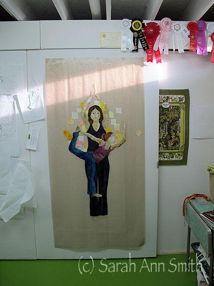
Fairly early in the fusing process for Strength and Calm

My first thought was to do a triptych of sorts:  breakfast is tea at my laptop with oatmeal (Irish oats), lunch is dog walkies, evening is decaf tea and a good book.  But I was bored with it before I even began.  And I was stumped.  I don’t feel like I really have any other rituals.  I’m sure I do, but what?  And could I make ANYthing of interest to ANYone?

While mulling over my lack of ideas, I signed up for a class at the local Y called Bodyforging.  This class combines some yoga positions, Pilates and other exercises to develop core strength, flexibility, and I’m sure there is something else.   One day while working on a “mermaid” pose, I was watching a classmate thinking how beautiful the shapes of her body are while doing these stretches and the idea for a “yoga” quilt was born.  At first the idea was just to do a figure, perhaps with some ghosting of the movements through the sequence.  But then I realized I could use this theme for Rituals, as this class has become an essential ritual in my week.  After a nearly 20 month hiaitus in exercise thanks to too much life happening, it was time to get serious and do something about my increasingly weak and flabby body.

Good news:  the body is getting stronger, flexibility has returned, I love the class, AND I morphed the idea for a “yoga” quilt into this project.

To fill the long space, I decided to use a woman in “Mountain” pose: standing straight with arms above her head, but with a closed fist and an open hand, since our teacher closes each class with the thought of the fist for strength, the open hand for calm, as we go into our days.

But a single figure like that would be boring, so I thought about layering figures and poses.  I loved “Mermaid” and “Warrior” so knew I would use those.  I needed another vertical image, so in googling yoga poses, chose the figure with the lifted leg.  Checks with a few friends indicated they didn’t like the pose with the arm extended in front (and therefore cut off from visibility on the quilt), so I moved her arm up for balance which is a challenging variation on the pose.  And I love what is known to me as the pretzel stretch.

I began by assembling various generic photos to use to create my sketches; when done, I outline using a fine black felt-tip pen.  The paper used below is medical exam table paper which is cheap, fairly thin and can be cut long—a lot more thrifty than tracing paper.:
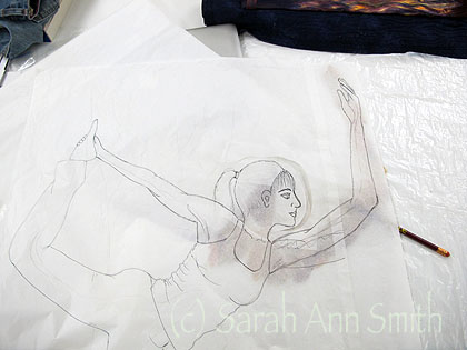
Full-size pencil sketch of one of the two main figures--I later realized that the arm in front is disproportionately long and fixed that.

Then I decided to begin with the two main figures in cloth, starting with the hardest parts:  the faces and exposed body parts.  I picked a bunch of pre-fused (I love Love LOVE MistyFuse!) skin tone fabrics:
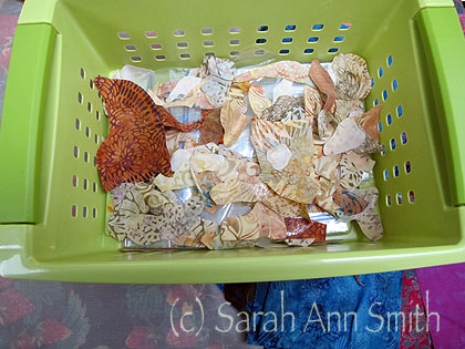
Skin tone fabrics--with skin tone being very loosely defined, since some of these include lavender and green and burgundy--cut into collage-able chunks.

I started with the face:
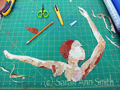
Blocking out the shapes. I cut to approximately the shape I need, then fine tune after "fuse-tacking" in place. Here I've moved the in-progress piece to the green mat to improve contrast for a photo
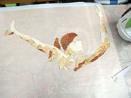
A bit more fabric added, blending done. You can see underneath the nonstick press sheet the ink outlines on my inked sketch. I position the fabrics on top and fuse them to each other. If you look at the very first photo, you'll see the head and arms UNDER the sketch. I will position them under the inked outline and add transfer paper to transfer the final edge and trim.

I’ll go through several building stages, starting with face/neck, adding head shape then more hair, then exposed body parts.
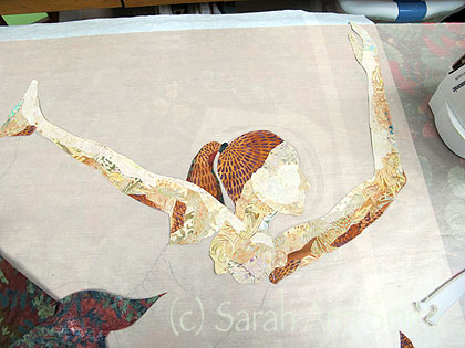
Refined a bit more; the fabrics on the left are ones used to cut slivers for more hair

The garments go together a lot more quickly, and use much larger segments of fabric:
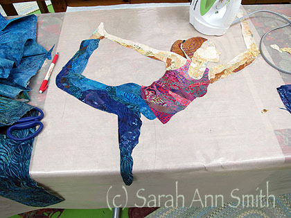
shirt made, pants in progress

Then there is the lady in the Mountain pose:
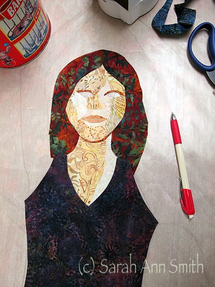
Working on the face...looks kinda creepy with the eyes not yet inserted under the openings.
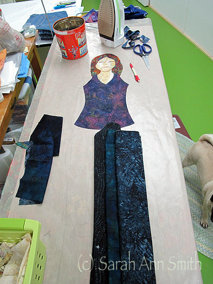
Checking fabrics for her pants. I wanted the garments for this figure to be darker and more toned in color than the woman in the foreground.

I didn’t want to use an exact replica of the photo I found on the internet, so I kinda made up this figure and her face.  I can tell.  For the hands, I used the camera on my laptop to take pictures of my hands in the position I wanted.  I struggled with the face getting the eyes and pupils and whatnot “just right.”  Now that it is done, it isn’t perfect, but it is improved one tiny sliver and trim at a time.

Here are the two mostly-completed figures pinned up on the wall:
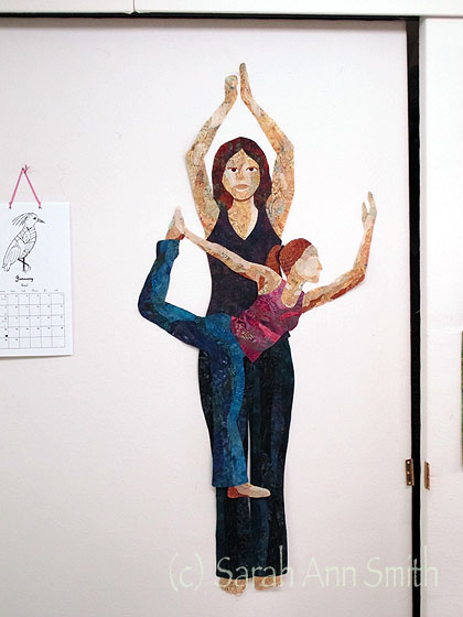
Mostly done and on the wall to review: there isn't enough contrast between the standing leg of the woman in front and the woman behind, so I revised the fabric on the standing leg. The accuracy of shading isn't right any more, but it works better overall.

I wanted to have the color radiate out from behind the figure with the lightest color like an aura/halo behind the standing woman, merging from yellow to coral and pink to plum.  I could have pieced it, but all those seams are lumpy and bumpy to quilt, and I wanted something fairly jiggedy-jaggedy.  So I fused it.  I prepared but using my stash of pre-fused fabrics and fusing up some larger chunks to cut into sorta-square-ish shapes.
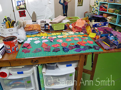
Ready to start on the background. I cut the shapes then sorted them into a color gradation.

Then I started working my way out, as seen in the photo up top, which I’m repeating here:

Fairly early in the fusing process for Strength and Calm--note the tan press sheet on the wall and see the text and link below.

For the next post, I’ll show the some photos of working out the background, then deciding what to do for the additional figures.  At this point I still didn’t know if I was going to use fabric–either collaged or silhouette or sheer, or simply quilted outlines, or what.

And a plug:  that long tan bit on the design wall is a ginormous non-stick applique press sheet.  It is pretty much the same thing which MistyFuse uses to make their nonstick Goddess press sheets, but really BIG.  I ordered it from art quilter Valerie Hearder, in Canada, here.  After several years of dithering and waiting to have some savings in the bank, I bought TWO pieces each 36″ wide by 72″ long!  One covers my big-board ironing surface, the other is pinned to the design wall.  It was totally worth the expense, and really easy to order from Canada–passing through Customs and international mail was easy peasy.  Valerie sells it in either 18 or 36 inch wide bits, and sells it by the yard so you can get just the length you need for your available space.

Foto/Fiber, a fundraiser for the American Cancer Society

Friday, January 20th, 2012

Hi all!   Welcome to those of you who have surfed in from Virginia Spiegel’s blogpost which featured my studio.  And for my regular readers, please do go visit Virginia’s blog…. here’s what it is all about:  Over the past several years, Virginia has singlehandedly—with help from a whole BUNCH of people–raised over $200,000 to benefit the American Cancer Society.  It began with FFAC–Fiberart For A Cause challenge–fabric postcards at $30 each donated by many, many, many talented art quilters.  After a respite, Virginia has launched the Foto/Fiber fundraiser for this year.  Learn more about it here and for how it works and to participate click here.  You can also click on the button in the left sidebar to visit this cause.

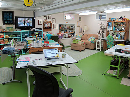
Welcome to my studio...this is what I see when I walk through the door.

Long-time readers may recall from my previous participation that I have a very special place in my heart for this cancer research fundraiser project:  my father was diagnosed with throat cancer (having smoked cigars for 65 years) at age 82; his treatment was successful and he lived another 14 years.  My half-brother Charlie, a many-packs-a-day cigarette smoker, died of cancer of a whole lot of organs due to his smoking, and my dear friend Linda Wauchope died of liver cancer–if good attitude could save you, she would be with us here today!  I miss them all, and it is a privelege to be able to remember them and do something to help support research to cure the many nefarious varieties of cancer.

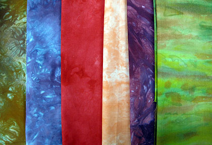
One of my gifties for Foto/Fiber is the postcard (fitting, don’t you think, considering it all began with postcards) seen (a detail anyway) on Virginia’s blog.  Another part is about a yard’s worth of my hand-dyed fabrics–a decidedly eclectic (odd?) assortment:

Hand-dyed cottons are the other part of my "bonus" donation

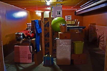
This was “in the beginning” for this studio:

This is what it looked like in the beginning. I don't have anything against brown walls, but in a basement room with one tiny window and two bare bulbs???? This was what my studio looked like before we began the work!

Most of last year’s teaching income went to fixing up the studio just right and some goodies for the house…like a new sofa and replacing the “vintage” (ahem) mattress!  I’m happy to say I no longer wake up with aching bones.

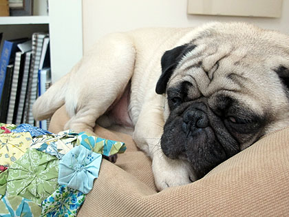
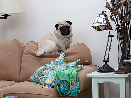
One of the best parts of my studio is mobile…he follows me where I go and often sleeps by my feet.  The painted cement floor, however, is too cold in winter so Pigwidgeon is on a mission to squash the new loveseat cushions.  How can I get upset with someone SO CUTE?

The pug who acts like a cat and sleeps on the back of the sofa. Oh how I love the dog-beast! Here he's wondering WHY I am snapping pictures when it is oh-so-hard to keep the eyes above half-mast.

Sometimes, however, a dog needs to move. In this case, about 22 inches to the next cushion over!

I blogged about the transformation of the space as it happened.  You can see those posts here:

  • First mention of the studio here with two pictures (one of them is the one above).
  • Then the transformation begins here.
  • More work, including painting the cement floor here.
  • More on the floor and small progress here.
  • A bulletin board/display wall here.
  • Adding the really LONG closet here.

If you are thinking about working on your studio and have any questions, just leave a comment!

Thanks so much for visiting.  I hope you’ll visit Foto/Fiber and make a donation on February 15 and 16!  One more time, here’s the link to how Foto/Fiber works!

Book Review: The Best of Quilting Arts

Monday, January 16th, 2012

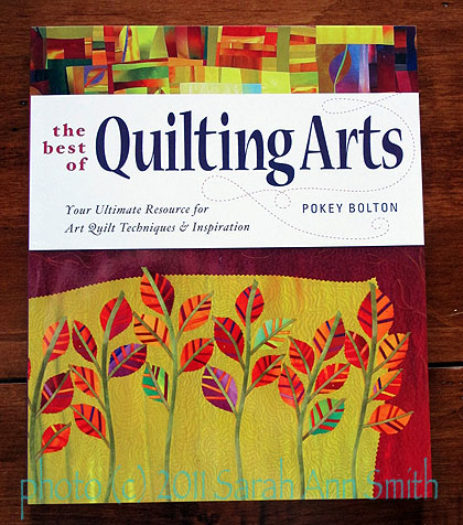
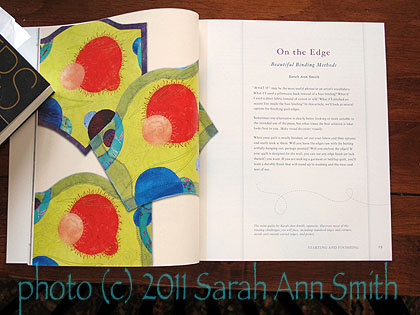
Another thrill—I am one of a number of folks who have written for Quilting Arts magazine whose articles were included in The Best of Quilting Arts: Your Ultimate Resource for Art Quilt Techniques and Inspiration, edited by Pokey Bolton.

The Best of Quilting Arts by Pokey Bolton

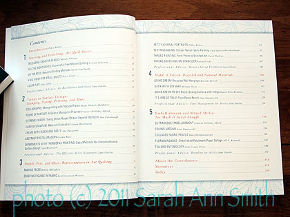
My articles on edge finishes were merged, edited and included in the first of five major sections in the book.  The Table of Contents is impressive:

The Table of Contents, The Best of Quilting Arts

The five major sections are:

  • 1. Starting and Finishing: Art Quilt Basics (this includes my article)
  • 2. Trends in Surface Design:  Stamping, Dyeing, Printing, and More
  • 3.  People, Pets, andMore:  Representation in Art Quilting
  • 4. Make it Green:  Recycled and Natural Materials
  • 5.  Embellishment and Mixed Media:  Too  Much is Never Enough

This page spread is the opening of my contributions.

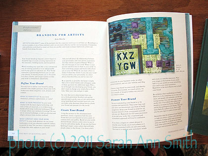
After each section Jane Davila has written a “Professional Advice” article on various subjects, all of which are interesting.

One of Jane Davila's Professional Advise articles.

For anyone new to art quilting, this is a fabulous all-in-one-place resource, and it would be a useful addition to the newbies library and even for those who are at an intermediate level.  As always with Quilting Arts magazines and books, the layout, graphics, and photography are outstanding.  And for those of us who live in the boonies, there is a useful Resources list in the back along with additional reading suggestions and a useful index.

Book Review: The Studio Quilt, No. 6: State of the Art

Friday, January 13th, 2012

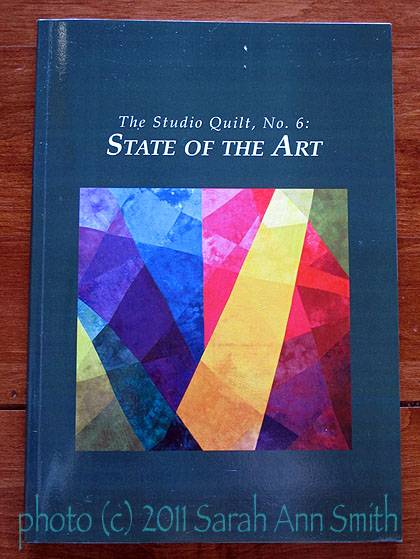
Sandra Sider's The Studio Quilt, No. 6: State of the Art

The Studio Quilt, No. 6:  State of the Art, by Sandra Sider, is a monograph that is part of a series featuring contemporary quilt art, all of which are available on Amazon.com (click on the title for a link to the listing).  The previous five volumes have each focused on a single artist.  This volume includes one quilt for 60 different artists–including (gulp gasp Who ME?) me!  To say that I am elated to be included in such elite company is an understatement of epic proportions.

Sandra Sider has been a well-known artist and curator in the art quilting world for a number of years (her curriculum vitae on her website is mind-bogglingly impressive), and is currently the President of the Studio Art Quilt Association.  The SAQA website states:  “Dr. Sandra Sider, a New York quilt artist and independent curator, has published articles and reviews concerning fiber art and other aspects of visual culture for three decades. Her graduate degrees include an M.A. in art history from the Institute of Fine Arts, New York University. Her most recent book is Pioneering Quilt Artists, 1960-1980: A New Direction in American Art (2010).”

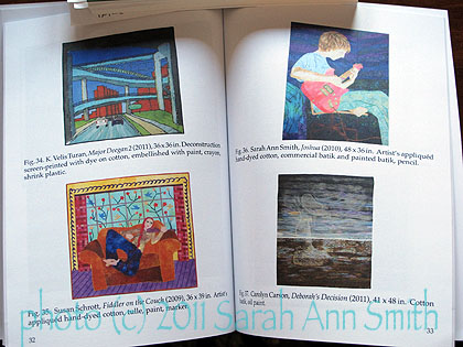
The volume is a slim, succinct snapshot of 60 artists working in textile art today, including Benedicte Caneill, Gloria Hansen, June Sowada, Jette Clover, Mary Pal, Virginia Spiegel, Grace Errea, Charlotte Ziebarth, Nancy Cook…the list goes on!   My portrait in cloth of our older son is the work included:

I'm artist 36 of 60 in this slim volume of contemporary textile art.

It is an honor to be included, and if you want a good overview of who is doing what, this is it!