Foto Friday, Week 35 (already?): White on White
Saturday, September 12th, 2015
Bottle tops at the Lavender store in Camden; original photo, un-retouched. NOTE: if you right click on all photos you can seem them larger.
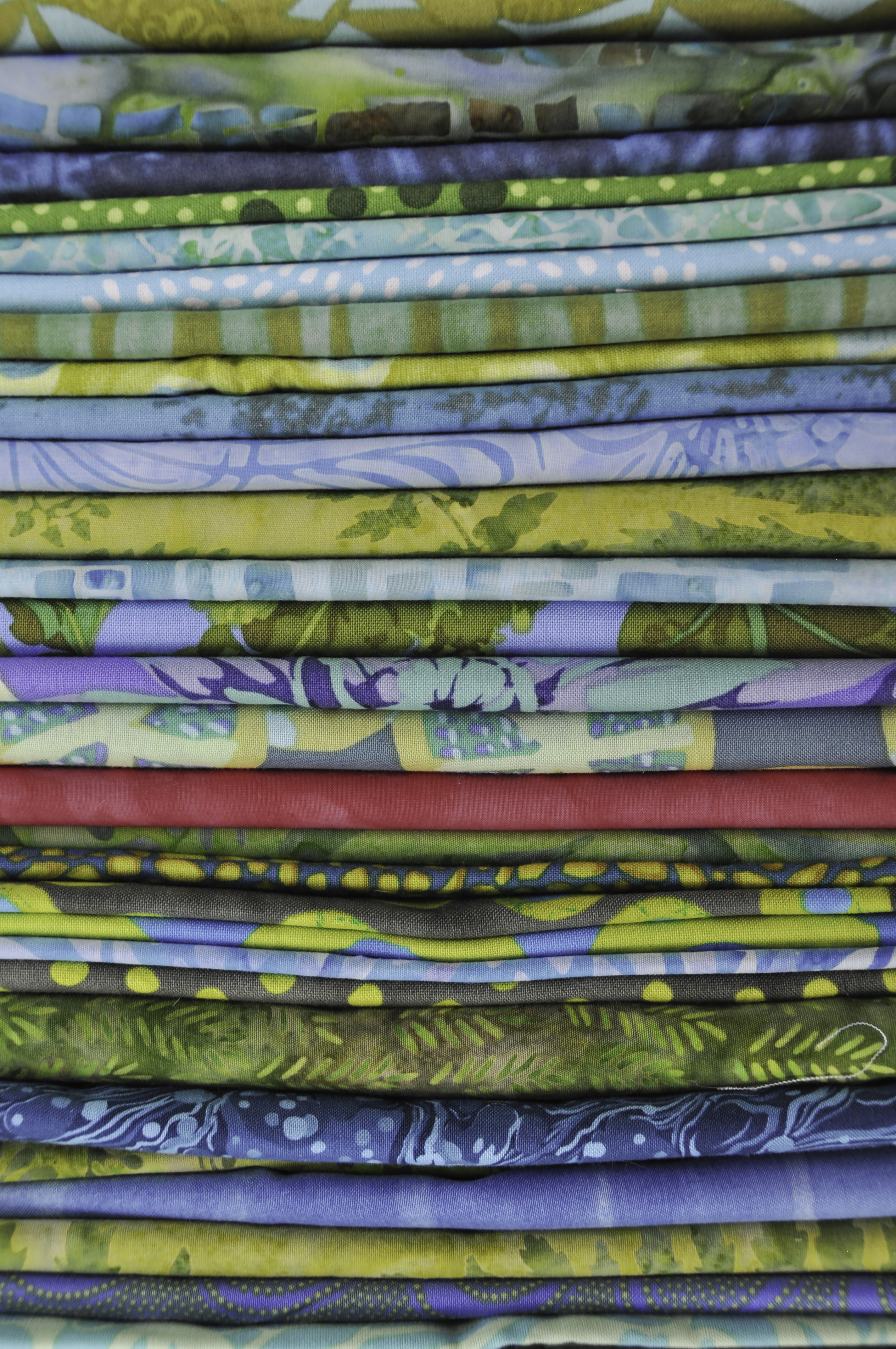
This week’s assignment was White on White. At first I thought WHAT can I find that is white on white other than eggs, which Ricky had in the assignment PDF? All of a sudden I realized it was ALL around me! I also didn’t want to do white fabric, but I looked up in my studio and BINGO! White on white. It didn’t quite meet the specifications, which were to not have any other colors or dark bits (like dark lines where there was a shadow), so some of the following photos didn’t quite cut it, but I liked them anyway. The photo above is as I took it. The next one is after photoshop to remove that one bit of label and edit the top left corner:

Well, I went a bit overboard this week. There is white on white everywhere it seems! But this was my favorite, so hope it is close to what RIcky wants. Had to remove a tiny bit of label on the bottom right, and something blurry in the upper left corner was a tad to orange-y for the assignment, so required some cloning and fiddling to lighten. I actually kind of like the original photo better as a photo, but this is better for the assignment.

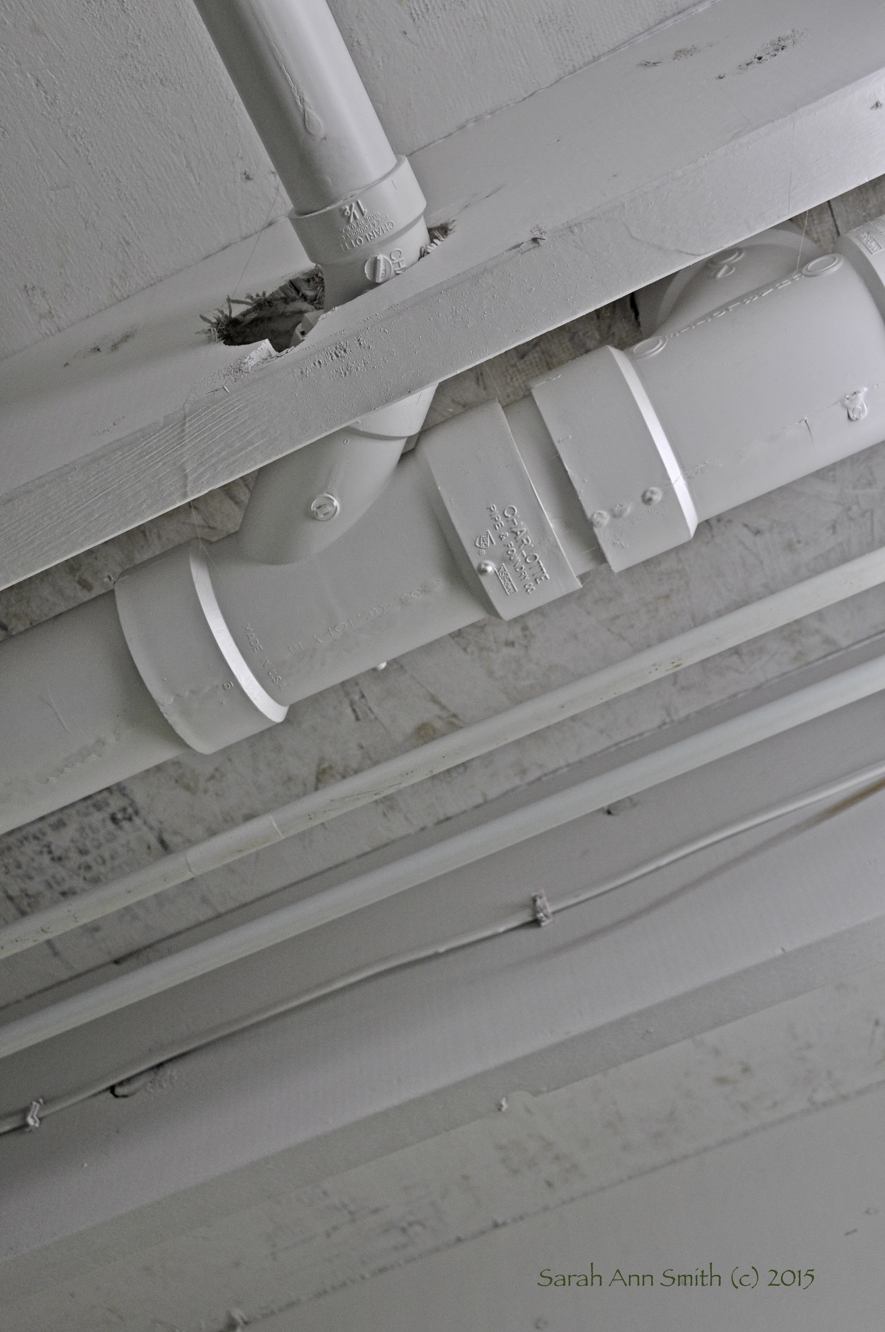
Ceiling of my basement studio: primed joists and underside of the upstairs sub-flooring
Another angle (pun sadly intended) of the same ceiling
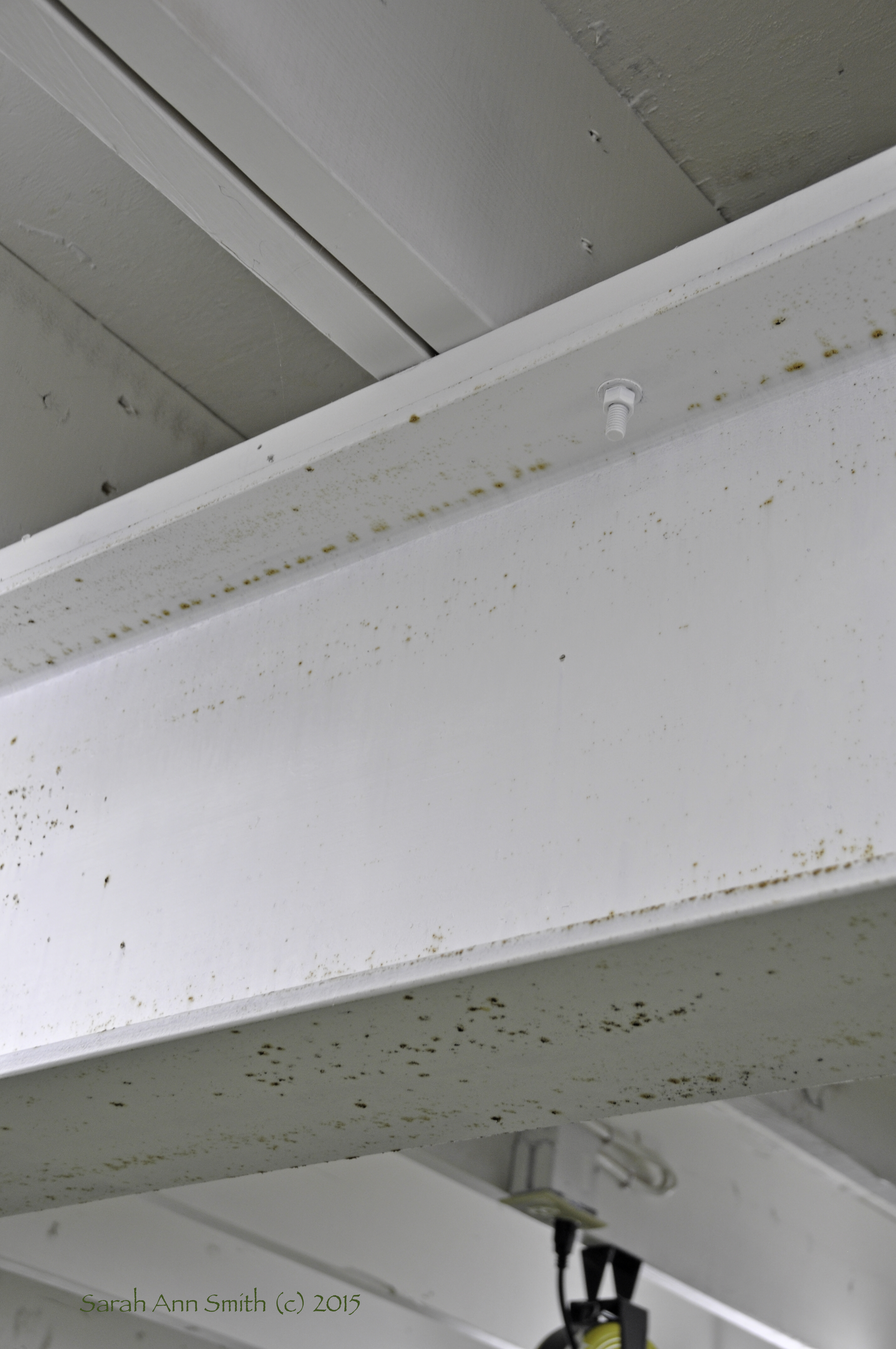
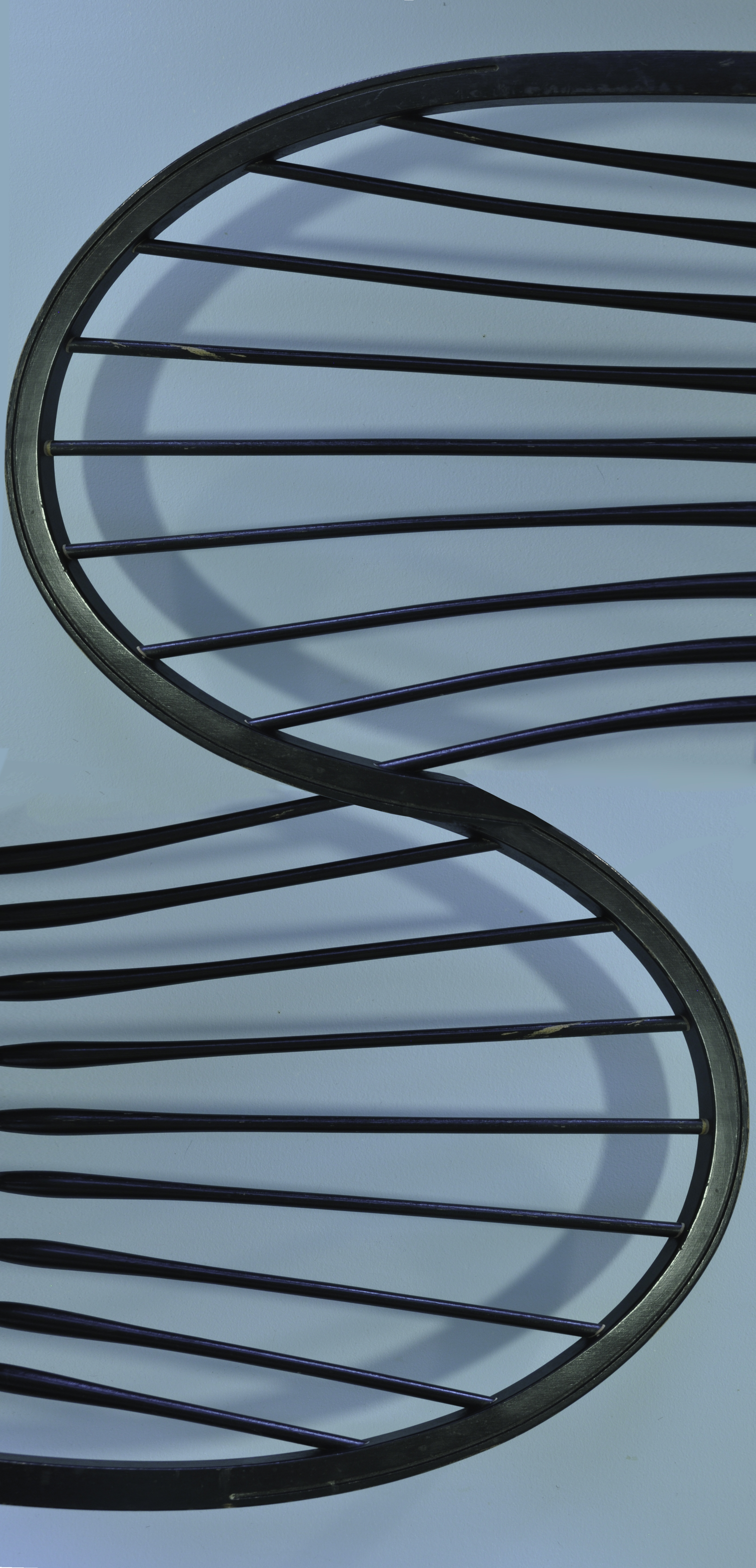
The steel “I” beam, which I can easily reach up and touch. So far I have resisted the temptation to put stuff on the ledge.

Flower. Duh! In the Children’s Garden at Camden Public Library.
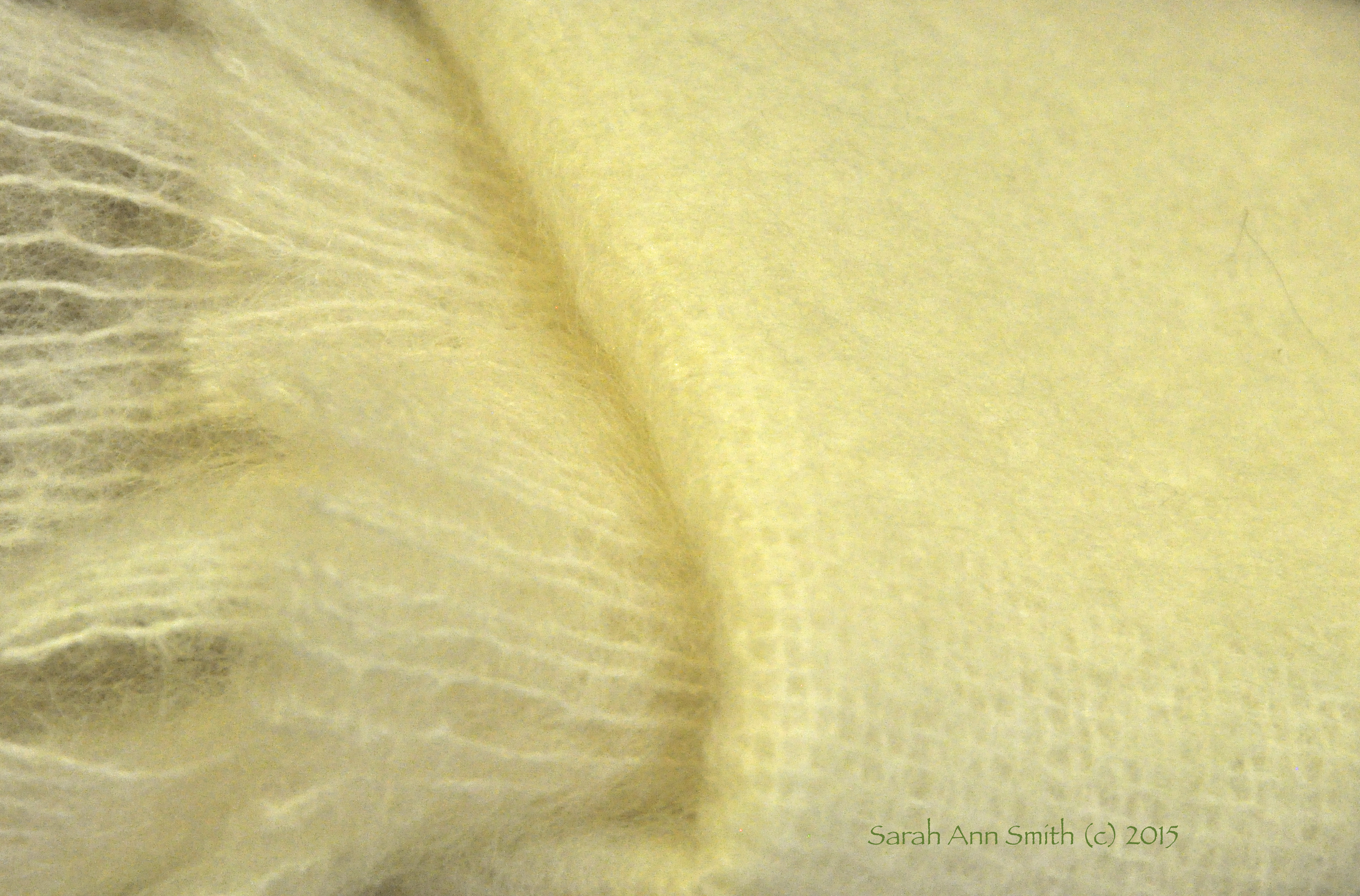
Mohair throw in the Lavender Store

Jackets at Maine Sport
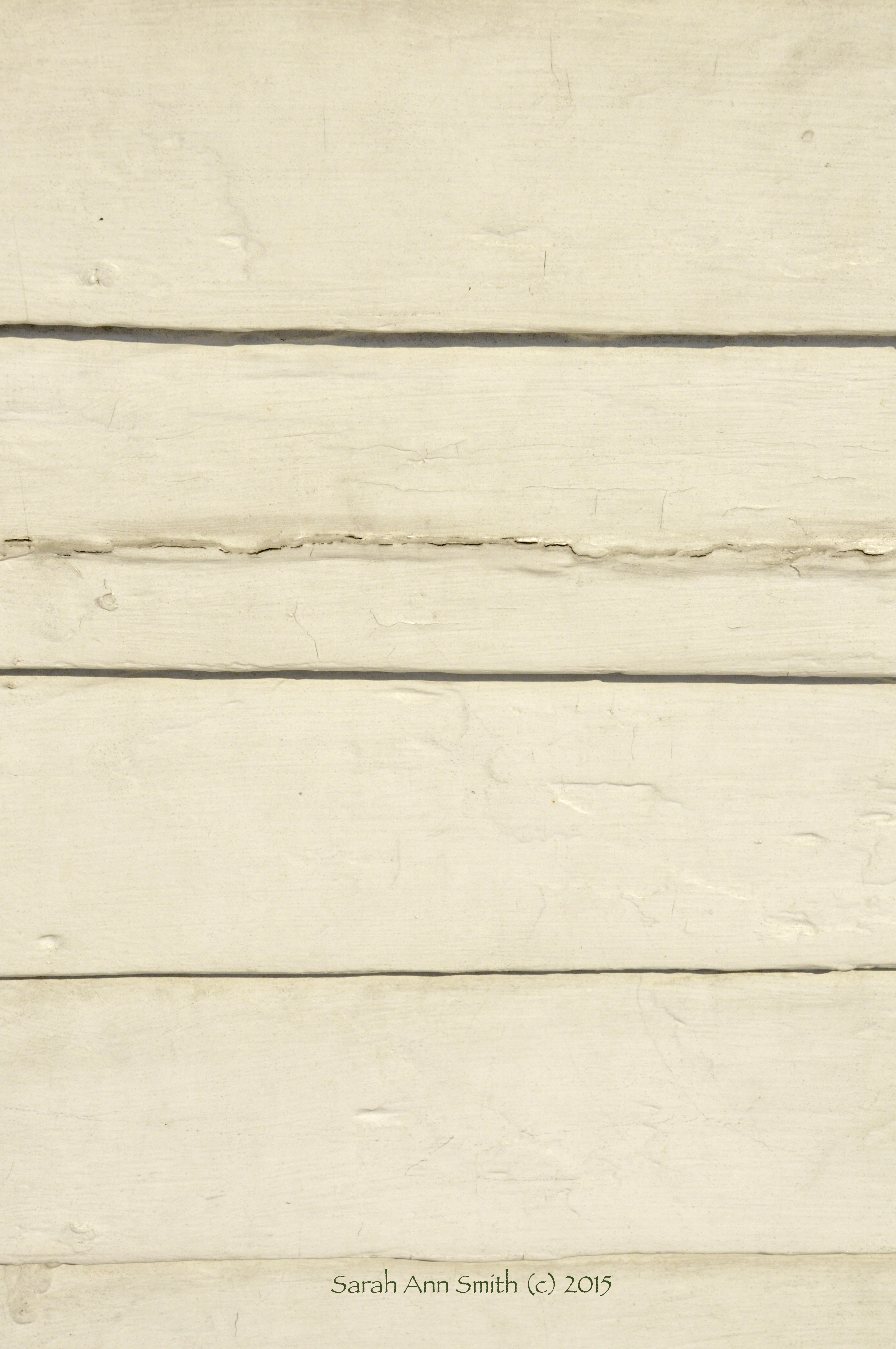
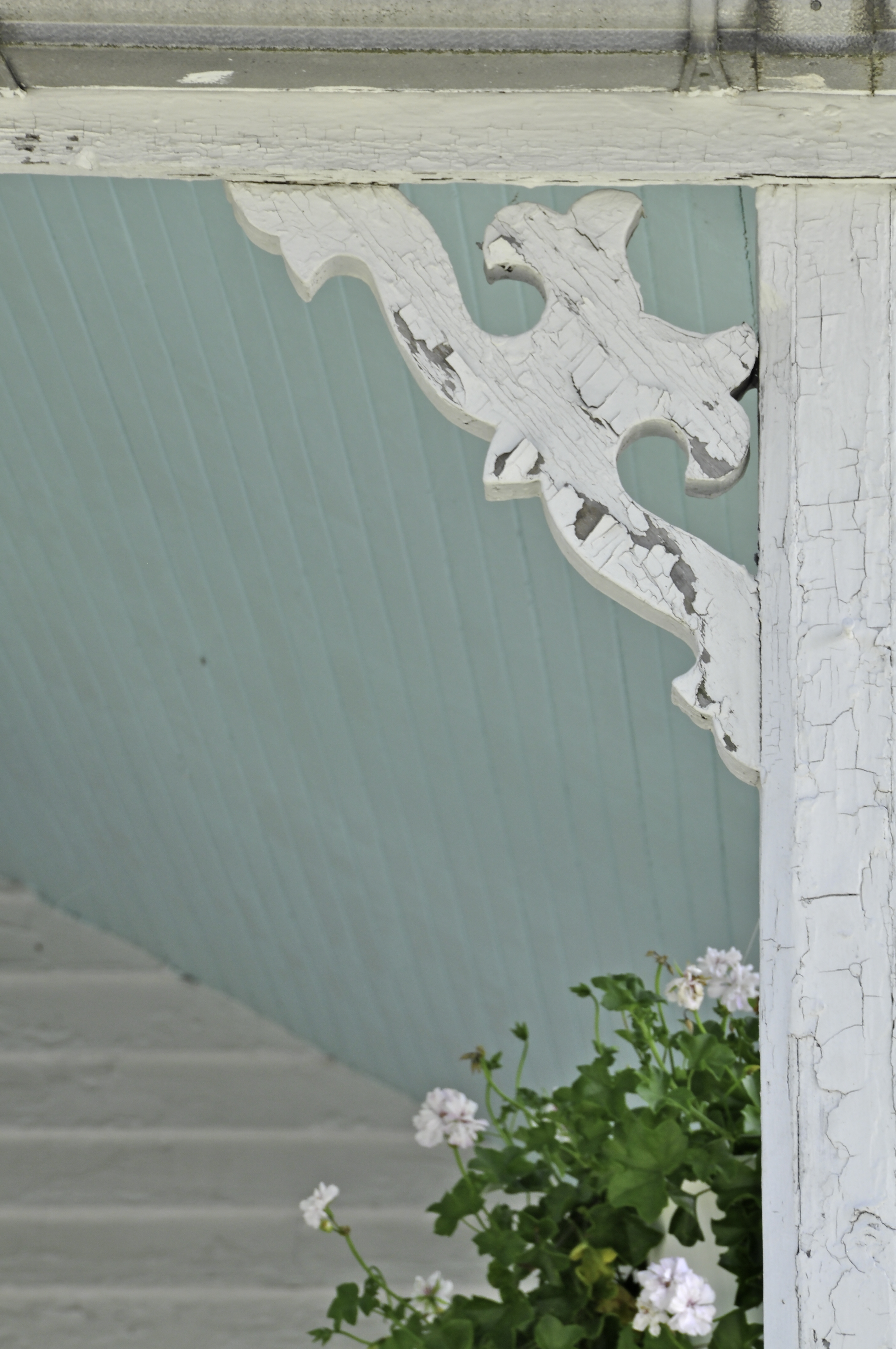
Wood siding on a downtown building
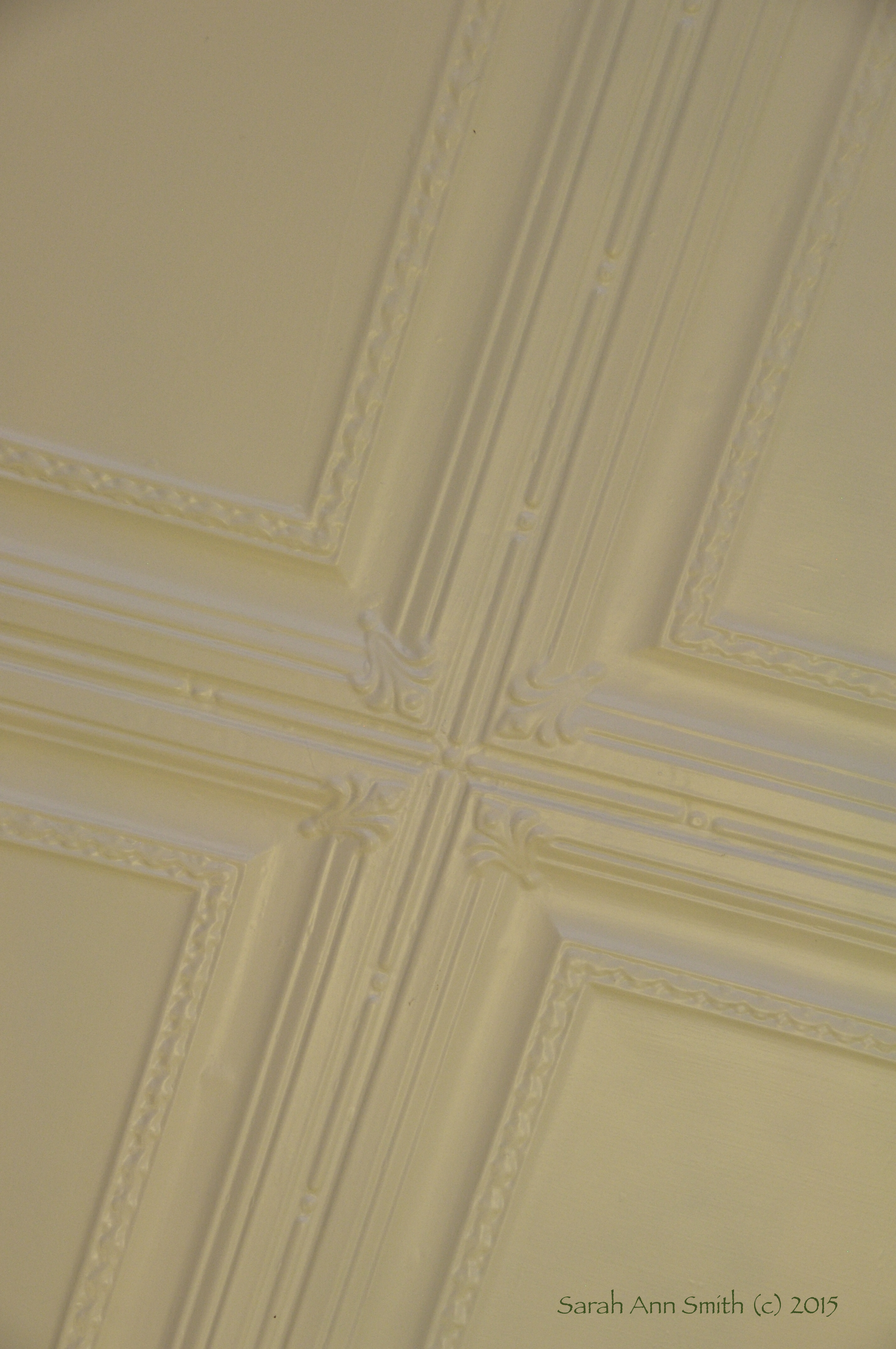
Tin ceiling in the Lavender store
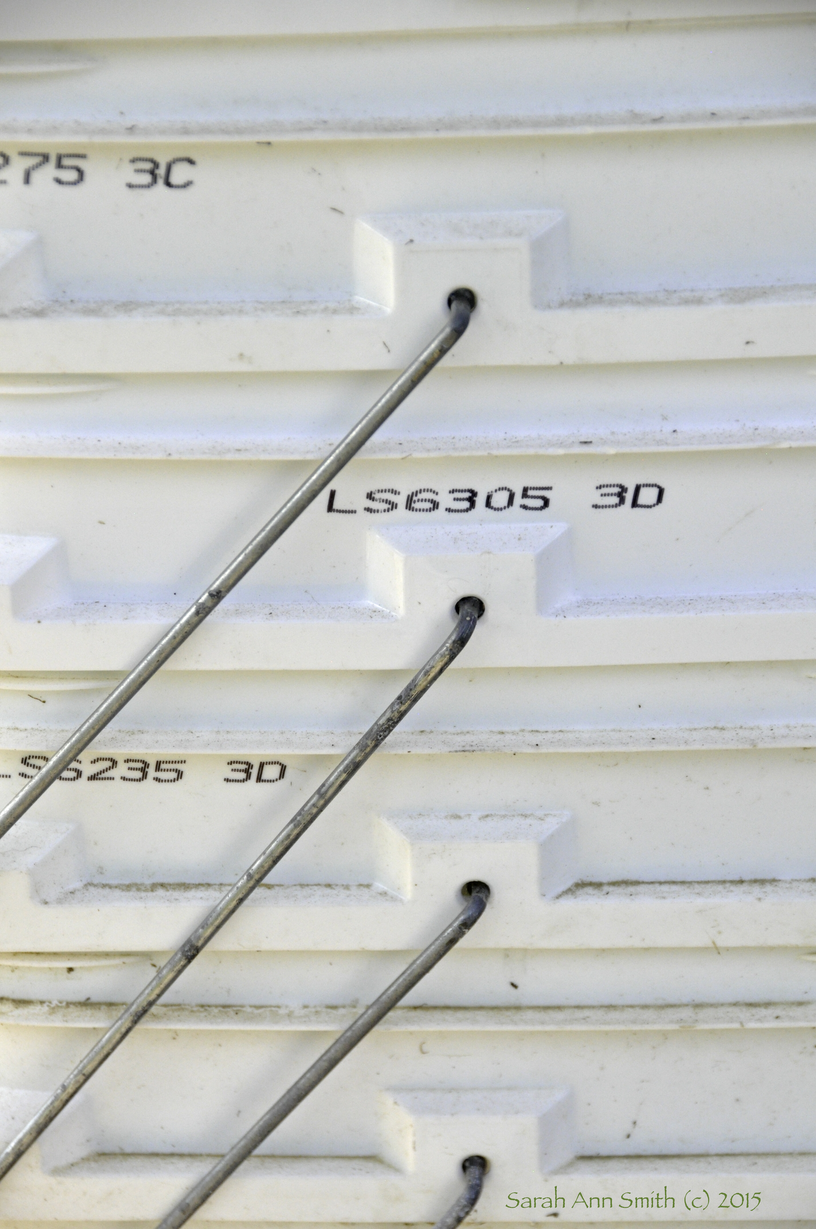
Empty cat litter buckets that I use for dyeing fabric and holding water when we think the power will go out (well pump runs on electricity–we are rural!)
Yup. I got carried away! And even though it is scarcely Saturday morning in Maine, I’m hoping it is still Friday somewhere just this side of the international date line!