email Youtube

Home
Galleries
Blog
Workshops & Calendar
Store
Resources
About
Contact

Archive for the ‘Published!’ Category

Hawaiian-style quilting at Lowell Quilt Festival

Sunday, August 31st, 2008

One of the most fun classes I taught was Hawaiian style applique by machine.  Normally, this applique is done by hand using the needle-turn method.  It is beautiful, meticulous, and time-consuming.  Some years ago I saw a quilt made by a New Zealand quilter, Donna Ward, that was stunning… similar to Hawaiian quilts in style, and satin stitched!  The stitching became a whole new design element, and I was hooked.  And I must repeat… I love google!  Here  is a link to Donna’s quilt Jewel of the Pacific–scroll down a bit to the blue quilt.

Sally I.’s block, reverse applique

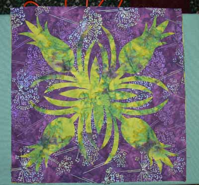
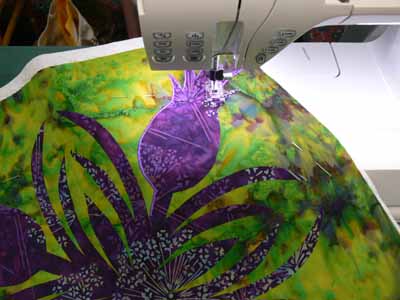
For my book, Unraveling Threadwork, (hopefully due out Fall 2009) I’ve designed a quilt with nine 18 inch blocks using five different designs, as one of the main pieces.  I’ve also designed two smaller “practice” blocks, one of the taro leaf, another of the turtle.  This class was the first time I offered the smaller practice blocks as an option, and it seems to have been a good decision.  Sally was the one person in the class who opted to start with the large block, in her case the pineapple.  Her combination of deep purple and mottled green (above and below) was wonderful. I also recognized her name from the quiltart list…way fun to meet someone you’ve “seen” on line!

A couple tricks to Hawaiian applique:  high contrast in your fabrics works well!  Variegated threads don’t always look so good…opt for a solid color. THEN you absolutely must:

MAKE VISUAL DECISIONS VISUALLY!

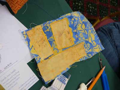
That means make a test, and try your threads to see how the look when stitched out.  Try adjusting width and length to see what looks best.  And if necessary (it probably will be) use a stabilizer under the background fabric to prevent unsightly puckers and uneven stitching.  Here is one student’s thread stitch-out sample.

Stitchout yellow on blue

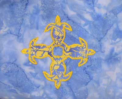
Her print fabric actually didn’t contrast a lot from the background–UNTIL she used the bright yellow thread to outline the design, at which point the subtle change in fabrics became awesome.

Yellow on turtles

Sally had brought a variegated that was PERFECT for quilting her pineapple, but when satin-stitched out, it really didn’t look so great, so a classmate lent her a perfect purple.

Sally’s pineapple

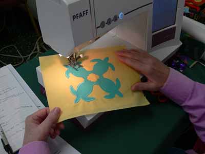
Another student opted for the traditional solid colors in very tropical aqua and yellow.  This simple choice is smashing!

Solids turtle

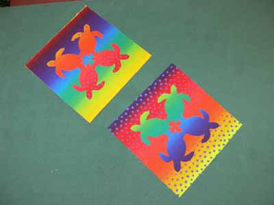
One student brought some VERY bright fabrics which had a stripe, but they worked!  Here are her turtles (before stitching)

Bright turtles with stripe fabric

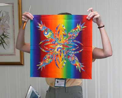
Since she hadn’t brought a varied enough thread selection, she opted to work on prepping a large block, also…talk about vibrant…wow!

really bright pineapple!

When she uses a starkly contrasting thread, like a tangerine or orange-y yellow or turquoise, the bright line of satin stitching will help pop the busy fabric inside the pineapple motif…trust me, this one will work amazingly well!

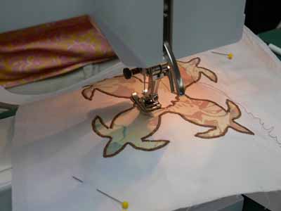
Other students preferred softer colors.  We were all surprised that this taupe-cocoa brown thread was such a good choice on the soft colors of the applique–sometimes the least expected selection works best:

Turtles with brown thread

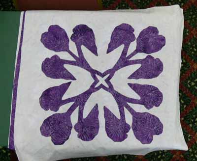
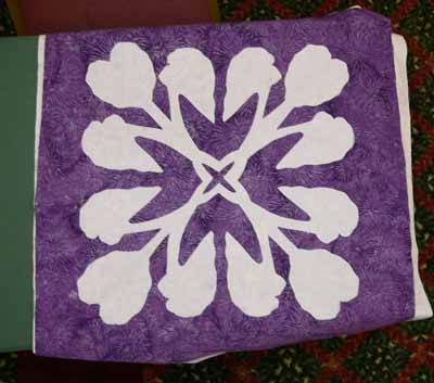
And here are her Taro blocks, in purple and soft lavender (which alas looks more white in these photos):

Taro…purple on white

and the reverse applique:

Taro–reverse applique

Here’s what I learned from teaching my class:

  • the small shapes on the turtles are a bit fiddly for beginners.  I need to make another, simply-shaped design, and have both turtles and taro leaf (or whatever) stitched out for students to see.
  • I should say on the supply list that variegated threads generally don’t work so well for satin stitching—be sure to bring plenty of solid colors
  • Also on the supply list, I should say to bring at least twice as many colors of thread as you think you will need!
  • Using the black Misty Fuse (adhesive web…a heat-activated glue for fusing fabrics) for demonstrating is perfect, since it is easy to see the bits that get left behind on the fusing sheets or baking parchment
  • I need to bring more Misty Fuse to sell….I ran out!

So it’s off to update my class supply lists!  Hope you enjoyed this vicarious tour around the classroom.  I sure had fun seeing my blocks interpreted in so many wonderful ways.  I hope the students had as much fun as I did…imagine, I get paid to do this!  WOOHOO!

PS:  I wanted to post a public thanks to the show organizers for the Lowell Quilt Festival.  The teachers were treated like royalty…. we had rooms to ourselves (weren’t required to share with another teacher), were presented with lovely welcome boxes with some snacks, little bottled waters, an a Lowell Quilt Festival badge holder in a color just for teachers…..   the hotel rooms were huge and comfortable, too.   It was a particularly nice experience, so thanks to all who were involved!

Koi is in Quiltmania!

Thursday, August 21st, 2008

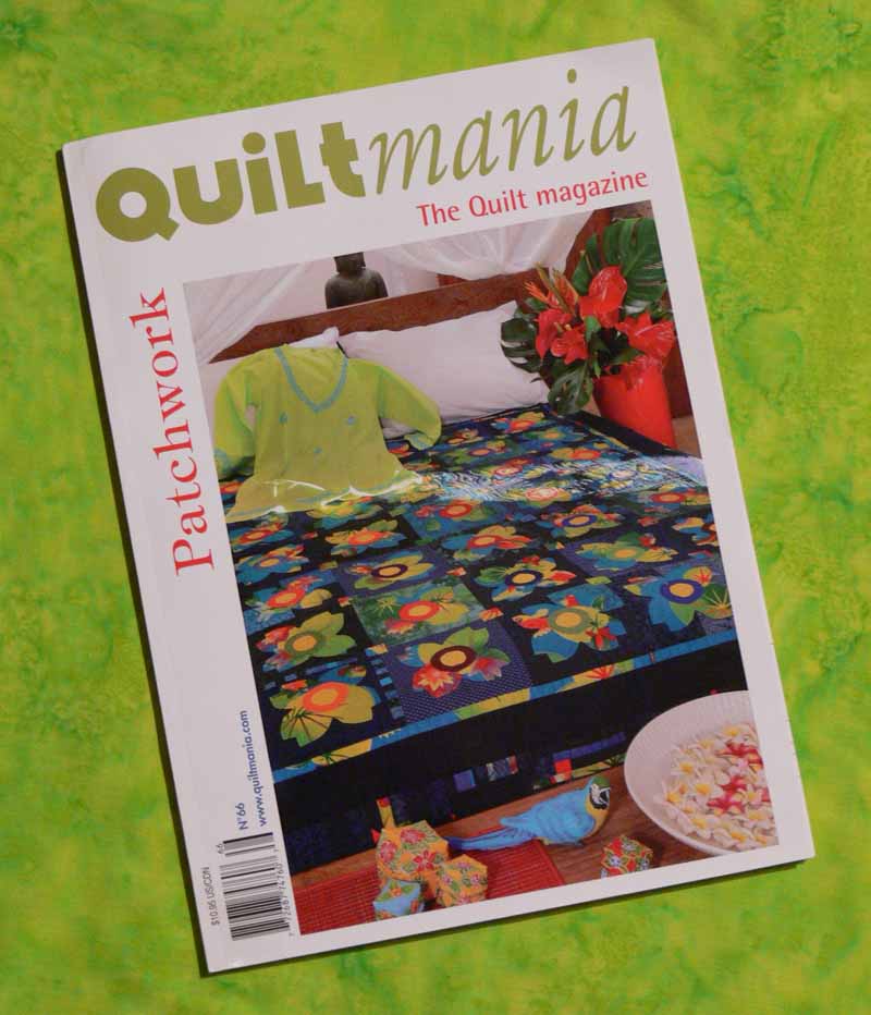
QuiltMania cover

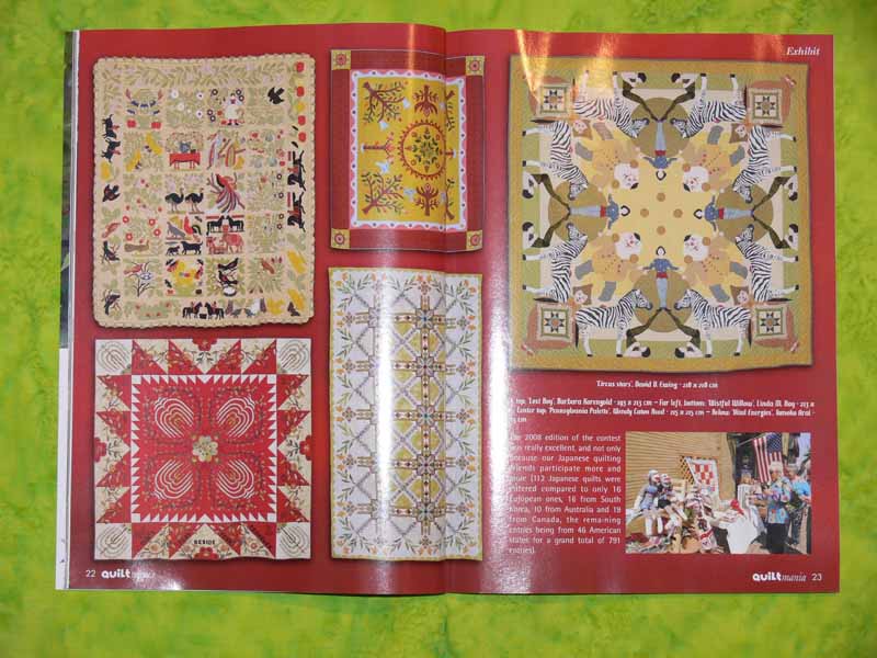
In mid-July a most delightful e-mail from blog-reader Evy V. in the Netherlands arrived, telling me that “I had to let you know I was very pleasently surprised to see a picture of your beautiful Koy Quilt in the French/Dutch magazine “Quiltmania” when they arrived at my store.”  WOW!   So I promptly surfed in to eQuilter, which I know carries the magazine (since of course no one within a 90 minute drive of Camden does).  They had only just received issue 65, and Koi is in 66…. so I checked last week, and my copy of issue 66 just arrived!

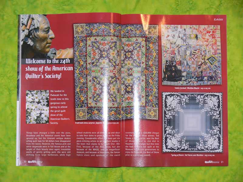
Here is the opening page of the article which, as I had guessed, was about the spring AQS show in Paducah, Kentucky; this show is one of the two most prestigious in the US (along with the IQA show in Houston), so I was thrilled Koi was juried in:

Start of article

Note:  photos are clickable to get a larger, more easily viewed size.  In some browsers you can right click or, on a mac use the applekey + click, to open the photo in a separate window.

I was happy to see another Maine Quilter, Wendy Caton Reed, represented on the second page…her quilt won a top ribbon at Maine Quilts 2008 this year.  It’s the one in the center, red and yellow:

Mary Caton Reed’s quilt

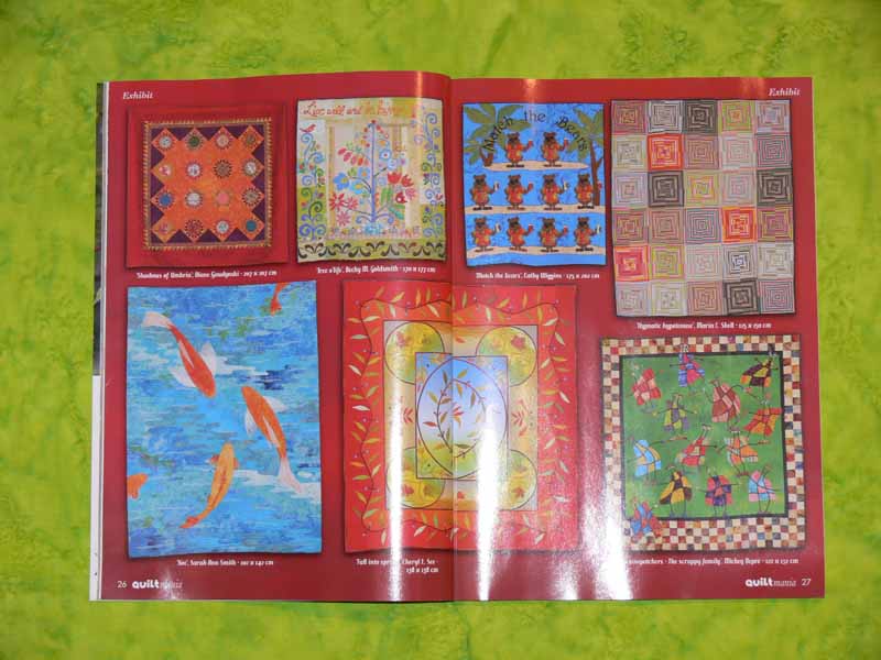
And here, drum roll, on p. 26, is Koi!

Koi

I’m in mighty good company…that quilt just above mine is one of the top prize winners by Diane Gaudynski!

After the many, MANY rejections I’ve had, it is heartwarming to know that out of the many, MANY outstanding quilts in Paducah, QuiltMania selected mine to include in the article!  Thank you to them, and to Evy for letting me know.  By the way, she is a quilt shop owner in the Netherlands, so click here to surf in, and I sure hope some day I get to VISIT her shop!

Manuscript samples

Sunday, July 13th, 2008

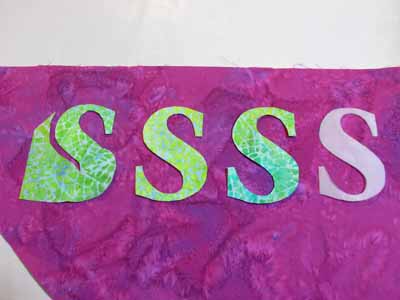
“S” applique

You may have noticed (or not, but I sure have) a dearth of quilty posts here the past many months. I really miss my studio and making art! Between family, exhaustion and a little working on my manuscript, I haven’t been able to create much. And the two pieces I’m working on now are for the Journal Quilt Exhibit this coming year, and can’t be shared (unless they don’t get juried in, or if they do get in, not until the show opens in Houston in late October–the hotlink is to the 2007 journal quilts… you can see mine on my website and on page 9 at the hotlink). BUT, I think I can share a little bit of the book samples I’ve been slaving over for my manuscript for Unraveling Threadwork (tentative title).

(Earlier blogposts about the book, in reverse chronological order, are here and here and here.)

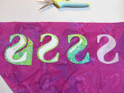
Anyway, the book is about using thread on the surface of a quilt, so that covers applique, decorative stitching, free-motion stitching (at the quilt top stage) and quilting. Here I’m making samples of various ways to applique, including illustrating the need to reverse somethings …here’s the “reversed” S shape:
Back side of “S” appliques

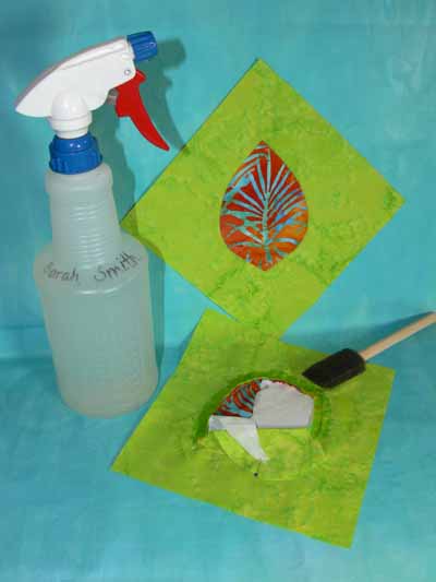
Here’s a mock up of the photo I’d like in the book on how to dampen the stitching to make removing freezer paper easier:

Removing freezer paper

One thing I didn’t realize, but which makes sense, is that if you want the book to come out the way YOU want, you need to give the publishing company real guidance on the photos by doing mock ups. Of course, this is a LOT of work… you don’t just make the sample, but in my case put the camera on the tripod, set up the photography lighting, take several shots , select the worst and delete the extras, re-size the photos, then (when inserting into manuscript) relabeling all the dang things, and making sure the labels and numbers and whatnot correspond! Talk about time consuming…. so I’m only nearly a year late due to life etc.

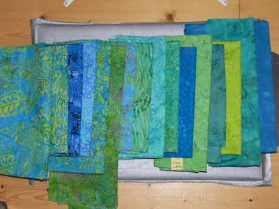
Another pretty photo is to illustrate visual texture in cloth, from plain (nearly solid) on the far right, to LOTS of visual texture (on the far left…larger designs, lots of contrast in both line and value).

fabric range of texture

And on that note, I’m gonna sign off, do some reading, and hopefully get back to work!

My Buoys Quiltlets

Tuesday, June 3rd, 2008

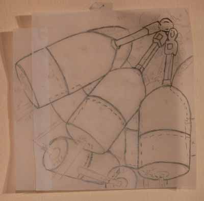
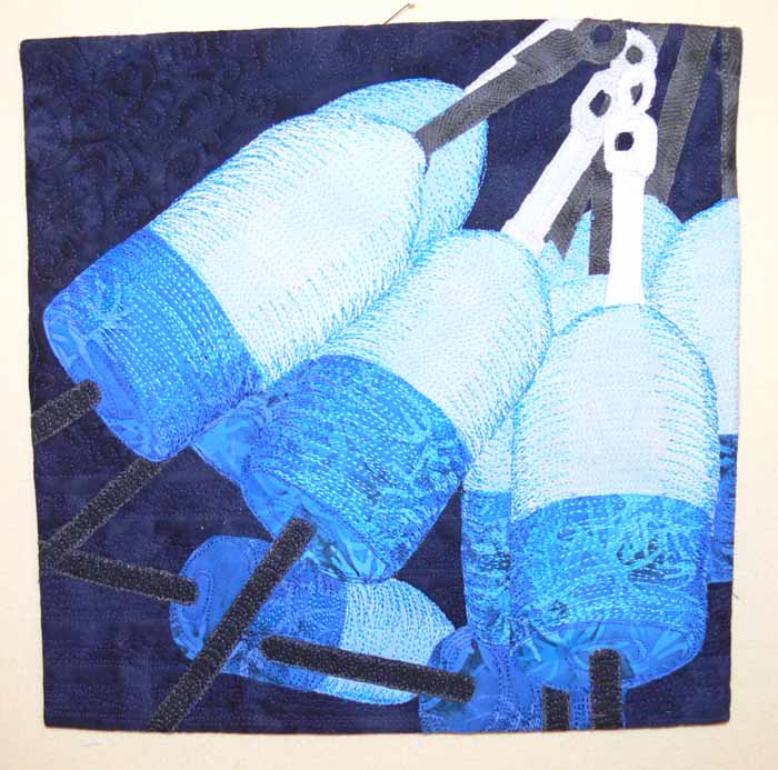
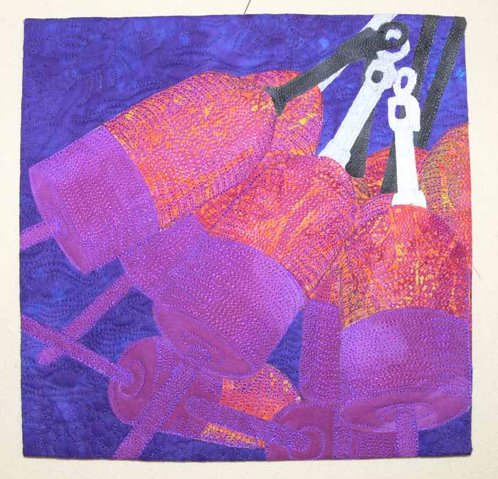
Not so long ago I shared the results of the Coastal Quilters’ Art Quilt Challenge, to take Dwight P’s photo of ropes and buoys and make a 10 by 10 inch art quilt. I decided to crop the photo tightly on the buoys and make a piece with the same values (light and dark areas) as the original photo, but in entirely different colors. I couldn’t decide whether to go with blues or with something wild, so I decided to make two! First, I enlarged the cropped photo to the desired size, then traced the outlines by taping tracing paper over my computer screen and, with a pencil, lightly marking the outlines:

Buoys traced

The first is in blues (click to make larger):

Buoys 2 Blue large

The second is in pinks and purples:

Buoys 1

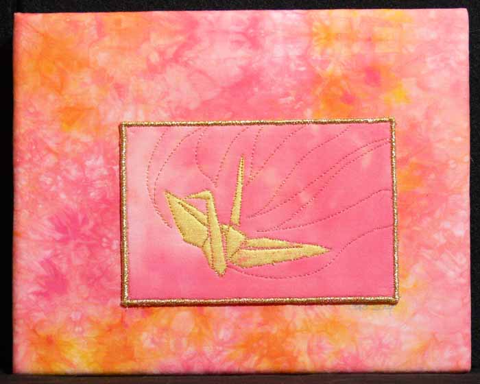
After the group quilts have been displayed at the statewide annual show, Maine Quilts (in Augusta the last weekend in July), I’ll mount my two pieces on stretched cloth the way I did with the crane (below) and offer them for sale. (The crane is for sale, too….. write me if you’re interested or go surf the for sale gallery on my website). The instructions on how to mount works this way is included in the Creative Quilting With Beads book for my second project. Hmm… don’t think I’ve shared that one yet, have I? Guess that’s a new blogpost! Anyway, hope you like the style (click for larger view):

Flying crane

Available for Orders! Creative Quilting With Beads

Sunday, May 18th, 2008

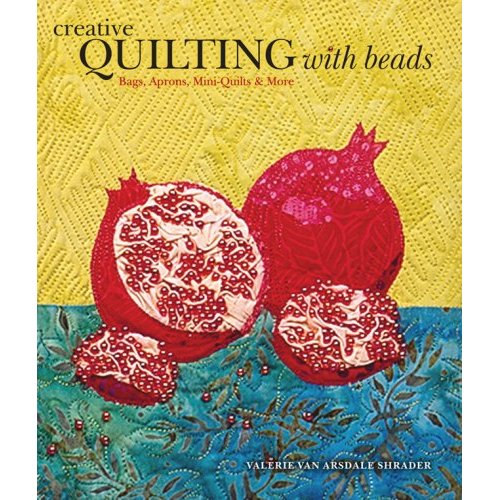
Creative Quilting With Beads

WOOT! My for-sale copies of Creative Quilting with Beads have arrived, along with the beads to make the pomegranate project on the cover. If you are interested, please pop over to the store page on my website, here. I have yet to figure out the mysteries of paypal shipping options (where you enter your location and actually get that to talk to the shopping cart to calculate the correct amount), so there are FOUR options, two for delivery in the US and two for delivery outside the US, all using the Flat Rate Priority Mail envelopes. I can fit one book (barely) into each envelope; I can also squeeze one baggie of beads into the same envelope, so you can purchase just the book, OR the book PLUS the beads.  (PS–if you are in Canada, write to me first, I may be able to get a less expensive postage for you than int’l flat rate….)

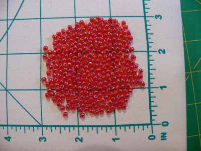
I actually counted (!!!) how many beads on my covers: 291! This was slightly less than a tube of the hard-to-find red drop beads. I had intended to use size 8 seed beads, but when I found the drop beads I knew they were perfect. They are–get ready for a surprise now (not!)–drop shaped, but the hole is near the skinny end. When you take a stitch with them, the thread disappears down at the base and only the red bulbous end shows…so it looks just like a pomegranate seed! I then counted out 300 beads, which was just over 15 grams, so I upped the quantity per baggie to an even 16 grams. So how much is that? Funny you should ask… it is this much:

Drop beads

If you bead at the same density I did, you should have about 15-20 beads leftover… a nice margin I think.

Anyway, you can order autographed-by-me copies on my website and the beads too. Thanks for reading! And once I get Eli to soccer practice later this morning, I’ll take a photo of my alternate colorway and orientation. The version in the book is to cover a composition notebook. The alternate covers a 7″ tall x 10″ wide Canson watercolor notebook/sketchbook (standard size available at www.dickblick.com among other places). Hmmmm…… maybe I’ll offer and e-mail with the measurements etc. already done to those who order from me and ask for them… does that sound good?

Now…to pack up a bag of reading materials while at soccer practice… it is GLORIOUS spring here in Maine…green is blushing all the treetops and after yesterday’s rain the sky is screaming blue! Thermometer says we are up to 62 already and it is only 10:15 am!

PS…for an earlier browse through the book, see my earlier blogpost here.