On the set at Interweave in Loveland, Colorado, to film a Quilting Arts Workshop! (Who me?!!!!)
Can you believe it? I’ve been to Loveland, Colorado, taped a Quilting Arts DVD Workshop, come home (exhausted but elated) and I can still barely believe it. Yes, I have been “on the set” filming this week. Due out in September as both a download and as an actual DVD (which is wonderful for us who live in the boonies with glacial internet), the working title is “Fused Collage and Thread-Coloring,” a Quilting Arts Workshop from Interweave Press!
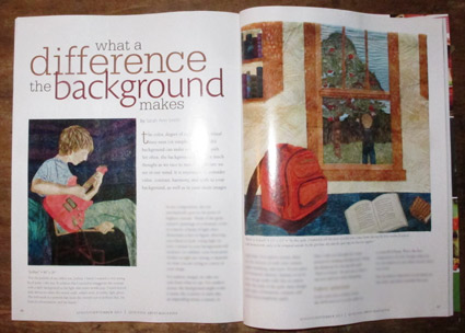
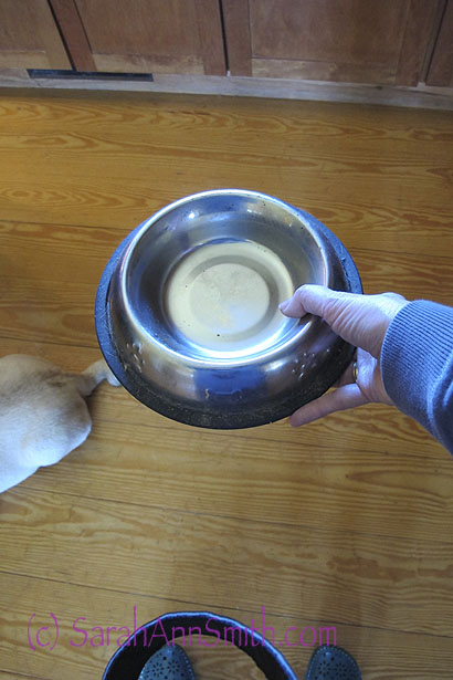
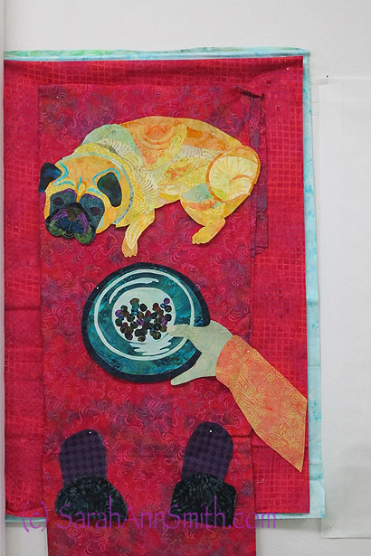
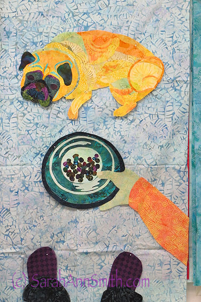
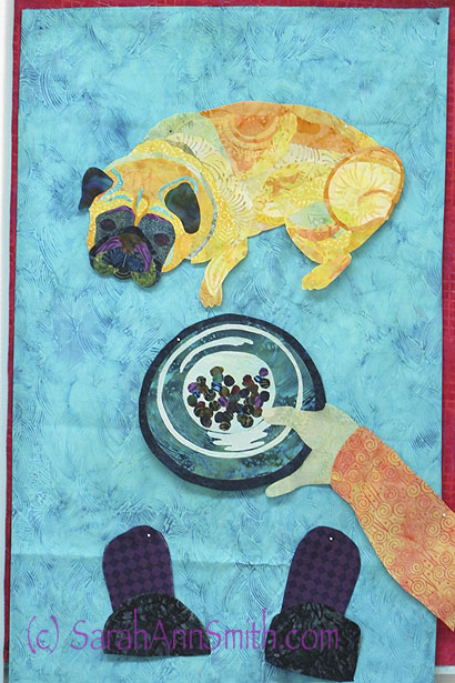
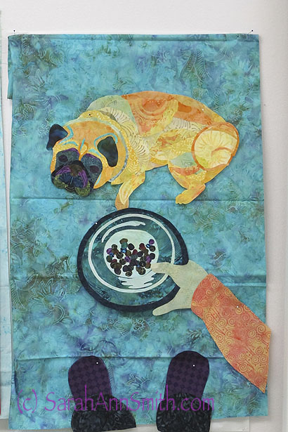
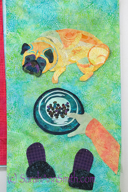
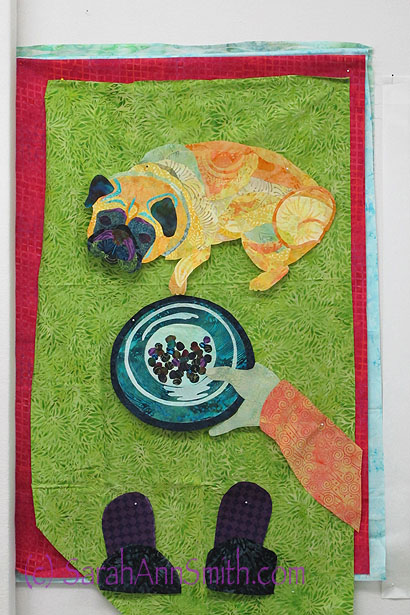
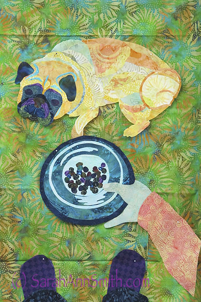
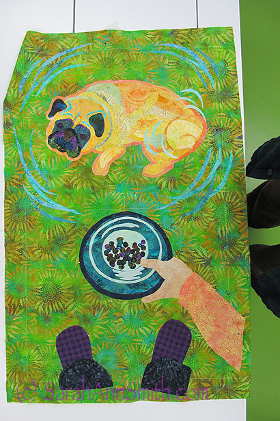
The project I used for the workshop is my Tomatoes, Basil and Garlic quilt (No. 1) [there will be 3 versions before I’m done], but the workshop is to teach you how to use your own photo to make an art quilt:

Tomatoes, Basil and Garlic, No. 1, the start of what I will call my Quilting the Good Life series!
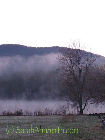
My trip to the airport was an omen–a good one–for how the trip was about to go. I mean, look at the beginnings of sunrise as I crossed the driveway to the garage!

4:25 a.m., Tuesday: leaving for the airport in Owl’s Head (near Rockland, maine) just before dawn
It got even more dramatic just over the ridge heading to the coast, at the intersection of Route 105 (the Camden Road) and High Street in Hope:

Can you believe that sky? Makes me want to get to the dye pots!
The route in was equally stunning. Here, mist rising off the Megunticook River in Camden.
And ten minutes down the coast in Rockland:

And the sunrise over Rockland Harbor, en route to our little airport at Owl’s Head.
I flew Cape Air (maximum of 9 passengers) to Boston, then JetBlue (for the first but not the last time!) to Denver, where I caught the shuttle to Loveland directly to the Interweave studio where I met Helen Gregory and the filming crew. There we set up my materials, hung the quilts, and went over my plans for filming the next day. Congrats to Helen on her promotion to Vice President for Content, Interweave and Martha Pullen, and upcoming move to Colorado!
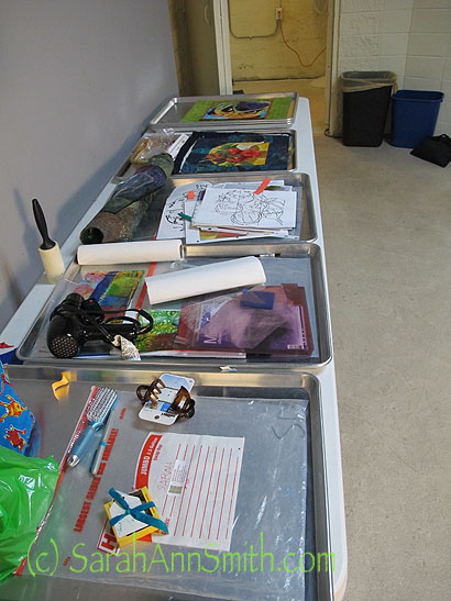
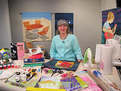
My DVD will have five segments, so five trays to lay out my supplies which I prepped at home.
And boy did I prep. I had about a month (shorter than usual I think) between my contract and filming date, so I pretty much did nothing but make step-outs, more step-outs, refine, video (to get used to talking to a camera and to time myself), cut/edit, cut/edit/shorten more, etc. For a month. Non-stop.
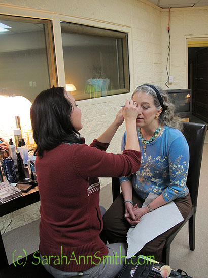
Make-up, first thing Wednesday!
Interweave has a make-up artist come do you up for camera, as there are special products that make you look right on camera under all those bright lights. I shoulda shot a picture of me sitting at the table looking at the room…it was FULL of big tripods, cameras, and cables and cords EVERYWHERE. Miraculously, I did not trip and break anything or anyone!
Reviewing my notes before getting changed for taping.
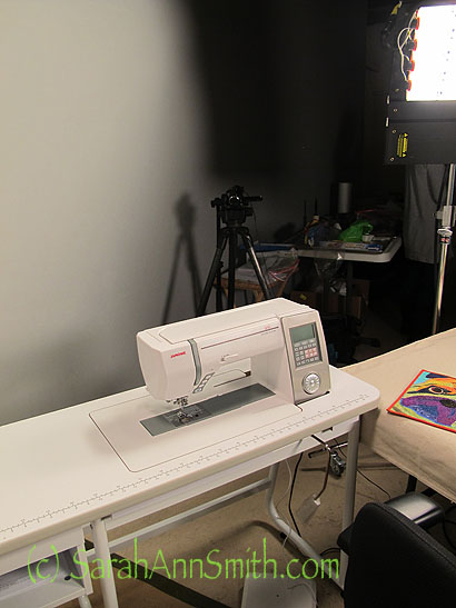
THANK YOU JANOME-America and Patty WInkelman of Quilter’s Stash in WIndsor, Colorado, for arranging a Janome 8900–the machine I sew on at home–to use along with a Janome sewing table. I’d never used the table and we were all impressed at how sturdy and stable and heavy it is. Of course the 8900 sewed flawlessly!
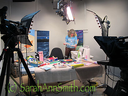
Then it was time to get changed and start taping. Then we mostly forgot to take still pictures! But here are some….
Me on the left, Helen Greghory in the green top, and I think that is Laura (webinars guru) on the right, hidden mostly by one of the cameras. We were getting ready for the concluding segment I can tell by what is on the table.
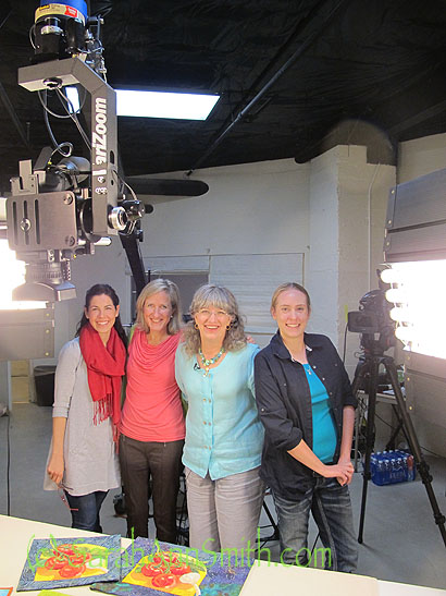
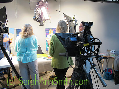
At the end, I asked to have apicture of four of us: L to R, Laura E. (webinars and more), Helen Gregory (new VP for Content), me, and Lauren our camerawoman extraordinaire. Camera dude Nick was taking the photo, and camera dude Garrett had already run off to another “gotta be there” job. Those lights were bright, but sure make things visible and looking good.
I never saw this view, but either Helen or Lauren kindly took this photo for me, which shows the jib camera shot of the table with my project and quilts on it:
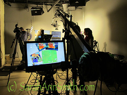
The jib/overhead camera view. If you look in the center just above the right corner of the screen view, you can see the overhead camera. Also notice in the backgorund it looks like the quilts are on an angle. They are–that is to offset the perspective angle that happens with the big camera lenses. Fascinating!
Then it was time to go home. Early.
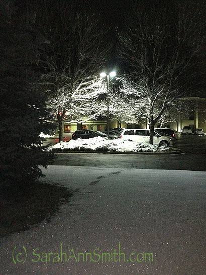
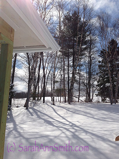
Before I arrived, Colorado hit 80 degrees (F). Wednesday, it SNOWED. When I left the hotel at 3:58 a.m. for the shuttle to the Denver Airport, it looked like this! Then by today it was supposed to be back in the 60s–that’s more insane than our weather!
I’ll spare you the tedium of a crowded plane from Denver to Philadelphia, a smaller more crowded plane from Philly to Boston, the utter hopelessness of Logan Airport (UGH UGH UGH), but flying home on Cape Air is always fun. As we approach the mid-coast, first I’ll spot the Camden Hills:
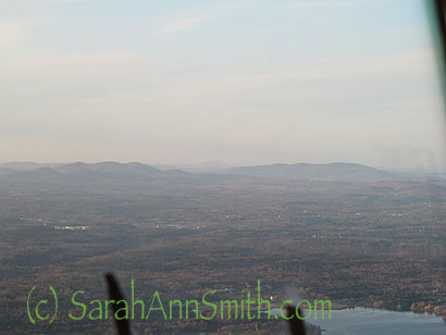
There are two landmarks visible from the sky from a distance. I was in the seat behind the co-pilot’s seat (which is usually filled with a passenger). The first are the Camden Hills: Battie, Megunticcok, Maidencliff.
Then
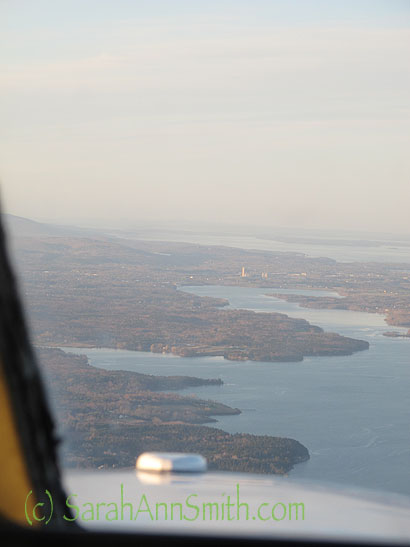
The second landmark is the big white tower at Dragon Cement, visible dead ahead in the middle of this photo. I realized on this trip how massively huge the quarry is for this company.
As you near Dragon Cement, we turn right and head for Owl’s Head (Knox County, RKD) airport. The lights of home!
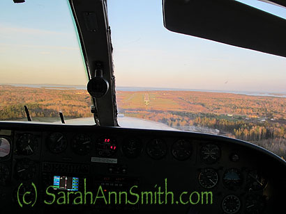
LOVE being able to snap out all windows of these small planes. Landing strip is visible just to the right of the bar up the center of the windshield.
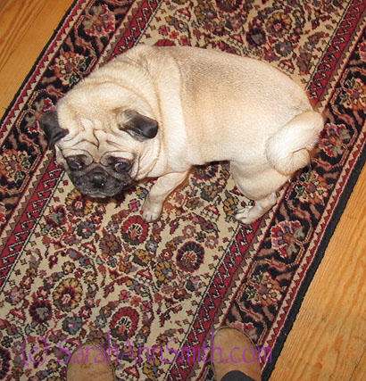
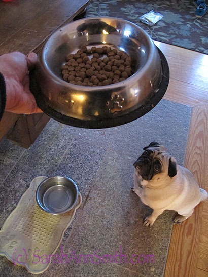
Travel was the usual crowded insanity and waiting, but I was home 16 hours later to son, hubby, cats and dog. Two of the seven are here:
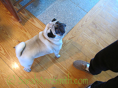
Doggie love is GOOD!
In the past month, I’ve not only prepped this, but THREE articles (more on them when they are close to being published), have a quilt to make in a week, another article to write, then teaching in North Carolina in June and southern California in July, then a quilt to make by August 5. Then I can collapse a few weeks before school begins (how will Eli be a SOPHOMORE already?) and fall teaching in Massachusetts and at International Quilt Festival in Houston. So I HOPE to blog more often, but at this rate can’t promise. I have so much to catch you all up on, pictures from teaching in Florida, Vermont, and Mass….but must be mom, wife, and author first. Stay tuned!