(c)Sarah Ann Smith 2015; quote (c) Mirza Khan, used with permission
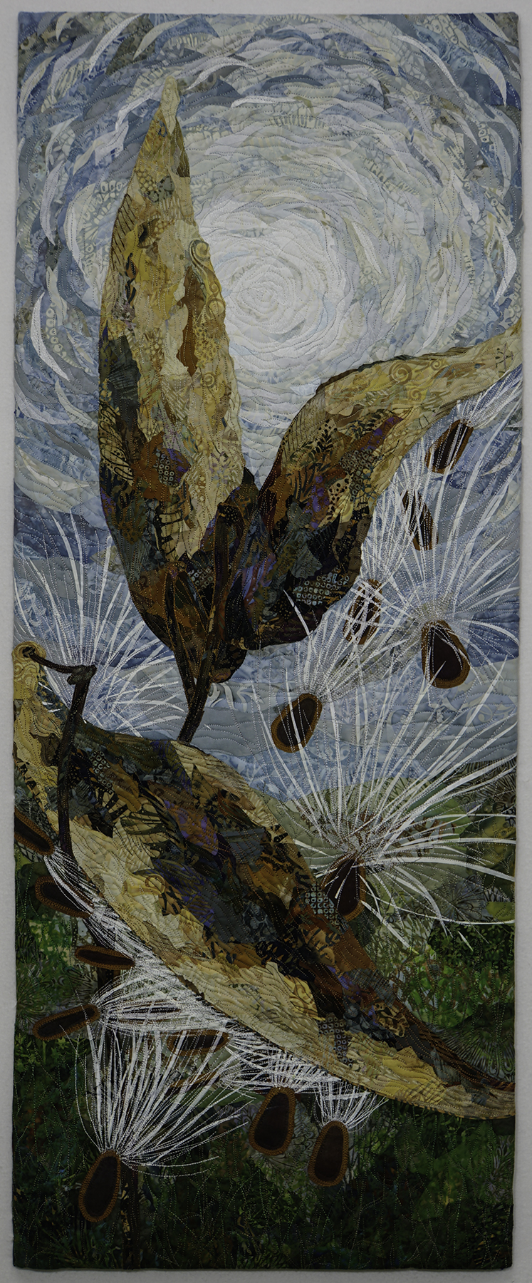
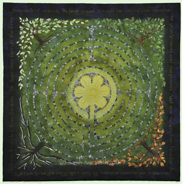
In my last post I shared my most recent work and the good news that Descended From the Stars has been juried in to Affinity, the 2015 Dinner@8 exhibit which will premiere in Houston. Today I thought I’d share how it began.
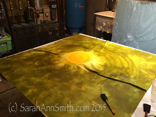
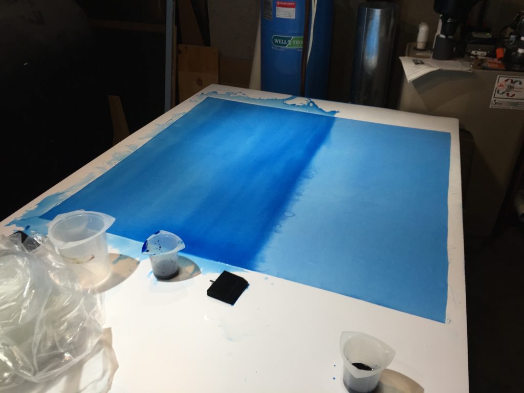
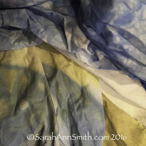
It began with an idea and Procion MX dyes…..and a pyrex pie plate (yes, dedicated to dye only use for safety) in the center. Here is the first round of dyeing, with the pie plate to elevate the yellow center and prevent tendrils of green from sneaking in to my sun.
When my sons were little they attended Children’s House Montessori School in Friday Harbor, Washington. The teacher asked me to dye a (GULP) hand-tatted doily of her grandmothers. Made in natural cotton color, she wanted it yellow because it looked like a sun. When a child had a birthday, she would place the doily on the floor, and the child would walk around the “sun” once for each year of their young lives: four circles for four years.
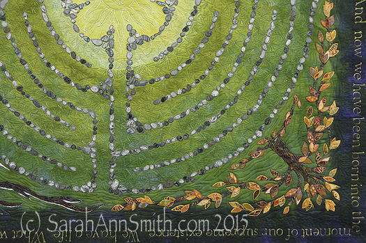
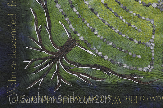
I then thought about a labyrinth. What is life but a labyrinth? It twists and turns, going around the center/sun, in the same place but not really, through the changing seasons. That led to thinking about the tree of life. Finally, I wanted to include Mirza Khan’s quote (see previous blogpost, here) in the deep blue of the heavens.
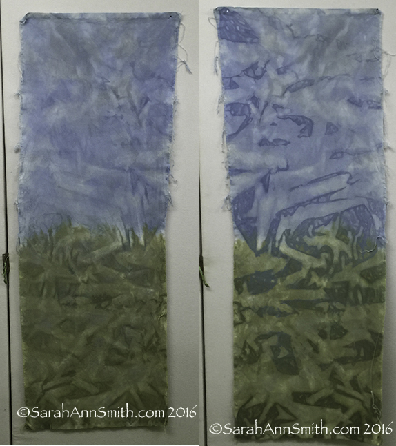
I knew I would never find fabric like I wanted, so out came the PFD (Prepared For Dyeing) cloth and the dyes and my color “bibles” from classes with Carol Soderlund (her website has info) to figure out which pure dyes I needed to get the colors I wanted. The photo above shows the yellow and green. The next photo shows when I added the deep blue to darken the edges. I ended up doing a second dyeing to get the deep, deep dark blue on the edge.
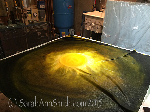
Deep navy is brushed on to the fabric to provide a gradation of color from pale in the center to deep dark on the edges.
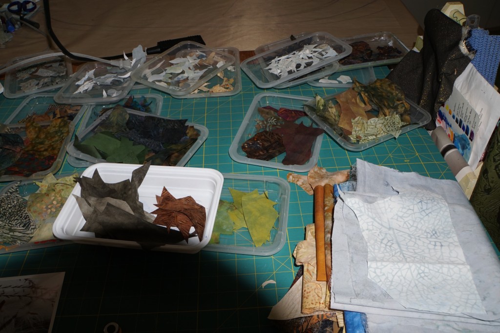
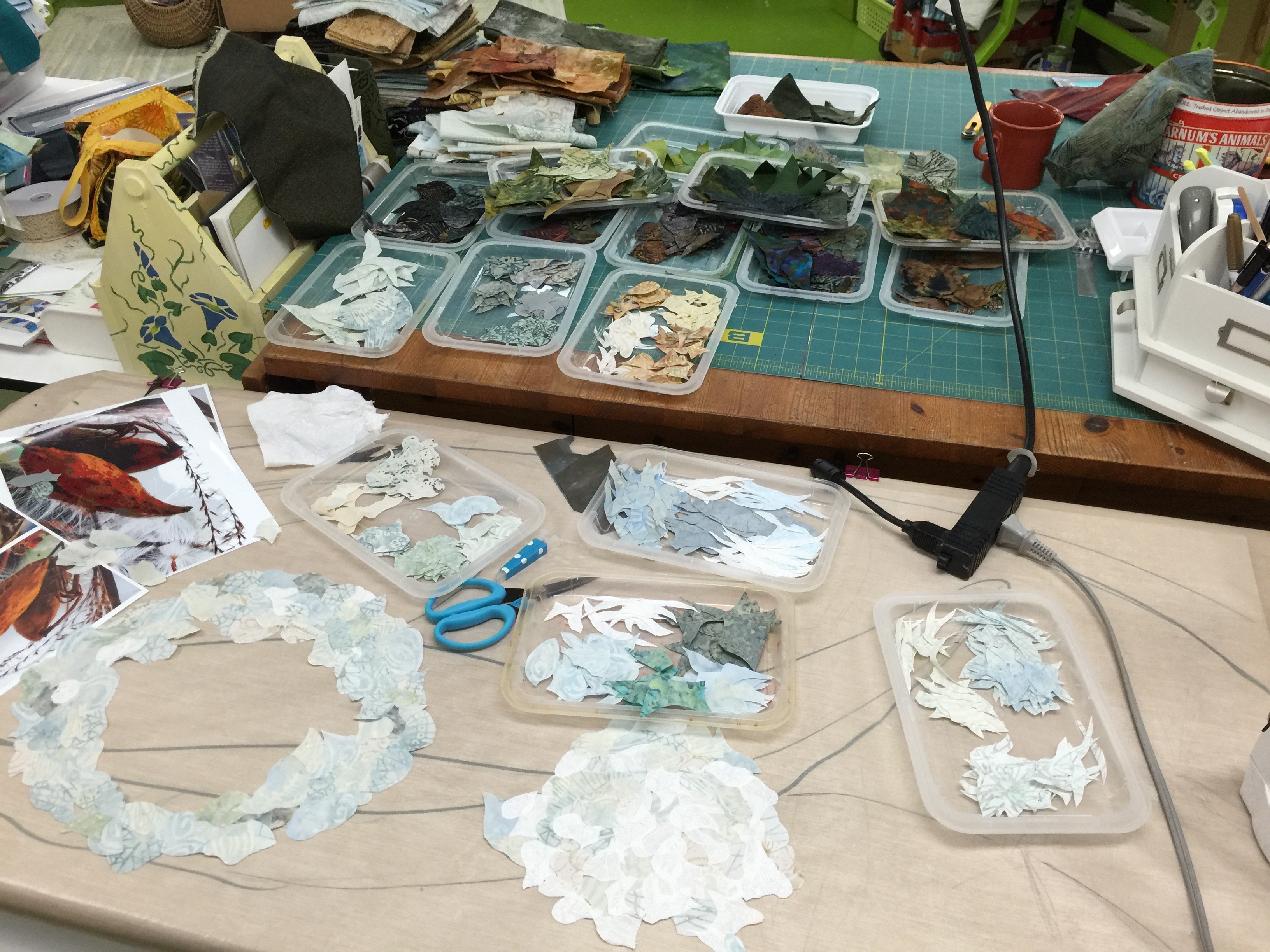
Once dyeing was complete, I enlarged a labyrinth design onto paper, then transferred that onto my dyed top. Then I spent several episodes of DVR’d MasterPiece Theatre cutting out stones from batiks pre-fused with Mistyfuse. I used an old ice cube tray, putting one type of stone (cloth) into a cup. That way I could choose fabrics to be sure I got a fairly random patterning.
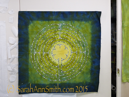
You can see a faint white chalk line on the edge of the green/blue that gave me my center square. On the left, you can see an idea that didn’t work out. Initially I planned to applique items onto the labyrinth that represented important phases in my life. But once the quilt took shape, I realized that would simply be too much clutter!
Next came the lettering, which was done with a dip pen and Liquitex acrylic Ink! in gold. I figured out how large I wanted the lettering to be (counted all the letters in the quote, divided by four to see where I would need to break at corners, etc.) and after a second try, got the size correct.
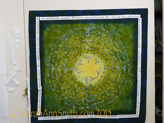
Here I have pinned the text, printed onto paper and cut apart, to see if it will fit. It does (on the second attempt). I chose a font I liked since I more or less copied the font in my lettering.
I chalked in guide lines: top, bottom, top of lower case, like on a second grader’s paper. I find that as you go along, large writing tends to want to get small and closer to normal size writing, so I needed the guidelines. I used the SewLine ceramic chalk mechanical pencils, then erased the lines when done. I covered the outer edge of the cloth with the text strips (seen above) immediately above where they needed to go so I could also keep my spacing consistent and accurate. I placed freezer paper underneath in case I had any blobs. Sigh. My first blob happened on my second letter! But I was able to fix it (used a little of the blue acrylic ink after scraping up the blob and that made it look like part of the dye patterning!) and learned to be more careful. It took a few hours for each side, so I only did one side on any given day.
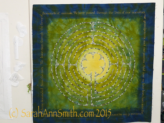
The lettering is done! next, on to the trees. You can see the chalk guidelines in this photo.
And yes, I did have a practice piece!
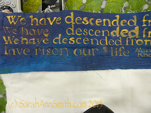
It’s quilted in this photo, but I had a scrap of blue fabric and tried various ways to write, from a chisel brush to the dip pen and crow-quill (metal) nib that I ended up using because it gave the crisp look I wanted.
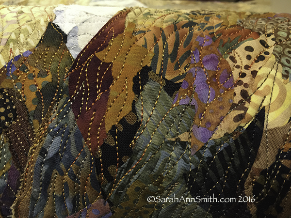
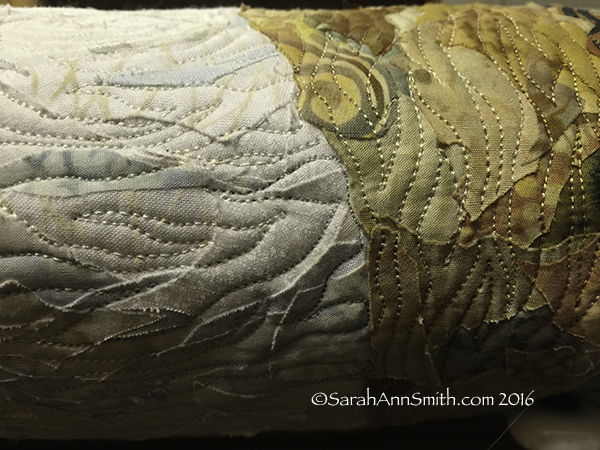
In the next post, I’ll show the trees and quilting.