email Youtube

Home
Galleries
Blog
Workshops & Calendar
Store
Resources
About
Contact

Archive for the ‘Dyeing’ Category

Surf

Monday, February 13th, 2017

If you wonder what I’ve been up to, I dyed a bunch of fabric a while ago.  Now I am in the throes of turning it into a quilt.  A Very Large Art Quilt.   The blueberry barrens quilt was a sprint.  This one is a marathon.  Perhaps an ultra-marathon.   If anyone has some clever titles for the Pacific ocean crashing up on a rocky shore, let me know. I stink at titles and names.   My teddy bears are named Papa Bear, Momma Bear, and Baby Bear.  My childhood lion is, get this for originality, Leo.   Suggestions welcome!

Hand-dyed fabrics I made in January for a surf/ocean quilt.Oh…that bright green on the top right, not part of the quilt.

This quilt has a due date / needs to be in a box and getting shipped of mid-March, so I’m going down to the studio.  I will emerge.  I hope.

Autumn on Blueberry Lane

Saturday, February 11th, 2017

This quilt was inevitable.    Right click to view larger.  That thing in the middle is the needle bar of my Bernina Q20.  Notice the difference as I lay in the grasses along the edge of the driveway:  done on the far left, upper grass done on the near left, upper and lower grasses done on the near right (but not the tall grass which will happen in the final pass back to the right), and no stitching at all.

This photo is not the full quilt, but the quilt is a strong horizontal, and this shows more of it than I’ve shared to date on Facebook.  I’ll share the full quilt in mid March when I tape my Quilting Arts TV episode on one of the techniques I’ve developed and used in this quilt.

The photo below, taken in October 2015, was my inspiration, along with every autumn blueberry barrens I have ever seen.  The colors in the wild blueberry bushes are just beyond belief.  So I dyed a lot of fabric and went to town!

More autumn decay with blueberry barrens, decaying stone wall and birches in autumn in Maine.
The usual edits: smart sharpen, tiny bit of vibrance, crunching levels.

Hand dyeing fabric inspired by the blueberry barrens Maine (they look the same in Nova Scotia, too)

Same colors, different technique, scrunch

Scrunch and done. I used just about every single bit of this piece of fabric except for the more pink bits.   The blueberries are more of a russet and burgundy…this needs a touch more yellow in the red to get to that color.  

I’m still doing the facings and hanging sleeve…I’ll share the finished quilt in March, unless I change my mind and do it sooner!


Productive procrastination

Sunday, January 15th, 2017

So, I am supposed to be working on something that has a FIRM due-date of mid-to-early-ish March.  I have dyed the fabric and know what I’m going to do, but got sidetracked for a few days doing something I’ve wanted to do for eons:  paint the basement room that has the furnace, water heater, fuel oil tank, and water pump in it.  WHY?  Well, it’s where I do my fabric dyeing.   Since fabric is a lot more attractive than cement, here’s my last two batches of fabric.  Remember them, you’ll see them transformed at some point this year.

My time at the dye pots was FUN! And more interesting than a basement utility room which is what this post is really about.

What provoked this flurry of activity?  The Elfa sale at the Container Store, where good quality closet storage stuff goes on an annual 30 percent off sale.  Decided after much research it would be the best option for getting some shallow shelves above my “not a legal sink but a a basin” in my dye room because it would require the fewest screws going into the cement foundation walls and those few could be above grade (important for when the ground and snow melt in spring).    Here’s the before:


Panorama shot of the basement in the before stage…which I remembered to take only after I had started putting the DryLock paint around the window.  Click to make larger.  

I decided that I couldn’t stand putting the Elfa stuff in without finally painting the walls white (which will help with light and visibility in the room), so I started painting.  Four days ago!

First coat of DryLock paint partly on.  Better already!

Just about done except for the cleaning and moving stuff back in place and waiting for the shelf stuff to arrive.  A vast improvement (did another coat of primer on the wall at the far left).  Now, if I could just convince Paul to let me paint our dark living room……

I finished the last of the painting/priming today.  I used DryLock which helps keep water out on the cement walls.  It is like trying to paint with sludge/mud/thick paste.   ICK.   Primer on the base of the chimney/stone fireplace, and semi-gloss on the wall behind the sink as well.    I’ll post pics of the shelf stuff once it arrives and is installed.   It will require a masonry drill bit and Advil for the arthritis in my hands that will be aggravated from drilling the holes!

Inspired by the National Parks

Friday, December 30th, 2016

2016 was a very good year for me, including being published in books and magazines.  It was also a very hectic year and I have neglected my blog and sharing my news, so I’m going to get caught up this week and next, at least on the published works.   One of the delights of the year was FINALLY being able to share a small quilt I made some time ago for an exhibit and book to celebrate the centennial of the founding of the US National Parks, website here.

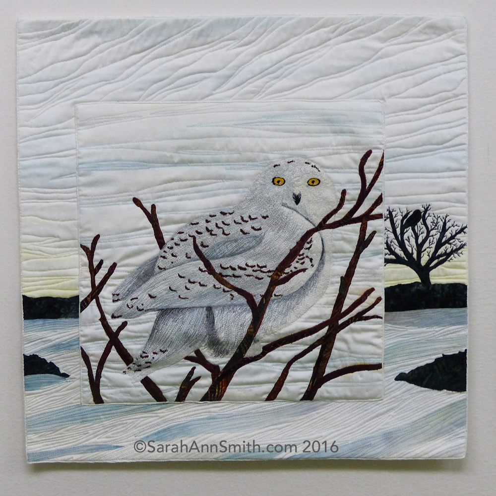
Snowy Owl by Sarah Ann Smith, ©2015/2016

Part of the exhibit debuted at International Quilt Festival in late 2015, but the book was not released until Spring 2016, so we were asked not to share photos online.   For once, since my contribution was for Acadia National Park, I was not alphabetically challenged (with a name like Sarah Smith, I’m at the end no matter whether lists are done by first or last name).

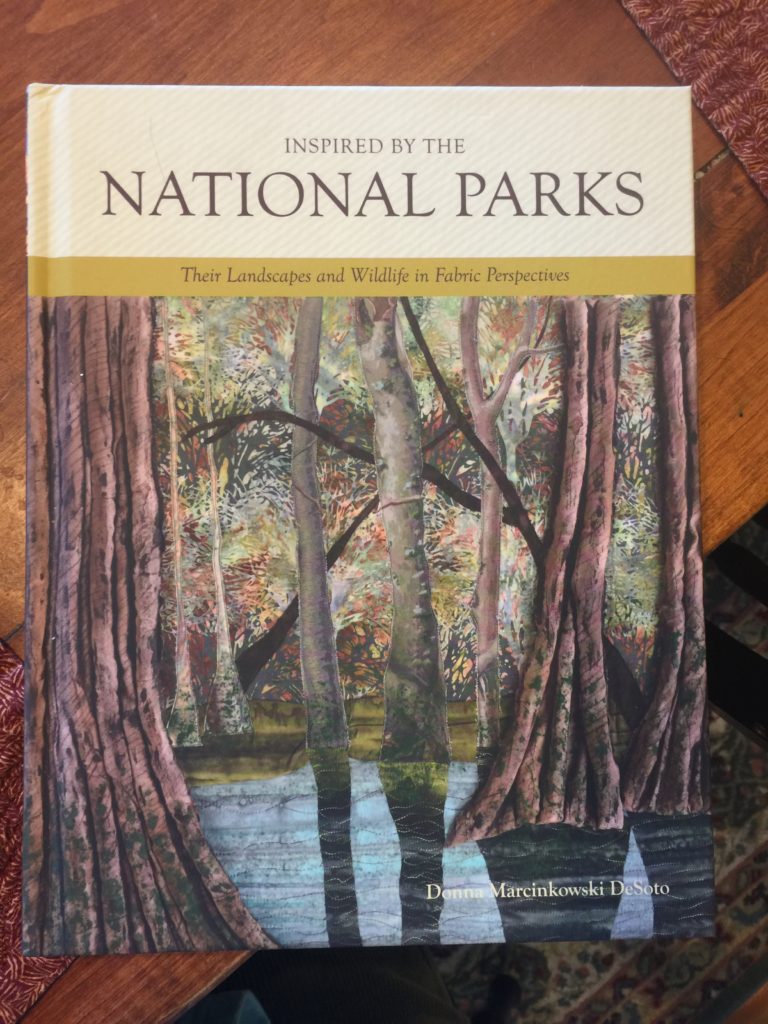
Inspired by the National Parks, by Donna M. DeSoto. You can visit the exhibit website here and purchase the book here.

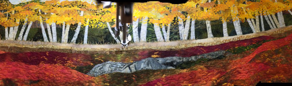
There were to be three categories of quilts:  Landscape, Flora and Fauna.  The landscape quilt is a long vertical or horizontal.  The Flora and Fauna quilts are squares.  When displayed together, the three works create a square.  Subject to availability, those participating got to choose which  theme and the subject, as long as someone else hadn’t already chosen.  For example, blueberries are very Maine, but they are also part of the scenery in other northern tier states and were already gone.  To be blunt, this could have been a disaster.  Instead, the work exceeds all expectations and forms the most wonderful whole.  I so wish I could see the entire exhibit **in person.**

In the book, Donna has contributions from one of the US Park Rangers working at each of the national parks, writing about the park, along with tidbits of information about each place.

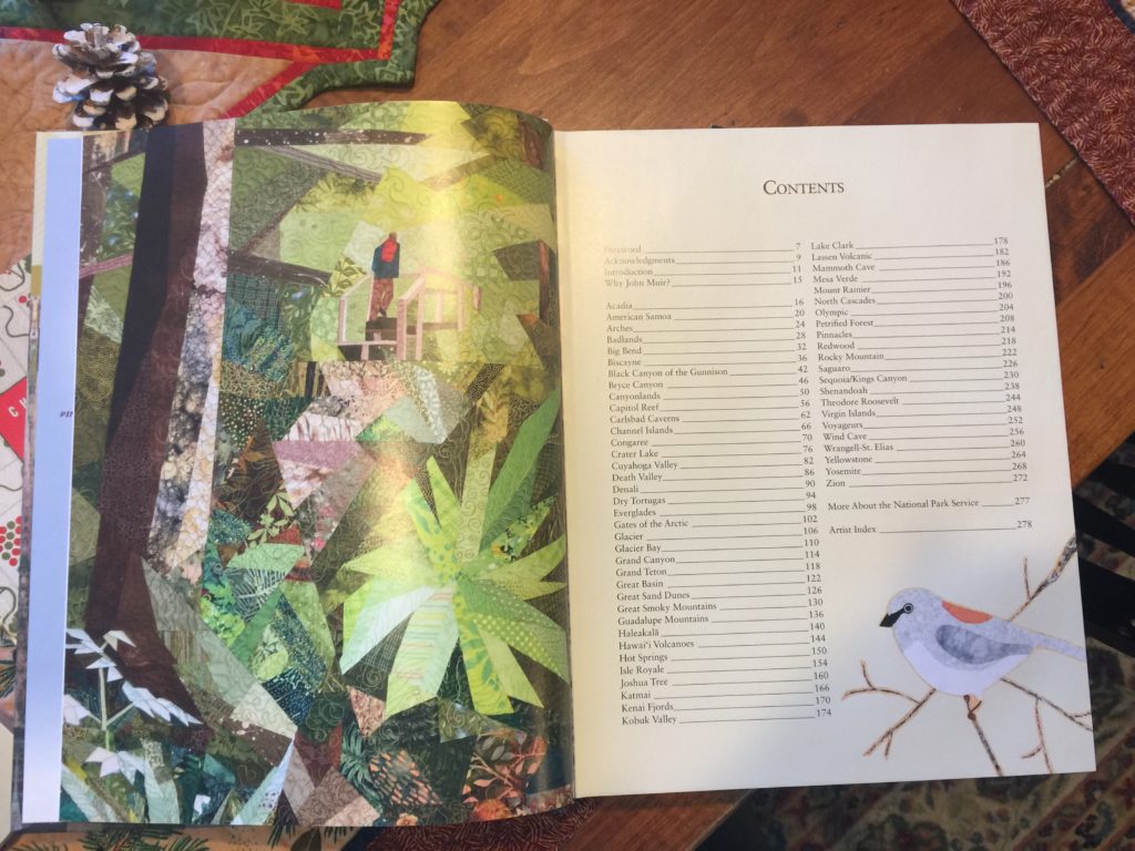
Inspired by the National Parks, Table of Contents

The next photo shows the opening for Acadia National Park, here in Maine:

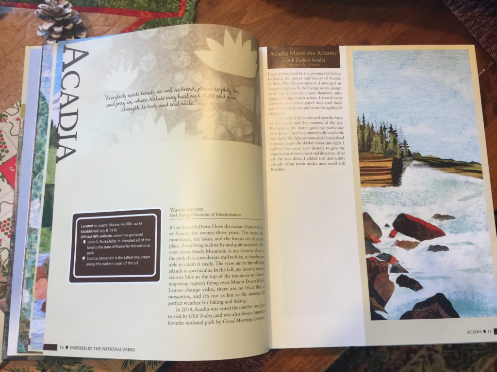
Acadia National Park, opening pages with statement from a park ranger and the landscape quilt, by Cyndi Zacheis Souder.

And the flora and fauna quilts for Acadia, including my snowy owl.  They wisely edged the photo with a fine line of black so it wouldn’t “moosh” into the page!

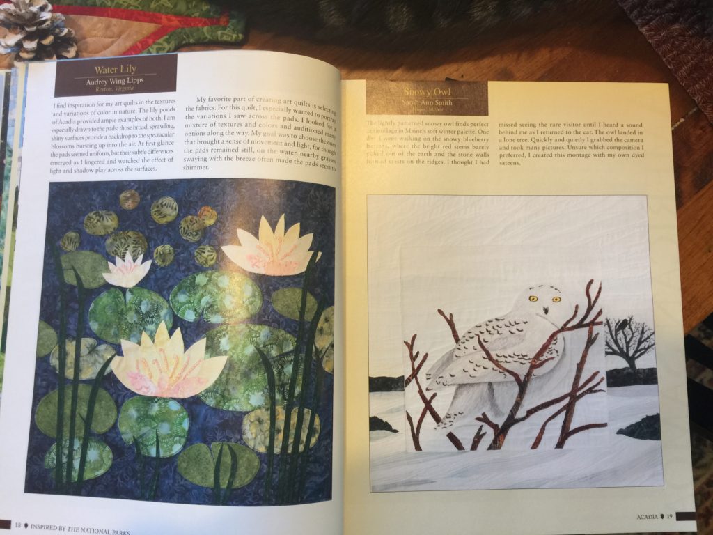
Water Lily by Audrey Wing Lipps and Snowy Owl by me

A couple years ago, there was an “irruption” of Snowy Owls, meaning they migrated a lot further south than usual, and were relatively easy to spot here in Maine.   I added the Snowy Owl to my birder’s “life list” that winter.  I went to Clarry Hill in Union, where two or three owls had been spotted.  I walked along the path through the blueberry barrens on the bare hilltop, but nothing.  As I was about to turn around, I spotted one at a great distance (beyond the no trespassing signs), so I was happy, but no good photos.  Then I returned to the car.  As I approached the car park, I turned and saw an owl in a tree growing next to a stone wall…camera OUT!   Snap! Snap!  Snap!  Thank heavens for auto-focus.

This was about 4 pm, as the sun was beginning to set. There was an owl in the tree on the ridgeline!  The owl had followed me down the path and was checking me out!

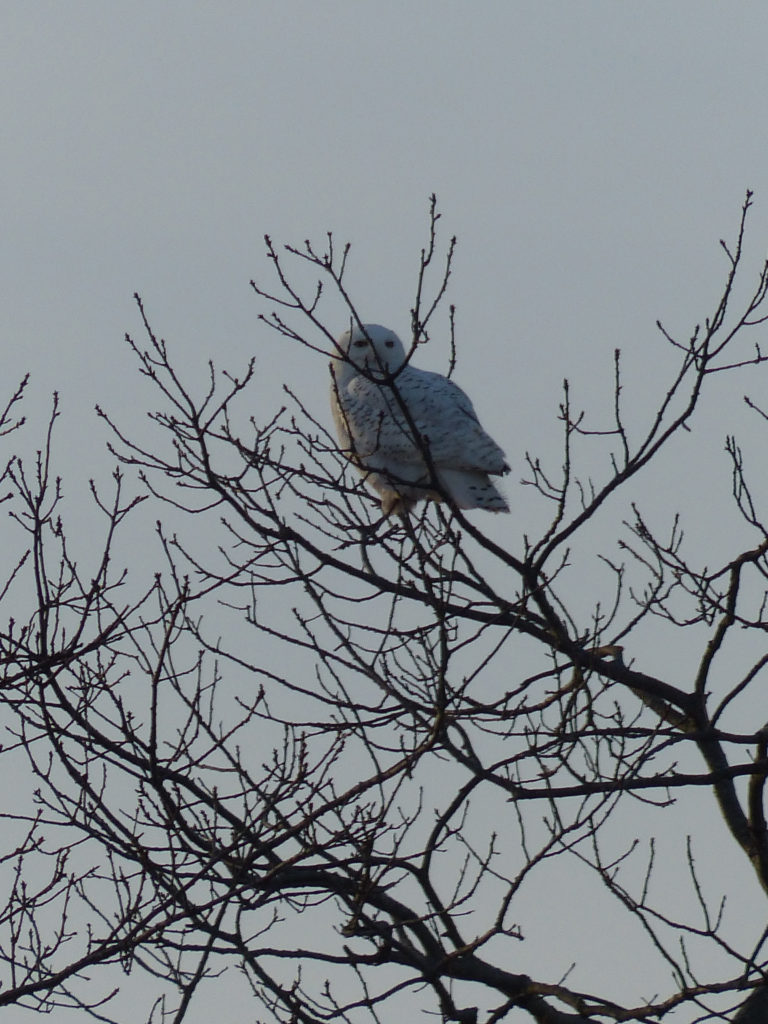
The owl few even closer, so I got some better images. I still get goosebumps looking at this photo! To hear the rustle of an owl’s wings and landing….wow!  Hopefully, one of these days Sony will make an even longer focal length zoom for my a6000 mirrorless camera…I am saving already because it WILL be expensive, but worth it!  I am inspired by Jeannie Sumjall Ajero’s nature photos she shares on Facebook.

When it came time to make my quilt, I couldn’t decide which view.  So I messed around in Photoshop, and thought, well why not BOTH?

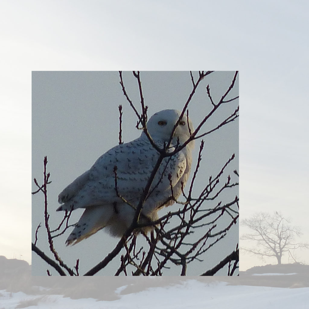
A composite photo image that was my guideline. I obviously adjusted the branches and the placement of the stone wall/tree in the final work.

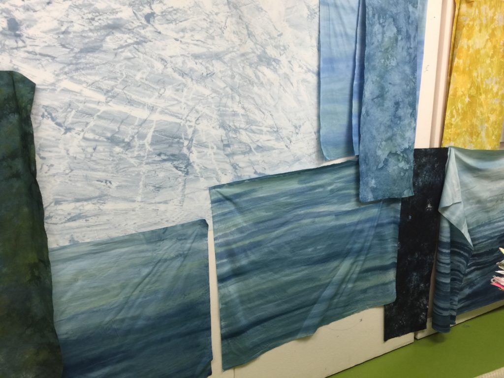
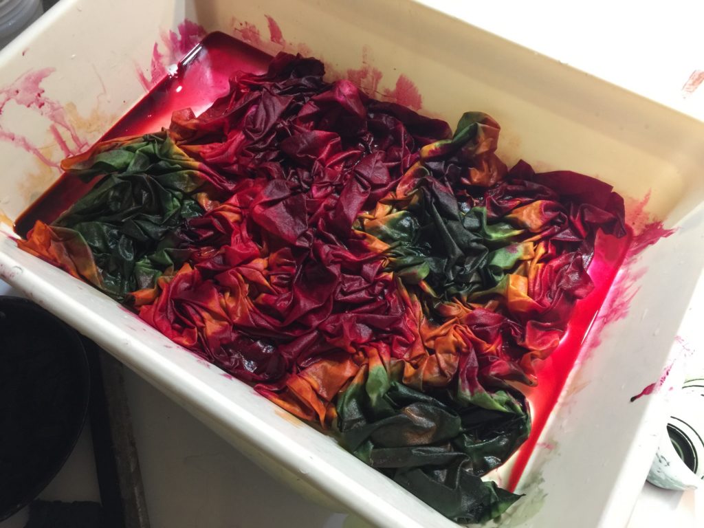
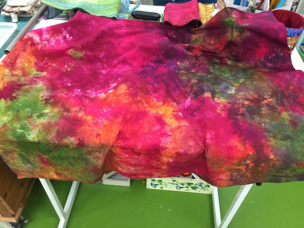
The subtle winter palette is challenging in terms of finding fabric, so I dyed some cotton sateen.  Despite being stingy with the dye, my first attempt there was too much color, so I tried again and got just the pale tones I needed.

I created the bird on white cloth, used stabilizer, and did the very heavy stitching on the bird first, then appliquéd her (probably a female because there is a lot of barring, the brown bits) to the smaller close-up image.   I then composed the background quilt and appliqués the smaller one to the larger one.   I’ll enjoy having her fly home eventually.  Until then, if you get a chance to see this exhibit, DO!   And no matter what, the book is a delightful volume.   The **Library of Congress** has included the book in a display this year…how amazingly cool is that?  Kudos to Donna and all the artists.  Exceptionally well done!

You can order the book on Amazon here.  What a great thing to do on a long winter’s day!


Descended From the Stars, Part 3

Wednesday, July 20th, 2016
The sun in the center of Descended From the Stars

The sun in the center of Descended From the Stars

When I left on in my last post about this quilt, I had shared the dyeing process and the stones and lettering.   Next, I fused trees in the four seasons into the corners.  I distorted the shape so the tree canopy served as a frame.  I had thought initially I might need an inner border, perhaps couched yarn or stitching of some sort, but the shape of the tree worked so well I didn’t need anything extra.   As I did with the stones, I cut out leaves, LOTS of leaves, separating the colors into the ice cube tray so I could place them carefully.

Detail, upper left corner, Spring Tree of Life.

Detail, upper left corner, Spring Tree of Life.  Each of the leaves is free-motion stitched with several rounds of thread on each leaf.  The nice part about doing this at the top stage is that I could use the scissors on my Janome 15000.  I didn’t have to bury thread tails!

Detail, top right, Summer Tree of Life.

Detail, top right, Summer Tree of Life.

Detail of the lower right corner, showing the autumn tree of life.

Detail of the lower right corner, showing the autumn tree of life.

Detail of the lower left corner, with the winter tree kissed by snow.

Detail of the lower left corner, with the winter tree kissed by snow.

I did the stitching around the stones and on the trees, including the leaves, at the top stage with stabilizer underneath.  (See my post here to learn more about my current article for Machine Quilting Unlimited on the Fourth Layer–stabilizer– for densely thread painted quilts.)  I removed the stabilizer everywhere except for under the center because I knew I would want to quilt that area more densely than the rest of the quilt.

Here

Here I have begun quilting.  You can see the custom-dyed cotton duck on the back.  The use of heavier cloth helps keep the quilt flat and stable; it also helps minimize shrinkage.  The final piece had to be 40 x 40 inches, and I wanted to have a balanced amount of blue on both sides of the lettering, so I needed to control the shrinkage that happens with dense quilting.

Next,

asdfa

Superior Threads (Thank you Bob and Heather Purcell!) has come out with some tone-on-tone variegated threads.   I have been pestering Bob for YEARS to make threads like these as I prefer blendy to contrasty.  I ordered up all of the new earth-tone blendy variegateds in the Fantastico line and used them.  I began with a light green blend in the first row around the sun, switched to another in the next to rings, and then a third in the fourth ring that you see here.  If you look at the left, you can see how I snuck some of the current thread color into the next ring to get even more color blending.

Then, I had to decide what threads to use in the dark areas.  My sewing tables (two back to back) are each 24 inches, so I have a nice, HUGE flat surface to support the quilt as I work.

asdf

Choosing thread:  dark, pine-y green and deep blue.

With all the manipulation, I realized that some of the ink had rubbed off, despite being REALLY careful to heat set it according to directions.  I wrote immediately to friends Judy Coates Perez and Susan Brubaker Knapp to seek guidance.  Judy had only used the regular colors, not the metallics.  And Susan had an article in the just-out issue of Quilting Arts about lettering, including these inks!  She too discovered that the metallics seem to “shed” a bit.

After quiting, some of the bling had rubbed off my quilt, so I had to do it AGAIN!

After quiting, some of the bling had rubbed off my quilt, so I had to do it AGAIN!  You can see where I have inked over the letters and what is left to re-do.

After re-inking and heat setting, I tested on my scrap cloth several products to seal the ink including GAC 900 (a textile medium that one adds to paint), a UV Coating, matte gel medium, and Krylon Spray Fixative which says it is acid-free, archival and safe on fabric.  Only the Krylon didn’t leave tell-tale signs that it had been used.  So I carefully masked off the rest of the quilt, leaving only the lettering area exposed and sprayed the Krylon on it (stinky!) in hopes that will help prevent the mica flakes in the gold ink from coming off.

I was nearly done, except that I didn’t really care for the multiple layers of thread I had used stitching the sun.  Picking it out did NOT appeal to me.  So I trekked down to Clementine fabrics in Rockland and bought some perle cotton in the right color.

I wasn't happy with the way the stitching looked, so I couched perle cotton on top of the outline of the sun.  MUCH better!  You can see the difference in this half-way-through shot.

I wasn’t happy with the way the stitching looked, so I couched perle cotton on top of the outline of the sun. MUCH better! You can see the difference in this half-way-through shot.

At last, it was nearly DONE!  Time for facings, sleeve and label.

The back side of the quilt.  By dyeing the back to correspond with the front, the quilting design shows up on the back as it does on the front.

The back side of the quilt. By dyeing the back to correspond with the front, the quilting design shows up on the back as it does on the front.

And I couldn’t resist the temptation to place a moon behind the sun as my label.  One more time with the dip pen!

The End--the label is on, the sleeve is done, the facings are stitched!

The End–the label is on, the sleeve is done, the facings are stitched!

(c)Sarah Ann Smith 2015; quote (c) Mirza Khan, used with permission

(c)Sarah Ann Smith 2015; quote (c) Mirza Khan, used with permission

This quilt will be for sale–another reason I opted to not include a lot of personal details in the quilt.   As I said before, I am happy!