email Youtube

Home
Galleries
Blog
Workshops & Calendar
Store
Resources
About
Contact

Archive for the ‘Techniques’ Category

Color Mixing for Dyers, week 2, continued… again!
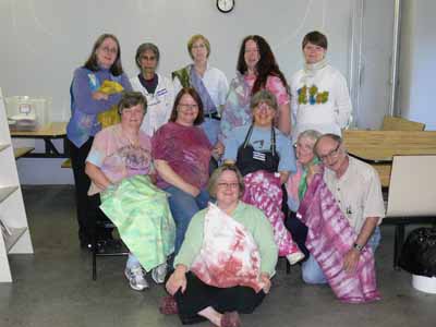
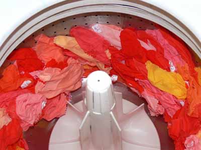
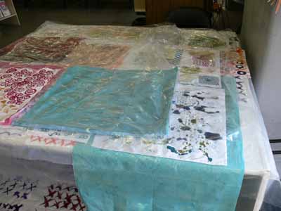
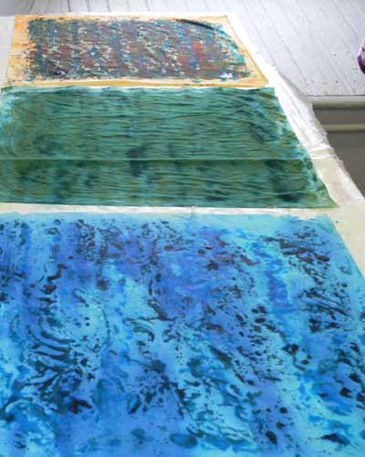
Monday, November 5th, 2007

On the first day of the workshop, Carol invited us to pick a color which would be our “base” color to play with. Since I knew I needed to make some fabric for an art quilt destined to an invitational exhibit, I knew I wanted blues and greens, so I selected a somewhat teal blue. Here are some of our pieces batching on a work table. Please don’t ask me WHY I had never thought of something as simple as this: just lay your pieces flat, layer with a plastic drop sheet, add more pieces on top, another piece of plastic, etc.

Class work batching, layered with drop sheets

This piece is one where I tried a variety of techniques on a half-yard length:

Blues1–all

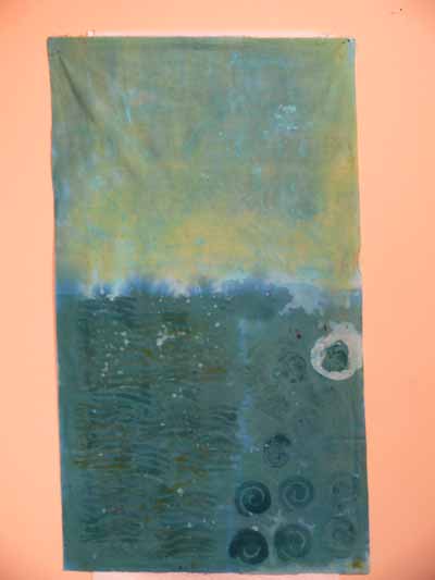
Then we started playing with resists: Elmer’s washable blue-gel school glue, cold wax resist, and Presist.

Blue glue-gel

The gel-glue has the virtue of being inexpensive and available just about everywhere. Since I wanted fabric for a pond and stream, I figured I’d make watery-shaped marks and blobs. The drawback to the gel-glue is that it takes a LONG time to dry: even though it was moderately warm (low 70s, which for Massachusetts in October is warm) and not oppresively humid, it took well over a day to dry fully. First I painted over the glue gel with a thickened print paste mix plus dye plus dye activator, and batched it. Then, I wanted to add more color and texture, so I scrunched the whole thing up in a plastic container and dumped on more dye. This partially dissolved the gel-glue which then migrated and formed the “rice” pattern on the cloth…cool!

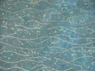
Presist is a VERY thick gooey stuff that looks like molasses, except thicker. You pour (slowly) some of the gunk onto a plate or other flat, plasticky surface. You either dip your stamp into the Presist or use a small make-up sponge to daub the presist onto your chunky stamp. I did that in the wave area of the 1/2 yard length shown above. This photo (for some reason the color in the photo is hideous–color accuracy on the photo above is better) shows what it looked like after a couple of overdyes and some drips and drops from the cold wax (next item):

Blues presist

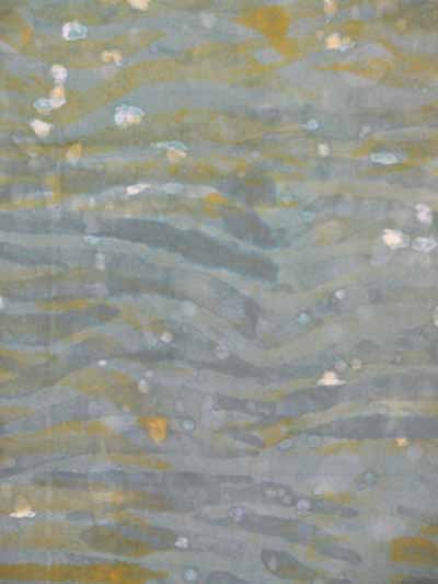
I love love LOVE the cold wax! The stuff is a milky white, in both color and consistency, and not inexpensive! You don’t have a lot of control with it but you can get these sweeping brush strokes for subtle overdyes. Here is a close-up of the upper section of the half-yard piece which shows some of the brushmarks and “water drops”. The color doesn’t photograph well (at least not with the time I spent setting up the shot!), plus it is very subtle to begin with. I would love to play with this medium more and see what I can do… I can see some awesome feathery-grass-like pieces in it. As with all wax (hot or cold!) you have to remove it; in this case, you can do the usual iron between newsprint or keep a plastic bucket (an old kitty litter bucket is perfect) for rinsing the wax out. The wax sticks to the side of the bucket instead of going down and coating your pvc water pipes in your house. That is a good thing!

Blues cold wax

Here is the print batching table once again, with three of my in progress pieces. As usual for wet cotton, the colors are deeper when wet.

Blues batching

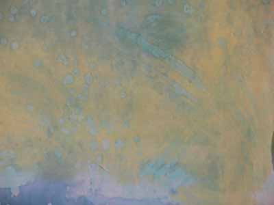
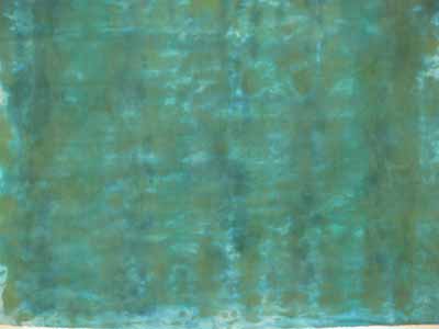
The piece in the middle in the photo above is shown in detail below: although it is pretty unremarkable as a piece of manipulated cloth, it will be very useful: think forest pond!

pond green monoprint blobby

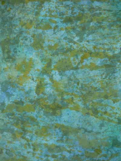
I made a second “monoprint” from the same leftover blobbies plus some more greenish print paste mixto make this more textured piece; think algae on forest pond!

blues monoprint

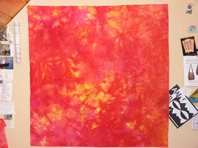
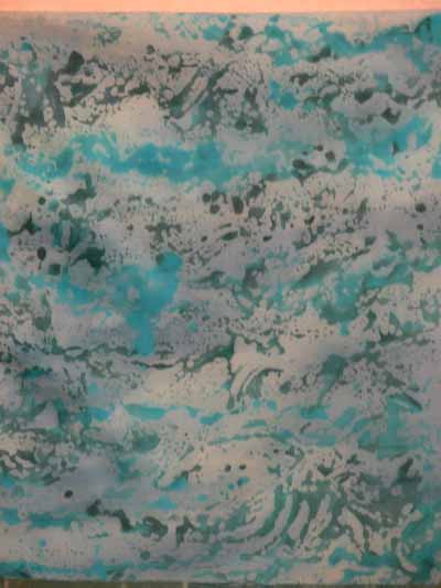
The piece on the bottom is one of my favorites. The blobbies are from using thickened print paste mix plus dye on vinyl, letting it separate into globs, taking a monoprint, then batching. After the piece was batched (to permit the chemical reaction between dye and cloth to happen), I allowed the piece to dry, then painted it with a thin wash of activated dye liquid, and here is the result:

aqua monoprint

Next assignment: make some art quilts out of the art cloth!

Windows of Hope, a Journal Quilt for 2007

Saturday, November 3rd, 2007

As I mentioned last month in my post about the book Creative Quilting: the Journal Quilt Project, this is the final year for this fantastic journey. Instead of making nine paper-sized quiltlets each month, this year’s assignment was to use three (or more) techniques used in journals in the book to create our 17×22 inch (vertical orientation) journal quilt. Here is my journal quilt for this year:

Journal 2007 full

For several years, I have had lurking in my brain a quilt about peace, and the horrors of war, and its innocent victims. The need to create that quilt stems from a visit to Hiroshima in 1996 when my mom invited me to accompany her on a trip to Japan. She had served in Japan in 1946-47 with the US Occupying Forces, and fell in love with the country, its people and its culture. This quilt is a test-run for several techniques which I hope to use on the large Peace Quilt one of these years.

Jnl 2007 detail 2 girl

Mom has a photo album from her two years there, plus her travels to mainland China (before the Communist Revolution, which came two years later), Thailand and Cambodia. One photo in particular, above, was riveting: a somewhat melancholy girl sat on a make-shift swing someone had fashioned from the rubble of a bombed-out building in Tokyo, 1946. Mom purchased the photo from a Western photographer, but doesn’t know any more about it. For my first technique, I took a digital photo, manipulated it to improve sharpness and give a faded “old photo” look, and printed it on fabric. If ANYONE has any idea who took this photo, please tell me!

That photo alone, though, wasn’t enough to carry the quilt, so I decided to include some of my photos of the ruins of the Hiroshima dome, the cenotaph to mark the deaths of all the victims of the atomic bombs and the Children’s Peace memorial.

Jnl 2007 detail 1

That memorial features an origami crane in the sculpture because cranes represent good luck and long life. That led to the second of my techniques: a thermofax screen.

A what you ask? Do many of you remember dittos from school, before we had photocopying machines? We the ditto masters were made with these machines that can also be used with a special plastic-coated mesh fabric and a carbon photocopy (or pencil drawing) to create a stencil. I ended up having to order away for the stencils (fabulous service from Pam Relitz of Flying Images, rockitz@tds.net), but can see that I need to save up to buy one of the antique thermofax machines so I can make my own screens! (If there is anyone out there in blogdom who has blogged the process with photos–Gerrie? Rayna? send me a link and I’ll add it here).

I made my origami cranes, photographed them, traced out the exact lines at the angle I wanted, and had several screens made, then used metallic and regular paints to screenprint onto the background batik fabric.

I was having trouble coming up with a coherent “whole”, however. In browsing the Creative Quilting book (while waiting for hubby who had just had rotator cuff surgery and was at post-op physical therapy), I spotted the ogival window shape in Larkin Van Horn’s piece and new I had my organizing element. I rooted through my sheer fabrics, intending to dye or paint something into which I would cut windows, when I came across a rejected but HUGE painted sheer piece (about 48×60 inches) that was the first attempt at one of the overlays for Tree Spirits 2: Song of the Solstice Grove (can be seen on my website here). As I tossed the piece over the batik the tree trunk landed on the left side of the quilt…PERFECT!

After sketching out the location of the windows on the quilt, getting a nice balance of large and small yet permitting the screenprinting underneath to be revealed, I made a paper pattern which I placed under an old storm window. I used a heat-tool (aka stencil cutter) to cut the windows in the sheer fabric. Since synthetic sheer fabric is notoriously wiggly, I lightly sprayed the sheer with basting spray to adhere it to the storm window before cutting; because the fabric was light, I could see the paper pattern underneath and cut the windows exactly in the correct places (a metal ruler helped on the straight edges!). I then placed the sheer over the background, couched (stitched) gold yarn around the windows, and quilted the entire piece.

The serendipitous placement of the treetrunk on the left led to the overall quilting design, with bark, grasses and leaves and branches. In the background of the overlay I used a basketweave pattern, while I used a swirly cloud motif inside the windows. Finally, I couched two twisted lengths of the gold “yarn” (more like a fine cord) to what would become the edges, added facings which were turned to the back, and stitched down the facings.

I hope you like it…and thanks to all who managed to read all the way to the end!

Color Mixing for Dyers, week 2

Friday, October 26th, 2007

Looking at this old mill building, you’d not realize that a glory of color happens inside! This is the home to dye-provisioner Pro Chemical and Dye….known to quilters and dyers as “ProChem.” ProChem

Earlier this month I was fortunate to take a second workshop with Carol Soderlund, Color Mixing for Dyers II. This workshop builds on what we learned in part 1, which I took last year. It was fun as several women returned from last year, so it was great to see familiar faces, meet new folks, AND meet Wil Opio Oguta, from the Netherlands, whom I had “met” online through the Fabled Fibers challenge. If you click on Wil’s name, you’ll go to her blog and can see some of her pieces form the workshop, too.

Here’s our “class picture,” with many of us holding something we had made during the five days.  We had folks not only from across the US, but also from Denmark, the Netherlands and France! Carol is in the plum tie-dye shirt in the center, I’m just to the right of her.

Class photo

I make MANY different pieces, but will share this one with you today; it is a mix of several yellows (ranging from a cool lemon color to a warm, nearly tangerine, plus two reds, a cool fuchsia and a warmer basic mixing red). Red cloth

Over the next week or so I’ll add several posts with different things I worked on during the workshop. The first two days were focussed on using thickened dyes (print paste mix), doing many techniques that were familiar to me, having used them with paints of various sorts. It was interesting, however, to do them with dye instead (I MUCH prefer the soft hand of fabric after it is dyed compared to even the most supple of paints).

We dyed a fourth “color family” using three new primaries over the course of the whole workshop, then the last three days we worked on layering and overdyeing for specific effects and our own personal projects. As with paint, some blues are warm (think turquoise), some are cool (think glacier blue), some yellows are cool (lemonade), some are warm (sunshine and buttercups). By using primaries with different properties, you can get dramatically different shades of color: a warm yellow, warm red, and shaded/toned blue produce a completely different palette thank a cool yellow, cool red and warm blue. I’ll share a few photos later on of my color swatchbook just to tempt you, but first I have to cut and paste up my swatches from this session!

Dyeing Cloth

Wednesday, October 17th, 2007

October 9-13 I took Carol Soderlund‘s Color Mixing for Dyers II at ProChem in Fall River, Massachusetts. Long time readers may remember that I took Week 1 last year and blogged about it here (1), here (2) and here (3). The large square in the last blogpost actually ended up being the focal fabric on Side 2 of Koi! (Here for that link.). Well, here is a tease from our second day: color wonderfulness, a.k.a. fabric in the washer:

Washer 1 And here is a full shot of the washer:

Washer 2

I am getting ready to lecture and teach in Manchester, NH, on Friday and Saturday, so will leave the “full” blogging about this wonderful week until next week, but will have more goodies and eye candy for you in a couple of days. Until then, hope you enjoy the color.

Keep on sewing!

Winter Warmth

Thursday, October 11th, 2007

Machine needle-felting is a new thing for me, but I can see great potential for working this technique into art quilts, especially landscapes. Thanks to Janome-America, I have an Xpression (FM-725) needle-felter to test and try out. Thanks to being busier than the proverbial one-armed paper hanger this year, I haven’t had much time to play with it. I finally pulled it out for these three pieces. When this machine first came out, you had to replace the entire needle-head of five barbed needles; they’ve now come out with an alternate needle housing so you can replace a needle if it breaks without replacing the entire head…hoooray! The price is also modest …somewhere around $300 I think.

Winter Warmth 1

The two larger pieces, in blues, are made from a base of hand-dyed wool from Wild Thymes Pattern Co. and a former knit hat that I made which ended up being too itchy. I tossed the hat in the washer for two full cycles to felt it, then cut it up. (An aside: I’m not big on wool quilts or someone else’s patterns, but Barb Cribb’s patterns, wool and kits are enough to make me double back and look again… I love her stuff, so please check out the link. I’ve only met her once, at either Market or Festival years ago, so I’m not affiliated…just love the designs!)

Anyway, the piece above is mounted on an 8×8 inch canvas hung on point, while the one below is 10×10 inches. Both are the deep-profile gallery-wrap canvas. Clearly, I did not have my lighting set up properly…the one above the yellow is more washed out in the photo than in real life (see the last “mocha” for a better rendition of the yellow), and in the next one I think I actually managed to make wool (as in light-absorbing wool) glare! I didn’t think that was possible…sigh.

Winter Warmth 2

Here is the one I think of as Mocha, a little piece just 3 1/2″ square mounted on a deep coffee (or is it chocolate) 6×6 inch deep-profile canvas. I felted various yarns onto the wool base for this one, then added the buttons and coordinating heavy threads.

Winter Warmth 3

All the pieces are for sale; prices are $30, 40 and 50 and do not include shipping.