email Youtube

Home
Galleries
Blog
Workshops & Calendar
Store
Resources
About
Contact

Archive for the ‘Techniques’ Category

Paducah 3 — Nearly No Mark Machine Quilting
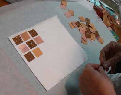
Monday, May 12th, 2008

My last quilting class in Paducah, and one of the most fun, was Nearly No Mark machine quilting. Marking a quilt top is up there in the (NOT) fun category with basting! But playing and doodling with your needle and thread IS fun! These designs are ones I use in art quilts all the time, but they can just as easily be used in contemporary and even some traditional quilts. I have come up with what I call my vocabulary of quilting stitches.

Pink quilt orbs

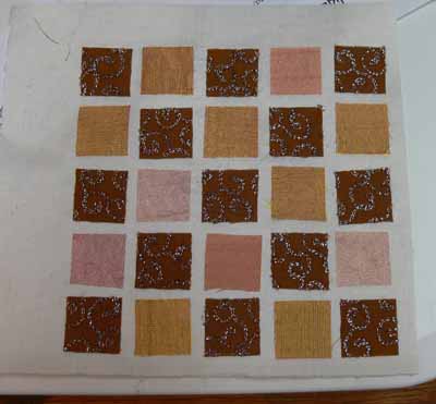
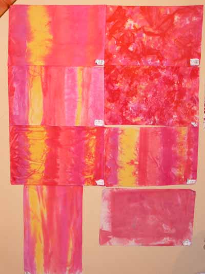
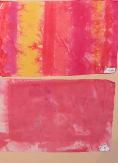
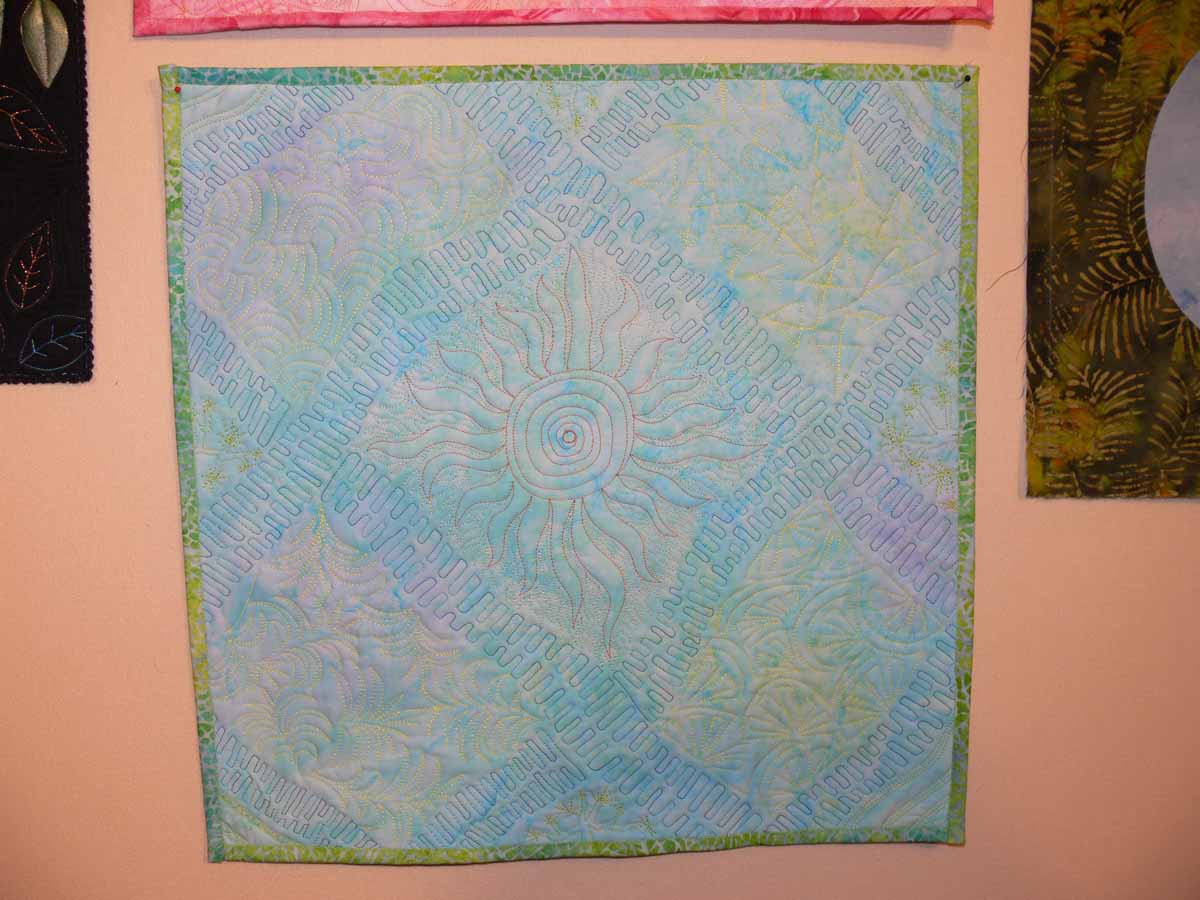
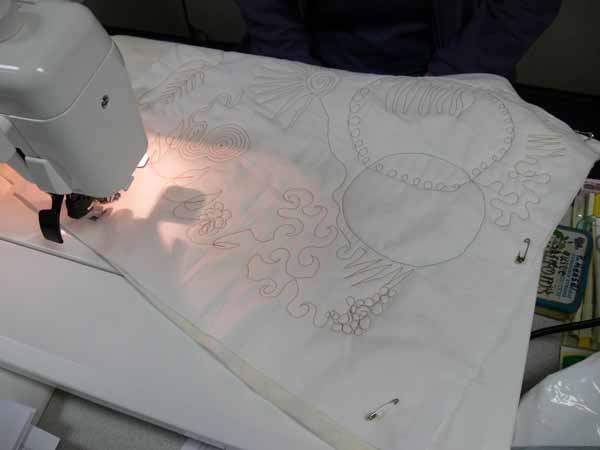
These are stitched out as fill patterns, but they could easily be enlarged and used for all-over quilting patterns for a lap quilt or snuggly. I shared my teacher samples a while back, but the pink sampler above is the one I like best so I’ll share it again!

FMQ pink detail

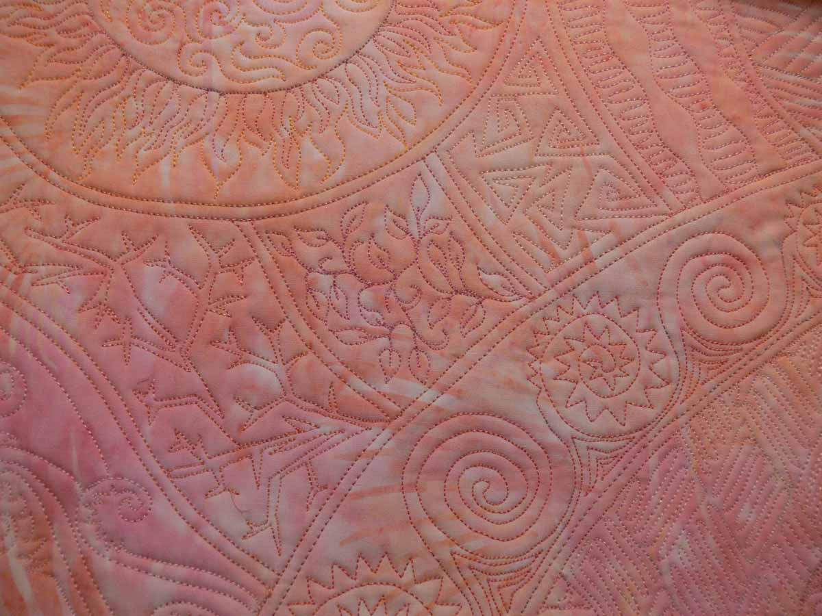
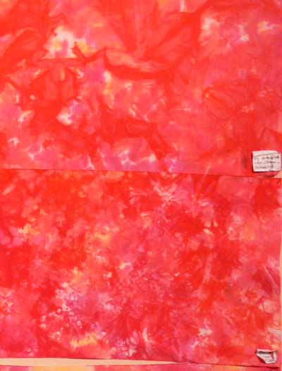
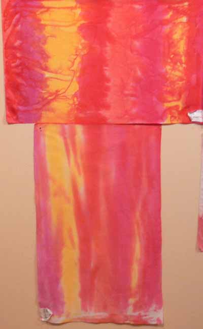
Click on the thumbnail for a larger view (or right click on a PC, and on a mack apple-key + click, to open in another tab/window) with more details of the quilting.

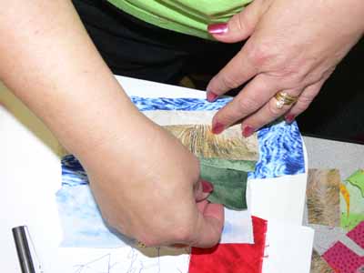
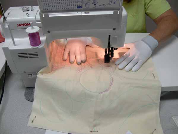
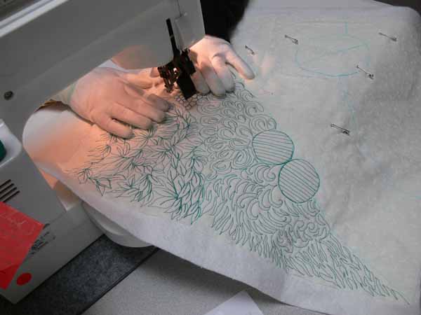
Now lookit what my great students did, and how they translated my patterns into their own thing! This first photo is awesome because she has her hands in what I call the safe position… where you are unlikely to sew through your fingers (it hurts… I’ve done it and do NOT recommend it!) (PS–the following photos can all be viewed larger–click on the photo to resize and/or open in a new tab/window). This hand position also has the virtue of making a small, smooth “hooped” area for your quilting…cool!


Safe hands position

I showed the students how to use your arm as an extended compass to make large arcs using your elbow as a pivot point. Many followed my example and made circles (using my high tech templates—yogurt and take-out lids) and arcs, then filled in the resulting spaces with the nearly-no-mark designs; in this one, I really like her variations on the spirals:

Arc with fill #1

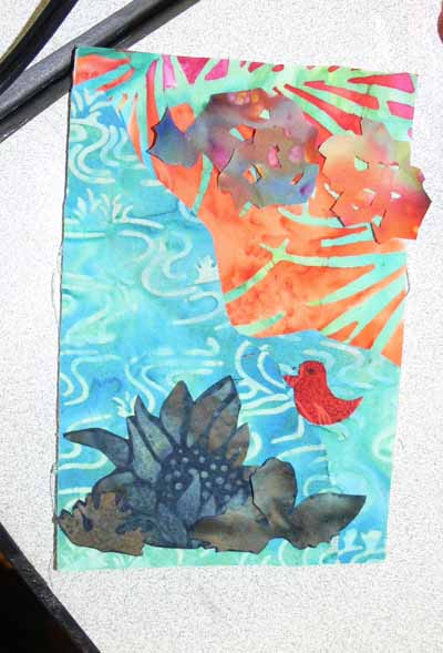
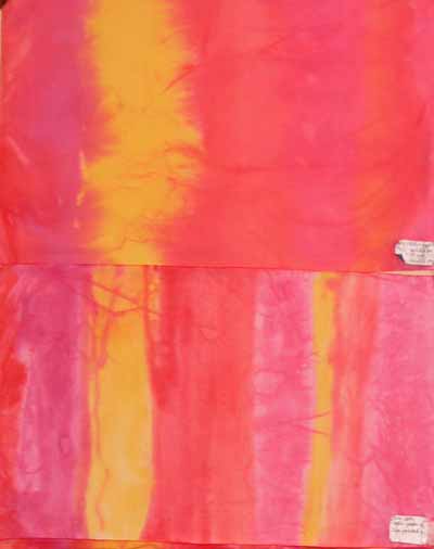
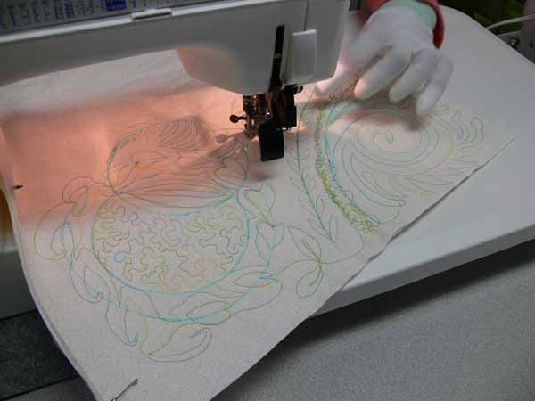
I want to find this thread… it is YLI and is heavier (cotton) than I usually use, but the colors are GLORIOUS and so “me!” The quilter lives in Florida, so I think the water colors are inspired by her home….

YLI thread

I think this student is comfortable and happy playing with free-motion, don’t you? (You can see a smidgen of my handout on the far right)

Arc with fill #2

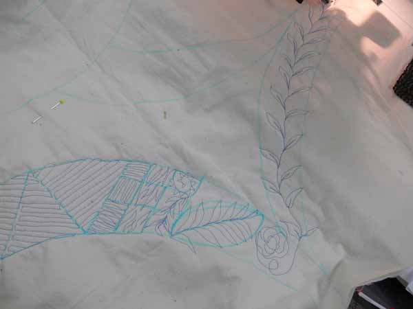
And another arc… I like the vine inside the arc and also switching up the fill on the mini-checkerboard:

Arc with fill #3

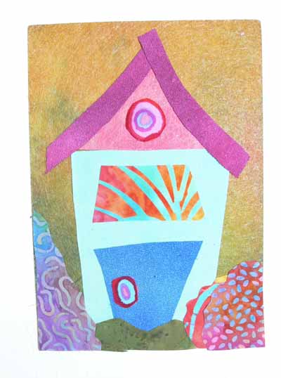
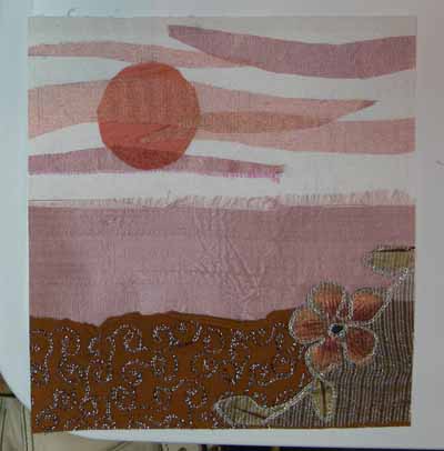
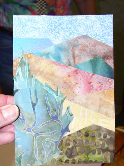
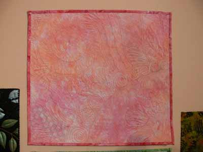
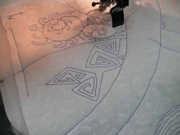
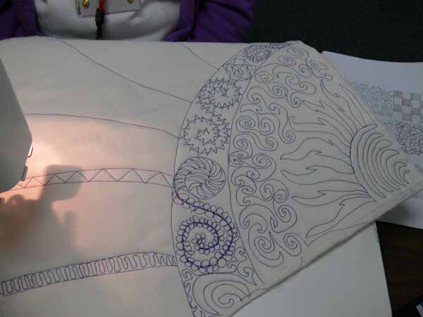
One student took my “Southern California themed” piece:

FMQ Turq

and reworked it… I like her version better! Her thread contrast is way better than mine (I think I’m going to re-do the blue one… it needs it….)

Changing up the grid

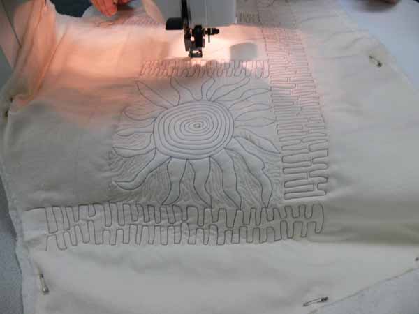
I love that spiky sun that is just at the edge of the sewing table, and also how she used the loops to outline the circle:

Arc with fill #4

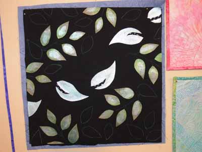
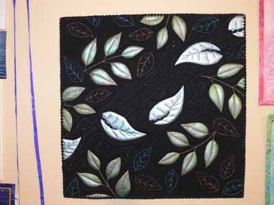
And can you tell she loves to quilt… this lady must love playing with the quilting as much as I do! And poor thing…she was short, and tables were SO high… I have no idea how she managed to quilt so well in those circumstances… I love the merging of one pattern into the next:

Go for the green quilting

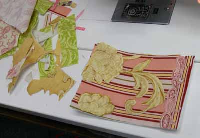
I think one of the things I enjoyed most was watching the students take my designs and turn them into their own, modifying, improving, changing up, experimenting… WAY cool!

Art quilting disguised as fusible applique

Friday, May 2nd, 2008

Turquoise coneflowers

My first day in Paducah, I taught an evening 3-hour class called “Chunk and Jigsaw Fusible Applique.” This class is actually a portion of my Fabric Postcards all-day class which teaches various art quilting and embellishing techniques. I teach how to make up a small stash of fused fabrics ready for a quick project using leftovers from other projects (placed on the fusible web like a jigsaw) or small chunks of fabric…say 5×7 to 10×10 inches or so…. Then, we make a few postcards. For most students in these classes, it is their first time trying to design something, so I provide eight patterns. What is interesting, once I started providing a selection of patterns, the students didn’t use them! HOORAY! It meant the variety of ideas was enough to get them going on their own… mo’ bettah! Here are some of the results–the one above is one I would have loved to fly home with me… imagine, turquoise coneflowers…. glorious!

Note: if you were in my class and made one of these, PLEASE let me know and I’d love to include your name in this post! The class was so short that I wasn’t able to get names attached to each postcard for sharing here, but I did ask in the class if it was OK to share them. Michele E in Alabama… I’ll not share your wonderful birdie because I know you wanted to finish him/her before “going public!” but I adore him/her!

This student was game, despite never having designed something like a scenic card… I love how she placed the shapes, added the cut-out leaves, and used color. See how she cut out motifs from a batik to create the waterplants?

Beach and bird

I love Love LOVE the swoopy roofline on this house! She had found some cool “postcard foundations”, in the YLI booth I think. They were dyed/painted, creating the cool colors and textures in the background… I’ll have to look for them! Also love how she used the circles in a Kaffe Fassett print (do ALL of us have this fabric in our stash?) for the window and doorknob.

House

Notice the cool not-quilting-cotton fabrics in the houses here?

Different fabrics

Another student worked on a slightly larger background that the 4×6 peltex cards I included in the kit, using her awesome selection of sheers (which I wouldn’t have minded if they flew home with me, either). Her first piece was squares, in progress:

Sheers checkerboard, beginning

and fused up:

Sheers checkerboard

Then she made this totally wonderful sun scene:

sheers scene

One student with a completely different sense of color and composition than I have used the prints in her fabrics SO effectively:

Baroque swirls

The combination of soft batiks creates a soothing landscape:

Mountain scene

And here’s another landscape under construction:

Another landscape, in progress

Despite the hour of the class– 5:30 to 8:30 pm — the students seemed to have fun, and I know I did. And the peanut M&Ms and Milky Way bars I brought to share helped!

Quilting with Decorative Threads

Monday, April 28th, 2008

When I teach the after-intro-level machine quilting class, the one for folks who are comfortable with free-motion (I always say you don’t have to be good at it, just comfortable with the concept) and want to explore playing with threads, usually I have students do a sampler to test thread tension on their machines with various needles and thread combinations. However, in Paducah, the students will be using loaner machines (HOORAY>… I got the Janome classroom filled with my loved 6600s!). I wanted the students to learn HOW to make the tension sampler, but what they need most is to take the sampler home and then play with the tension on THEIR machines! That would leave some extra time in the class.

Painted leaves

That led to the idea of a project. I grabbed my tossed leaves patterns to use as handouts, and thought gee, let’s quilt up a square that could be practice OR be a pillow top (or whatever) that lets students play with a variety of fancy threads. Rather than fuss with applique or whatever, the students can simply outline the shapes on their fabric, then quilt them as if it were a wholecloth. Of course, I decided I wanted to play with paint (who wants to mark a quilt when you can paint it?), which led to the sample above. I took some 12+ year old black print fabric and painted on the back through a freezer paper stencil using Lumiere paints. I then tossed in a few other leaf shapes (the fine white lines you see on the black) .

I used the following threads, all from Superior Threads:

  • Rainbows, a variegated 40-wt trilobal (shiny) poly
  • Highlights and the other 40-wt. trilobal polyesters in a solid color
  • Metallic (gold I think it was?)
  • Glitter, a holographic thread
  • in the bobbin, The Bottom Line, a 60-wt poly

Metallic tossed leaves

To see a close up of this quilt, click on the thumbnail (if you are on a PC and right click, you can open in a separate tab or window, if on a Mac click the apple key and mouse at the same time):

Metallic tossed leaves–larger

And here is a detail shot:

Tossed leaves detail

if you click on the shot, it will open up larger, too.

Superior offers this awesome service: as a teacher, I can order a bunch of thread, then have them re-wind the cones onto “bobbins” (not for use in the bobbin, more like micro-spools on a clear plastic bobbins). Then I can make kits for students with a range of threads. For $15, my students will get samples of the Bottom Line (on bobbins that can actually be USED in the bobbins), King Tut (variegated cotton), MasterPiece (50/2 cotton, solid colors), Rainbows (variegated poly), 40-wt trilobal poly, metallic and Glitter! You’d MAYBE be able to buy two spools of thread, and they get to try six different types of thread to see if the look is right for their style of quilting and compatible with their machines (after all, we KNOW some machines are just cranky!) without spending a fortune on spools they might never use again. Cool! Love the service!  And then I know the students will have good quality thread and not be frustrated with junky stuff or not have a good selection because 8 spools just costs too much!

Creative Quilting With Beads–it’s on the way!

Saturday, April 26th, 2008

Great news…. the Lark book with 8 projects by the Frayed Edges is now available!!!!

Creative Quilting With Beads

I’ve ordered copies, and as soon as they arrive you’ll be able to order up an autographed copy (or unmarked if you prefer… either way is great!) here. I have also obtained a supply of the drop beads I used, so if folks want, let me know and I can add a baggie of enough beads to make one journal cover to the store site if there is any demand for them.

I am so proud of ALL of the Frayed Edges! Four of the five of us submitted proposals, we were all accepted and we are either

  • on the cover (my pomegranate notebook cover, which you can see here)
  • on the table of contents (Deborah)
  • on the Introduction pages (Deborah and Kate)
  • or the FIRST project in the book (Kathy!)

WOW! Here are some pictures and a bit of a review of the book:

After the elation of learning a while ago that my project was on the cover, it only got better as soon as I opened the book. Here is the table of contents, with part of Deborah‘s Cobblestones piece on the lower right:

Table of Contents

Then I turned the page to the Introduction, which repeats Cobblestones and has BOTH of Kate Cutko’s pieces (Broken Dishes and Petroglyph):

Intro

Then I turned to the projects, and it begins with Kathy Daniels‘ sea piece:

Kath’s project

Kate’s Petroglyph panel (one day at one of our regular Frayed Edges meetings, we decided the beads were too bright and shiny, so we sandpapered them and stained them with leftover coffee!):

Kate’s

Deborah’s landscape triptych with her signature writing on her fabrics (one of her THREE projects!):

Deborah

The layout of the book is good–nice and clean, clear instructions, concise (I tend to go into LOTS of detail!). The projects look as though they could all be fairly easily and quickly accomplished (once you get the “stuff” you need for them anyway!). A basics and tips/ideas section starts the book, then it progresses to the projects, which are nicely illustrated and beautifully photographed! I hope the photography in my book turns out as well as this! Apart from the Frayed Edges projects, there were a couple I loved, and I could see doing a riff on this bag in an art quilt:

Seaweed bag

The projects shown could easily be adapted to use in your own art work or done as is… way cool.

At the end of the book is a gallery of inspiring pieces. These are much more in-depth, complicated works of art from some of the top art quilters today. It would probably be impossible to pattern these works of art (if the artists would even be willing), but they show what you can do with the techniques learned in the book. Just let yourself loose and PLAY! Which is what I hope to do when I get back from teaching in Paducah.

I should be home on April 27th, and the books for sale should be here that week. I’ll start shipping as soon as I’m unpacked!

Working on texture when dyeing

Thursday, February 14th, 2008

Dye on snow

Happy Valentine’s day everyone… in celebration of the day, I bring you reds and roses….and to find out why there is dye in the snow, keep reading!

One of the things that has frustrated me is getting the visual texture I want in my dyed cloth. I know how to get intense scrunch and markings, but a lot of the time, fabric like that is too visually busy for the way I work and make quilts. I want a softer, more subtle color shift. So, over Christmas (yes, that long ago), I did an experiment using four different red dyes and one yellow on a 12×21 inch piece of fabric. Where the fabric is striped, the dyes were painted on in the same sequence across the cloth (even the vertical piece…the stripes are just skinnier)

Here is the whole bunch:

Texture study samples

The techniques I used are as follows….. in the next photo,

–top sample is dry cloth, set flat, with dye painted on, left for 30 minutes, then soda ash solution painted on

–lower sample is dry cloth, set flat, using activated print paste mix (in other words, mix up print paste, add soda-ash-solution and dye) painted on with a sponge brush

Texture studies 1 and 2
In the next pair,

–the top sample is fabric soaked in soda ash solution, placed flat on the table, and dye painted on; note the sharper patterning than in the painted-on version above

–the lower sample is “snow dyed.” Good thing I did this in December as it has been warmer in January than in December! Anyway, you are supposed to pour dye on snow, let it freeze, pick up the chunks of dyed snow and place them on your cloth. Bleach. This is a candidate for the rag bag… an interesting concept but boring results I think…

Texture studies 7 and 8

In the next photo,

–top sample is dry cloth placed (sorta bunched) in tub, dye poured on, set about 30 minutes, soda ash solution added

–lower sample is cloth soaked in soda ash solution, scrunched, and dye dribbled on (note a sharper pattern of crystals)

Texture studies 3 and 4

Saving the best for last…..

–the upper photo is fabric that was soaked in soda ash solution, then allowed to dry completely. Then it was laid flat on the table and dye was painted on.

–the lower photo uses Robbi Eklow‘s drip-dye method, featured in her book Free Expression (available here at Quilting Arts) in one of the most useful appendices to a quilt book in a long time (and great stuff on my favorite, quilting, in the rest of the book!).

Texture studies 5 and 6

I really like smooth transitions and soft color, so it is no surprise that the first piece and the last are my favorites (in the overall photo at the top of this LONG post, the top and bottom pieces on the left side). I also rather liked the texturing from painting on soda-soaked-and-dryed.