email Youtube

Home
Galleries
Blog
Workshops & Calendar
Store
Resources
About
Contact

Archive for the ‘Techniques’ Category

The State of the Studio, a display wall

Saturday, April 30th, 2011

When I moved out of the old house, I removed the design wall from my old studio.  Since the corners were cut off the 2-feet wide rigid foam insulation, they couldn’t be re-used well in the new studio as the new design wall.  BUT, as I was hanging some artwork, I decided a ginormous “bulletin board” would be just the thing to display smaller pieces by sons, friends, inspiration, and so on.
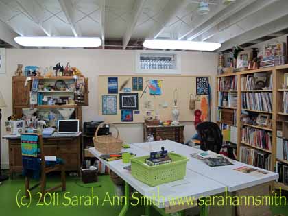
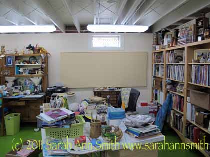
The display wall installed, but without stuff...yet.....

With stuff...quilts and art on the left are by Betty Johnson, Jacquie Scuitto, my son Eli, some calligraphy from Lunnette (a christmas card) and a fabric postcard of hers, and on the right a photo that was on display at IQA-Houston, a leftover Koi from that quilt that will be made into something eventually, my very first (but I hope not my last) Houston ribbon, and a basket

Here’s how I did it, so you can try also.

  1. I took the largest piece of rigid foam insulation which was 2 feet wide by 91 inches long as my “big piece.”
  2. The second piece, with a corner cut off, would yield another 91 inch piece that was 12 inches wide.  I  cut the pink 2″ thick insulation with a new blade in the box cutter (extended to a scary distance) and managed to get a nice clean edge.
  3. I used clear packing tape on both sides at the join so it wouldn’t buckle, then wrapped the flannel from the previous design wall (a sheet from Lands End) around the 36×91 inch piece (that’s just under one metre tall by about 2.5 metres long for my metric readers).
  4. Next, I used “L” shaped brackets spaced about every 20 inches so there were 5 brackets on the bottom edge.  I bought some wood lattice (a thin strip of wood about 3/8″ thick by 91 inches long) which I screwed with very short screws to the brackets.  This gave me a long, flat, firm bottom edge on which to rest the display wall.
  5. Placing the display wall on the strip, I marked the top edge just about above the five “L” brackets on the bottom.  I added another five brackets to the top edge, moving them down about 1/16″ or 1-2mm. below the marked top edge.   This way I can just slightly squish the rigid insulation and it is held in place by friction…no need to use glue or otherwise muck up the wall (well, any more than putting the screws in).

I made a smaller “bulletin board” with a 24×24 piece of insulation leftover from another project and covered it with this beautiful fabric.  It’s by the door the center part of the basement (which WILL get a different color of paint…sky blue, with green on the floor….but not soon….maybe in August or September after the year’s travel teaching is mostly done). I had to underline this one with batting because the pink insulation changed the color of the fabric–an effect I did not want.
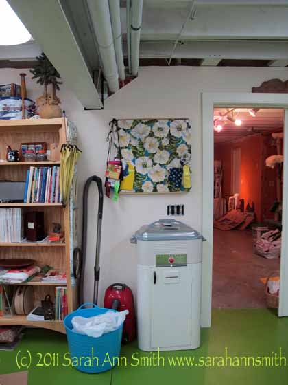
The bulleting board next to the door is made the same way as the large wall, but I added batting because the pink of the insulation distorted the crisp white in the flowers, so I added batting to prevent that.

And when the closet is done, that vacuum had better fit inside!  Don’t like the look!   The blue bucket is my large new garbage can…5.99 from Target!  I think it was intended as a beach tote or bucket for filling with ice and sodas in summer.  Nope.  With the flexible shape and two handles it’ll be easy to tote upstairs to the outside garbage can. That’s it for now!

Mistletoe Ornaments

Monday, January 10th, 2011

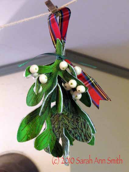
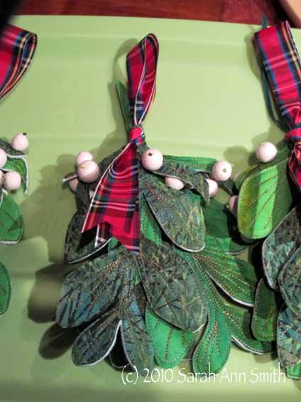
These past few months have been more than amply filled with family and household responsibilities, and precious little time for creativity and art.  But I did eke out a few moments…over the course of two weeks! (these ought to have been done in a day or two..tells you what my days have been like) to make some mistletoe ornaments for my Frayed Edges Friends (we are, by the way, getting a rather lovely collection of ornaments we have swapped over the years).

Photographed at Kate's house, the Mistletoe ornament pattern is by Susan Brubaker Knapp, in the 2010-11 Quilting Arts Gifts magazine

When I received my author’s copy of Quilting Arts Gifts 2010-2011, I immediately paged through it to find my article, but on the way was immediately stopped by Susan Brubaker Knapp‘s wonderful mistletoe ornaments.  Susan and I have only met once “in the real,” in Houston (where else?), but have become friends via internet.  I was thrilled when I looked at the credit to see that these beauties were her pattern!

Of course, could I make it just like the pattern?  Not quite….. I used a slightly smaller pattern (I think now I like hers better–more room between the leaves…since I haven’t seen “live” mistletoe in decades tho, I wasn’t sure about the branching pattern on the leaves).

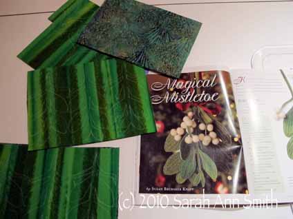
My leaves ready to cut out, and the big photo from QArts Gifts issue

Also, when I went to make these just before our Frayed Edges meeting, I realized I didn’t have either the 1 cm white wool balls Susan used OR the variegated light green floss OR anywhere to buy them locally AND not enough time to order stuff.  So what did I do?  I made it up!

I promptly thought of my polymer clay (neglected for a couple years in a box), and dug out my translucent and Pearl white Sculpey III (I think that was the kind) and made round white beads.  LOTS of them.  Think 7-8 for each sprig, with three sprigs per ornament, times four ornaments…… folded up some parchment paper into “Z” folds so the little pesky things wouldn’t roll in the tray while going into and out of the toaster oven. And since I couldn’t sew through wool beads with floss and make a lovely French Knot like Susan, I used green seed beads (a couple colors) as a “stop” to secure the beads to the stems.  I think Susan had quite a few more berries per ornament than I did, and if I had had time I would have made another bazillion beads, but not enough time!  Oh well!

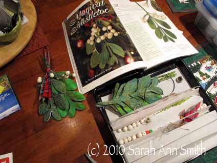
Here's my "work station" on the dining table, with the polymer clay beads I made in the "Z" fold parchment, waiting to be sewn on to the ornaments. Wear a thimble!

Then I didn’t have lovely silk ribbon like Susan, or a place to buy any, or time to order, so I dug through my ribbons and tidbits box and found the plaid ribbon.  It’s not great quality ribbon, but it looks PERFECT.  I tied an overhand knot about halfway down to make a hanging loop.  Then I used some 1/8″ wide green satin double-faced ribbon (from JoAnns) to seriously tie together tightly the three branches of mistletoe and the plaid loop.  I made sure the knot of the loop was below the tightly-tied green ribbon so the loop wouldn’t pull up and out.

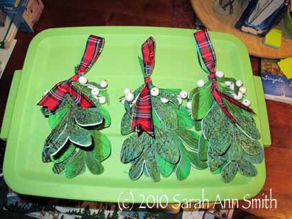
Here’s the three I gave away—mine had to wait until later to get finished, but it did make it onto the tree before Christmas!

3 mistletoe ornaments, and MANY polymer-bead-berries

And a close up:


On mine I tried painting the edges as I wasn’t certain about the white.  What a PAIN!   I finished my ornament that way but it was so fiddly getting the brush between the edges of the leaves that I decided to skip that.  And Kathy said she really liked the spark of white…good!   Also, I used a heavy 35-wt cotton thread–heavier than I usually use–for the quilting.  I had bought some of Superior Thread’s King Tut line (the Bullrushes color) for a class for kits, and had a bunch leftover.  It was perfect, used it top and bobbin!

Best of all was when Kate just gasped….she had bought a similar ornament at a craft fair for the Mother and SO wanted one for herself but was good with the budget and didn’t buy one.  So she got one anyway!

Thanks Susan for a really WONDERFUL ornament!

Photo EZ, an alternative to a Thermofax

Thursday, December 2nd, 2010

OH WOW am I in love with a new product and process! 

The product is called PhotoEZ and it allows you to make detailed screens for printing (on paper or fabric), such as the treetops in the fabric postcards in the picture above.   The best place to get PhotoEZ  is directly from art quilter Ginny Eckley at http://www.photoezsilkscreen.com/about.htm .  Wonder how many requests Santa is gonna get now……

Many quilt artists now use Thermofax machines to make their own highly detailed screens for surface design printing.  These machines were on their way to becoming dinosaurs and land fill when they were discovered by art quilters and tattoo artists.   In both cases, the artists involved create intricate designs which are then “burned” into an emulsion-coated screen (or for the tattoo guys spirit masters).  The process removes the image, leaving a screen to use for printing or, in the case of tattoo artists, for transferring the design to the skin to use as the guide for inking the tattoo.  As the machines become more and more scarce, the price has   gone through the roof:  reconditioned machines now cost nearly $1000.  Yes, one THOUSAND dollars.  Plus supplies! My budget doesn’t stretch that far.

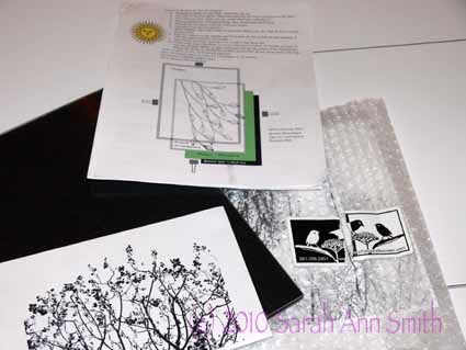
Well, a year ago at Quilt Festival in Houston, I visited Ginny Eckley’s booth where she sold (among other things) the PhotoEZ screen kits — a starter kit is $37 — and materials.  Here is a picture of my kit and the photo I used:

PhotoEZ kit, instructions and on the bottom left my image

Ginny told me she likes PhotoEZ so much she actually SOLD her Thermofax machines because she no longer used them.  Rather than carry the stuff home, I opted to order the supplies from Ginny (here) and have them shipped to my home.  One key thing:  You need to refrigerate the screen material to keep it fresh!  I have a flat baggie on the back wall of my fridge, behind the shelves, to keep mine fine.

After a year, I FINALLY got around to trying it out.  I was concerned because I don’t have strong sunlight up here in Maine most of the year the way Ginny does in Texas!  But I used my tulip-lights that I use for photography and they worked fine.  When I asked Ginny a couple of “how to” questions this year at Festival, she said she uses a light box most of the time, so this makes the process accessible for everyone (not just those of us in sunny spots).  In addition to the detailed info in the kit, you can find even more instruction on her website.

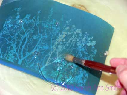
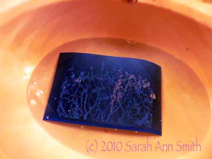
I had forgotten that the kit included an inkjet transparency sheet, so I fiddled with my photo of treetops in spring in Photoshop Elements (to turn it into a crisp black and white image) and printed it on paper.  The trick was to figure out the correct time under the lights to get the screen to burn.  I thought I had messed it up, but was elated when I did as instructed and popped the screen into the sink:

The image began to materialize; I used a soft paintbrush to swooosh away the area that had "burned" where the black ink reacted with the emulsion

Anyway, here’s another view:

Part of the burned emulsion removed (lighter area), the rest to be removed

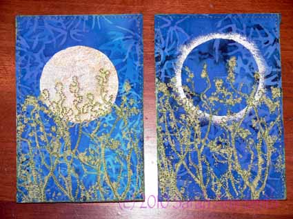
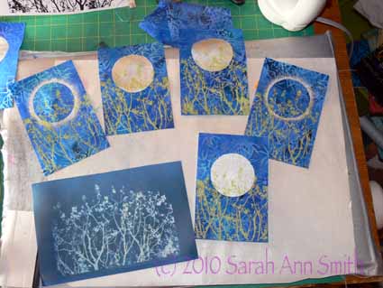
And here are the fabric postcards, for a “circles” swap I recently did, in process:

five of the postcards screened, with the full screen on the lower left

The moons and eclipse glow were done with freezer paper stencils using Lumiere paints, and the treetops were screened with Jacquard Lumiere Citrine (the lime green color).  I REALLY like the squeegee that comes with the kit…it was JUST the right balance between firm and soft for me.

What I learned:

  • I LOVE THIS PROCESS!
  • And it costs a fortune less than a Thermofax.  It isn’t, however, cheap per screen, but it will work and cost less per screen I think than a Thermofax.
  • Spring for the extra cost for transparencies for your images.  Then you don’t have to guesstimate the exposure time for your screen.  With a clear sheet, exposure time will be consistent.  If you print on paper you have to think about how heavy the paper is and how much it impedes the light working on the emulsion-ink reaction.
  • Play with your image and print it in black and white (to make sure you like how it turned out) before printing it onto the not-as-cheap-as-paper transparency.
  • Think about your images; in my case, I deliberately took the photo with only sky behind the treetops to make the photo editing process easier.
  • Clean your screens promptly so the paint doesn’t clog the screen permanently.
  • There is a learning curve about how much paint is enough but not too much; like most things, it takes a bit of practice and testing the various consistencies of paint
  • I’m gonna do more of this!

PS–I am not affiliated with Ginny in any way.  I just really liked the product and process!  I surfed around online and Ginny’s prices seem to be the best out there.  Plus she’s a quilter! While you’re at her site, check out her artwork, here.  Her newest work uses the screens and is amazing (click on the New Work button).

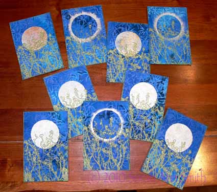
And a last look at all the “circles” postcards:

Spring Moonrise and Spring Eclipse postcards

The blue applique vest

Saturday, July 17th, 2010

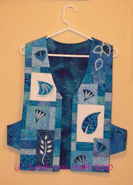
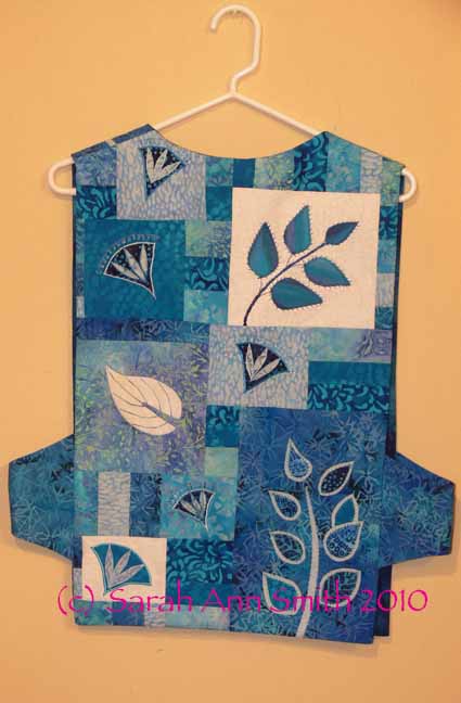
Since there is SO much that has happened in the past two months, I’m going to alternate between the April trip and vacation and other events.   For about two years now, I have wanted to make a vest to wear while teaching applique to show the various types of machine applique and decorative stitching that I teach (two different classes), and how the samples can be used in various projects including clothing, not just quilts.

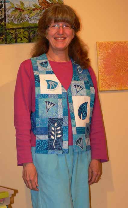
Here’s me in the just completed vest, frizzy hair, no makeup (and therefore disappearing eyes…I SO envy people with dark eyelashes!) and all:

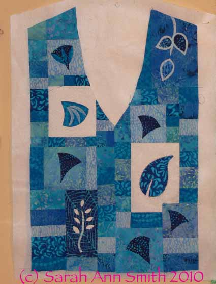
I thought pictures of the vest pinned to the design wall would make it easier to see–this is the front:

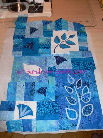
and the back:

At least 12-14 years ago, I bought Make Your Own Japanese Clothing by John Marshall (yes, THE John Marshall who teaches katazome and shibori, makes amazing silk, etc…..  his website is guaranteed to keep you looking for a long time!).  Amazingly, the book is STILL in print (tells you  how good it is); you can find it at Amazon, here.  The Japanese use 14″ wide lengths of cloth to construct their clothing without cutting into the cloth from the sides, so garments are based on rectangles, which makes for easy sewing.  I developed this pattern when I made my Frayed Edges vest (seen in the second photo in this post).

In a nutshell, take your measurements or measure a vest with a fit that you like.  To make the math easy, let’s say 42 inches around.  Divide by 3 and by 6:  1/3 of 42 is 14.  1/6 of 42 is 7.  The front of your vest needs to be, therefore, 14 inches or 1/3 of your circumference (finished…remember to add seam allowances!), the back is the same.  The sides are 1/6 of the distance around you or 7 inches.  It’s that simple!

When I first made the vest, I used rectangles for the sides.  The bottom of the rectangle hit my hit and bent, making me look decidedly hippy and wide.  So I changed the shape to arch on the bottom, with the same curve on the top.  It turns out to be easy AND flattering!

Since I had weird shapes and samples for my applique blocks, I decided to draw out the shape of the vest (used an existing vest to copy the angles for the shoulders and neckline, but modified the front “v” to be slightly curved, again, a flattering line) on RinsAway, a lightweight wash-out stabilizer which I used as a temporary base for construction and decorative stitching.  I placed the applique blocks in a pleasing arrangement, then figured out what I needed to use to fill in the gaps.  I selected about 6-8 prints and cut strips 1 1/2, 2 and 2 1/2 inches, then sewed them together.  I cross-cut sections to create the pieced inserts….I just used a ruler to measure the size I needed, added 1/2 inch (a quarter inch seam allowance for all sides) and cut.

In the photo of the back, the cut pieces and trimmed applique samples (not yet stitched for the fused ones), are pinned to the stabilizer.  In the photo of the front, below, I have pieced together the random shapes and cleaned up the edges.  The pieced fronts are now spray basted to the RinsAway stabilizer in preparation for the decorative stitching.

After stitching, I removed as much of the stabilizer as I could, and sewed up the garment using the usual way of making a vest (it’s a bit of a mind-wrap…you sew the outside to the lining except at the side seams, then turn it right side out  through an opening left in the lining shoulder seam—it seems impossible until you’ve done it!).  Because I tend to get warm walking around the classroom all day (yes, my feet ACHE and THROB by the end of the day), I did not add batting or quilt this one.

I used both turned edge and raw-edge / fused applique, with various sorts of decorative stitches.  I particularly like the vine coming down over the left shoulder onto the front and the blue background / white sprigged stem (reverse fused applique) on the front.  For the turned-edge pieces, I’ve discovered this new product that I love…. C&T’s washaway applique sheets (click on previous link to see the product).  It has as much body as Ricky Tims’ Stable Stuff (which I still love), but it  is IRON ON!   You can run the sheets through your printer if you want (for example, to print off a zillion identical leaves or to produce templates for a design), cut out the shape in the C&T sheets, iron lightly to the wrong side of the applique fabric, and press the edges.  You can use either a washable glue stick, starch, or just heat to turn the edges before stitching down.  Way cool!

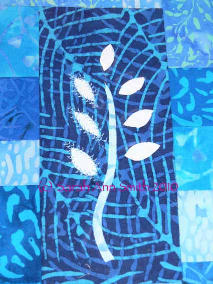
Here are some detail photos of some of the blocks–see what a difference the stitching makes between the buds on the left and the un-sewn ones on the right?:

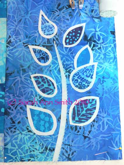
And my two-layer leaves, which I developed for my Balinese Garden table runner (more on that in an upcoming post!):

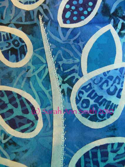
In the photo above, I’ve used a blind hem stitch, available on the most basic machines, to stitch the right side of the stem. In the next photo, you can perhaps see better.  I subsesquently used a 2-sided feather stitch to outline the dark inner leaf and stitch down the lighter outline:

I came up with this 2-layer leaf because on a different project I wanted to use a busy, medium-value (not light, not dark) fabric for the background, and still use medium-value fabrics for the leaves.  Set directly onto the background, there would have been almost NO contrast and the leaves would have been visually lost.  By layering up the leaves like this, you get a nice contrast and outline without having to satin stitch (which while lovely is VERY time consuming, uses LOTS of thread, and may not be the look you want).  Hope you like the vest!

Joshua, the quilt in progress and done! #6

Sunday, May 9th, 2010

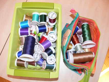
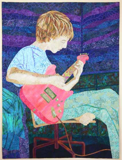
With this blogpost, we will end the series on how I made the quilt of my son playing guitar.  I had fun with the quilting, too.  Here’s the bucket and bag of threads I used for the quilting:

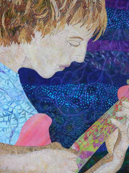
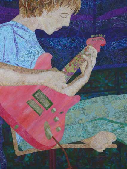
And here is the completed quilt; notice that the proportions have changed a little.  The finished size for the exhibit is 36 inches wide by 48 inches long, so I needed to remove some extra, especially in the length.  If the quilt hadn’t been in this exhibit, I might have let it go a little longer, but I think in terms of design and composition it is still fine the way it is.

While I was mulling over how to quilt the walls, there was yet another discussion on either QuiltArt or SAQA (or both?) about the line between traditional and art quilting.  As usual there were those who want nothing to do with traditional quilting.  I, however, am proud of our traditional roots and proud of this as an art form that began with women’s work.  As someone recently said to me, Quilt is NOT a four-letter word!

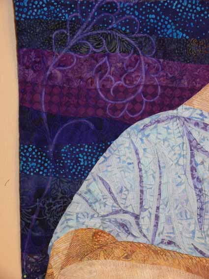
This discussion led me to the idea of using traditional feathered vines for the background quilting.  As you can see from this next photo, though I chose a thread I thought would show up on the background, it was too subtle.  I decided to echo-quilt around the feathered vines, then pencilled in the resulting space/channel to define the outlines of the vines with Prismacolor Pencil (which I later covered with a combination of a textile-friendly varnish and water to seal it to prevent it from rubbing off).

Here is a wider-angled shot of the wall area showing the feathered vines…I just love them!

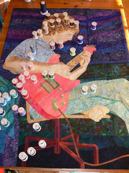
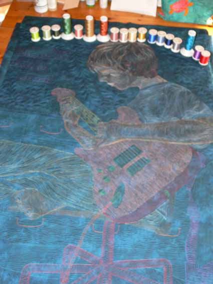
This shows the quilted quilt with the threads distributed over the top where they were used:

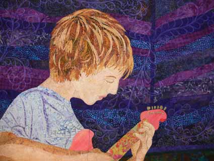
Here are two close-ups of the quilting of Joshua’s face and torso:

I love the backs of my quilts, the line drawing look, so took this (alas blurry) photo–you can see the feathered vines clearly on this semi-solid background fabric, and that the entire quilt is stitched 1/4″ apart or close… a lot of thread!

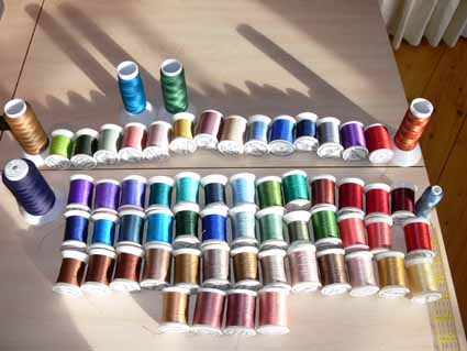
And to end where we began, but arrayed nicely, all those beautiful threads ( all but one of them Superior Threads):

PS–I am reminded by the comments to add that Joshua –hallelujah!– actually likes the quilt!  Given how picky teenagers are, especially of pictures of themselves, I am so thrilled that he of all people likes it.  Hugs to my firstborn!  Now…. what will the years bring that I can do another quilt, this time of secondborn son?