email Youtube

Home
Galleries
Blog
Workshops & Calendar
Store
Resources
About
Contact

Archive for the ‘Tutorials’ Category

Refining the t-shirt–how to take a boring t-shirt to fitted and fine!
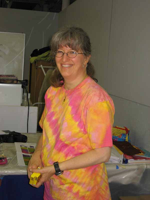
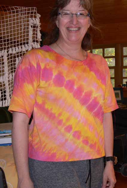
Friday, November 14th, 2008

Quite a long time ago, about a year in fact, I took my second dyeing workshop with Carol Soderlund (wonderful! highly recommended!  go here to find out more!).  I tried again to get my dream-colored t-shirt, and this time succeeded! Here’s a picture Beth P. took of me (weighing, sigh, less than I do now):

SAS at Workshop in t-shirt

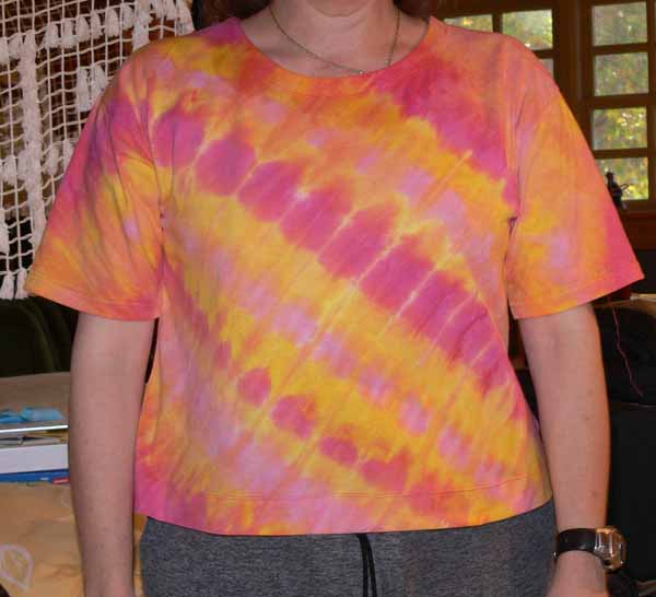
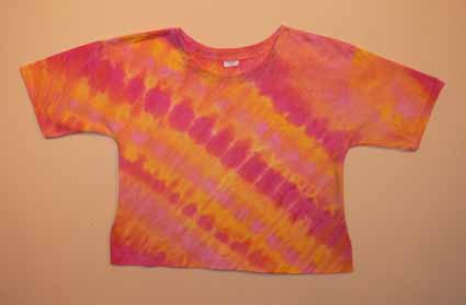
I knew back then that I wanted to re-make the shirt into a nicer top, but ProChem only had t-shirts in stock, plain old T’s.  Here is what the shirt looked like before I took to it with pins, sewing machine and scissors in late October:

T-shirt, before

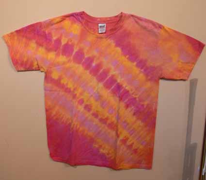
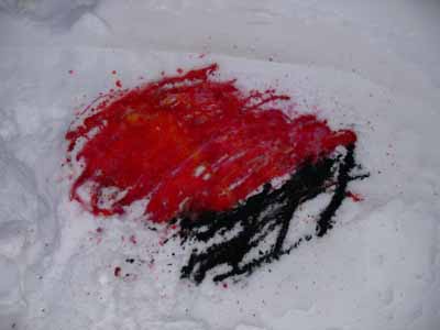
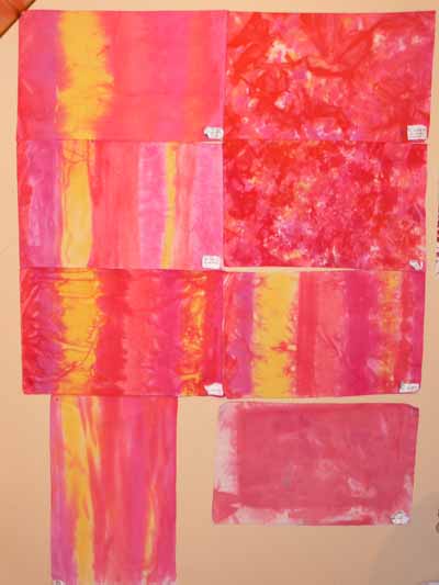
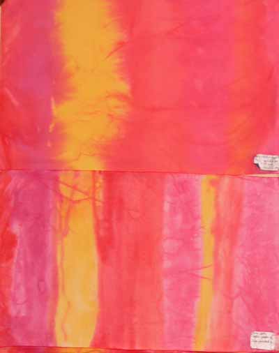
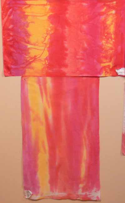
I used fuchsia dye, the other red that is MX R4 (Fuchsia is 8R), a warm yellow and a cool yellow… it was pleated on the diagonal with the lines running from upper left shoulder to right hip.  The dye was then poured – squirted – painted on in the opposite diagonal.

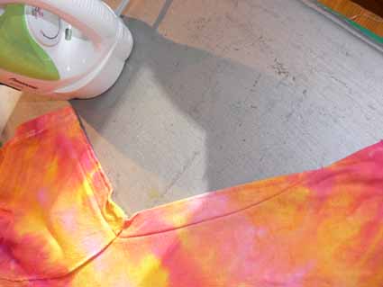
First, I pinned out what I thought I wanted to take in on the sides and underarm, then went into the bathroom (which has a low enough mirror) to see how long I wanted the shirt to be.  I ended up cutting 5 1/2 inches off the bottom, then taking a 1 1/2″ hem.  I used a twin needle, which gives the double-straight stitch on the top, a zigzag on the bottom, and stretches just a little bit.

Second, I took in the sides (alas, I am not blessed with a generous bustline, tho in summer I actually am grateful), leaving the extra room at the bottom my hips need.  I also took in the sleeves a bit.  This photo shows the taper…from about 3/4″ at the hem of the sleeves, to a smidge over an inch at the torso, tapering to a point like a dart. I used the stretch stitch on my machine…basically it looks like three stitches on top of each other.

Side seam

For those of you with a larger bustline, you can also take vertical darts in the waist area underneath the bust for a more tailored fit…just put the shirt on inside out and pin.  Carefully.  Then REALLY carefully remove the shirt, try it on right side out and if it looks good, take it off even more carefully and stitch.

At first I wasn’t going to trim and finish the edges, but the amount taken in was enough that the underarm seam pulled unattractively, so I trimmed to 1/4″ seam allowance,  and zigzagged the edges.  Serging would also work, but I don’t have matching thread and didn’t feel like setting up the serger!

Square neckline mocked up

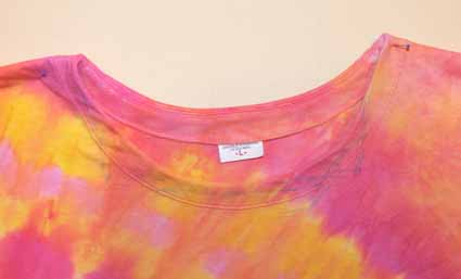
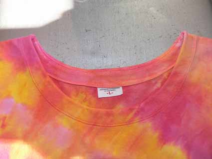
You might (?) be able to see the blue washout pen markings on the top in the photo above.  I look good in square necklines, so had planned to trim off the neckline edging and sew a facing using the cut-off fabric from the bottom.  However, I wanted this to be a simple tutorial, and–on a whim while checking out the fit after stitching the sides –turned the collar ribbing inside.  I liked the look!  So, I simply stretched the ribbing so that it would instead function as a facing, and topstitched it in place with the twin needle.  Here t is without the blue pen!

with blue stuff washed out, neckline

And here is a so-so picture of me (with no make-up and messy hair… what am I thinking putting a picture like this on the internet?????) in the shirt–sorry about the partial lobotomy…that’s what happens when you set the camera on timer to take a photo of yourself:

Sarah in shirt, angled view

And an even less flattering photo (I decided to decapitate myself with photoshop…the fat sloping chin was just too awful LOL!), but straight on so you can better see (?) the final result:

SAS in shirt, straight on

Remember the original look of the shirt?

T-shirt, before

Here’s the finished outline:

Finished shirt on design wall

All in all, I think it is a vast improvement over the baggy shirt.  Even with trying it on about four times, it took easily less than two hours to do everything.

Printing with Leaves

Friday, October 31st, 2008

A while back, I blogged about preserving leaves with glycerin and freezing for later printing (as in during winter when there are no leaves on the trees), here.  I was fortunate to be able to demonstrate leaf printing at Open Studios, part of the Make It University section of the International Quilt Festival in Houston, on Wednesday evening.  I’d like to share here what I did, and include some written directions for those who were able to stop by my table and who surf in to my blog.

Mixed Media Mirror with leaf print tissue

Since the MIU is about mixed media, I decided I had best do something mixed media, even though that is SO not me….   When Deborah flew up to Maine and we all got together (see the post here), Hannah gave us all Ikea mirrors–the cool square ones with the wide wooden frames.  I decided I’d do a mixed media thing, since that is what Hannah loves, and do some leaf printing on paper as well as cloth.  I then used some papers from a journal kit Deborah made and gave us all one Christmas, then added a milagro Kate brought back from a trip to the southwest a couple of years ago.  Finally, I asked Kathy for some of her dyed cheesecloth–I wanted to add something that was from each of the five of us. The result is above! I LOVE IT!

Late note:  after writing this post but before taking the picture, I remembered the sea glass and shells we collected this summer with Hannah down at a beach / cove not too far from her house.  I decided to add some to the bottom of the mirror and love the addition (I used K6000 glue…the stuff that I think could hold up a roof).  I also like the reflection of my camera and hands!

Here is what the leaves look like soaking in glycerin… I use about a one part glycerin to four parts water solution, but I’m really slapdash about it… I pour the glycerin into the lasagna pan,  add enough water that I’ll fit all the leaves.  If the water feels watery and not slippery like glycerin, I add more of the latter.  Very scientific.  Ahem.  The green leaves are fresh; the brown ones were collected brown about 4 years ago…they’ve been in the freezer all this time and still work for printing!

Glycerin leaves

To do your own leaf printing, first you need your supplies:

•    Textile paints
•    Fabric or paper for printing
•    Sponge roller
•    Soft rubber brayer
•    8×10 glass, edges taped or plastic page protector as a palette
•    Sponge paintbrush
•    Leaves, clean and dry
•    Paper towels, parchment or other paper
•    Plastic to cover surface
•    Lightly padded surface/worktable

The last time I dyed fabric, I used paper towels to mop up some of the mess.  They were so lovely I couldn’t toss them.  Then it occured to me to use them in my leaf printing and get a two-fer!

How-to:
•    Squeeze or pour paint onto glass

roll the paint onto the leaf

•    Roll sponge roller to create an even coating
•    Place leaf bottom-side-up on clean / dry plastic and coat with paint; use sponge roller or paintbrush (as you can see, I didn’t do that…I just squished everything onto the glass)
•    Lift leaf and place paint-side-down onto cloth or paper

leaf on cloth

•    Cover with parchment or other paper–I used the dye-soaked paper towels!
•    Roll over leaf with soft rubber brayer (seen at left in photo above) OR press with hands
•    Remove cover sheet and carefully lift up leaf (the gold thing is the leaf with paint on it)
•    Allow paint to dry and heat-set or cure according to paint manufacturer’s instructionsThe amount of pressure applied with a roller versus your hands differs.  A brayer will produce a finer, lighter print.  If the contrast between paint and cloth/paper is too subtle, add more paint or try pressing the leaf onto the surface with your hands.

Hope you like!  Thanks to Barbara Delaney and Pokey Bolton at Quilting Arts for  the opportunity to participate in Open Studios, and to Cate Prato for inviting me to submit some ideas for the Embellishments newsletter. Click here to sign up for the free newsletter.

Studio time… it’s a miracle!

Tuesday, May 27th, 2008

Buoys traced

I actually had a little time to play in the studio and tidy up. I had not planned to participate in the Coastal Quilters challenge, which I blogged about a few days ago here. But……about a week before the 10 by 10 inch quiltlets were due I thought, hey…. I could actually pull this off, I have a week. I knew what I wanted to do with the photo… of ropes and buoys… how I wanted to zoom in. And I knew I wanted to do a color study changing the colors from yellow-red buoys and multicolored ropes to something else, but couldn’t decide if I wanted to do all blues, or go wild and use pink and coral and purple. So I decided to do both! I didn’t have the facings finished in time, but since I volunteered to do the paperwork and prep stuff for hanging them in Maine Quilts in late July, I was OK.

Here’s how I did it. First, I took the photo (by CQ member Jan’s husband Dwight… you can see their website here) and fiddled around with various cropped versions until I had a composition I liked. Then I enlarged it on the computer and taped tracing paper to the screen, and traced lightly with pencil. I needed to reposition the paper and photo a couple of times since my screen isn’t 10 inches tall to get the drawing / tracing in the photo at the start of this post.

Then I picked fabrics. I kept the values the same–the background is the darkest area, the center of the tops of the buoys is the lightest (except for the white thing at the top… can you tell I’m a transplant to Maine… I don’t know what the parts are called…blushing, blushing, hanging head in embarrassment!). I was thinking teal, but the true blues picked themselves. Then I wanted to go way crazy and use a printed batik for the tops, which led to the purple-pink version! I used Saral or Transdoodle transfer paper between the traced design and the fabric to transfer the markings (like using dressmakers paper to mark darts) and cut out the pieces of pre-fused fabrics.

Finally, after fusing up the compositions, I selected at least six threads per piece and quilted the living daylights out of them! FUN! Last step, a facing since I wanted a clean “no edge” look for these pieces. When they return from being part of the group challenge, I’ll mount them on stretcher bars covered with cotton like I did the crane or white flower: White Flower

Working on texture when dyeing

Thursday, February 14th, 2008

Dye on snow

Happy Valentine’s day everyone… in celebration of the day, I bring you reds and roses….and to find out why there is dye in the snow, keep reading!

One of the things that has frustrated me is getting the visual texture I want in my dyed cloth. I know how to get intense scrunch and markings, but a lot of the time, fabric like that is too visually busy for the way I work and make quilts. I want a softer, more subtle color shift. So, over Christmas (yes, that long ago), I did an experiment using four different red dyes and one yellow on a 12×21 inch piece of fabric. Where the fabric is striped, the dyes were painted on in the same sequence across the cloth (even the vertical piece…the stripes are just skinnier)

Here is the whole bunch:

Texture study samples

The techniques I used are as follows….. in the next photo,

–top sample is dry cloth, set flat, with dye painted on, left for 30 minutes, then soda ash solution painted on

–lower sample is dry cloth, set flat, using activated print paste mix (in other words, mix up print paste, add soda-ash-solution and dye) painted on with a sponge brush

Texture studies 1 and 2
In the next pair,

–the top sample is fabric soaked in soda ash solution, placed flat on the table, and dye painted on; note the sharper patterning than in the painted-on version above

–the lower sample is “snow dyed.” Good thing I did this in December as it has been warmer in January than in December! Anyway, you are supposed to pour dye on snow, let it freeze, pick up the chunks of dyed snow and place them on your cloth. Bleach. This is a candidate for the rag bag… an interesting concept but boring results I think…

Texture studies 7 and 8

In the next photo,

–top sample is dry cloth placed (sorta bunched) in tub, dye poured on, set about 30 minutes, soda ash solution added

–lower sample is cloth soaked in soda ash solution, scrunched, and dye dribbled on (note a sharper pattern of crystals)

Texture studies 3 and 4

Saving the best for last…..

–the upper photo is fabric that was soaked in soda ash solution, then allowed to dry completely. Then it was laid flat on the table and dye was painted on.

–the lower photo uses Robbi Eklow‘s drip-dye method, featured in her book Free Expression (available here at Quilting Arts) in one of the most useful appendices to a quilt book in a long time (and great stuff on my favorite, quilting, in the rest of the book!).

Texture studies 5 and 6

I really like smooth transitions and soft color, so it is no surprise that the first piece and the last are my favorites (in the overall photo at the top of this LONG post, the top and bottom pieces on the left side). I also rather liked the texturing from painting on soda-soaked-and-dryed.

A sampler of background quilting

Wednesday, January 9th, 2008

At long, LONG last, I’ve been able to make some headway on completing the last section of the manuscript for my book. Over the last few days of the boys’ vacation, I was able to complete a sampler quilt showing the effects of using different threads and different background quilting. I used the same wreath pattern on all eight “blocks”:

Full… coral Background QUilting sampler

I used a matching 40-wt. trilobal polyester thread (shiny and beautiful like rayon, but stronger and more lightfast), Superior Threads Living Colors # , for the top row. I used a darker 40-wt. polyester thread for the wreaths in the second row, Superior Threads Nature Colors # . For the background I used Mettler 60-wt. “embroidery” cotton in a matching color, and in the bobbin I used Superior Threads The Bottom Line. If you click the photo above, it will open and enlarge.

As you can see from the overall shot, from a distance the matching color-thread quilting nearly disappears. The dark color stands out a lot, though, especially with the “pearl” circle in the center. If I were quilting a real quilt, I personally would choose something in the middle of these two colors. I think the reddish color is too strong, but the matching color doesn’t stand out (so why do all that hard work if no one can see it?!).

Here’s a picture of the quilt “in progress” under the sewing machine. As you can see, I used the easy-on-the-eyes blue marking pen (the thick one). If I had had the fine-point blue pen, I would have used it. The line on the Dritz wash-out pens is so thick (nearly 1/16th of an inch) you have to choose whether to quilt on one side of it, the other side of it, or aim for the middle!

Coral Background Quilting Sampler while being stitched

The next part of the experiment was to illustrate how different background quilting blends in with or causes the main motif to pop out. From left to right (in both rows) I used:

  • no background quilting
  • cross-hatching (a grid) in a size similar to the large end of each feather in the wreath
  • cross-hatching in a smaller scale
  • stippling; on this one, I varied the size of the stippling. On the top row I used a fairly large stipple; on the bottom row I used a very small stipple to help the wreath stand out.

Between thee and me, I detest stippling most of the time. It has become SO overdone with the advent of machine quilting. There are lots more interesting ways to compress the background, but it does have its place (though infrequently!), and in this instance using a simple background quilting gets the point across better than something more creative.

Here’s a close-up of the no-background quilting blocks in the close up below…on the left. Boring and I think the background ripples some. I don’t personally care for this look, but certainly understand why some folks choose it, especially when hand quilting a big quilt!

Background sampler, left side

On the right you see the cross-hatching in a similar scale as the wreath. By using contrasting lines (curved and straight), you get some differentiation between the motif and the background. Especially when looking at the block quilting in dark thread, it works.

When you reduce the scale of the cross-hatching, you get further contrast of scale as well as line. This really helps accentuate the motifs. In antique quilts, this is how they got those beautiful wreaths and feathers to stand out and be noticeable, even though they were usually using white thread on muslin. This photo will enlarge if you right-click and open it in a new window or tab.

Coral Background Sampler, left side

In the stippling examples, boooorrrrriiiinnnngggggg, the larger stipple doesn’t do much AT ALL for me. The scale is too similar to the curves in the wreath. No significant contrast in line or scale. In the second block, the small scale of the stippling really helps “pop” the motif, as well as the small-scale cross-hatching. However, I still think there are lots more creative ways to deal with the background than boring old stippling. You can see the nearly-no-mark sampler I teach in my intro machine quilting classes here or here. That sort of background quilting is a LOT more fun (and visually interesting, at least to me!).

Finally, here’s a picture of the back. I used three fabrics on purpose to illustrate how the back looks when you have

  • a solid (ish) fabric that matches the front
  • a busy print
  • a solid fabric that contrasts with the front

Coral Background Sampler, backIf you right click on this image, you can open it up larger to see more detail (I hope!).

I prefer to use a bobbin thread that matches the needle thread so that small variations in stitch tension and balance aren’t noticeable. Some quilters REALLY don’t like it when the bobbin thread contrasts with the backing. Personally, I really like the line-drawing appearance. As you can see from these photos, the bobbin thread is visible (but not very) on the matching solid, disappears completely on the busy circle print fabric in the center, and makes a nice picture (to me anyway) on the blue:
When I finish my Hawaiian-style jumbo 9-patch quilt, Nourish the Body, Nourish the Soul, I’ll share the background quilting on that and on a couple of my pattern quilts.