email Youtube

Home
Galleries
Blog
Workshops & Calendar
Store
Resources
About
Contact

Archive for the ‘Tutorials’ Category

The blue applique vest

Saturday, July 17th, 2010

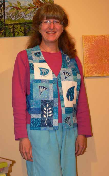
Since there is SO much that has happened in the past two months, I’m going to alternate between the April trip and vacation and other events.   For about two years now, I have wanted to make a vest to wear while teaching applique to show the various types of machine applique and decorative stitching that I teach (two different classes), and how the samples can be used in various projects including clothing, not just quilts.

Here’s me in the just completed vest, frizzy hair, no makeup (and therefore disappearing eyes…I SO envy people with dark eyelashes!) and all:

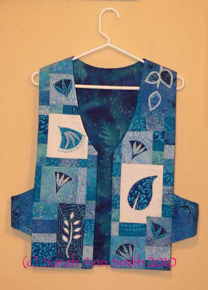
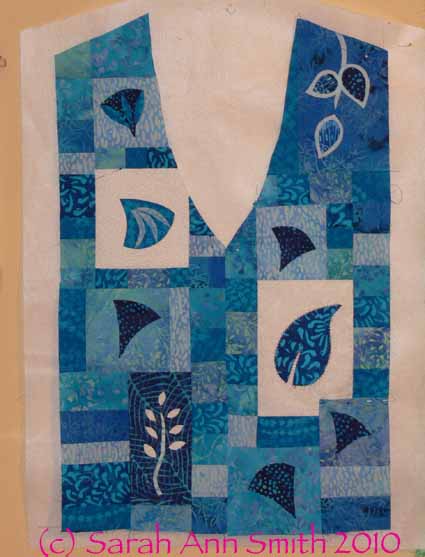
I thought pictures of the vest pinned to the design wall would make it easier to see–this is the front:

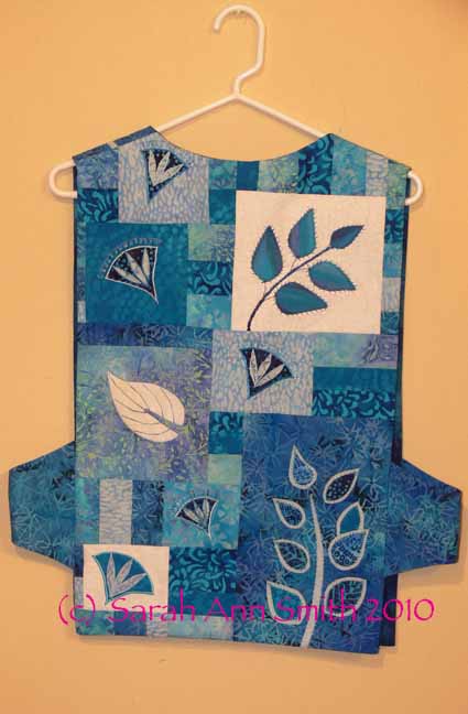
and the back:

At least 12-14 years ago, I bought Make Your Own Japanese Clothing by John Marshall (yes, THE John Marshall who teaches katazome and shibori, makes amazing silk, etc…..  his website is guaranteed to keep you looking for a long time!).  Amazingly, the book is STILL in print (tells you  how good it is); you can find it at Amazon, here.  The Japanese use 14″ wide lengths of cloth to construct their clothing without cutting into the cloth from the sides, so garments are based on rectangles, which makes for easy sewing.  I developed this pattern when I made my Frayed Edges vest (seen in the second photo in this post).

In a nutshell, take your measurements or measure a vest with a fit that you like.  To make the math easy, let’s say 42 inches around.  Divide by 3 and by 6:  1/3 of 42 is 14.  1/6 of 42 is 7.  The front of your vest needs to be, therefore, 14 inches or 1/3 of your circumference (finished…remember to add seam allowances!), the back is the same.  The sides are 1/6 of the distance around you or 7 inches.  It’s that simple!

When I first made the vest, I used rectangles for the sides.  The bottom of the rectangle hit my hit and bent, making me look decidedly hippy and wide.  So I changed the shape to arch on the bottom, with the same curve on the top.  It turns out to be easy AND flattering!

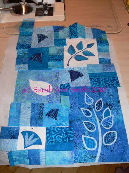
Since I had weird shapes and samples for my applique blocks, I decided to draw out the shape of the vest (used an existing vest to copy the angles for the shoulders and neckline, but modified the front “v” to be slightly curved, again, a flattering line) on RinsAway, a lightweight wash-out stabilizer which I used as a temporary base for construction and decorative stitching.  I placed the applique blocks in a pleasing arrangement, then figured out what I needed to use to fill in the gaps.  I selected about 6-8 prints and cut strips 1 1/2, 2 and 2 1/2 inches, then sewed them together.  I cross-cut sections to create the pieced inserts….I just used a ruler to measure the size I needed, added 1/2 inch (a quarter inch seam allowance for all sides) and cut.

In the photo of the back, the cut pieces and trimmed applique samples (not yet stitched for the fused ones), are pinned to the stabilizer.  In the photo of the front, below, I have pieced together the random shapes and cleaned up the edges.  The pieced fronts are now spray basted to the RinsAway stabilizer in preparation for the decorative stitching.

After stitching, I removed as much of the stabilizer as I could, and sewed up the garment using the usual way of making a vest (it’s a bit of a mind-wrap…you sew the outside to the lining except at the side seams, then turn it right side out  through an opening left in the lining shoulder seam—it seems impossible until you’ve done it!).  Because I tend to get warm walking around the classroom all day (yes, my feet ACHE and THROB by the end of the day), I did not add batting or quilt this one.

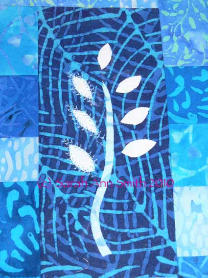
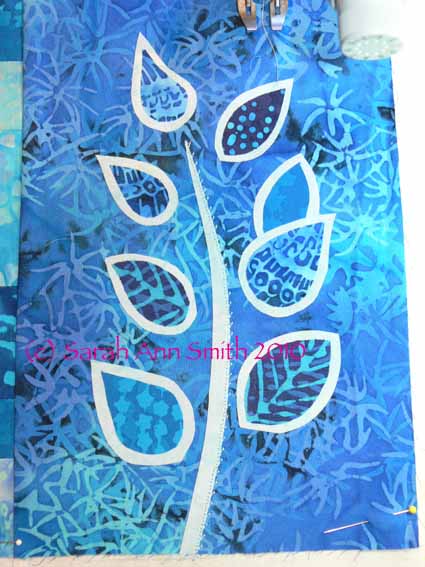
I used both turned edge and raw-edge / fused applique, with various sorts of decorative stitches.  I particularly like the vine coming down over the left shoulder onto the front and the blue background / white sprigged stem (reverse fused applique) on the front.  For the turned-edge pieces, I’ve discovered this new product that I love…. C&T’s washaway applique sheets (click on previous link to see the product).  It has as much body as Ricky Tims’ Stable Stuff (which I still love), but it  is IRON ON!   You can run the sheets through your printer if you want (for example, to print off a zillion identical leaves or to produce templates for a design), cut out the shape in the C&T sheets, iron lightly to the wrong side of the applique fabric, and press the edges.  You can use either a washable glue stick, starch, or just heat to turn the edges before stitching down.  Way cool!

Here are some detail photos of some of the blocks–see what a difference the stitching makes between the buds on the left and the un-sewn ones on the right?:

And my two-layer leaves, which I developed for my Balinese Garden table runner (more on that in an upcoming post!):

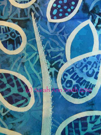
In the photo above, I’ve used a blind hem stitch, available on the most basic machines, to stitch the right side of the stem. In the next photo, you can perhaps see better.  I subsesquently used a 2-sided feather stitch to outline the dark inner leaf and stitch down the lighter outline:

I came up with this 2-layer leaf because on a different project I wanted to use a busy, medium-value (not light, not dark) fabric for the background, and still use medium-value fabrics for the leaves.  Set directly onto the background, there would have been almost NO contrast and the leaves would have been visually lost.  By layering up the leaves like this, you get a nice contrast and outline without having to satin stitch (which while lovely is VERY time consuming, uses LOTS of thread, and may not be the look you want).  Hope you like the vest!

Windows and Sketches–Exercise your Imagination!

Thursday, August 27th, 2009

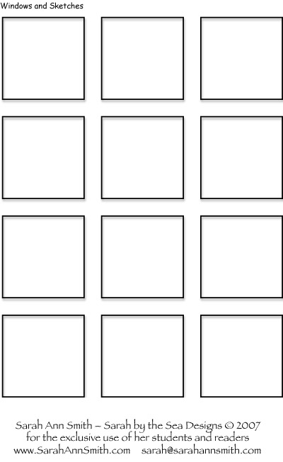
Download is available here: Windows and Sketches PDF.

The September issue of Machine Quilting Unlimited is now hitting mailboxes, so I thought I’d share the cover:

productimage-picture-mqu-september-2009-22_t280

My article this month is about texture:  both literal and visual texture in machine quilting.  Quilts can be old-timey puckery like the 1930s quilts we know and love, but they can also be (literally) flat, like the fabric postcards made on Timtex or Peltex (a rigid stabilizer sometimes used in cap brims).  But there is also visual texture…what the eye thinks it sees depending on the type of line created by the quilting.

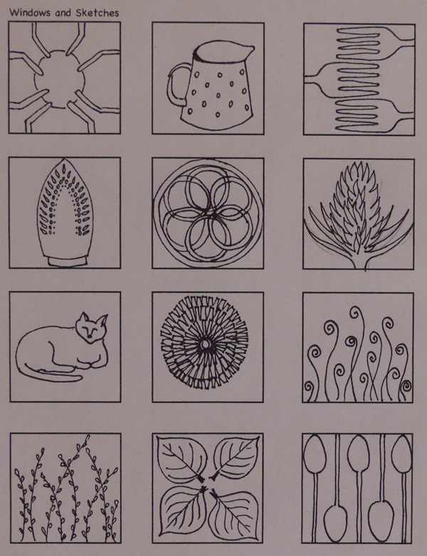
One fun exercise is to give yourself 30 minutes (at most!) to fill the 12 small boxes on a page.  Fill each square with a different “something” from around your house and garden; for a change of pace, take your sheet (or another one!) into town, walk in a park or look at the downtown buildings, and look for images that might make good quilting designs.  Check out the article for more information!  It is in the September Machine Quilting Unlimited magazine (ask your local quilt shop to carry it!) or order an issue / subscribe at www.mqumag.com.

Here’s the Windows and Sketches workpage I shared in the magazine:

2009.08.Blog.WindowsSketchesFilled600

You can download a blank template of this form using the link at the top of this post or here: Windows and Sketches PDF.  This is what the blank looks like:

2009.08.Blog.WindowSketches

Leaf and Vine Motif

Tuesday, June 16th, 2009

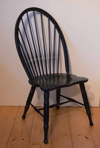
The newest issue of Machine Quilting Unlimited is out, complete with my article on Negative Space or what I like to think of as “the spaces in between.”  I promised a download of the leaf and vine motif from the feature quilt, Little Brown Bird, which I’ll share in another post.  For a full discussion of negative space, you can buy a copy of the magazine here, but here is a quick recap.  Think of a chair with slats on the back:

sasmithaprilmquxsmall009

The spaces between the spindles on the back are “negative space.”  The chair itself is the “positive” image.  Likewise, the spaces between the legs and rungs are negative (or “in between”) space.

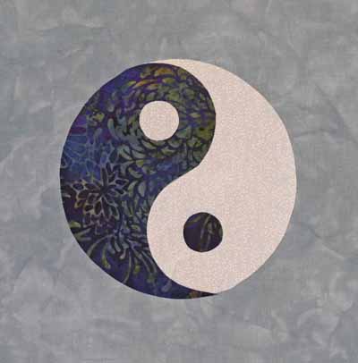
For the article, I created some examples based on the principles of Notan.  The definitive book is Notan:  The dark-light principle of design by Bothwell and Mayfield.  The Yin/Yang symbol is the class example of positive and negative space.  Each teardrop shape is identical to the other, but one is dark and one is light.  The two are perfectly balanced, and the proportions of the small circle within the teardrop, the shape of the large end of the teardrop, and the entire circle are all geometrically related:

sasmithaprilmquxsmall002

Here is the vine motif I developed:

sasmithaprilmquxsmall001

If you like this motif, I’ve prepared a PDF which you may download for your personal use.  Since it is under copyright, please don’t sell it or use it in classes you might teach (without receiving my written OK first), or other nefarious stuff… please DO use it in your quilts, modify it, and have fun.   Also, this is my first time trying to create a down-loadable PDF, so I’m hoping it works!  To download the PDF version (with the black removed so it doesn’t eat up your ink), click here: leafandvinemotifpdf

Enjoy!

Birch Pond Class

Monday, March 16th, 2009

200903blogbirchtreesclass001

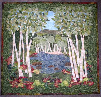
Today’s post is about a new pattern I’ve designed to help folks who want to start art quilting or for folks who are experienced art quilters but want an appealing yet fairly easy pattern.  The class to teach Birch Pond Seasons (when I get winter and spring made, I’ll have four views of the same pond across the four seasons) for the first time went swimmingly well as you’ll see by the photos!  The pattern itself will be available in about two months (guessing…have to send it away for printing the large sheet this time).

As you might guess by that rather extended absence from the blog, I’ve been busy! Between the first draft of my next article for Machine Quilting Unlimited magazine, getting together the stuff for taxes (not only ours but mom’s, too…bleah), attepting to get some sleep, going to wrestling meets, the usual family and household stuff, making a new small quilt for the article, and teaching, I’ve been rather behind the curve.  A while back, I got to teach my Birch Pond landscapes pattern for the first time at Maine-ly Sewing, and it was a gas!  I will definitely be polishing up the instructions, sending the pattern off for printing (it’s oversized, and copies at Staples are about 6 times more expensive than shipping it away and getting it professionally printed).

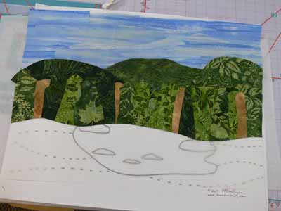
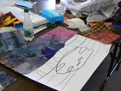
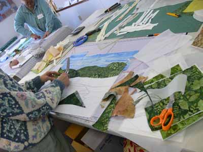
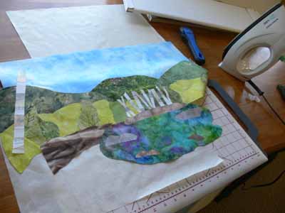
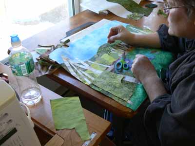
After showing the students how to fuse up fabric (both large chunks and smaller bits) they began composing their quilts.  The easiest way proved to be setting out the large pattern (the piece of paper is about 18×22), placing parchment paper on top of the pattern, then the pre-fused fabrics on top of the parchment.  Here you can see the pattern through the parchment on the lower half of this quilt.  This student did a fabulous job with her sky; she had one piece of fabric that was perfect, but WAY too narrow, so we cut, spliced and overlapped for it to look like a summer’s cloud-dotted sky.

Another student chose a dramatic lightning-streaked sky and dark mountains for her quilt:

200903blogbirchtreesclass009

200903blogbirchtreesclass012

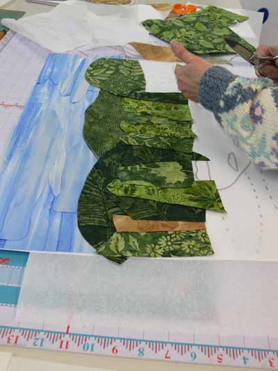
Working from farthest away (sky) to the front (foreground), we began with the sky, then the distant hills, then what I have called “the woods behind the pond.” You could cut a single swath of fabric to go across the entire quilt, but I think by cutting chunks and “piecing/fusing” a band, you get greater depth in the piece:

Creating the woods behind the pond

Creating the woods behind the pond

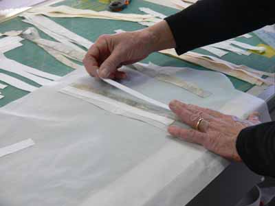
To make the tree trunks, we created “new fabric” by cutting strips of white, cream and gray, then cross-cutting into tree trunks:

Using strips to create new "fabric"

Using strips to create new "fabric"

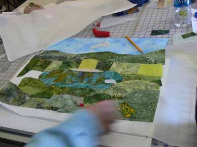
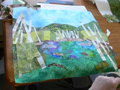
One student decided to go for wild and funky colors… I’d love to see how this one turns out after she adds the birch trees, foreground plants and quilting.  Here is her quilt at the adding the pond stage:

Adding the foreground in the wild and funky one

Adding the foreground in the wild and funky one

After the pond, we added the foreground and rocks:

Adding the foreground and rocks

Adding the foreground and rocks

Or, you could add the birch trees behind the pond first:

Adding the birch trees behind the pond

Adding the birch trees behind the pond

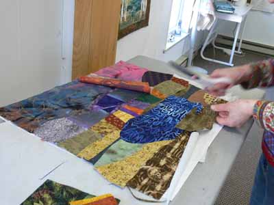
Two sisters took the class together, and decided to combine forces.  Rather than both of them working separately, they decided by late morning to create one quilt together and get it to nearly-done stage, then make another at home.  Here is one of them “building” the scene and adding the birch tree trunks first:

Building the scene

Building the scene

Finally, a nearly complete top (minus borders):

Birch trunks added...next, foliage!

Birch trunks added...next, foliage!

At the end of the day we discussed border selection, quilting designs (the ones on my quilts, which you can see here, are designed to be do-able by newbie machine quilters), and  using a facing to finish the edges.

And thanks to one student who went home and finished up, a finished student quilt…hoooray!  I REALLY like how she added red flowers going back to the sides of the pond…really helps lead the eye to the pond and the birch trees behind it:

Finished student quilt (thanks Martha!)

Finished student quilt (thanks Martha!)

Mounting a small quilt on a canvas

Saturday, February 28th, 2009

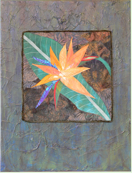
I’ve mounted a number of pieces on either painted canvas or fabric stretched over artist’s stretcher bars.  When I posted my piece for SAQA@20 recently, a friend asked if I could share how with her.  I decided it might be a good idea to share with EVERYone, so here goes.  Here is the SAQA@20 piece:

Bird of Paradise full shot

Bird of Paradise full shot

For this piece I purchased a primed canvas at my local art supply store (and how heavenly is it to LIVE near an art store…a real one, not a chain…. glorious!).

Here’s what I wrote to Debby, chatty and all:

  1. Buy canvas.  I take the finished (or nearly so) piece with me to the store to eyeball the right dimensions.  Make sure you leave enough space on edges that you can sew through canvas, not wood frame (otherwise it is E6000 glue time, and yes, I have done that too!) Canvas is usually primed (painted white).
  2. Mark the location of your work that will be mounted.  I placed mine, measured to make sure it was square/level and equidistant from the sides.  With a pencil, reach underneath the artwork and sketch a line, maybe an inch inside the edges of the piece.
  3. Find tissue paper-I actually happened to have a fairly old, tatty piece of acid-free tissue so used that, but I would just use plain old tissue paper if I had it.  Tear tissue into bits and “glue” to the surface, wrinkling and scrunching as desired.  I used Golden Mat Medium, but a Gel Medium or Mod Podge would work too as the “glue” with a sponge paintbrush.  The tissue will likely tear a bit–that’s OK.  I did NOT extend the tissue far under the location of the artwork… I went to about the pencil line.  Allow to dry–overnight if possible.
  4. Paint.  I used a blue paint first, and it was WAY too blue.  You may need a brush (not sponge) brush to get into some of the tissue crevices.  Allow to dry to the touch.  Oh yeah… I happen to have on hand Golden Fluid Acrylics (available at www.dickblick.com) so I used those.  You could also use craft acrylics, but the pigment load per   ounce (or whatever measure you want) isn’t as much…in other words, there isn’t as much pigment.  You get better coverage and durability with artist acrylics, but they aren’t necessary (my Cappuccino series that are on the square canvases…check in the For Sale tab… were painted with craft acrylics).
  5. Paint a second layer of same color if you don’t want the white of the canvas to show through.
  6. As I mentioned, mine was way too blue, so using a sponge paintbrush, I added some green, which made it too green.  By the way, I tested on the area that would be under the artwork so if it was awful and I couldn’t clean it off, I wouldn’t ruin the canvas.  Then I took a wadded up paper towel and swiped.  For this one, I kept the swiping vertical, but it could be fun to do every which way, too.  That lifted some of the green, and thinned other parts of the green, which was kinda cool.
  7. It still wasn’t quite right.  Did the same thing using Raw Umber (or was it Raw Sienna?), a dark earthy brown.  I applied less paint, almost a dry-brush technique dusting the color here and there, then paper-toweling.
  8. Oh…sewing it on.  Once everything is dry, I position the artwork, again measuring for level/equidistant.  I spear the corners with pins (and more on the sides if the piece is large).  Using a sturdy needle threaded with a double strand of thread that matches the outside edge of the quilt, I stitch about every inch or so.  Some artists may only do the corners, but I don’t trust cloth not to move.  On the bottom I’ll do maybe every two inches.  A thimble REALLY helps as the canvas is tough.  I have heard that some folks will sew felt to the back of the quilted art, then use maxi-hold glue.  I’ve done that, but don’t really like doing it.
  9. Finish the back.  Black dust-cover stuff (what is underneath upholstered chairs) works great on the backs.  I staple gun that (or whatever) to clean-finish the back, and hammer one of those picture hangers to the center top… I call them alligator hangers…straight across the top, downward facing triangles/teeth on the bottom.
  10. Turn around, admire and enjoy.  Hope for a quick sale!

Really fancy eh???

I suppose I should have applied a varnish to the top.  I KNOW I should have with the craft acrylics since they are starting to scuff a bit on the edges.  I think I shall apply Glad Press N Seal to the top of the quilted parts, then use a spray varnish (Matte or Satin) for those pieces to protect the paint.  Maybe on this one too.

Some alternatives:

Buy a canvas the same size as your piece.  Paint the edges.  Sew felt (black would be best) to the back of your quilt.  Glue it using permanent glue to the canvas.  By using felt, you can later change your mind and remove the quilt from the canvas if you feel like it.

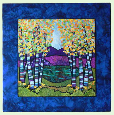
Use artists stretcher bars, cover with batting and coordinating fabric, as I did with Birch Pond and a number of other pieces (check the for sale gallery… the Cloud crane, Tree Branch Moon and maybe some others are done this way):

Birch Pond, on blue batik over stretcher bars

Birch Pond, on blue batik over stretcher bars

If there is anything that is confusing…just ask! OK…NOW it’s done.  I think…