email Youtube

Home
Galleries
Blog
Workshops & Calendar
Store
Resources
About
Contact

Archive for the ‘Uncategorized’ Category

Digital Camera query

Friday, February 24th, 2006

Hi all….not feeling so hot tonight, like I’m coming down with something (my sons love to hug me, which is wonderful, except when they share their germs….) so will keep this short and resume the color studies tomorrow or Sunday.

In the meantime, I’m on the hunt for a good digital camera that will take pictures of my quilts with high resolution for entering into shows AND take good action shots of my kids at wrestling meets (guess where I’ll be tomorrow) and karate, as well as the usual assortment of stuff. I’m considering these:

Fuji 5200
Panasonic DMC-FZ5
and
Canon A620

The Fuji and Panasonic are extra-long zooms (12 x !!!!! equivalent of a 35-400 zoom on a film camera….wowza!) and get rave reviews; both are 5 mp.

The Canon is a 4x zoom, but 7 mp.

Any thoughts on these, or anything else, related to buying a new digital? I can afford to spend $350-400 I think, including batteries and memory card…..

Now I’m going to bed EARLY…..stayed up way too late last night watching the skating, and tonight everything aches….nitey nite,
me

Color Study 7: Split Complementary

Thursday, February 23rd, 2006

Remember complementary colors? Ones that are directly opposite each other on the color wheel, with a straight line as the visual memory-clue? Well, a split complementary is similar, but instead of going straight across the color wheel, the line splits into a skinny “Y” on one side, like this:

I selected red-violet (a very dark shade of it). The complement—the one just opposite on the color wheel–is yellow-green. If you make a “Y” instead of an “I”, you’ll get a skinny triangle that touches red-violet, yellow and green. I have a couple of traditional quilts I’ve made using this combination, but I think it is because it is a combination found often in nature, including my Gramma’s favorite, pansies!

Well, piffle! I just looked in my files, and I don’t have any digitals of my purple-yellow-green quilts in digital! Over the next few days I’ll try to dig them out and take pictures to share. Anyway, for the “quiltlet” side of this lesson, I finally gave in to my urge to do representational. Using a “vertical” composition, I made flowers out of pale yellow, deep and deeper darker red-violet, and green. I plan to “meld” the colors of the flowers with the quilting thread, so it will be interesting to see the difference between the quilted and unquilted scans.

Color Study 6b: Warm and Cool colors

Wednesday, February 22nd, 2006

Martha mentioned in a comment that she had never understood what was meant by warm and cool colors. The easiest way to think of it is this:

Warm, the colors of
–fire
–embers
–the sun
–morning
–summer
–autumn leaves

Cool, the colors of
–night
–ice
–cold places / winter
–many shadows (though the Impressionists had a lot to say on that one!)

Another way is to look at the color wheel. Here are scans of my favorite color wheel (I have at last three!), but alas I can’t find it anywhere on the web for sale….It is the Grumbacher Color Compass, item B425, has a 1972 copyright date on it, and Third Edition 1977:

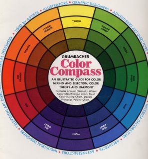
If the color wheel were a clock, yellow would be at high noon. The colors before noon, the “morning” colors are “warm”—starting with red-violet at 7 am, through red at 8, into orange at 10 and yellow at noon. The afternoon colors are “cool.” The early afternoon is starting to cool, but you still get a “warm green” in the yellow-green at 1 pm. Then you move through progressively “cooler”, more blue shades of green to green and at 6pm, dusk falls and you reach violet. Isn’t color wonderful?!!!! It is SO much fun.

That brings me to dual primaries. Michael Wilcox’s book Blue and Yellow Don’t Make Green first introduced me to this concept: there is no such thing as pure red. A red pigment is either a blue-red or an orange red. After all, who’s to say what is “true” red? How do any of us know that what I see and call red is the same color you see?

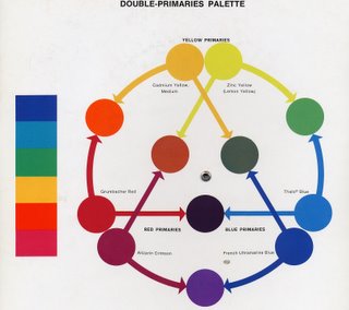
This color wheel in the Grumbacher Color Compass is a guide for artists who use Grumbacher paints. If you click on the photo, you can have a window open with a larger image; then you might be able to read that there are, for example, two reds: Grumbacher Red has an arrow that points to orange, indicating that it is on the orange side of things. Alizarin Crimson points to violet, indicating that it is a blue-red.

Try pulling a wad of one color fabric off your shelf, then really look at it: if you’ve picked red, is it kinda blue-y? Or could it be more towards tangerine (a red-orange)? If you have pinks, does the color veer toward fuschia or even a violet (cool), or is it more peach (warm)?

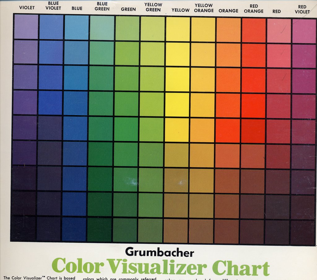
And since I had the color compass on the scanner, here’s the Color Visualizer Chart…which shows what happens when you mix white or black with a given color. There are nine lines of colors on the chart below. The one smack dab in the middle is “pure” hue / color. The ones above it are the color mixed with white, the ones below mixed with black. At the end of the series of color studies, I’ll talk a little about tints (mixes with white), shades (mixes with black) and tones (mixes with gray added), and about tertiaries.

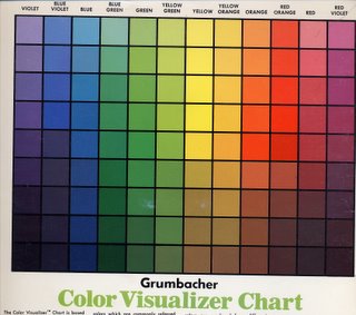
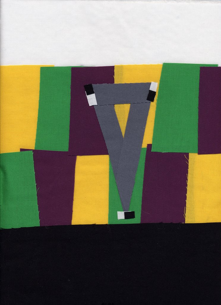
BUT, I’m going to force you to wait a couple months for color samples….I have three small deadlines in the next two weeks to finish entries for various things, then I have a HUGE quilt I want to make and finish by May, and I really need to get cracking. Well, huge by art quilt standards, small by bed quilt standards…about 40-54, but with lots of detail and embellishments. I’d like to finish it in time to enter in Houston (so done by June 1 at the latest so I can photograph, etc.)

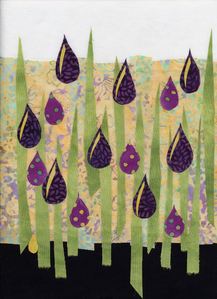
And now, I’m going to go add a little more quilting to my February Journal quilt (which alas I can’t share, even here on my blog…sigh) so I can get it e-mail off to IQA by the due-date!

Hope this helps! Tomorrow, ummm…what comes next…….tetradic I think…….nope–not yet, we’ve done one-color quilts (monochromatic), two-color (complementary), three color (analogous and triadic) and next: another “3”, split complementary. Stay tuned!

Color Study 6: Triadic / Secondaries

Wednesday, February 22nd, 2006

Hi all! Thanks so much to all of you who are surfing in to read these “lessons” on color….you give me confidence that maybe I am on the right track! I was going to include a discussion on warm versus cool colors in this post, but decided to make it into two posts tonight. So for our first installment:

You’ll recall that primaries, red, yellow and blue, are colors that can’t be created by mixing something else. Secondaries, however, CAN be mixed from equal amounts of the primary colors….and I’ll bet every single one of you remembers mixing tempera paints in your first years in school:

Yellow plus Red makes Orange
Red plus Blue makes Violet (aka Purple)
Blue plus Yellow makes Green

And if you mix them all together, you don’t get black… you get that lovely shade known to artists and fingerpainters the world around: mud!

Here’s the colorblock side of the quiltlet, once again with the equilateral triangle to denote a “tri” / triadic color scheme:

In most western cultures, these secondary colors (and then the tertiaries, the ones that are blends of the secondaries and primaries, and their muted or paled versions…such as burgundy and pink are variations on red) are often perceived as more “sophisticated” or “grown-up” than the primaries. All I know is that I found it MUCH easier to work with these three colors and create a pleasing composition than I did the red-yellow-blue combination. Here’s the “quilt” side, again an effort at abstract using a diagonal composition (although honestly I think of this as treetrunks on the crest of a hill!), mixing in gray among the vertical bits.

As in earlier quilts, since I’m working from my stash to make these pieces, it was virtually impossible to create something without a bit of “other” colors creeping in…there is a bit of blue in the green fabric in the upper right, there are some caramel browns in the purple. But I figure that makes it a more true-to-real world experience, right?

Color Study 5: Triadic / Primary Colors

Tuesday, February 21st, 2006

So why am I going through all these combinations you might ask. Gee…maybe I should have started these lessons with this thought….the joy of writing before you edit your brain!

A lot of folks are scared of color; they don’t understand it, and they don’t understand how to make the colors work (or play) well together. Do not be afraid—of color that is! By understanding how the colors relate to one another, you can make quilts, art or outfits that look good. Or, if you want to create a jarring image, you can use colors that fight one another to help create that effect. Once you understand how colors work, you can get them to work for you!

Today’s quiltlet is about the triadic color combination. Here’s the color block side of the quiltlet:

As you might guess, it means there are three colors evenly spaced around the color wheel. That means you can have a threesome of red-yellow-blue, or orange-green-purple, or the “tertiary” colors…remember them? the ones that are–for example– a combination of yellow and orange make yellow-orange.

If you look at the color wheel in yesterday’s post, the primary colors are in the center, and look like colors we associate in the US with children—colors that little kids just love. The center of the color wheel is an equilateral triangle, one where all three sides of the triangle are the same length. So, drum roll along with a flash of the obvious, I chose a triangle as my symbol for triadic combinations.

For the “front”, I chose a radiating design, again using the white top and black bottom borders, with my medium gray salted into the swirls. You can see on both sides that the gray seems dark compared to the yellow, yet lighter than the medium blue. This is the value of “value”–the comparative lightness or darkness of a color.

Tomorrow, the secondaries in a triadic / triangle combination!