Feedback Mysteries
Thursday, June 12th, 2014So I recently sent a couple quilts out to be in national juried shows. Let me begin by saying that I truly do respect the judges and the difficulty of the judging process. But I thought that some folks new to entering shows or who might consider entering shows would like to know what comments are like. I’ve waited a while since receiving these two quilts back so folks couldn’t really guess (or do a lot of work) to figure out which shows and which judges because I DO respect them and their job.
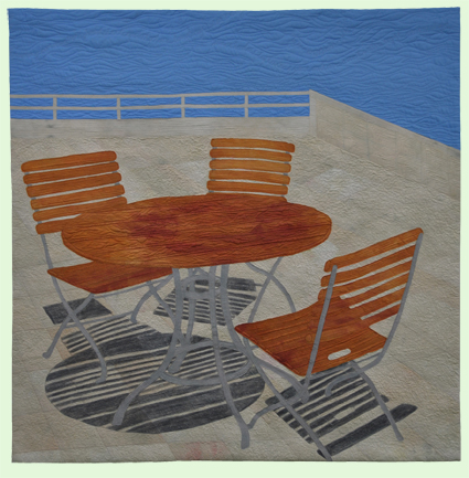
The comments on this quilt are the one that most mystify me.
The comments received were:
- Best Features:
- Raw edges work well done
- Piecing in background
- Area(s) to Improve:
- Value Changes to emphasize depth and shadow
Best features: OK: Thank you for the compliment on raw edge work, which is usually disparaged. Thank you for the compliment on piecing; however, there IS no piecing. It is all fused. I will take that as a compliment that the fusing was so well done that they thought it was pieced.
Areas to improve: I am utterly perplexed. HOW could I have further value changes? The pale color of the stone and dark of the shadows is about as extreme as it gets this side of black and white. The only thing I can figure out is that perhaps they want some shadow on the wall versus the surface of the patio. I will note at this point that this is a composite image from several photos, but with the angle of the sun used from the first photo with two chairs and the table, a corner of the patio as in this scene would have been utterly flooded with light and have no shadows, just perhaps a bit of grunge where ground met wall. This scene is from the Getty Museum in LA, and the sun was screaming blue sunny sky–flooded with light. ????
I take comments seriously (most of the time) because I want to learn and improve. So my question to all of you is:
Can you figure out where they want me to improve value changes to emphasize depth and shadow? I’d love suggestions. Please, be kind to the judges.
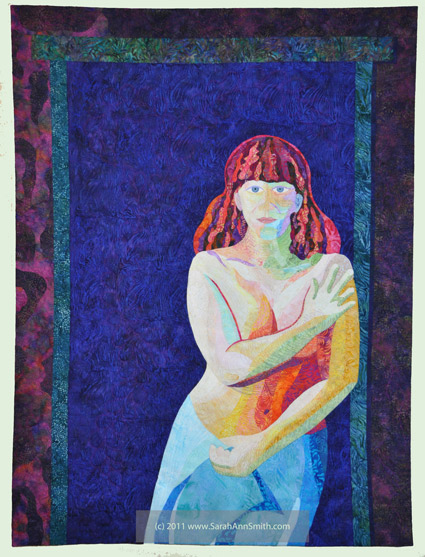
Then I got this quilt back.
The area to improve was that (I’m paraphrasing as I don’t feel like rooting around to find the comment sheet) “the off-center composition is good, but there is too much negative space.” This comment I am utterly ignoring. The figure (me) is in a doorway. That is how much negative space there IS in a doorway. And the amount of space is intentional: it conveys the feeling of isolation and tension I wanted to express about that time in my life. So I’m chalking it up to “they just didn’t get it.” I’m OK with that.
