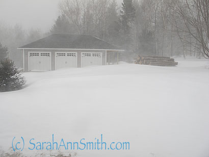
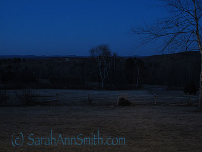
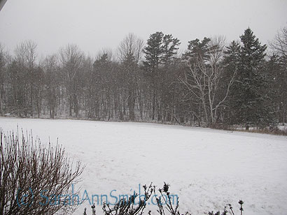
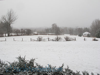
The Blizzard, after…
Sunday, February 10th, 2013Last night we heard a sound in the driveway that wasn’t wind. Alex! We wondered how he would manage with his plow. Well, he didn’t. He called in his big guns:
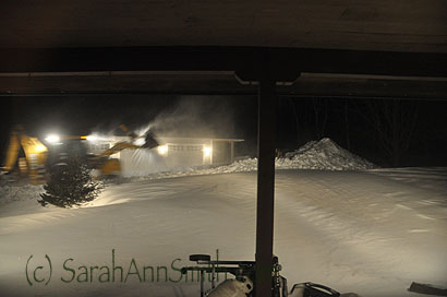
Alex to the rescue—with the frontloader. So nice to have a neighbor-plow guy-town road commissioner with BIG stuff in addition to the big plow on his big pickup truck! Love this photo because it shows how hard the wind is still blowing, lifting snow out of the bucket. And notice that vast mound between the edge of the porch and the driveway….
I just stood in the kitchen looking out the window and laughed! The “plow” pile grew so huge the big bucket on the frontloader (or is that a backhoe? or two-in-one?) couldn’t reach over the top!
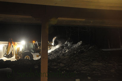
He’s actually driving UP the plow pile to try to dump over to the back side.
And bless that man. Remember that DEEP drift (about 3 1/2 feet deep) between the front door and the driveway in the first photo?): Lookit what that nice man did….
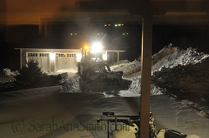
Alex came in with the wide bucket empty, set it down gently about 4 feet from the edge of the deck, and then dragged all that snow back out to the center, then scooped it up to dump on the ginormous pile. That meant LOTS less shoveling for us! When the snow melts its gonna be a serious mudfest getting over to the garage!
Made us a wide clearing so we wouldn’t have to shovel as much. DEFINITELY buying a snow blower before next winter!
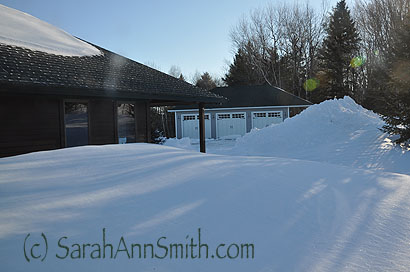
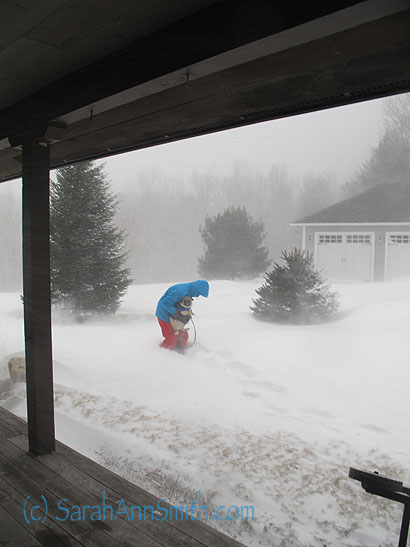
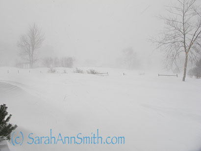
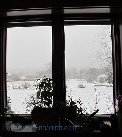
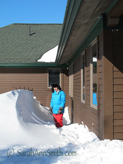
This was the view out our bathroom window this morning. Notice how high the drift is by the entry windows on the left.
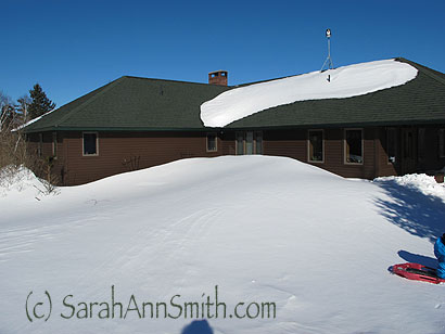
And looking back at the house. The photo above was taken from the window on the far left. I was standing just uphill of the ginormous snow pile for this photo.
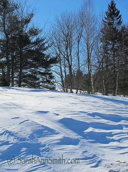
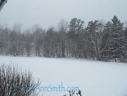
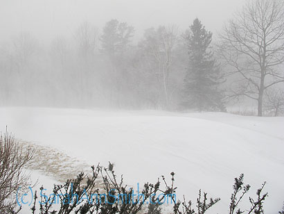
It was a glorious crisp morning! I love the strong shadows and the blueness of the snow and the wind-carved ridges in the snow.
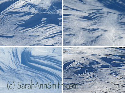
Love those wind carvings so much I kept taking pictures. As I tell my students, there is quilt inspiration everywhere!
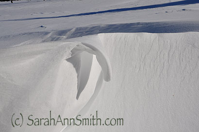
Eli spotted this cool overhang: yes, that is a “corner” of snow hanging on the uphill side from the wind!
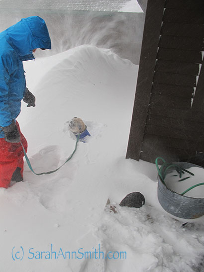
Eli scraped the snow away under his feet to stand on the ground next to the drift from what blew over the roof. He’s almost 5’10” tall. Love how the wind whips a channel next to the house. We saw little tiny critter tracks in the snow near there.
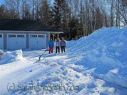
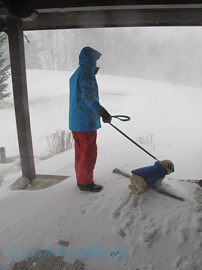
Eli, Me with Widgeon, and Paul. We got the gas grill back up on the porch, then set the camera on timer. For once I was going to get into the picture, too, as we aren’t likely to see anything like this again for eons. I mean…snow as tall as the eaves? It may be routine in the mid-west, but not in Maine!
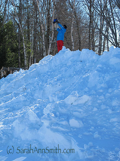
Eli hoists the King of the Mountain, as said king’s leggies are too short to get him up to the top of the hill! Eli also needs to go back up there and retrieve the shovel he left up top!
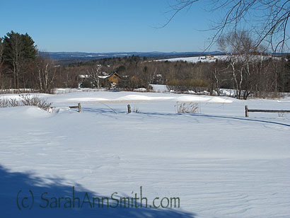
And the storm clouds have cleared and we have that GLORIOUS view back. Yes, the towns of Freedom and Liberty are off in the distance as we stand in Hope! I LOVE MAINE!
And yes, I really DO have art and quilting to share…stay tuned! First post is tomorrow.
And a PS: our neighbor is wonderful, but plowing is part of his business! He gets paid for plowing, but he does it well and responsibly and promptly every snowfall. It can snow overnight, and when we get up at 6 am the driveway is already plowed most often! Lots of folks here in Maine have 2 and 3 jobs, including seasonal ones. The landscaping folks work the earth when it is visible, and plow in winter, for example. And MANY people buy a plow for their truck and then earn extra money plowing in their neighborhood. It’s the way life is here in Maine, and I expect in most of the northern tier of the US where snow is prevalent.