email Youtube

Home
Galleries
Blog
Workshops & Calendar
Store
Resources
About
Contact

Author Archive

Extreme Shepherding

Friday, June 7th, 2013

Our younger son is a fan of Stumble Upon, which took him to this video, which he shared with the comment:  People with too much time on their hands.   On the other hand, it is FUN (and probably a commercial for Samsung, but who cares because it is wonderful)!  Enjoy!

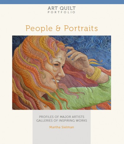
Art Quilting Portfolio: People & Portraits

Wednesday, June 5th, 2013

The winner has been chosen using a random number generator at random.org for the free copy of People and Portraits, it’s number 22!  My comment list says it is Anne, so please contact me via the Contact page on this site with your name and address, and Lark will send you a copy.  Congrats and thanks to all.

Martha Sielman and Lark Crafts have done it again:  another wonderful survey of art quilts today, this time with the theme of People and Portraits.

Art Quilt Portfolio:  People and Places by Martha Sielman, published by Lark Crafts

Art Quilt Portfolio: People and Places by Martha Sielman, published by Lark Crafts

The book includes profiles of 21 major artists from around the world and galleries with works by another 120 artists based on themes:

  • Happiness
  • Contemplation
  • Community
  • Icons
  • Family and Friends
  • Work
  • Play

There are several ways to approach this book:

  • Sit down and devour it at once from cover to cover
  • Dip in at random, opening a page to works by people you may or may not know
  • Savor a section or an artist at a time
  • Grab a favorite beverage, find a comfortable place to sit, and reward yourself with a half hour or hour to read and study the artists you admire
  • or all of the above

I started by devouring the book, seeing whose work was in the book, were my favorites there (yes!), whose work had I not seen before?  If you’d like to do the same, read to the end of this post for information on how to win this book, thanks to Lark!

I appreciate the more in depth look we get at each of the featured artists.  Each feature has a one paragraph introduction by Martha, followed by five or six images and writing by the artists (I’m presuming in response to questions from Martha). The commentary covers both technique and substance.   In Bodil Gardner’s section, I enjoyed learning that she includes sheep to add a dash of white to a piece, and that cups are her symbol for women sharing and getting together.  I love reading about Collette Berends’ life and inspiration and also about the wide range of materials used.

There is a very good range of styles and techniques represented as well, ranging from the cartoon-style of Pamela RuBert to Bodil Gardner’s whimsy to Jennifer Day’s and Jenny Bowker’s realistic portraits.  Lastly, this book has the dates the quilts were made. I LOVE THIS because I enjoy looking at the works in chronological order to see the artist’s progression in style, theme and technique.  I do wish they had included the artist’s home country (recognizing that a number of them were inspired by life in other places), and it would have been wonderful if there had been room to include a small photo and bio of each artist, perhaps in the index, but I realize that we all want to see more quilts and there are only so many pages you can squeeze into a book.

From a technical standpoint, almost all the photos are crisp and clear.  The majority show the edges of the quilts; you can tell those because of the drop-shadow used on the page.  Others are clearly cropped to be in a rectangle.  I vastly prefer seeing the entirety of the quilt, not cropped, and wonder at the decision to do this–I wish they hadn’t.  I also wish there were some detail photos:  the first time I flipped through the book quickly, I actually looked to make sure these were all quilts, as I couldn’t see the stitching on many pieces.  This is a function of two things:  the quality of the photograph submitted by the artists and the size of the original quilt (the larger the quilt, the more detail is lost as it is shrunk to fit on a page).  For example, Julie Duschack’s “Monk in the Doorway” is very large, about 4 feet tall by 6 feet wide.  I saw it in Houston and walked as close as I could get to see the stunning quilting on the large black wall; alas, only a portion of this stitching shows on the page:  a detail photo that included part of the stitching would have been wonderful. These are, however, minor quibbles about a book that is well worth adding to your library.

Bottom line:   You’ll love this book!  And I’m thrilled to say that Lark has offered a copy to a reader who comments on this blogpost!  Thank you Lark!  So please leave me a comment.  Tell me what you like to see in portraits, whether your preferences are abstracted, photo-realistic, close-ups, painted or appliqued, tell me what is it that speaks to you when you see an art quilt portrait.  On June 12 I will pick one person at random (I’ll use an online random number generator based on the total number of comments); I’ll need your email to contact you with the good news, which I’ll also post on this post as the last message.


The Land of Quilty Delights

Friday, May 31st, 2013

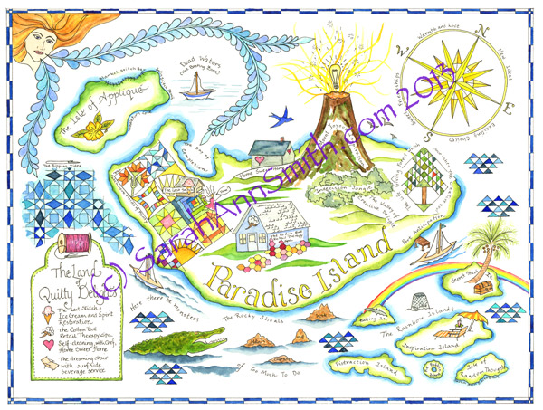
Hi all!  During my busy spring, I managed to complete a watercoloring class.  I’ve been wanting to use a sketchbook more, and love coloring with watercolors.  When it came time to do a postcard swap earlier this year with a map theme, I had this crazy idea to map a Quilter’s Paradise.  Fitting it all into a 4×6 would be insane, so I decided to make a large painting (12 1/2 by 18 inches) which would scale down into 4×6 for the postcard swap and notecards, an 8 1/2 by 11 inch giclee print ($28 plus $5 priority mail in the US, shipping higher abroad), and a special order 11 x 14 inch print ($45 plus actual shipping costs which depend on whether you want it flat or rolled).  [See last paragraph about ordering inf0.] So here is  The Land of Quilty Delights:

Here is The Land of Quilty Delights, with my apologies for the ugly watermark.  This is available as an archival quality giclee print from me at SarahAnnSmith.com/store

Here is The Land of Quilty Delights, with my apologies for the  watermark. This watercolor is available as an archival quality giclee print from me at SarahAnnSmith.com/storeRight click to see larger.  If you begin at Home Sweet Home (under the bluebird of happiness) and travel clockwise, you’ll follow a quilter’s journey, ending at The Last Stitch Ice Cream stand and/or the Cotton Boll Retail Therapy Spa–your choice!  Mine is ice cream with hot fudge, please!

I had SO MUCH FUN doing this!   The bluebird of happiness is flying over Home Sweet Home on Paradise Island (which the legend tells you is self cleaning and equipped with a chef).  The happy quilter then climbs Mount Joyous Inspiration, passes through Indecision Jungle, enters the valley of Creative Delight, and can visit the Life-Giving Forest (tree of life block with a cardinal in the tree).  Shining down from the upper right corner is our Compass rose: N = North/New Ideas, E = East/Exciting Choices, S = South/Sweet Friendships, W = Warmth and Love.  After all, isn’t that what it’s all about?

Our quilter sets sail from Port Anticipation and sails through the Rainbow Islands (which include Batting Island, complete with bat, Inspiration Island with drink service complete with little paper umbrella, and Full Bobbin Island).  The traveler then passes the Rocky Shoals of Too Much To Do (Chores, meals, work).  So why the alligator?  Well, in my first job in the Foreign Service my boss had a saying I love dearly:  When you are up to your a** (posterior) in alligators, it’s hard to remember the original goal was to drain the swamp.”  Sometimes you have years like that!

You sail past the colorful Patchwork Fields of Plenty, with some of my favorite quilt blocks, through the Storm at Sea only to encounter The Ripping Tides (seam ripper) before approaching The Isle of Applique with Satin Stitch Beach, Blanket Stitch Bay and Needleturn Cove.  Can you tell I had FUN?   In the upper left corner instead of Zephyrus, the god of the Gentle West Wind, we have instead Zephyra, the goddess of the Gentle West Wind and patroness of quilters, who wafts us with gentle feathery plumes.

Alas, before reaching the Bay of Completion, you must make it through the Dead Zone (a.k.a. the Basting Zone), an area where ships stagnate in becalmed waters.  But finally, you reach the Bay of Completion, and our happy quilter is celebrating at The Last Stitch Ice Cream and Spirit Restoration.  We could go straight home, but instead I’ll choose to enjoy the view of the Patchwork Fields of Plenty on the way to the Cotton Boll Retail Therapy Spa, complete with Grandmother’s Flower Garden.

I hope you’ve enjoyed this Quilters journey and the Land of Quilty Delights as much as I enjoyed making it!

Notecards are also available, 6 for $12 plus shipping.  All prints are sized to fit standard frames and mats (http://www.dickblick.com/ has a wide selection) and are shipped in a clear sleeve with acid-free foamcore plus an extra piece of cardboard to protect the print in transit.

This week my webhost is upgrading their server, so I can’t get these on to my Store page yet.  If you would like a print or notecards, please email me (here) and I’ll send you a PayPal invoice.  You don’t need a paypal account; you may safely use your major credit card.  For international orders, I can figure out exact postage (I will see if straight first class is less expensive than flat rate shipping which runs about $20 to anywhere in the world, but seems rather expensive to me).  If you have several friends who would like a print, contact me directly and if one of you pays for all of the items, I can ship them grouped to reduce cost for you.

Checking in, Track season

Monday, May 27th, 2013

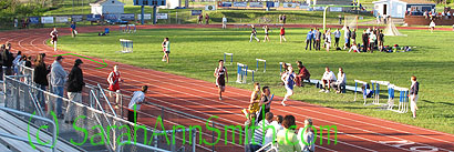
Well, life continues busy at Casa Smith.   I’ve finished and sent off the last of three articles commissioned and written in the past 9 weeks, got the quilt done (will share in a couple of days I hope), and watched many miles of track and sundry field events.  Today was the KVACs, the Kennebec Valley Athletic Conference meet and will be followed next weekend by States.   Astonishingly, Eli qualified as a Freshman–in a race (300 metre hurdles) he had only run twice in his life!   He was also put onto the 4×400 relay team!   And thankfully, the week of ceaseless rain finally ceased and it was glorious Maine today:  upper 60s, sunny and clear in Bath, where the meet was held.

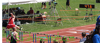
Here’s Eli in the 300 hurdles–he finished about in the middle of the group of boys running in Class B–not bad considering he’d never jumped a hurdle before this season!  If he can work on his form, he has a chance in this event next year!

Eli clears his last hurdle (literally) in the 300 metre hurdles.  He finished in (I think) 50 seconds.  Pretty good for a Freshman who had never run hurdles before early May!

Eli clears his last hurdle (literally) in the 300 metre hurdles. He finished in (I think) 50 seconds. Pretty good for a Freshman who had never run hurdles before early May!

Eli is also fast fast enough that since he had not qualified in any other events, the team put him on the 4×400 relay as he was faster than some of the other boys who had run it during the regular season.  He may have turned in the fastest lap for the team–in part because the anchor, Ben Trapani, WON (!!!!) both his 800 and 1600 metre races!  Way to go Ben!   The 4 x 400 is the LAST event–the kids arrived at the meet at about 8 am, and their race ended just before 7 pm!  LONG day!

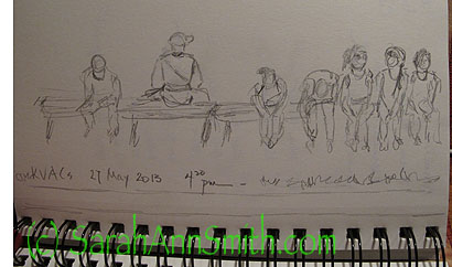
During the llllooonnnggg wait, I managed to sketch some kids and one adult waiting on a bench:  the first sketching I’ve had time to do in nearly two months!

A  VERY quick sketch--less than 10 minutes--of some kids and one adult on a bench late in the afternoon

A VERY quick sketch–less than 10 minutes–of some kids and one adult on a bench late in the afternoon

Here’s Eli in the far outside lane on the first leg of the 4 x 400 relay:

Eli on the last 50 metres of his lap, the first of the relay

Eli on the last 50 metres of his lap, the first of the relay

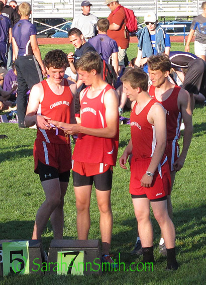
Eli ran the first leg in about 57 seconds and the team finished at 4:00:75 to place 7th!  YES, the Camden BOYS placed at KVAC’s!  Here they are having just been handed their ribbons:

The boys--Mark M., Adam, Eli and Ben T--look at their ribbons

The boys– L to R Mark M., Adam, Eli and Ben T–look at their ribbons

and all the teams:


On the podium

On the podium.  Eli is third from the right.

What is astonishing is that Eli is a Freshman, Ben T. is a Junior, and the other two boys are sophomores:  what a young team to do so well!  Most of the other teams are older, so kudos to them!

And astonishingly, Eli has now qualified for States in all three of his sports as a Freshman.  Absolutely amazing!   I’ll be back soon, and now that the deadlines of the past two months are met, hope to return to a more regular blogging schedule.  I’m also traveling to North Carolina to teach in 2 weeks and then to Southern California in early July!   Hope I get to meet some of you.  Now it’s late and time to collapse on the sofa before the week begins anew!

Listen to the Song in the Night

Thursday, May 16th, 2013

Wow have I been busy, and I’ve woefully neglected my blog!   I’m sorry!  The good news is that a flurry of activity is nearly over.  In the past 8 weeks I have made a quilt for inclusion in a book due out next year, flown from Maine to Colorado to tape a Quilting Arts DVD workshop (more on that here), written and submitted two articles to two different magazines (more on those when they come out), and written a third but still have step-outs and photography to do on that one.  BUT–I am thrilled to share with you that Listen to the Song in The Night has been juried into the this year’s Dinner@8 exhibit, An Exquisite Moment.
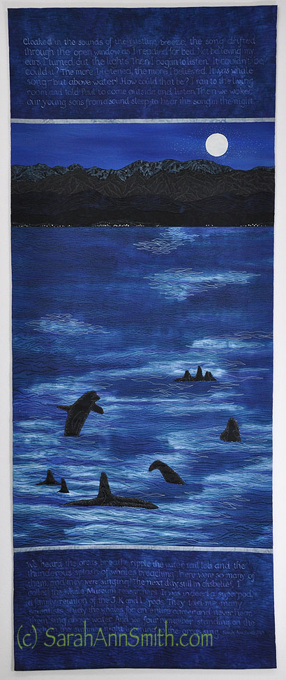
Listen to the Song in the Night by Sarah Ann Smith (c) 2013.  24 x 60 inches.  Artist dyed silk and cotton, a few commercial batiks (mountains).  Free motion quilted, ink with dip-pen, paint.

Listen to the Song in the Night by Sarah Ann Smith (c) 2013. 24 x 60 inches. Artist dyed silk and cotton, a few commercial batiks (mountains). Free motion quilted, ink with dip-pen, paint.

You can read more about the exhibit, here. Last year I was really stumped.  This year it was a matter of which quilt to make:  childbirth (done discreetly–the mom’s view looking over the sheet over your knees at your newly hatched child in the doctor’s hands), Eli as a 2 year old under the blueberry bush grinning as he munched blueberries, or any of a number of other moments.  But then I remembered the whalesong.  Best of all, not only did hubby Paul, but so did the boys who were about 5 and 9 (or maybe even 4 and 8).  We lived on San Juan Island in Washington state at the time.  Our house  was about 1/3 mile up from the water and faced the Straits of Juan de Fuca with the Olympic mountains on the other side, 17 miles away.  We could see and hear the orcas from our house.  The writing on the quilt tells the story:

Cloaked in the sounds of the rustling breeze, the song drifted through the open window as I readied for bed.  Not believing my ears, I turned out the lights.  Then I began to listen.  It couldn’t be, could it?  The more I listened, the more I believed.  It was the whale song–but above water!  How could that be?  I ran to the living room and told Paul to come outside and listen.  Then we woke our young sons from a sound sleep to hear the song in the night.

We heard the orcas breathe, ripple the water, tail lob, and the thunderous splash of whales breaching.  There were so many of them, and they were singing!  The next day, still in disbelief, I called the Whale Museum researchers.  It was indeed a superpod, a family reunion of the J, K and L pods.  They told me many scientists study the whales for an entire career and never hear them sing above water.  And we four remember standing on the deck in the summer night listening to the orcas sing.

 I knew that I wanted to dye some silk for the water because of the sheen of the sandwashed satin, and found some silk I had dyed for the San Domenico Tableau quilt (here) for Mary’s dress.  I used the matte side for the sky–it’s at the top in this picture.
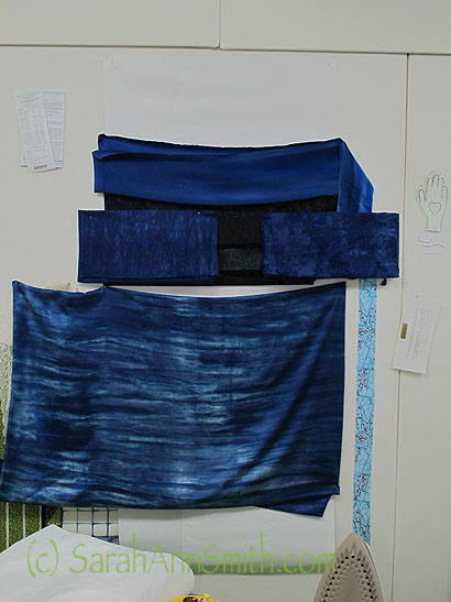
First round with the dye bath.  The big piece on the bottom is silk.  The others are cottons.

First round with the dye bath. The big piece on the bottom is silk. The others are cottons except for the very top piece which is a silk I dyed earlier.

Then
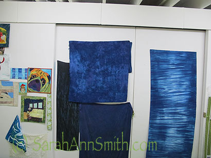
More fabrics dyed for the project. The cotton on the right is what I used for the back.

More fabrics dyed for the project. The cotton on the right is what I used for the back.

I used the blue on the top left in the photo immediately above, but had overdyed it to be darker and more solid, for the top and bottom panels where I would write the story.  After all, it is hard to make a picture of something you heard but didn’t really see so I though I’d best add some words!   I took some artistic license and added a full moon and lightened the scene just enough to actually make a picture not a large blotch of dark! First, however, I needed to figure out how I was going to write on the cloth.
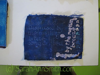
I knew I wanted to write on the top and bottom panels of blue cotton that I had dyed, but wasn't sure what method to use.

I knew I wanted to write on the top and bottom panels of blue cotton that I had dyed, but wasn’t sure what method to use.

On the right, you can see assorted lower case “a’s” written with DeColourant (some colored) and assorted tools to apply.  I thinned the thick liquid, but then it ran.  Not the look I wanted. It’s a great product, but not the right one for this purpose.  The top “Disguised” is done in an archivally safe Sakura Jelly Roll pen, but it looks much brighter in the real than in the photo.  It was OK, but the Liquitex Ink! (acrylic ink) in white with the “crow quill” dip pen was perfect.  The variations in pressure as I wrote gave an almost italic look, so that was my choice.

Next I printed out the text at full size to make sure it would fit and to use as a guide.  I was afraid that I would get the word order wrong or space out and misspell something, so I folded the printouts and set them just above the line I was writing, covering up the  previous line so I didn’t confuse myself!  You’ll see my chalk-lines in the photo; I used SewLine by Moda with ceramic chalk lead which erased like a dream when I was done.
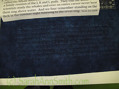
Above you can see how I folded the printed paper so I could follow along, line by line.

Above you can see how I folded the printed paper so I could follow along, line by line.

Next step was to over-paint some batiks for the mountains.  I had a few that worked as is, but most needed to have the batik design muted.
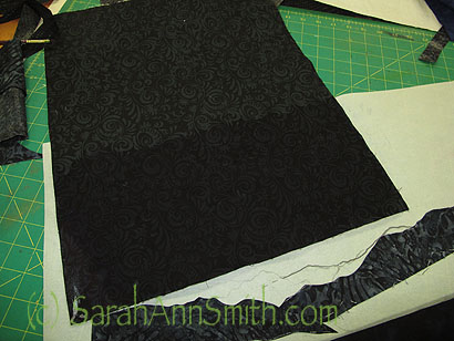
Batik fabric for the mountains.  In the loewr part of the photo you can see how I have already cut some of the mountains.

Batik fabric for the mountains. The cloth was over-painted with dark (not sure if I used black, blue or a combination).  In the lower part of the photo you can see how I have already cut some of the mountains. I wanted the foothills and coast to be even darker than higher up, where the moonlight hit the tops of the Olympics.

Next I auditioned various fabrics, two blacks for the whales, a gray (which needed darkening) for the thin strips separating the top and bottom panels from the center.  I free-motion stitched on the black sateen I selected for the whales with just a stabilizer underneath, then cut a slit in the silk (BIG gulp and holding of breath), then tucked the whale into the opening and hand-appliqued them down.
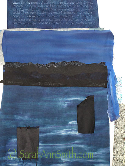
 

Test-driving fabrics for this and that.

Test-driving fabrics for this and that.

And finally, the quilting. It went fairly quickly, as it was all blues from palest (which appears white but is actually a pale silvery blue) to nearly black on most of the quilt, with just some gray and deep charcoal for the mountains.
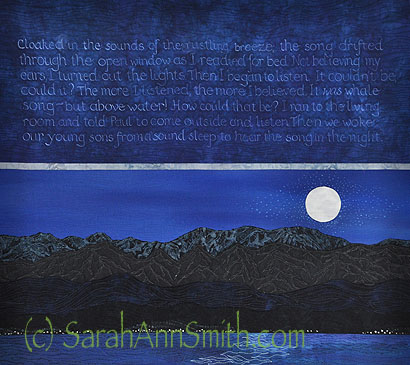
Detail shot showing quilting, moon, and white ink dots for the moon glow.

Detail shot showing quilting, moon, and white ink dots for the moon glow.

The exhibit will debut at the International Quilt Festival in Long Beach this coming July.  I’m thrilled to be a part of the Dinner@8 exhibit once again, and would like to thank our various sponsors over the years, especially Moore’s Sewing Centers, Havel’s Scissors and Mistyfuse (which I use a lot)!