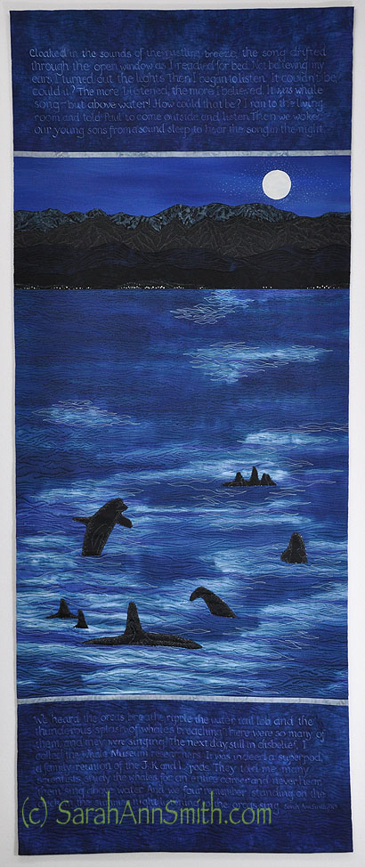
Remember back when the world looked like this? Yes, that was a bit over 3 months ago–hard to believe in the torrid heatwave right now!
Well long ago and many degrees cooler than now (about 75 degrees cooler to be precise), I began work on a piece for a juried exhibit / book, and I’m thrilled to say that my piece was accepted. Mary W. Kerr, author of Cutting Edge Art Quilts (see my book announcement blogpost here), came up with another great idea for an exhibit: “Dare to Dance, An Artist’s Interpretation of Joy.” It worked so well, she sent out an invitation to make a quilt 18 x 30 inches for possible inclusion in a book on that theme. Immediately I KNEW what my image would be… but it would just need to get squeezed into a very busy time period when I was also writing three articles, doing new artwork for the articles, AND prepping and filming my Quilting Arts DVD (post about that here).
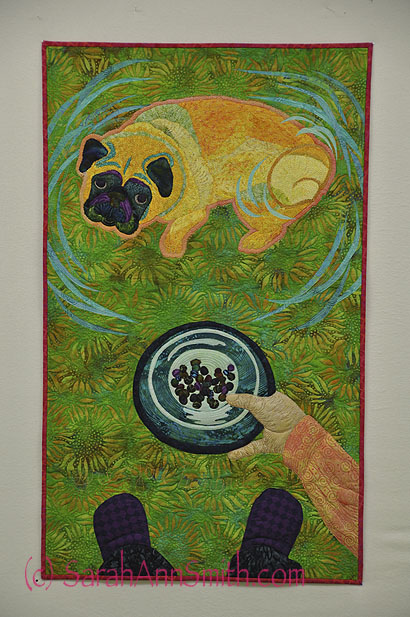
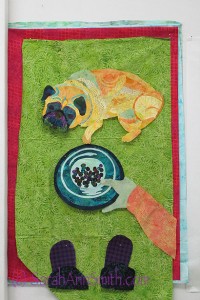
The image: Mr. Wiggles a.k.a Pigwidgeon a.k.a. our pug! See every time he gets hungry, he puts his feeties up on your leg. When you look down at that sweet pug mug and ask, “Are you hungry?” he immediately hops, then drops onto all four feet and begins The Circle Dance. Always counter clockwise. Several times. Accompanied by a hop or three. Then he scootches around behind me (after I’ve creaked my knees into standing) and nudges me into the kitchen by pushing at the back of my calves with his sweet smooshed-in face, just to make sure I know where to go!
I’m excited to see my article on backgrounds come out in an upcoming Quilting Arts issue (blogpost about that here), and this is yet another example of how backgrounds make a difference. But first, I needed to get a photo to use as my model for his wiggly body:
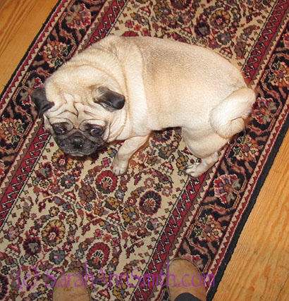
First I had to capture the correct curve of his body. This too MANY photos because they were mostly blurred because he was moving too fast!
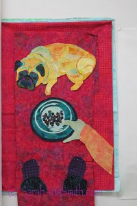
Then we needed to get the “putting down the dish” thing:

First attempt at putting down the dish. Decided the proportions and bowl at the top didn’t work.
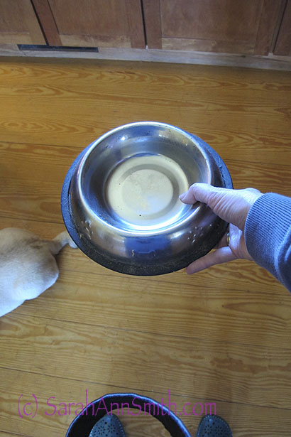
So….

So this time I managed to take a photo with my left hand only to get the proper perspective, which would then be at the bottom of the quilt.
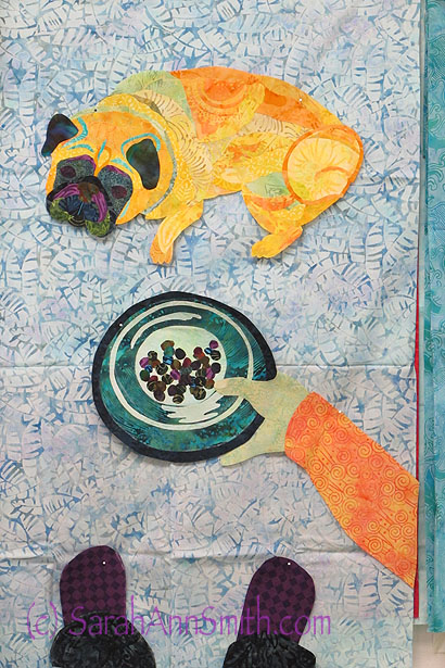
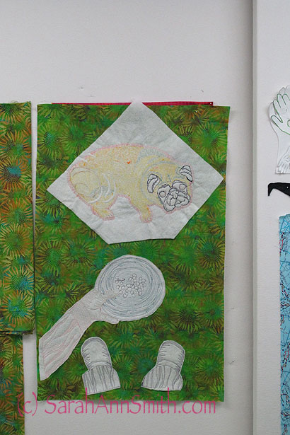
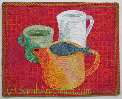
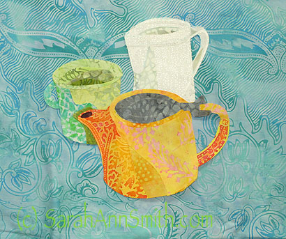
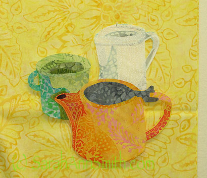
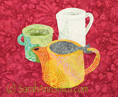
Once I had my working photos, I fuse-collaged the dog, the bowl and my hand, and my slippers. Next: choosing a background. Hmmm. Let us just say I tried MANY colors. If a color contrasted with the warm tones, the blues/purples blended in. If the color contrasted with the purple and blues, the pug got lost. Some prints were blah. Some were too visually busy.
The red contrasts well with everything, but was a bit much for me. I know this will hang in our home, but it was just too much red.
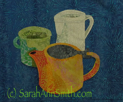
So how about blue? Egads, NO!

So then I tried blue. Definitely not this one. Nice batik, but not here–washed out AND busy. Blech!
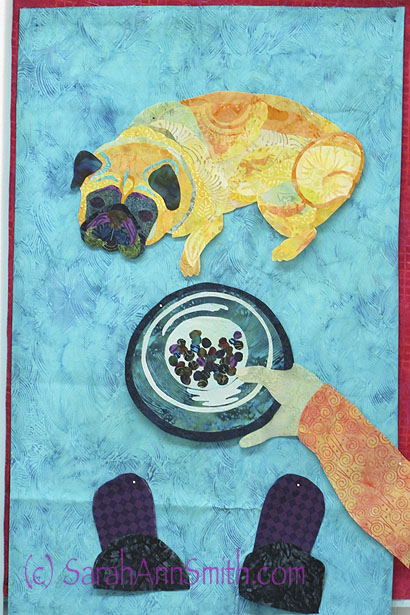
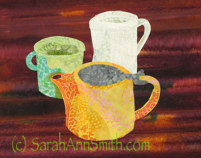
So off to try my favorite turquoises. Hmmm. Not so much.

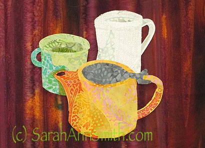
OK, but not great. The dog and my arm stand out well, as do the dark slippers, but the food dish kinda mooshes into the background.
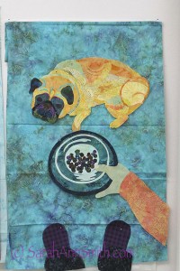
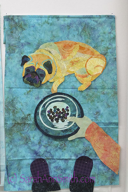
Tried another turquoise, with more visual texture. This was NOT an improvement. OK, moving on….
OK, so yellow and orange won’t work for obvious reasons, don’t want browns, red doesn’t work, neither does blue or turquoise. Don’t want that much purple. That leaves (drum roll) green. So how does that work?
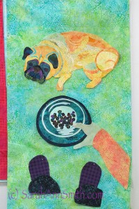
Definitely better. However, this fabric looks much better in the photo than it did in person. It is a “fractured ice” type of pattern, and it looked pretty flat and dead in person, but the color was definitely working for me with pug, arm, dish and feet!
Here’s another green. Again, the “print” of the batik is a bit flat, and perhaps it is a bit too briht, but like the red strips on the side. For quite a while I planned on vertical stripes of red.

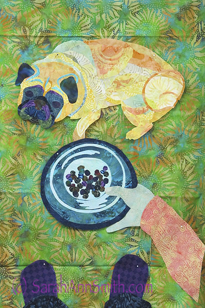
I really liked this print, but the yellow of the sunflower petals was a bit disctracting.
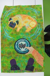
The solution? PAINT! A thin (very thinned) wash of blue paint knocked back the contrast a bit. Just enough visual “life,” not too contrasty, not too flat. The Goldilocks choice: Just Right!
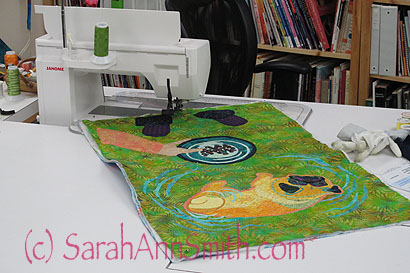
Then comes the quilting. A couple of times I have tried this method, and I like it–not all the time, but often.
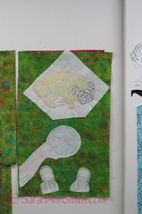
Here you can see the back: I do the thread-coloring (aka thread-painting) with a batting behind the figure as a stabilizer. Once done, I trim away the excess (not trimmed on the pug). Notice the fabric on the left, unpainted, with the painted background…just a bit of difference on the yellow petals.
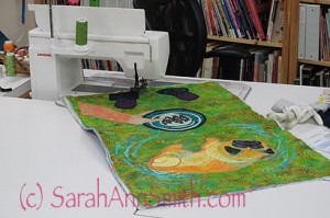
Can you say “LOVE MY JANOME”? This is the 8900–every time I think they can’t make a machine better, and yet they do. LOVE quilting on this baby (I call him Gandalf because of the silver front, and it has to be a guy because he’s so big!).
Tomorrow, the completed quilt!