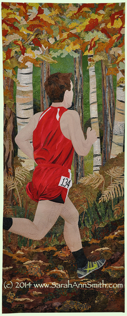
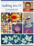
Of late I have been busy with many things, one of which is Sketchbook Skool, an online cast of a gazillion students and, each term, six different teachers. This past week’s lesson was with Brenda Swenson, and the use of single colors of watercolor on paper, letting them mix and play has been a revelation. Since my last post, about the new Series 1400 of Quilting Arts TV, featuring little ol’ me in three episodes talking about making a quick bag as a gift, machine quilting, and correct needles/thread, was the last post, I thought I’d continue with the Series 1400 theme, creativity and inspiration. (To see the information on the series and the ongoing bloghop, please click here to read about the series and visit all the creative, inspiring bloggers who just happen to be guests on this season!).
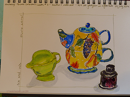
The completed sketch by me–contour drawing with fountain pen with non-waterproof ink and watercolor.
To begin at the beginning, we were to do a contour drawing, 3 minutes, of an item. Then 6 minutes for two items, and 10 minutes for three. Here’s what I did in my “everyday” sketchbook, which happens to be a Stillman & Birn Epsilon, 7 x 10 inch size. This sketchbook has a hot press finish, about 100-lb paper; they are available at Binders Art Supply in Atlanta (google up the website) and Dick Blick (ditto), among other places. I didn’t know where I put my Tombow marker (water soluble), so decided to use my Flex Nib (Noodler’s Creaper pen) fountain pen with R&K Alt Goldgrun ink (LOVE); both pen and ink came from the wonderful Goulet Pens. (Note: I’m not advertising, just anticipating questions!)
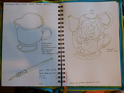
Timed contour sketches of fiestaware pitcher, tea-for-one teapot/but from my friend Marie many years ago, and a bottle of deAtramentis Roses scentted ink (heavenly color AND scent, also from Goulet Pens). I used R&K Alt Goldgrun in my fountain pen.
Today, I rushed a bit and the pitcher is seriously tipsy, but I’m pleased, especially with the way the reds and black merged on the label on the bottle. And the more I practice / make art, the more I am embracing the idea that I do not need to be absolutely freakin’ perfect, that the wobbles and imperfections are what give something individuality, just as our handwriting varies from those cursive letters above the blackboard back in second grade.
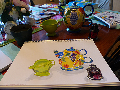
Here’s the in progress, with the items behind the sketchbook on a dining table that I should have tidied before the photo but of course did not. Truth in blogging…..
Notice the difference between this page and the one at the top–what a difference a little “framing” makes! And I LOVE that green ink!
And for more inspiration, I just had to add this. Last night thunderstorms rolled in, so of course we lost satellite signal and everything started to pixillate. Immediately I tried taking a photo with my iPad (on which I was trolling FB or playing solitaire), but the camera just c ouldn’t capture the incredible colors. So I dashed madly for the camera in the next room and got this photo at the last second before the picture returned to normal. THIS is inspiration…aren’t these colors glorious? I’m not much of one to enjoy abstract art, but this is enough to make you want to grab tubes of paint, several palette knives and go to town.
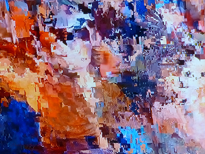
Our pixillated TV screen. Isn’t this incredible? The COLOR!
So that’s my life the past 48 hours (plus helping to hang the quilts for Maine Quilts, the annual quilt show here). Art and inspiration! And check out my previous post (link above) if you’d like to scope out the bloghop for the new Series 1400 of Quilting Arts TV, featuring yours truly in three episodes!
As for sketching and watercolors and contour drawings, I have a lot to learn, but it is so much fun, and it inspires me to make more art, including of the textile kind!