Descended from the Stars, Part 3
Wednesday, July 22nd, 2015Good news: it looks like there will be an article on this quilt! Bad news: that means I won’t be sharing quite as much here out of respect for the magazine. But here is a lot, and I’ll tell you when the article is out!
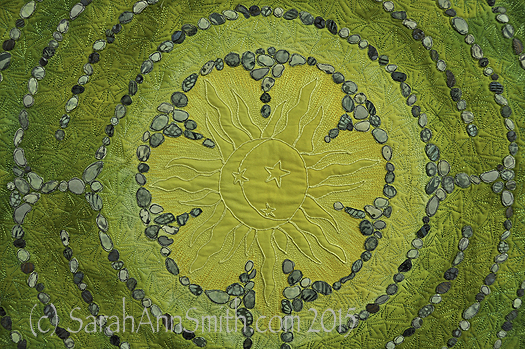
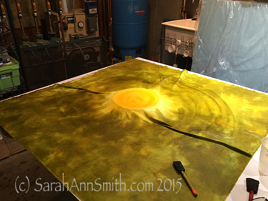
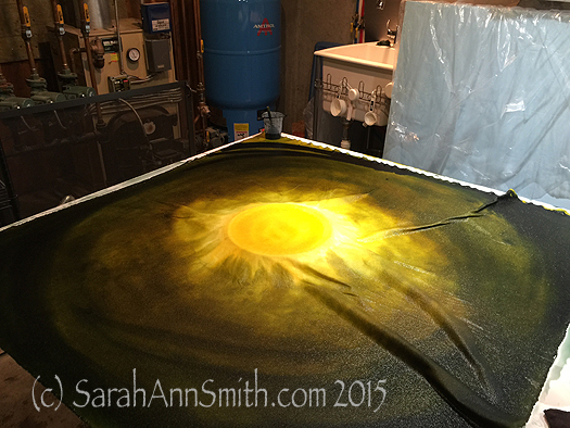
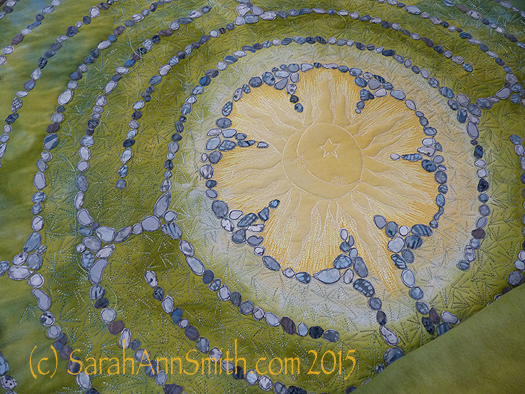
The sun in the center of Descended From the Stars
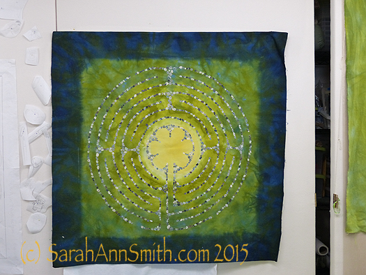
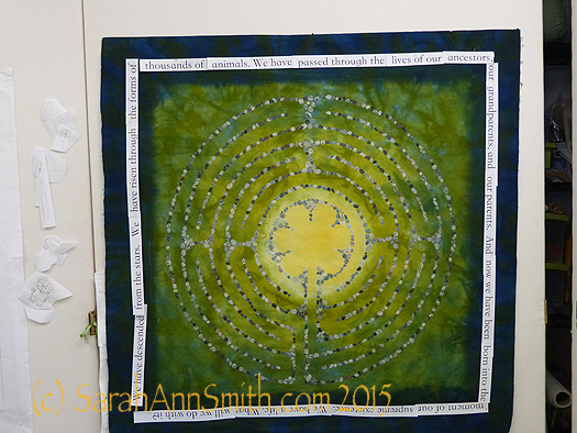
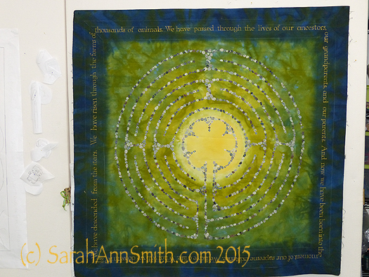
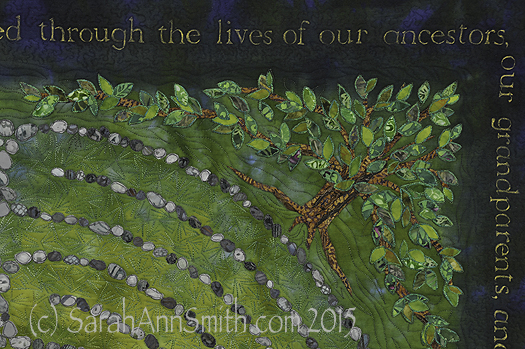
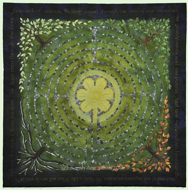
When I left on in my last post about this quilt, I had shared the dyeing process and the stones and lettering. Next, I fused trees in the four seasons into the corners. I distorted the shape so the tree canopy served as a frame. I had thought initially I might need an inner border, perhaps couched yarn or stitching of some sort, but the shape of the tree worked so well I didn’t need anything extra.
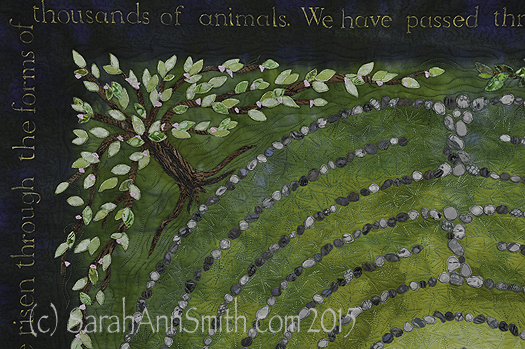
Detail, upper left corner, Spring Tree of Life. Each of the leaves is free-motion stitched with several rounds of thread on each leaf. The nice part about doing this at the top stage is that I could use the scissors on my Janome 15000. I didn’t have to bury thread tails!
Detail, top right, Summer Tree of Life.
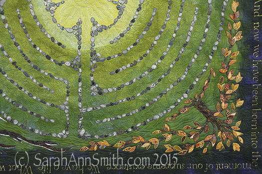
Detail of the lower right corner, showing the autumn tree of life.
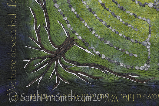
Detail of the lower left corner, with the winter tree kissed by snow.
You can see my work (on a glorious Janome 15000) as I am quilting around on the stones and leaves.
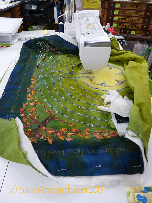
Here I have begun quilting. You can see the custom-dyed cotton duck on the back.
Next,
Superior Threads (Thank you Bob and Heather Purcell!) has come out with some tone-on-tone variegated threads. I have been pestering Bob for YEARS to make threads like these as I prefer blendy to contrasty. I ordered up all of the new earth-tone blendy variegateds in the Fantastico line and used them.
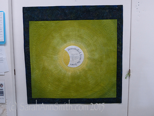
At last, it was nearly DONE! Time for facings, sleeve and label.
The back side of the quilt. By dyeing the back to correspond with the front, the quilting design shows up on the back as it does on the front.
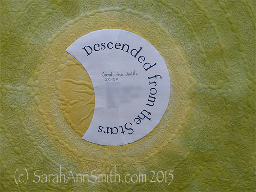
And I couldn’t resist the temptation to place a moon behind the sun as my label. One more time with the dip pen!
The End–the label is on, the sleeve is done, the facings are stitched!
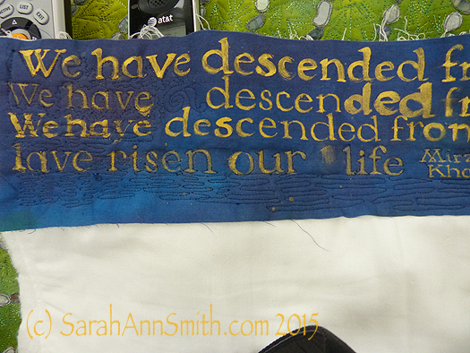
(c)Sarah Ann Smith 2015; quote (c) Mirza Khan, used with permission
This quilt will be for sale–another reason I opted to not include a lot of personal details in the quilt. As I said before, I am happy!