Foto Friday, Silhouette
Friday, August 7th, 2015This past weekend we went on a 4 1/2 day trip to Nova Scotia and home via New Brunswick. Gardening work and unpacking and starting on an article has distracted me (gee, who me?) from blogging, but promise I will. This past week’s lesson and challenge in the Ricky Tims 52 Week Photography Challenge class was silhouette. I tried a lot of things, but due to travel wasn’t at a time/place where I could do sunrise or sunset silhouettes. So I ended up submitting a photo of the rigging of the Bluenose II (the Bluenose original is on the Canadian dime) in Lunenburg harbor. Right click on photos to see larger.
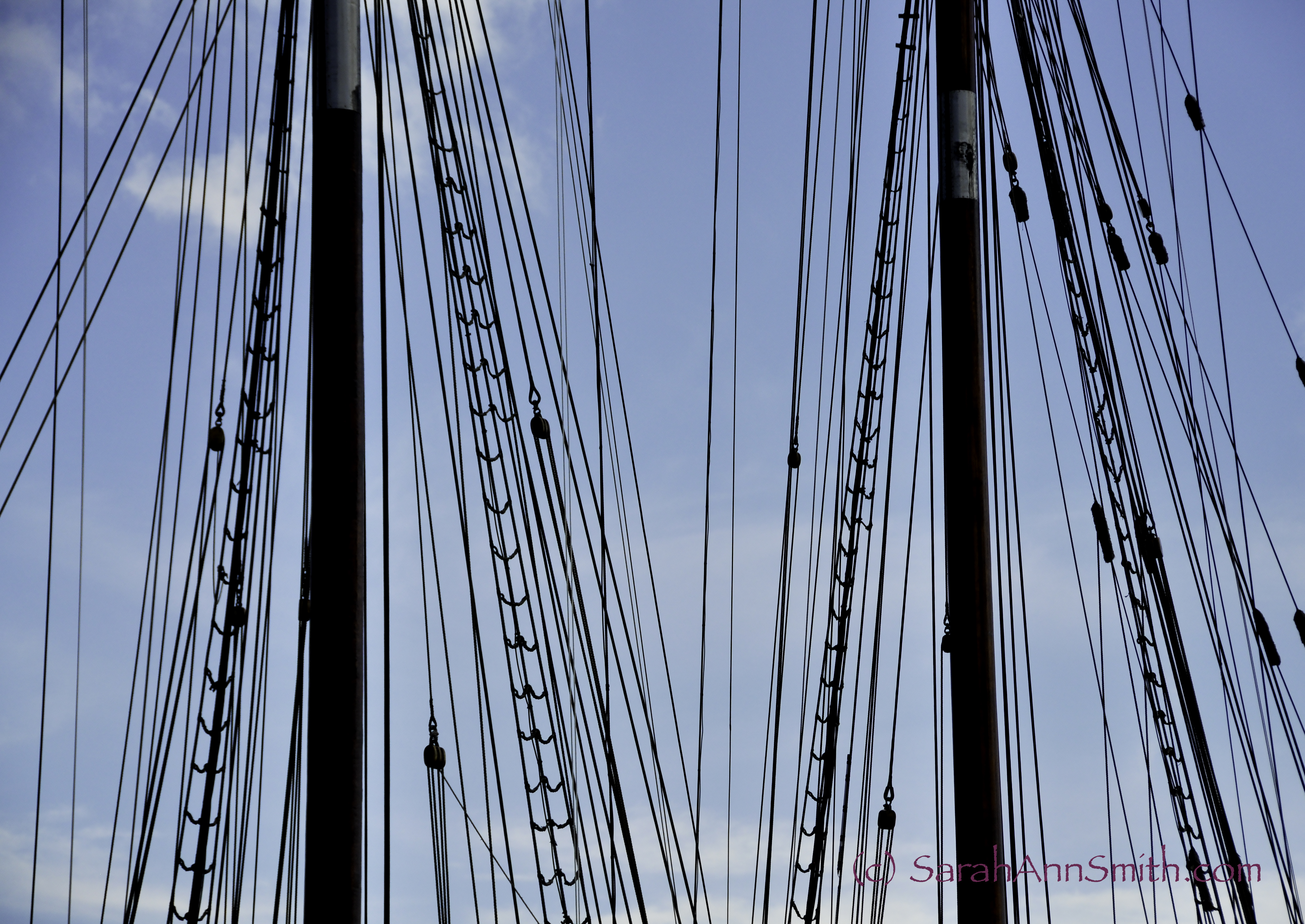
adjusted levels to darken the masts, smart sharpen. Lightened the sky by adjusting the blues slightly. Slightly cropped on the right.
The Bluenose II, a replica of the Bluenose which is on the back of the Canadian dime. Lunenburg, Nova Scotia. I liked the play of lines across the image.
Major thanks to Valerie Hearder, an art quilter in Nova Scotia, for replying to my email and suggesting stops and things to see between Yarmouth and Mahone Bay and Peggy’s Cove. More anon!
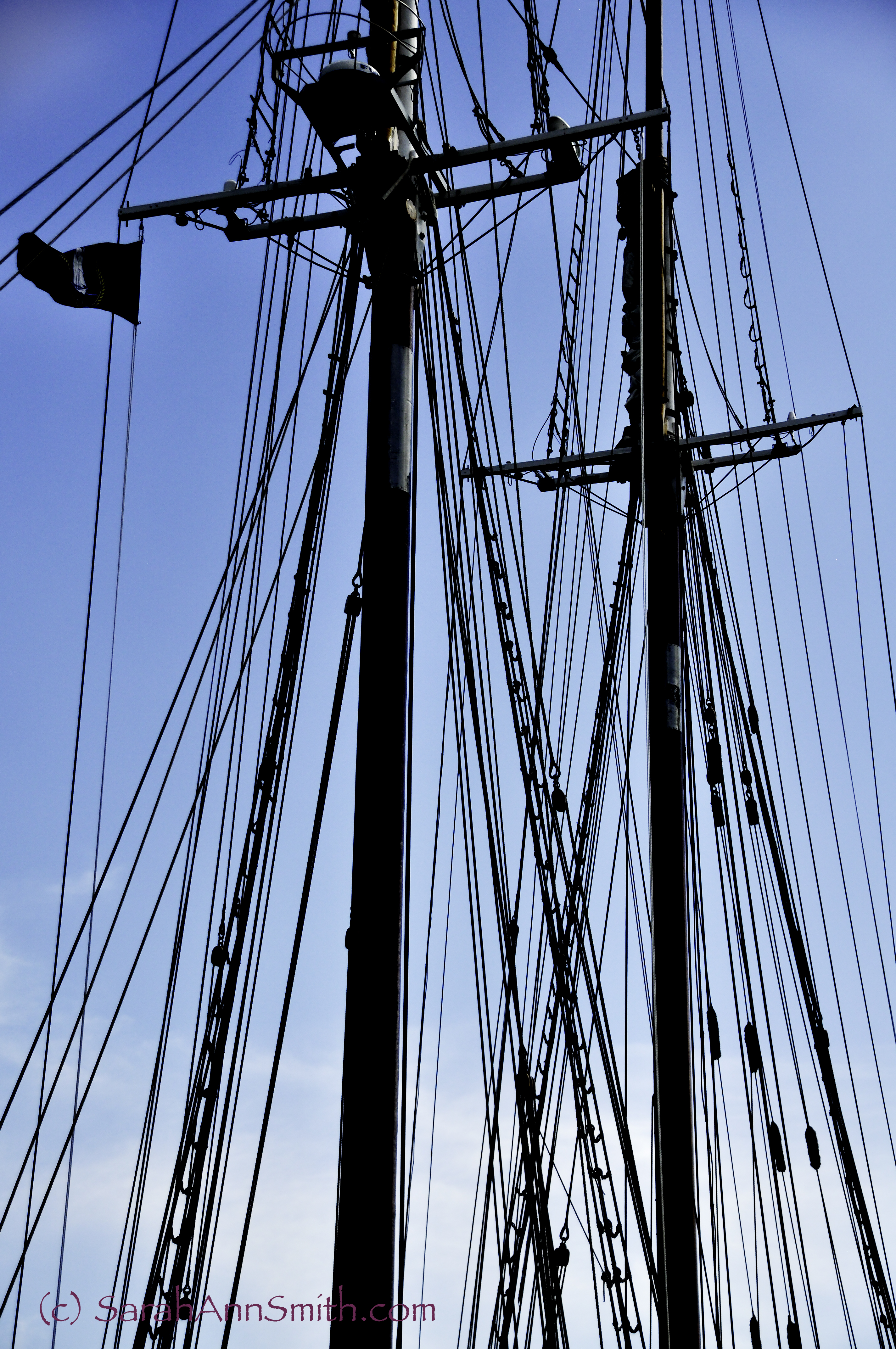
Lightened vignetting in the top corners, crunched levels to darken masts. Punched up sky with vibrance.
The Bluenose II, a reproduction of the Bluenose on the back of the Canadian dime.
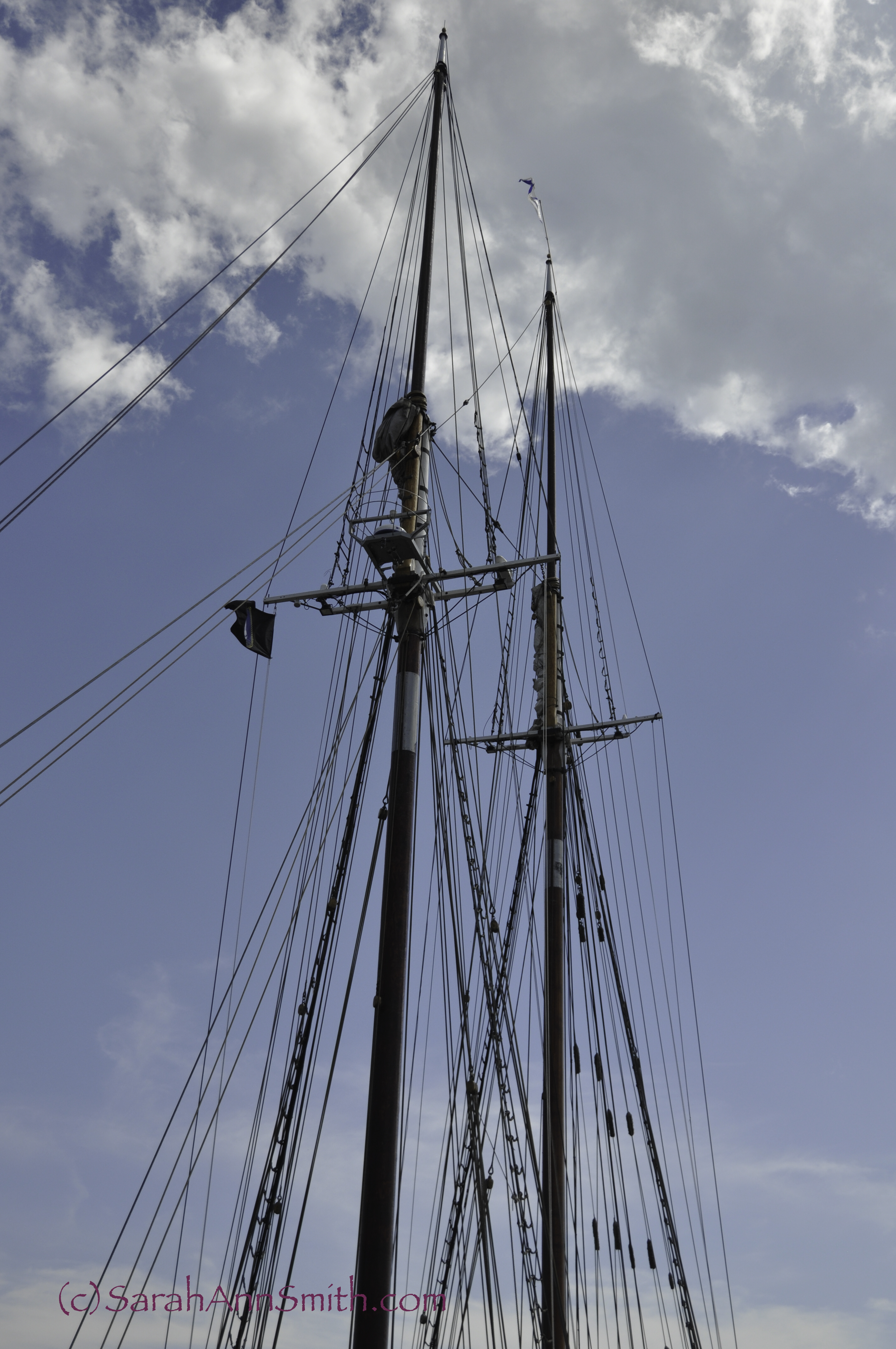
The masts to the tippy top of the Bluenose II. Essentially no edits.